Previous: New in the WDBA (21)
Hopper watercolors
Post #1006 • May 22, 2007, 4:36 PM • 6 Comments
Boston—Any considerable gathering of Hopper paintings is going to invite a comparison between his watercolors and his oils. Hopper had an economical touch, but a very different sense of economy compared to someone like Manet. Hopper would minimalistically group shapes together in a cool manner, so one doesn't admire his brushwork in oils, so much as one might admire that he knew when to quit work on a shape while he was ahead. Color areas, therefore, tend to stack up in his oils like blocks of cheese. That's why his architectural forms come off so much more gracefully than his figures.
But watercolor doesn't want to look weighty. One has to coax it into dimensionality. In a sense, Hopper's bricklayer touch (I mean that as a compliment) met with the natural tendencies of watercolor in a way that neutralized the weakest aspects of each. He was able to create hard edges and high volume with a medium not given to either, and the watercolor injected playfulness, lightness, warmth, and even panache into an oeuvre that rather needed them. I don't think Hopper would have made the impact he did if he had only worked on the scale of his watercolors or with their more modest pictorial ambitions. But taken for themselves they depict a happy combination of talent and material.
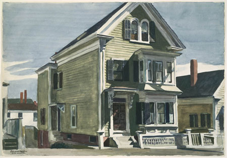
Edward Hopper: Anderson's House, 1926, watercolor over graphite pencil on paper, Museum of Fine Arts, Boston, bequest of John T. Spaulding, photograph © Museum of Fine Arts, Boston
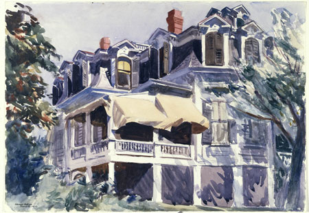
Edward Hopper: The Mansard Roof, 1923, watercolor over graphite on paper, The Brooklyn Museum, New York, Museum Collection Fund, courtesy, Museum of Fine Arts, Boston
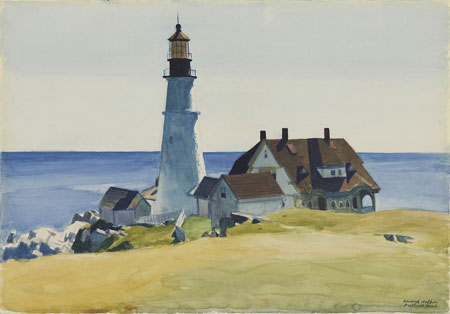
Edward Hopper: Lighthouse and Buildings, Portland Head, Cape Elizabeth, Maine, 1927, watercolor over graphite pencil on paper, Museum of Fine Arts, Boston, bequest of John T. Spaulding, photograph © Museum of Fine Arts, Boston
2.
May 23, 2007, 10:19 AM
Wow. Wish I could've seen that show. Thanks for posting that.
3.
May 23, 2007, 11:29 AM
Opie, I don't understand ghreenburgs Quote. It seems to me that Hopper was a better painter his paintings wouls be better, thus a superior atist?
4.
May 23, 2007, 11:56 AM
I take it to mean, and I am reasonable sure he meant, that Hopper was rather clunky in a purely technical way, but made wonderful paintings anyway, and that if he was "slicker" as a technician he might not be as good an artist as he was. There are, after all, a number of very excellent painters of lighthouses and the like who are not nearly as good as artists, as such, as Hopper. I am very familiar with several.
Although what Greenberg said strikes me an an apt observation, particularly in Hopper's case, I found I had to take some exception to it after seeing the show, because close examination of the pictures revealed that Hopper was indeed an exceptional technician, and led me to believe that Greenberg was probably referring not to detail but to the somewhat off-putting clunky and occasionally "sour" look that Hopper gives us.
One of the joys of good art is the logical difficulties it forces on us when we try to put these things into words.
5.
May 23, 2007, 11:17 PM
How does Hopper pull off those brush-strokey skies?
6.
May 24, 2007, 10:58 AM
I think by using lots of little brush-strokeys, Ahab.
1.
opie
May 22, 2007, 11:18 PM
This was a wonderful show, a little to large, maybe; there were a dozen or more pictures of lesser quality, and some water colors even better than the ones above, a couple of Cobb's Barns and one with a telephone pole straight up the left side, and some others. (I didn't want to stand in line for a half hour just to buy a catalog), The show was jammed but fortunatly half the people were reading large wall labels so I was able to get up close to most paintings.
While I am mindful of Greenberg's trenchant comment that if Hopper “were a better painter, he would, most likely, not be so superior an artist.” I found that the pictures, particularly the oils, were beautifully painted in detail even when "crude" looking at viewing distance, and that the better the detail the better the painting. A vice-versa example would be the much-reproduced "Second Story Sunlight" - the far gable was awkward and seemed to turn against the picture plane, and the close-up details were not as good as some of the earlier pictures.
The later pictures in particular did not hold up as well as I thought they would, nor did some of the watercolors from the 20s, but there was no bad painting here. The lesser pictures are only lesser by comparison with absolutely masterful painting throughout. This, and the wonderful Monet show at Wildensteins in NY filled my esthetic gas tank for another trip back to this cultural wasteland.