Next: MIT is going to save art from what, exactly? (16)
Americans in Paris wrap-up
Post #826 • July 10, 2006, 3:16 PM • 28 Comments
I can think of legitimate criticisms of Americans in Paris, but they hardly seem to matter after spending long years in the sunny, yet benighted provinces of South Florida. Even to be able to complain about this show is a luxury. Concentrating on portraits, interiors, and cityscapes of Paris would have produced a tighter, more thematically cohesive exhibition, even though it would have knocked out lovely things like a Metcalf view of Gloucester Harbor. But what the hell, it sprawls a bit wider than it might, and consequently we get the major MFA holdings next to, at worst, a lot of context. The show includes artists at work in fields far from the city, or cashing in on the demand for Orientalist subjects derived from North Africa, or using the new Impressionist modality back at home in New Hampshire, all in all making Paris seem like a rather large place. I wouldn't say that it caused me to suffer. Painting this good, in this quantity, justifies a loose curatorial approach, which shows how far the ripples extended from the boulders that the French dropped into the pond of art. New discoveries for me included Mary Fairchild, whose 1886 portrait of one Mlle. S. H. should have been placed in the vicinity of Whistler's Mother so it could chase it up a tree, and Robert Vonnoh, whose 1888 study of poppies takes Impressionist freedom to an extent that recalls floral studies by Nolde. (Neither are pictured below.) And the familiar pieces only ever look better.
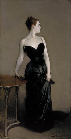
Madame X (Madame Pierre Gautreau) (1883-1884), John Singer Sargent (American, 1856-1925). Oil on canvas. Overall: 208.6 x 109.9 cm (82 1/8 x 43 1/4 in.) The Metropolitan Museum of Art, New York. Arthur Hoppock Hearn Fund. © The Metropolitan Museum of Art, New York. Courtesy, Museum of Fine Arts, Boston.
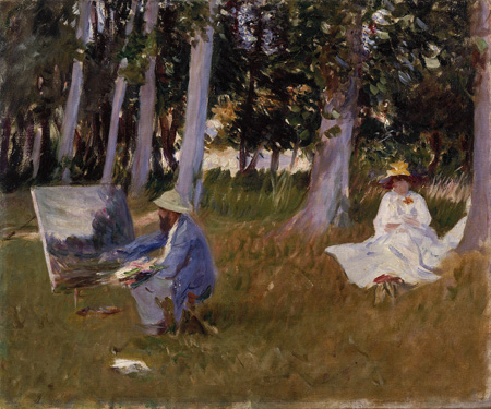
Claude Monet Painting by the Edge of a Wood (about 1885), John Singer Sargent (American, 1856-1925). Oil on canvas. Overall: 54 x 64.8 cm (21 1/4 x 25 1/2 in.) Tate, London. Presented by Miss Emily Sargent and Mrs. Ormond through the National Art Collections Fund. Photo credit: © Tate, London 2006. Courtesy, Museum of Fine Arts, Boston.
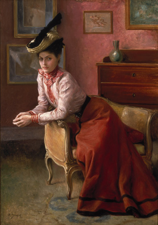
Woman in an Interior (1895), Julius LeBlanc Stewart (American, 1855-1919). Oil on canvas. Overall: 91.4 x 64.1 cm (36 x 25 1/4 in.). Private Collection. Courtesy, Museum of Fine Arts, Boston.
Gloucester Harbor (1895), Willard Leroy Metcalf (American, 1858-1925). Oil on canvas. Overall: 66.4 x 74.3 cm (26 1/8 x 29 1/4 in.). Mead Art Museum, Amherst College, Amherst, Massachusetts. Gift of George D. Pratt. Courtesy, Museum of Fine Arts, Boston.
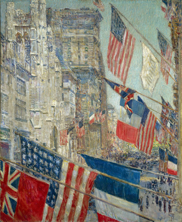
Allies Day, May 1917 (1917), Frederick Childe Hassam (American, 1859-1935). Oil on canvas. Overall: 93.5 x 77 cm (36 13/16 x 30 5/16 in.) National Gallery of Art, Washington, D.C. Gift of Ethelyn McKinney in memory of her brother, Glenn Ford McKinney. Image © 2006 Board of Trustees, National Gallery of Art, Washington. Courtesy, Museum of Fine Arts, Boston.
2.
July 10, 2006, 5:15 PM
You're right about the Chase, JL. On the right was the Beaux mother and child. And that is indeed the Vonnoh, although the image is drastically too yellow. Go give that Stewart another try - it's not the most charming thing in the room, but compositionally, it's a machine. I just can't figure out what she's doing with that giant shoe on her head.
3.
July 10, 2006, 5:17 PM
And let me thank you again for your excellent company at the show. Let's do something like that again soon.
4.
July 10, 2006, 5:42 PM
On the right was the Beaux mother and child.
Ah, that's right. The Chase and the Whistler are a common pairing--they were hung together, not for the first time, just a couple of years ago in the After Whistler show that appeared in Atlanta and (under the name American Attitude) Detroit, where I saw a bit of it. But the Beaux, wow, that looked great. It would have been more fun to have Beaux and Fairchild on either side of Whistler, instead of Chase.
Let's do something like that again soon.
I enjoyed it as well, so let's. You still need to see the Painting Summer show at Salem, if only for the Hans Hoffman--could be the best painting on view in these parts right now (it's Summer Bliss, from the early '60's; I'd link to an image, but all the photographs I've seen of it are horrible. And it's a truly great late Hoffman; I don't know how to say this properly, but you can just feel him going for it.)
5.
July 10, 2006, 6:35 PM
I believe it is "Summer Night's Bliss", and I also believe it is one of the best AE paintings ever painted..
6.
July 10, 2006, 6:39 PM
Sorry, I checked and there is a "Summer Bliss", 1960.
So try to see "Summer Night's Bliss" if you can. Great picture.
7.
July 10, 2006, 7:00 PM
In case anybody doesn't already know, Madame X's right shoulder strap was originally painted drooping down, which was considered so shockingly sexually suggestive that Sargent repainted it as it now appears.
8.
July 10, 2006, 7:11 PM
P.S. Sargent's initial choice was better. It hurt the picture to put the strap back up.
9.
July 10, 2006, 7:43 PM
Franklin, please, that is not a shoe on her head (#2). It's a black machete sheath disguised as a hat ornament, but actually signifying her repressed desire to avenge herself on the patriarchal society by castrating any male that dares to underestimate her. If you need further exposition of the matter, e-mail Naomi Fisher.
10.
July 10, 2006, 9:34 PM
I don't much like the way pasty Madame X drops off the page into her very own white-hole of negative space, but I think the lower half of the painting looks wonderful. The graceful pose is thwarted by the high-contrast contours of the figure's arms that drive the eye so severely upwards towards the head. The whiteness of skin juxtaposed against an inky gown is surely intended to convey something symbolic about the sitter's personality or social position; but for me the picture is upset by the way the flesh looks rather like the distant light one sees at the end of an unlit tunnel. (Dropping the strap off the shoulder would be only a fractional improvement to the composition.)
I don't mind the Edge ot the Wood too much, but feel like the whole thing slants a little much to the right. and find myself looking at it with my head cocked. And I think it's the middlemost tree trunk causing the problem, as well as seeming to be an awkwardly poised part of Monet's special painting headgear.
I love the Interior portrait. My favourite of this group. Compositional Machine says it well enough, methinks: shivers down my spine as I consider this lady's intense and reddish glare in my direction.
The Harbour is pleasant enough. Almost looks like a collaborative work though, with one artist working the bushy foreground overtop of another's earlier covescape. The series of sails and light roofs carries a really great rhythm. I like the lines of the wharfs and coastal contours and masts and even the slope of the extreme foreground. But the sag of the dark green shadow under the main pier niggles, and I think it should probably be a much straighter description of the posts in the water.
Allies Day makes me think of Rosenquist. I don't like it, not a whit.
Thanks for posting a bunch of good things to look at, Franklin. Posts that focus on literary concerns are of course valuable (and fun) in their own right, but those like today's and the "Cassatt, Beaux" post of last week have much more to offer for sheer enjoyment.
11.
July 10, 2006, 9:39 PM
here is a link to summer night's bliss
http://www.mcah.columbia.edu/cgi-bin/dbcourses/item?skip=37480
this painting is very similar in style to one i saw at art basel/miami this past year that knocked me out. it was one of the most powerful and beguiling paintings i ever saw.
12.
July 10, 2006, 9:45 PM
The unnatural color of Madame X's flesh was one of the things that made it "scandalous" initially. It was considered too decadent, and in fact it was unnatural--the lady, a "professional beauty," applied a special powdered mixture to her skin to achieve the violaceous pallor, which of course had the intended effect of making her more visually striking.
13.
July 10, 2006, 10:15 PM
Actually, Ahab, I'm not sure about the strap now. The drooping version would, of course, have (and had) more interesting connotations, and it would have added a certain immediacy, making the image a bit more personal and less remote. However, the revised version is probably superior from a purely formal visual standpoint, and it makes the image more iconic. Propriety and meaning (real or imagined) aside, it's what Ingres or van Dyck would have chosen, I think. Letting the strap drop may, conceivably, have been done more for the frisson than for purely pictorial considerations.
14.
July 10, 2006, 10:19 PM
"Violaceous pallor", good one Jack. Well then, if she must appear a striking apparition then she must be painted like the walking dead. The table and the coiff are more alive to me and of more interest.
15.
July 10, 2006, 10:48 PM
To me, the real core of the picture is the superbly painted black dress, which, in its way, is more substantial, more real, than what's in it. The ghostly humanoid is a kind of glorified mannequin to present The Dress. Madame Gautreau was, in fact, a classic high society creature, whose chief goal in life was to attract maximum attention in the best circles from the top people. She lived to be noticed, talked about, admired or envied. It was all show and display, all image, all packaging.
I don't know what Sargent actually meant, but I can easily read the picture as an allegory of emptiness and the soul-killing power of such intense artifice. The dress is more alive than its wearer.
16.
July 10, 2006, 11:57 PM
I remember a teacher saying once that Sargent had described her skin as being the color of blotting paper. Thank you for "violaceous."
17.
July 11, 2006, 12:19 AM
Thanks for the link, #1. That's the one. Great painting, wild and all out.
18.
July 11, 2006, 2:09 AM
"Great painting, wild and all out."
I'll say !
I went to the Baltmore museum and did'nt get to see it in person. They have a Motherwell show up which showed him sort of all over the place until he latched on to that large flat black 'cojon' that her pumped out as a signature shape. I found these quite boring visually, however as a pos. and neg. 2d design composition this flat black "Elegy..." series does work.
19.
July 11, 2006, 7:40 AM
Hi Every one, I am daniela, I wanted to know what people think of buying art from china ?
I have recentry run into this website and ordered a painting, the quality was good and I was happy but I just cant realy go around the thout of art made in china.
I will be happy to know what people think.
Daniela [Link deleted. -F.]
20.
July 11, 2006, 7:52 AM
"Recentry," Daniella? Stereotypes are an ugly, ugly business. Buying good art from China is fine, of course, but if you go to one of those websites, you're likely going to be dealing with a painting mill of some kind, where one hack is pounding out the same image over and over agian for eyeless dupes with mistaken aspirations to good taste. You'd be better off dealing with a reputable gallery. And definitely don't bring up the tendency among native speakers of certain Asian languages to conflate "r" and "l" sounds. That's totally rude.
21.
July 11, 2006, 8:14 AM
I don't know why you assume that was done on purpose, Franklin.
22.
July 11, 2006, 8:17 AM
Just having a little fun at a spammer's expense, OP. You haven't had your coffee yet, have you?
23.
July 11, 2006, 9:05 AM
Well, no, but still, I don't think that's clear.
24.
July 11, 2006, 9:14 AM
Glad we could clear that up, then.
25.
July 11, 2006, 11:56 AM
Will the real Madame X please step forward.
Is it contestant #1
or contestant #2
or contestant #3
???
26.
July 11, 2006, 12:04 PM
Funny, I was just reading an article on "Engrish" (poor translations, especially from asian electronics companies), where I was surprised to see, in addition to mistaken grammar, mispronunciations writen phonetically, which makes sense, in a way.
27.
July 11, 2006, 12:08 PM
And what is that right above X's head? Her fairy godmother? The tiniest tiara in the world?
28.
July 11, 2006, 1:14 PM
Marc, just file it under "hair accessory." It appears to be the shape of a crescent moon, which would suggest an allusion to Diana, the moon goddess.
1.
JL
July 10, 2006, 4:51 PM
169 comments? That's insane.
Anyway, Americans in Paris. I nearly went to see it again this morning, as I've had a hard time writing about it and now I'm starting to mistrust my memory in certain regards. For one thing, I seem to remember the Mary Fairchild painting (which is great--all manner of shades of brown dominating the entire canvas, except for the small single blue and white porcelain tea cup in the sitter's hand) hanging right next to Whistler's Mother, with a big William Merritt Chase on the other side of it. Anyway, most of the criticisms I'd make are of the sort that you, with reason, dismiss, so I'm not going to bore anyone with them here. You're quite right to note that it's a luxury to be dissatisified with the MFA and its big exhibitions; we'll know you've truly become at home when you start complaining about them as well!
If I remember correctly, this is the Vonnoh Franklin mentions. I recall the color as even more intense and saturated. On the other hand, I've not been able to warm up to the Stewart portrait above at all. There's nothing about it as a painting that seems remarkable to me, and the way it's arranged--especially her pose--seem almost a parody of the conventions of that style of portraiture.