Previous: I have heard of these 'holidays' of which you speak (10)
Cassatt, Beaux
Post #824 • July 6, 2006, 4:41 PM • 14 Comments
I'm still trying to get my head around this show. In the studio I'm staggering, trying to come up with something that will match this treasure-heap of charm, knowing that the contemporaneity is as important as the technique. I'm making progress, I think, but won't jinx it by talking about it more.
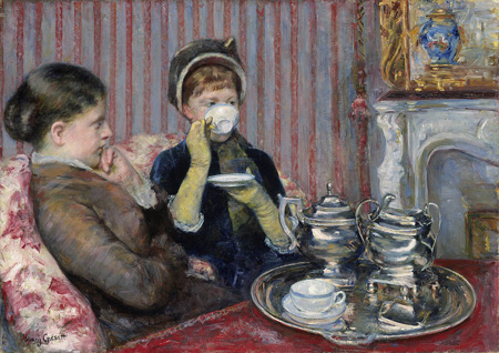
The Tea (about 1880), Mary Stevenson Cassatt (American, 1844-1926). Oil on canvas 64.77 x 92.07 cm (25 1/2 x 36 1/4 in.) Museum of Fine Arts, Boston. M. Theresa B. Hopkins Fund. Photograph © Museum of Fine Arts, Boston.
I used to antagonize a painter friend of mine (hi, Kerry!) by saying that Cassatt is better than Max Beckmann. I did it mostly to irritate him, but now that I've seen each recently, I will restate it as fact.
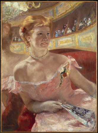
Woman with a Pearl Necklace in a Loge (1879), Mary Stevenson Cassatt (American, 1844-1926). Oil on canvas. Overall: 81.3 x 59.7 cm (32 x 23 1/2 in.) Philadelphia Museum of Art, Pennsylvania. Bequest of Charlotte Dorrance Wright. Photo By: Lynn Rosenthal. Courtesy, Museum of Fine Arts, Boston.
Cassatt has been getting trash-talked by a reviewer or two (as noted here), obliging me to point out that Cassatt took a painting motif monopolized by Madonnas and an army of infant Christs and transformed it into a secular expression. In the meantime, she dashingly employed a hachure that prefigures Cezanne's phlegmatic version, right down to the areas of open canvas. So there.
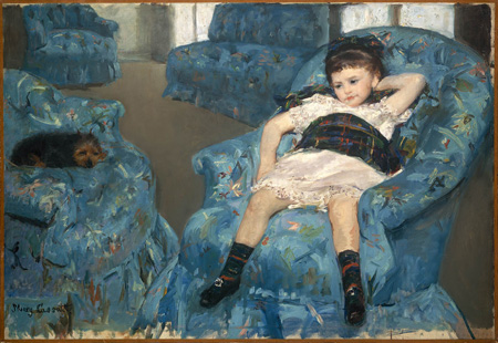
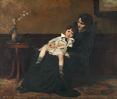
Little Girl in a Blue Armchair (1878). Mary Stevenson Cassatt (American, 1844-1926). Oil on canvas Overall: 89.5 x 129.8 cm (35 1/4 x 51 1/8 in.) National Gallery of Art, Washington, D.C. Collection of Mr. and Mrs. Paul Mellon. Image © 2006 Board of Trustees, National Gallery of Art, Washington. Courtesy, Museum of Fine Arts, Boston.
Beaux nailed two sitters admirably here.
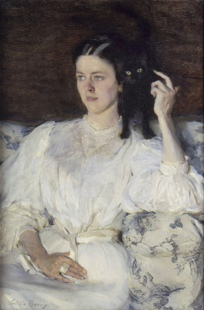
Sita et Sarita (Jeune fille au chat) (1893-1894). Cecilia Beaux (American, 1855-1942). Oil on canvas. Overall: 94 x 63.5 cm (37 x 25 in.) Musée d'Orsay, Paris. Gift of the artist to the Musée du Luxembourg. Photo Credit: Erich Lessing / Art Resource, NY. Courtesy, Museum of Fine Arts, Boston.
This work hangs next to Whistler's Mother in the installation, and holds up. In fact, with its higher contrast and interacting pair, it makes the signature Whistlerian atmosphere look like it could use an open window to blow out the fog.
Les Derniers Jours d'Enfance (1885). Cecilia Beaux (American, 1855-1942). Oil on canvas. Overall: 116.2 x 137.2 cm (45 3/4 x 54 in.) Courtesy of the Pennsylvania Academy of the Fine Arts, Philadelphia. Gift of Cecilia Drinker Saltonstall. Courtesy, Museum of Fine Arts, Boston.
2.
July 6, 2006, 6:50 PM
The Beaux girl with cat is gorgeous, especially the handling of the dress, including the tonal variations. The Sargent analogy is obvious, but this is a bit more restrained or perhaps ladylike; Sargent tended to go for more bravura virtuoso effects. Her earlier painting is more academic or traditional, though certainly accomplished and effective in its way. The child is beautifully realized, with lovely subtle coloring; everything else in the picture acts as a framing device or background for it. Beaux indeed.
It's difficult to see painting this well done and have much patience with those current figurative painters who, certainly technically, are hacks by comparison. Again, technique alone is not enough, but when combined with taste and sensitivity, as in Beaux's case, it's very satisfying.
3.
July 6, 2006, 6:59 PM
You link to JL's comments on the reviewer who seems to be bored by good painting if he has seen it before and apparently yearns to see more up-to-date overexposed work. I guess the fashionistas prevail everywhere.
Bunny's response is excellent, as usual.
4.
July 6, 2006, 8:04 PM
I suspect Giuliano, bored as he seems to be by mere excellence and better, would have found our little MAM's Big Juicy Painting more stimulating. I certainly think he'd be more deserving of it. One just hasn't lived till faced with the abominably bad drawing and queasy coloring of a Francesco Clemente, not to mention the unfathomably abysmal splendors of a David Salle big enough to decorate the Grand Canyon. I suppose I should be more grateful that our local cognoscenti have gone so far beyond genteel 19th century Bostonians.
5.
July 6, 2006, 8:14 PM
Upon further observation I would speculate that raw umber was used as opposed to burnt umber.
6.
July 6, 2006, 8:51 PM
You said "burnt sienna" originally, Jordan. There appears to be raw umber in the picture because it is a pretty cold brown, but as you say it is hard to tell.
7.
July 6, 2006, 10:56 PM
Thanks Old Pro - the Siennas are undoubtably warmer browns. I messed up; on-line the browns appear to be warmer than the paintings are in person. Burnt Umber is pretty neutral however - Raw Umber is cool (greenish), while anything 'Burnt' is redish so-to-speak. Non-the-less, the paintings presented here by Franklin indicate that a conscious choice was made by Cassatt to emulate a 15th/16th century concern regarding the representation of obseved physical (perceptual) reality with drawing; (even though she used photographic imagery). It seems that all "beautiful" paintings begin with a brown of some kind. I believe that both Paynes Grey and Black, as well as Olive Green and Venitian Red are also choice initiators for those seeking realist depictive window-like physical spaces. Here are the succseful colors to use: any brown, ( may vary based on the 'specific' subject matter ), Cadmium Red Middle, Ultra-Marine Blue, Yellow Ochre, Cadmium Yellow Light, Viridian Green, Titanium White, Cadmium Orange, ( the most important hue in any painting depicting space), and transparent Earth Orange. Lazy people will use Black, while more subtle painters will find that Alizarine Crimson and Viridian Green make choice subtle Blacks.
However, Jack will disagree because he knows a lot more about color and painting than I do.
Thanks for the post Franklin - sorry that I missed you in New England but since I had a precious passenger - I decided to skip the floods.
8.
July 7, 2006, 12:03 AM
Hey Jordan,
Maybe you could start a post, and create a repository of this colorific know-how, at the 'technical' table in the artblog/cafe...? That way, some lazy black-paint-usin' MF'er might be able to find this critical info easily, and become enlightened about the importance of Cadmium orange, and whatnot.
A public service!
Just a thought.
9.
July 7, 2006, 12:07 AM
Yes, making black is necessary for a number of reasons, but the Cadmium Orange space connection I never heard of.
10.
July 7, 2006, 11:31 AM
Ilusionistic space with natural light - using orange as a base hue sets the cool colors off with more intensity.
11.
July 7, 2006, 11:51 AM
Why the gratuitous Jack crack, Jordan? I mean, you can make one if you like, but it seems a bit odd. Jack, not being a painter nor wanting to be one, does not presume to have minute, detailed technical knowledge of how paintings are made. He does, however, look hard at the final product (which is what matters), makes judgments, and articulates them. He will continue doing so, on his terms, regardless of what others may or may not like. Nobody is obliged to agree with or take notice of him. Should you want someone more palatable, or easier to swallow, try Elisa Turner, or some other local pundit who's more correct and in tune with the official program. I'm afraid Jack's hopeless in that regard. And he likes it that way.
12.
July 7, 2006, 5:44 PM
Jack - I am just trying to bait your opinions about color. You seemed to have a lot to say to Dorsch regarding my color choices/usage in a group of still life paintings that I exhibited a couple of years ago.
13.
July 7, 2006, 8:48 PM
Ah, so Brook let you in on what I wrote to him about that show. I think I understand now: you evidently didn't like my asessment and probably thought it was high-handed. Well, it was my honest, unvarnished opinion, and I only bothered to write because I thought you were worth the bother. Miami has a number of artists more successful (after a fashion) than you for whom I wouldn't have taken that trouble.
I'm surprised you've hung on to it so long; it's not as if I'm a mover and shaker or as if my opinion matters to those who are. What do you care what I think? I'm serious, yes; I'm not in this to be hip or "with-it," and perhaps that's part of the problem--that you knew I wasn't some glib scenester type carrying on.
Whatever the case, I simply did what I always do: look, respond, and try to sort out the reason(s) for my response. Of course you may disagree, but once you put work in front of me, it's not about you--it's about me and the work in question (and it definitely isn't about other people or current dogma).
14.
July 7, 2006, 10:49 PM
Good enough Jack - as I've stated before, I admire that you care.
Thanks.
1.
jordan
July 6, 2006, 6:26 PM
It appears that she began with a burnt sienna underpainting/drawing - and perhapes used a wipe-out technique by charging her brush with turps and scrubbing out values with varing degrees of pigment removal. Color may have been added and removed after the underpainting was dry as to not muddy her colors. Her edges appear difused and soft as opposed to crisp and sharp. This is speculative of course - I could be way off the mark here.