Previous: finally, a trendlet in my favor (35)
Next: artblog.net plans your weekend for you (3)
ware, bethea, weihnacht at dorsch
Post #707 • January 12, 2006, 5:12 PM • 25 Comments
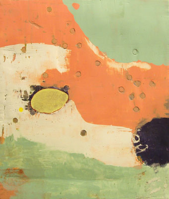
Kerry Ware is officially outpainting nearly everyone in Miami, which shows you what diehard focus on your core convictions can get you. His new works at Dorsch show him surmounting, at last, a longtime difficulty in which his pictures wanted for more contrast, but his attempts at introducing it led to the compositions breaking up in unfavorable ways. Here, they work, and now over the hump, he's knocking out paintings that could give any mid-size abstraction a run for its money. They're up there with James Brooks, at least, maybe even a touch better a times. The colors terminate at edges that resemble torn paper, as dowels embeded into the plaster surface punctuate the fields. Two larger pieces, eight feet square, have Ware working in an angular manner that seems alien to his sensibilities, but they still command the rectangle with authority.
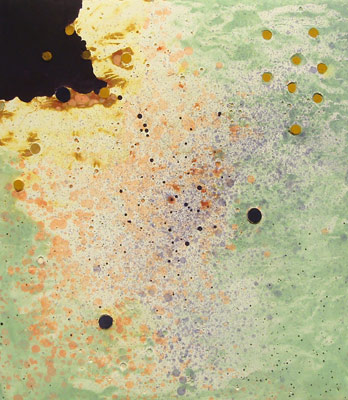
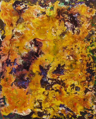
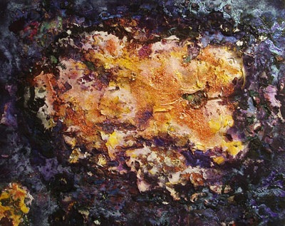
George Bethea is using a motif derived from images from the Hubble telescope - a sparkling, warm organic area floating in the middle of a sea of violet. Bethea continues to employ a high paint volume, and has introduced glitter onto the surfaces. Bethea works in a ferociously repetetive manner that succeeds over the long haul, but doesn't always appear to when we look at short stretches of paintings like the samplings here - their lack of differentiation makes the weaker images aggregrate and drag the show down. But when he hits, he hits good, particularly one work in which a supernova of orange takes up the whole area, with bits of purple ground showing through all over. The glitter seems charged and appropriately stellar.
Dan Weihnacht's long horizontal panels with three identical photographs mounted on each of them don't work for me nearly as well. The battleship green behind all but one of them is preventing the photos from joining into a geometric statement that might activate the whole area. In fact, the most successful one uses a field of mocha brown and slightly differentiated photos, and the greater variety on the more neutral background gives the most satisfying sense of compositional completeness. An obvious solution for further works would be to match the background color with one of the colors in the photos. Despite the Zen aesthetic of the present ones, duly noted by the artist, many of them feel merely empty.

2.
January 12, 2006, 9:05 PM
I guess "ferociously repetetive" could sound pejorative, but I don't mean it that way. I'm describing a working method akin to a brute force computation - minor variations, one after another, until the optimal solutions reveal themselves. It's a complement on his hard work. No one painting dragged the show down, but several sub-optimal ones made the ringers pop out more than they ought to have. Granted, George's sub-optimal is still better than 90% of what I see out there.
3.
January 12, 2006, 9:57 PM
FYI, this Saturday is Wynwood gallery night, so Dorsch will be open.
Kerry Ware's work reproduces fairly well, far better than Bethea's, because it's "cleaner," more sharply delineated, much flatter, and more "collected" or less explosive. These are, yes, formalist works, which requires no apology or justification other than knowing what one's about, and Ware does.
His smaller pieces (21" x 18") work better than the larger ones (96" x 93"), because they're more concentrated and immediate, more focused in character, more there. My favorite one, by the way, Pacey Gestures, is not reproduced above. The big pieces (not shown) are too sprawling, more impersonal and somehow more mechanical, possibly because it takes more calculation to fill a bigger space, and it's harder to avoid having it show. Also, the big ones are less interesting in terms of color.
The wooden pegs, for me, work better the more they're integrated into the surrounding matrix--the more they seem to be, or to have become, intimate or "familiar" with the plaster and oil paint, as opposed to imposed upon them or tacked on for effect (as in the weaker of the two large pieces, Full Pelt).
A similar principle applies to the use of glitter by Bethea. I admit I have glitter issues. At first glance, it put me off, my inclination being to reject it as too flashy, if not vulgar. The paint (acrylic) colors also take some getting used to, because they're not "nice" colors but rather funky ones. However, the more I looked (and I looked enough to make Bethea's father notice it), the more comfortable I got.
These paintings can be seen as abstract, but they were inspired by cosmic or galactic images captured with the Hubble telescope, and they can also be seen as such. This rationalizes the use of starry glitter and the swirling, churning outer-space colors. There's also prominent use of surface texture, and the glitter works best when it seems to be peering through the paint or glowing from recessed spaces (Dharani Dream) as opposed to stuck or pasted on (Cat's Eye). In general, less or subtler glitter tends to be more (as in Dharani Light and the two very nice small pieces), and placement counts.
Interestingly, one of the best pieces (Source) was placed next to what I thought was the least successful (Buddha's Light). The former, despite fairly aggressive texture and coloring, had a flowing, organic, rhythmic rightness to it, like an alien or exotic but coherent environment. Its neighbor, on the other hand, was jarringly chaotic and overloaded, as if everything but the kitchen sink was thrown into it with little rhyme or reason, and was then liberally sprinkled with glitter. Sort of like "This works well; that doesn't."
I hesitate to discuss Dan Weinacht's show because it's not the sort of work for which I have a natural affinity. It takes more of an effort on my part to engage with it, and I'm more likely to find it intellectually interesting than viscerally fulfilling. In place of his previous painstakingly drawn approach, he's now using serial photos, most of which prominently feature linear patterns or grid-like elements--a different way to express the same sensibility. I agree that the specific green background used in all but one piece was safe or correct, but a bit generic or staid. The show did have a pleasant internal logic or consistency, meaning it was all of a piece and evidently well thought out.
4.
January 12, 2006, 10:09 PM
from what i have seen in this show, both in person (only the three from the "miami painters" show) and the others from here and the catalog, george would be considered much less repetitive than many artists. i actually see quite few avenues that have been opened. application stays fairly consistent/repetitive, but he has mixed it up in terms of composition to good effect/affect. the composition and edge management may have been a more pronounced dilemma with the earlier pics of this ilk but it seems to be working itself out.
the 2 paintings above are very different to me. i see george's work as an extension from hubell telescope pics, recent olitski, classic fautrier and late hofmann. yet the one above that franklin relates to a "supernova of orange" has the all -overness and energy of some jackson pollock non drips, while the last one is more a hubell -fautrier set-up and application and subdued or less frantic. simplified, but that is how i feel now.
as is the case with many artists george usually has 2-6 that stand out above the rest.
5.
January 12, 2006, 10:23 PM
in regards to kerry he is in the right direction. has established some new footing. the introducion of some new elements, sharper contrast with color and composition and as jack says the pegs look better with these. the above 2 are a good jump from the miami p.. show.
6.
January 13, 2006, 12:18 AM
I wouldn't overdo the Hubble comparison. I think he sees those images as a complement to an idea he already has about what a painting should look like. These are in no way paintings "of" outer space.
I had the same reaction to the all-over picture as 1 did. I thought it was the best picture and it also reminded me of the pre-drip Pollocks - it has the same kind of distribution of parts and the same awkward, angular, rough energy. It is a damn good painting, period.
It was Kerry's best show by far. The big pictures did not quite make it - I think Jack's analysis was about right. No reason they can't work out in the future.
In fact, all in all, between the two artists, it is probably the best show Dorsch has had.
Weihnacht's pictures have their own character and virtue but it was a mistake to put them together with the others. They are just too dissimilar.
7.
January 13, 2006, 12:24 AM
"It is a damn good painting, period."
whatever, OP....
wouldn't want someone to be rehashing the long dead ghosts of an abex icon like jack the dripper, now would we?
talk about beating a dead horse.
8.
January 13, 2006, 5:27 AM
Not only is the horse alive, it's walking on the heads of a bunch of folks with confused ideas about contemporaniety.
The consensus here behind the all-over picture of George's as the best one is notable. Anybody want to pick the best of Kerry's? My vote's for the top one posted above.
9.
January 13, 2006, 6:06 AM
I've made an "outer space" painting too - come and rip on it this Saturday at Tachmes Gallery.
For a nonfigurative show, this trio made some bold objects.
What ties this show together however is the physical charactor of each piece as an object - not in a virtual or pictorial sense as a 'frontal experience' phenomenon but regarding the picture as a thing.
I don't personally want to look at the edges/sides of a painting or it's facture; I want to look into it and at it frontally as If having a conversation with a person while looking into their eyes and not looking at their ears, deltoids or ass as we interact.
Dan, I've allways liked your clinical tightness, Ware, you've made your best work here in terms of scale, form and color and George, the pieces are eye popping as allways. A DAMN GOOD UNIQUE SHOW.
10.
January 13, 2006, 7:45 AM
Congrats on your upcoming show, Jordan. I trust Franklin will post examples.
11.
January 13, 2006, 8:24 AM
ware's work is too generic/safe. It doesn't have much life to it. Bethea's are unusual, full of color and very lively
12.
January 13, 2006, 8:40 AM
I don't agree that the picture posted is the best in bethea's show. Atleast it's not that clear to me. There was one on the oposite wall and the 2 that were next to the cats eye may havebeen better.It's not that easy to tell on first look. Ware's reproduce on this blog better than they look in person. I would say one of the smaller ones is his best but not sure. I'll go back and see the show.
13.
January 13, 2006, 9:52 AM
orange supernova is one of the better ones from what i have seen. but i also don't know if i would call it the best , yet. others that compete for that honor would be dharani dream and source. dharani light is another that i would need more time with. it could be the best. that picture gives me some trouble. all good but very different pictures.
jordan don't know if you were eluding to my comment about the edge/composition situation. if so just take it as composition issue which directs attention to the edge for the wrong reasons. makes you question the composition, set-up or cropping. could it have been better?
14.
January 13, 2006, 3:33 PM
I'm a little confused. To me judging this kind of art is like judging the quality of Britney Spear's voice. Not completely horrible, but worthless enough to not merit much discussion.
Ware's works are asthetically pleasing, yet are mundane and trite.
Bethea's paintings are even more overrated. The first piece you listed reminds me of wallpaper, while colorful still has nothing to hang your hat on. Nothing to hold on to. The second piece is a bit better, it has some distinction and great color changes and subtleties. Yet still it is somewhat lifeless.
Weihnacht's work is competely without need for comment. I'm sorry to say, but it's crap. I don't care how long it took an artist to make a piece, but I do care what it looks like. Art is for the looking after all.
15.
January 13, 2006, 4:23 PM
I agree with olga!!!!!!!!!!!!!!!!!!!!!!!
Are you guys serious????????????????
16.
January 13, 2006, 4:35 PM
I think you are confused, Olga.
Whatever you think about them, Bethea's paintings hardly compare to "wallpaper".
17.
January 13, 2006, 5:18 PM
Oldpro, don't. It's just drive-by dumping, which is beneath notice.
18.
January 13, 2006, 5:47 PM
With all the texture, you probably could hang your hat on it.
19.
January 13, 2006, 11:09 PM
I know that jumping into the fray will open myself up to snipes from all quarters, but I thought I would offer some thoughts and opinions...I agree with one writer's comment about the strength of the painting shows. George's and Kerry's shows are excellent, and I think the gallery looks - holistically speaking - perhaps the best I have seen it in 3+ years of visiting. I like the way they ended up side by side. It also helps that my show does not involve painting or drawing and so it contrasts, rather than engages with them.
I am happy with my show, and negative comments won't detract from that. I actually prefer negative comments to none at all. I feel I managed to make a unique visual statement that has a quiet and peaceful effect. I used images of likely overlooked details in our urban environment that had a visual appeal and often seemed to be an analogue for feelings of loneliness and solitude. I collected, pondered, and edited the images over the course of about 3 years, and developed a format for presenting them. I visualized an installation that I feel is cohesive and allows for visual interplay between the pieces. As a project in a new medium, it is consistent with an underlying aesthetic I have been developing for several years. While it may not be decent or valid art to some, I assume that if it has such resonance for me, it will speak to a selection of viewers out there in a similar way.
20.
January 14, 2006, 1:21 AM
Dan, thanks for the background information, which always adds something, but don't feel you need to explain or justify yourself to anyone whose very language precludes being taken seriously.
This is the blog of a painter, which attracts hardcore painting types like Oldpro and me, but the fact we relate better to that sort of work doesn't mean we don't respect yours. I trust that's clear.
21.
January 14, 2006, 7:12 AM
Dan, I second what Jack said above.
22.
January 14, 2006, 8:51 AM
Dan: Ditto. I regard your work as both decent and valid, and hope you are able to use the comments in my post to help develop it. Its thoughtfulness comes through, and perhaps I should have made more of it, but I think you have your best works a head of you, and I look forward to seeing them. Cheers, and thanks for your comment.
23.
January 14, 2006, 2:17 PM
No Jack, it was not drive-by-dumping. Why is it not ok in this day and age to offend anyone. Why must I, just because an artist created something, love it and praise it?
And to Dan W., I'm sorry for the harsh words. I really do respect anyone who put time and effort into creating something. Most people would rather watch TV than take time to make anything. But I guess it's just not my thing, maybe I just don't understand your art.
I just feel like the world is upside down these days. Artists no longer know what the hell to create. The days of beauty have passed, and now it's all about the ugly. The uglier the better. Sometimes I understand that, sometimes something more intense and darker is needed in this world. But c'mon, we can't get so damn lazy to think that anything will qualify as great art.
24.
January 14, 2006, 4:58 PM
Olga, I don't subscribe to your sweeping generalizations.
25.
January 14, 2006, 6:21 PM
I always try to get my subscribtions at Publisher's Clearing House, at least you have a chance to win a prize.
1.
oldpro
January 12, 2006, 8:13 PM
I think you should go back and look at the Bethea pix again, Franklin. "Ferociously repetetive" is neither accurate nor appropriate (how "ferociously repetetive" would a show of Picasso's Cubist pictures of 1910 be?) and there are no paintings there that "drag the show down". Not at all. Just look again, one at a time. That's all that counts.