Art Basel Miami Beach, 2009
Post #1443 • January 13, 2010, 11:28 AM • 58 Comments
[I learned yesterday that my Art Basel Miami Beach piece for The New Criterion was cut due to space constraints. Such is life in the world of print publishing. Since it's no longer timely, and I wrote it specifically for TNC readers, I doubt it would be worth trying to turn it around to another publication, so here it is. - F.]
During the first week of every December, Art Basel Miami Beach takes over a goodly portion of the Miami Beach Convention Center, divvies up the space into booths, and rents them to galleries from all over the world. A number of satellite art fairs spring up around the main one; 2009 saw fourteen of them, give or take a few depending on your standards for inclusion. You would have to possess a frighteningly intense commitment to art, plus the endurance of a marathoner, to see all of them. This is to say nothing of the harm that would be done to your sensibilities as you encountered a dozen eye-injuring inanities for every work worth looking at.
Nevertheless, one can see good art there. Having cemented its role as the Fair of Record, Art Basel Miami Beach reliably attracts an impressive if variable roster of galleries. Presentations, despite taking place in glorified cubicles, typically reflect the gallery's effort to bring its top game. True, that game may be a social one in many cases; several galleries dedicated their entire space to a single, enormous, attention-getting conceptualist work. But the fair provided plenty of solid efforts by a range of modern and contemporary worthies.
Art Basel Miami Beach 2009, in addition to the regularly exhibiting galleries, featured three subsections: Art Nova, Art Positions, and Art Kabinett. Art Nova, by thematic diktat, presented recent works by up to three artists in each booth, and was described by the fair guide as an "ideal place to spot the newest tendencies in artistic production." Art Positions, again quoth the guide, "showcas[ed] both cutting-edge projects by single artists and conceptually driven group shows." As you'd expect from copy like this, most of it rehashed spent nihilist themes from 1971, but there were notable exceptions. Galerist, hailing from Istanbul, showed Haluk Akakçe, whose paintings harkened back to California hard-edge abstraction as they riffed on silhouetted architectural plans. Andrew Edlin Gallery exhibited Brent Green's sculptures, which have served as set pieces for maudlin animated films that simultaneously evoke Edward Gorey and Edvard Munch. Neopolitan gallery T293 filled its space with paintings by the Lisbon-born, Boston-based Sonia Almeida, in which she applied color fields with a tentative touch to hinged triptychs of rough wood.
For the Art Kabinett installments, located throughout the fair, ABMB organizers asked galleries to create a display of a single artist or single theme. This introduces a much-needed curatorial aspect into what threatens every year to degenerate into a wholly mercantile experience. Coincidentally, two Art Kabinett exhibits featured the work of Jack Tworkov. Mitchell-Inness & Nash showed the authoratative, muscular abstractions we usually associate with his oeuvre, while Valerie Carberry Gallery, coming from Chicago, exhibited his energetic figurative work from the late '40s, executed practically next to de Kooning in their Fourth Avenue studios as both of them struggled through Cubism and the female form. Haas & Fuchs, from Berlin, put up a handsome suite of George Grosz drawings. Tom Wesselmann works on paper, appearing courtesy Maxwell Davidson, evinced warm handicraft, a reverence for Degas, and other virtues not visible in his chilly cut-steel cheesecake.
Jacobson Howard stood out among the main galleries by showing large-scale works from the early 1980s by Norman Bluhm. By that date, Bluhm had largely abandoned the flinging of paint, in favor of looping shapes with an attractive sweet-and-sour palette. Considering the tendency of 1980s painting to over-emote, these should be better known by virtue of combined expressiveness and sophistication. Yun-Fei Ji, whose delicately painted critiques of the Cultural Revolution make him an able scion of Grosz, appeared at both Nitsch/Paragon and James Cohan. Works by John McLaughlin, the veritable Zen master of west coast modernism, graced the galleries of Michael Kohn of Los Angeles and Greenberg Van Doren, who had an exquisite little piece from 1962, brought to satisfying completion using only vertical bands of blue, bone, and black. El Anatsui, who is making some of the most effective art from found materials since Kurt Schwitters, showed his sprawling, polyrhythmic tapestries of shredded cans at Jack Shainman. Judy Pfaff likewise deserves a mention for some long horizontal boxes charmingly filled with silk flowers and colored paper at Ameringer McEnery Yohe.
Allan Stone brought abstract works from the '50s by Alfred Leslie, one of which, Four Panel Green, was fourteen feet across. This presentation, combined with Stone's Art Kabinett exhibit of Wayne Thiebaud, was a museum-quality effort. But if allowed to choose from everything on offer, it would have been hard not to take home Fairfield Porter's Anemone and Daffodil from 1965, painted in oil on Masonite with his characteristic sumptuousness. It leaned temporarily against a wall in Michael Rosenfeld's space, dominating the room even from its position on the floor. Serendipitous encounters like that one make the schlep through the Miami fairs worthwhile.
2.
January 13, 2010, 1:42 PM
The important thing is, did you get paid for it anyway? A kill fee at least?
3.
January 13, 2010, 1:51 PM
Landau got cut due to my space constraints. I figured that Landau's holdings of second-tier work by first-tier artists wouldn't be news to anyone.
I did get a kill fee.
4.
January 13, 2010, 2:54 PM
Well look at it this way. I used to write for the NYSun fairly often as a freelancer. Who gets staff jobs nowadays? And then the newspaper folded and my writing disappeared from the world of print. So things ain't that bad right?
5.
January 13, 2010, 6:27 PM
So things ain't that bad right?
I don't take anything for granted. I could be in Port-au-Prince right now.
6.
January 13, 2010, 6:49 PM
Sorry Franklin. It was a well written piece. Why not try ART NEWS? The "lede" (as Piri would put it) is definitely newsy, and ART NEWS might be in the mood to throw a bone to its Florida readers.
In the the third paragraph, I would substitute "This year's fair," for "Art Basel Miami Beach 2009," because you have already covered that awkward title in the first and second paragraphs.
You of course can do a submission bow to the editors and let them know you are open to their suggestions for change.
All in all, it does not seem as "highty-tighty" as the usual stuff in TNC. I doubt AN would ask you to change much, except perhaps shorten it. Editors always seem to want less.
7.
January 13, 2010, 9:00 PM
You should re-submit the piece ASAP, Franklin, as John suggests. You have nothing to lose except a little time.
8.
January 13, 2010, 9:22 PM
Too bad the piece didn't run. Lotta useful information in it, but not snotty enough for The New Criterion, I fear.
I don't want to discourage you from trying Art News, but my guess is that if they wanted it covered, they already have.
9.
January 13, 2010, 9:59 PM
I agree with Piri's evaluation of your piece, Franklin. When you announced you were doing something for TNC, I expected something ... less generous in tone?
10.
January 13, 2010, 9:59 PM
Anybody have an editorial contact at Artnews? I can't find one on their site.
Like Piri said, it looks like they have February pretty well programmed and they would have covered it by now, but if you don't ask, the answer's no, that's what I always say.
11.
January 13, 2010, 10:01 PM
less generous in tone?
I understand. A takedown would have been too easy, though, and not really worth anyone's time, least of all mine.
12.
January 13, 2010, 10:53 PM
Thanks for posting this Franklin. Nice job. I'm sure I would have chosen the Porter to take home too.
13.
January 14, 2010, 12:43 AM
I agree Franklin (#11). Besides being too easy, take downs don't really count for much in art writing. Look at Robert Hughes and his self-copy-catted, recirculated piece on Noland that he changed slightly and used against Morris Louis as well. Neither the original nor the clone have had any appreciable effect.
The snooty tone of TNC obstructs what they have to say. The could do worse than follow Hemingway and avoid the ten dollar words (and the peculiar phrasing) ... just say what they feel, unadorned, without running it through all the intellectualization. But I salute them for paying the kill fee. Not everyone does that anymore.
14.
January 14, 2010, 3:14 AM
Bad luck, Franklin. It's easy enough to imagine the internal politics of small magazines, in which the claims of long-time contributors take priority over contributions from relative newcomers - the quality of the contributions notwithstanding. Still, it must be quite annoying for you.
On the other hand, what a fascinating piece. Not least, it passes one important test of any exhibition review: is it worth reading even for someone who lives far enough away not to have seen the actual show itself, who is unlikely to see its successors and who is unfamiliar with many of the artists mentioned? Manifestly so. And am I the only one who thinks the piece gained something from including hyperlinks, as the print version of TNC (no matter how lovely those fonts) could not have done?
So thanks for posting it. It's TNC's loss, really.
15.
January 14, 2010, 7:34 AM
I appreciate the sympathy and the heartening remarks about the work. Getting cut is disappointing, to be sure, but I'm mustering a Nietzchian attitude about it, a Buddhist one being out of reach at the moment. For all I know, the tone was off and politics played a part, suggested here and there above, but my editor cited lack of space, and I have taken that at face value and intend to pry no further into the matter. In a couple of months I will pitch another story as if it never happened.
Given the pay scales in art writing these days, my primary reasons for doing it are inherent enjoyment and modest increase of credibility I gain when something gets published. A few days ago, Dude asked what's going on with Kung Fu Art Critic. I realized immediately after starting it that posting criticism every day was too great a demand for someone who wanted to paint, however badly that's going at the moment. But some of what I was hoping to do with KFAC was correct. I'm banging around a related idea with a more sustainable schedule, longer-form writing (Bunny, as far as I'm concerned, is the art writer to beat right now, not that there's a hope in hell of my ever doing so), and a revenue model I haven't seen tried yet. "Fail hard and continue" is my motto these days.
16.
January 14, 2010, 8:30 AM
Why would politics have anything to do with it? Your account seemed very even-handed and non-partisan.
Do you think they wanted more of a "think" piece? If so I assume you would have been so informed.
17.
January 14, 2010, 9:22 AM
Perhaps I should clarify that by 'politics' I mean the informal, small-p 'politics' of long-established small organisations everywhere: a sort of 'last in, first out' rationale whereby, if ancient and esteemed contributor X decides to write 3,800 words rather than the 2,000 he was allotted, then the piece by contributor Y, promising yet relatively new to the scene, gets sidelined, amid much regret all round.
18.
January 14, 2010, 9:36 AM
Like what happens when the high-profile talk show guest goes on too long and the musical guest gets bumped.
19.
January 14, 2010, 10:47 AM
I once had a review published in a fairly rigorous opera journal, which the editor at the time asked me to write based on some prior letters to the editor I had written and which had been published. I was not looking to become an opera writer, had no track record doing that, and had no formal musicological background. Anyway, he asked and I was happy to do it. It came out reasonably well, at least he seemed satisfied with it, but after it ran he told me he regretted not being able to use me again because of internal small-p political opposition, as Bunny put it, to an "unknown" getting print space which could obviously go to more established contributors. Anyway, that may or may not be relevant here, but I'm sure that's not an uncommon scenario.
20.
January 14, 2010, 11:11 AM
That is funny Jack. It reminds me of the job postings the require x number of years / experience in order to be considered. Although I understand logically why postings are constructed this way, this practice doesn't always produce the best candidates for the job at hand, or in your case the best writing. We wouldn't want to give a new writer a chance at becoming an "established contributor" after all. My take: backwards corporate/journalistic governance is a big contributor to the politically correct, aesthetically inert cultural landscape we find ourselves in today.
21.
January 14, 2010, 11:42 AM
And so many job postings are put up to follow guidelines even though they already know which insider is getting the job. That's happened a lot in my experience -- Human Resources says "Post the job but we'll give it to so-and-so". Companies require that a dog-and-pony show of resumes and interviews be played out before the job can be filled.
I don't think I've personally ever been on the wrong end of that, but I've heard of it from the inside many times.
22.
January 14, 2010, 11:53 AM
Chris you are precluded from just giving the job to the best available person, at least in academia. The charade is not a matter of choice; it is legally enforced.
The other side of the coin is that after the charade has gone the distance there is the universal resistance to giving a tenure-track job to someone who has been working out first-rate for years as an adjunct or part-timer.
Life ain't fair.
23.
January 14, 2010, 12:25 PM
Franklin, if you're still looking for a contact at ARTnews, a hard copy issue (available in a library or most likely at Barnes & Noble) should have its address, phone number & masthead, with names of all the different staffers. The top cheese is Milton Esterow, but he's about 80 & I have been told that he leaves day-to-day management to the next guy up on the masthead (can't remember his name). Suggest you try that next guy. If the masthead doesn't have the phone #, www.refdesk.com should have it.
24.
January 14, 2010, 12:36 PM
You're right, OP. As the great William Goldman wrote in The Princess Bride, "Life is pain, Highness. Anyone who says differently is selling something."
25.
January 14, 2010, 5:15 PM
Well, re-reading the review, I think it's quite possible that Franklin's tone was too liberal, or at least too neutral, for what TNC had in mind. Certainly, there were no doubt numerous unused opportunities for serious bashing of the usual suspects (such as an unbelievably lame, patently embarrassing Alex Katz portrait I saw at one of the satellite fairs). True, the usual suspects do their usual thing, which is hardly news, but when you're the editor, you can always decline to run what doesn't fit your bill.
26.
January 14, 2010, 7:21 PM
The article lacked something like (for lack of a better term) an edge. Perhaps the occasion didn't merit one, or, from the sound of things, merited one which would've been read as an all-too-easy take-down. After reading others' take on that show, fair, whatever it was, it seems like you did what you could with what you had to work with, Franklin.
My experience with the number of publications I've worked with is that cuts and bumps happen all the time, and, because the operation is so complicated and there are so many people involved, each with an agenda, it's mostly impossible (or at least waste of time unless one plans legal action, which is highly unlikely) to get to the bottom of why something got bumped. With publications, everything stays in a fluid state until the edition is 'put to bed.' The best attitude about this kind of thing, if one has to have one, is healthy skepticism rather than suspicion, cynicism, conspiracy theories, etc., although the latter probably provides a great deal more recreational fun and salve for delicate egos.
My work has been enthusiastically used by a publication one time and then bumped the next time. I took whatever explanation I got at face value and moved on without a thought, way too busy to bother. I never worked without a written understanding regarding a kill fee though, and I always got that fee, and sometimes the total fee. In media, if you don't take care of yourself, you aren't respected.
27.
January 14, 2010, 9:46 PM
Oh, and you might like this, Franklin:
Mingei 1
Mingei 2
Mingei 3
(Click on image to enlarge).
28.
January 14, 2010, 10:09 PM
Nice.
By the way, I don't have to click the image to enlarge - I have a 22" screen and a 17" screen set up as a tandem display. They come up full size for me.
29.
January 14, 2010, 11:04 PM
That's a beuty, Jack. I'd like to know exactly how that resist drawing is done.
30.
January 15, 2010, 12:53 AM
Apparently we here at Artblog would call mingei the Tao of Jack: made by anonymous crafts people, functional in daily life, and so on.
There's a museum.
31.
January 15, 2010, 12:55 AM
I was wondering about Jack's always harping on clicking on the image, since in Firefox any image larger than the view window is reduced but the mouse pointer becomes a magnifying glass, making it obvious you can click for the full-size image. Then one day I was using IE for some ungodly reason and saw it reduces the image the same way but stupidly doesn't make it clear that you can enlarge it. Stupid Microsoft.
33.
January 15, 2010, 5:18 AM
There's something very tactile about that bowl. As with so many of the other bowls, it's beautiful, but this time I really, really wanted to be able to touch it and pick it up.
34.
January 15, 2010, 8:21 AM
It seems more like something edible to me, Bunny. Chocolate & butterscotch. It provokes a sensual response.
35.
January 15, 2010, 8:32 AM
The pot is in the style of Hamada Shoji, and yes, it does indeed look edible. It's probably a bowl for sweets.
36.
January 15, 2010, 8:52 AM
That's interesting, David. I assume the top section would be a decorative, hollowed-out enclosure for a 3-D tree, correct? I think you did something similar to that already.
By the way, how did tea bowls lead to a piece like this?
37.
January 15, 2010, 9:49 AM
Thanks for having a look Jack. I'm thinking about a piece of furniture as a useful object that can carry "high" art, like painting and calligraphy, as the tea bowl does - sort of a medieval multi-media experience. I did use a branch once before in a little writing desk. The branch in that piece works like pigeon holes in a traditional slant lid desk, holding a few letters or outgoing mail. I haven't had the nerve yet to write on a finished cabinet, but I'd like to try it. I was thinking of a series of cabinets based on the beat poets, but found the Frank O'Hara poem that refers to Gary Snyder and the light of Japan, which seemed kind of perfect. The aspects of chance and abstraction that we love in the tea bowl glazes is something I worked on a little in the last piece I made and would like to explore more. I think about a piece of furniture painted by Cy Twombly. I have a friend who's a very good abstract painter and we talk about doing a collaboration sometime. Years ago I made a small dome top box as a wedding gift to this same friend, and asked my teacher at the time, Kaji Aso, to paint on it. He was a very good sumi painter (as in living national treasure) and he painted 2 crabs on the inside, which is probably where this got started.
38.
January 15, 2010, 10:33 AM
Japanese pots, of course, sometimes have writing on them, particularly poetry.
39.
January 15, 2010, 10:52 AM
When David's friend got married, he received a box with crabs.
I'm sure she's got a great personality, though.
(ba-dum dum)
40.
January 15, 2010, 10:53 AM
Sorry, I had to beat Chris...
41.
January 15, 2010, 10:55 AM
Right. There's one in particular that I linked to once before, by Kenzan Okada with a wonderful waterfall roughly painted on one side and a poem on the reverse.
42.
January 15, 2010, 11:33 AM
That joke was funny enough, MC, that I didn't even think of it. Funny and bad, but funny.
43.
January 15, 2010, 11:49 AM
The first image is lifted from you, David, but others might like to see the waterfall bowl (the poem is on the unseen side):
Kenzan 1
Two other Ogata Kenzan bowls:
Kenzan 2
Kenzan 3
44.
January 15, 2010, 12:00 PM
My God (Kenzan). Need I say more. The perfect object.
45.
January 15, 2010, 4:18 PM
Yeah. Those are great.
Chris & MC should be put in the stocks, if they can be caught.
46.
January 15, 2010, 4:33 PM
For those who think abstract painting began ca. 1910, here's a dish by Kenzan (1663-1743), who was by no means always austere:
Kenzan
47.
January 15, 2010, 4:51 PM
before abstract painting, granite and marble flooring and wall treatments were a good alternative for the elite as well.
48.
January 15, 2010, 5:23 PM
The color scheme on that dish seems very Matisse to me.
As far as the stocks, I say bring 'em on! I like a good soup base.
49.
January 15, 2010, 5:26 PM
OP, Chris lives in NJ and MC is not only Canadian but from Alberta. Enough said.
51.
January 15, 2010, 7:18 PM
It's O.K. fellas. Sarcasm requires practice. You may be right about the crabs Chris. The marriage didn't last and I think the ex has the box with crabs.
52.
January 15, 2010, 7:38 PM
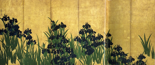
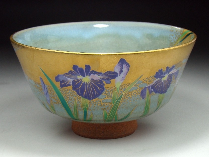
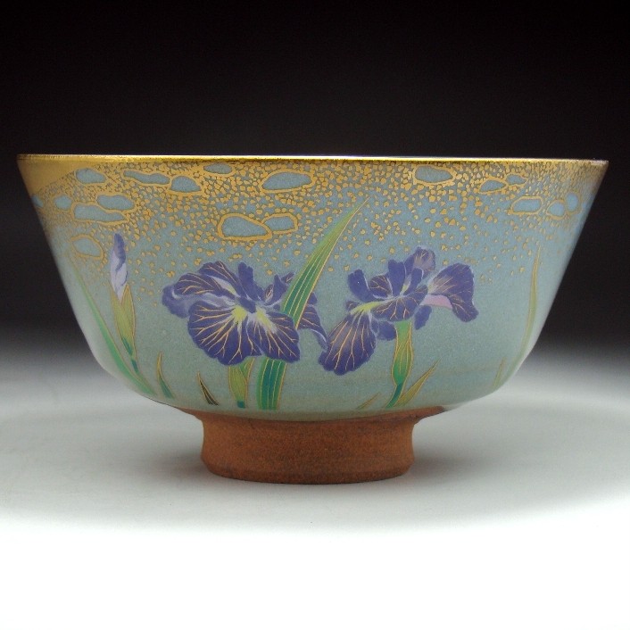
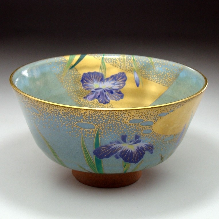
Ogata Kenzan's older brother, Ogata Korin, was also a famous artist, but not primarily in ceramics. His most famous works include painted multi-panel screens decorated with irises:
Korin
And here's a modern tea bowl inspired by Korin:
Iris bowl 1
Iris bowl 2
Iris bowl 3
This is, of course, a very decorative and somewhat extravagant sensibility, but it retains a lyrical elegance which is lovely, and another facet of the Japanese aesthetic.
53.
January 15, 2010, 9:19 PM
For those who may need to be told, be sure to click on the Korin image once it comes up so it will fill your computer screen.
54.
January 15, 2010, 9:24 PM
But now, back to our regular programming:
Miyajima 1
Miyajima 2
Miyajima 3
Miyajima 4
Miyajima (detail)
56.
January 17, 2010, 5:09 PM
Some of us, Franklin, are too, uh, hip for Twitter.
57.
January 17, 2010, 6:55 PM
"Hip" as in "prepped for a hip replacement"?
58.
January 17, 2010, 8:49 PM
No, Chris. Go have a cookie.
1.
opie
January 13, 2010, 1:37 PM
A shame it didn't get printed. You obviously found a lot more to like than I did, but then you really looked.
I guess you were trying to cover mostly more contemporary art, but the Laudau Gallery from Montreal had the highest concentration of good stuff up, including good work by Dubuffet, Gris. Kandinsky, Klee. Matisse. Miró, Jawlensky & others.