Previous: October to November (37)
Next: Beauty as an act of self-denial (83)
Happy New Year
Post #1436 • December 24, 2009, 10:20 AM • 82 Comments
That's it for me this year. I'll put up something next week to keep the comments open, but otherwise, see you on Monday, January 4, and all the best to you and yours.
2.
December 24, 2009, 11:20 AM
Franklin, Happy Holidays and warm wishes for a wonderful New Year to you and yours.
3.
December 24, 2009, 12:07 PM
Happy Christmas! Merry New Year! Joyful Saint Gulik's Day!
4.
December 24, 2009, 4:11 PM
HO,
5.
December 24, 2009, 4:13 PM
HO...
6.
December 24, 2009, 4:14 PM
HO!!!!
7.
December 24, 2009, 5:08 PM
Best Art Blog 2009!
Have a happy and healthy one!
All the best!
8.
December 24, 2009, 6:18 PM
Let the Saturnalia festival begin. lo saturnalia!!
9.
December 25, 2009, 11:42 AM
Merry Christmas and Happy New Year everyone.
I guess to establish a discussion I should say "Have a miserable damn holiday!!"
But that might violate the Happy Franklin guideline.
10.
December 25, 2009, 11:55 AM
Yes, may we all have a good 2010.
11.
December 25, 2009, 12:26 PM
Happt Solstice, everybody!
12.
December 25, 2009, 1:58 PM
Piri I just opened your book - my best Christmas present after the wind up Martian toy. My wife said skip straight to Greenberg (she peaked before she wrapped it.)
13.
December 25, 2009, 3:09 PM
One look at Piri's book and she peaked? Wow, that must be some book!
14.
December 25, 2009, 4:15 PM
Chris, you're being inappropriate. Again.
15.
December 25, 2009, 4:28 PM
I realize that could be construed as naughty, but we're celebrating the Saturnalia ("they're not from here, they're from New York").
16.
December 25, 2009, 10:12 PM
Hope you enjoy it, David. Thanks for asking for it.
17.
December 26, 2009, 5:59 PM
Happy New Year. Looking forward to more in 2010!
18.
December 26, 2009, 8:29 PM
Come on, David, you don't still believe in Saturn, do you?
19.
December 27, 2009, 1:38 PM
I believe in nature. I'm not prepared to go beyond that in this forum, but I do like a good party, oh and here's a holiday treat:
One day I was walking on w.25th st. and a Sphinx asked me “what is the perfect art object?” Realizing that my life hung in the balance, I answered (perhaps too quickly) “the Japanese tea bowl.” The Sphinx neither killed me nor leapt to her death, but instead said, “prove it, and come back you stupid fuck” (this is New York you understand).
generated in Jerry Saltz's great Christmas Artist's Statement seminar.
20.
December 28, 2009, 2:07 PM
John, in reference to your penultimate comment in the New Criterion blog post, which I got to too late to answer:
George said:
"What I mean by 'logic' is perceptual coherence of the mapping method, it makes some sense to the viewer because they can link it back to their own perceptual experience."
and
"Whatever organizational methods are employed they must present a coherent viewpoint to the viewer -- this is what I mean by logical, the pictorial space makes sense."
Perceiving coherence, which I guess is what he means by "making sense", has nothing to do with logic. Logic is a mode of reasoning. Making sense of pictorial space is intuitive.
It is a bad word choice. That's why, as George put it so expressively, I choked on it.
21.
December 28, 2009, 2:37 PM
John, thanks for clarifying my use of of the word 'logic' - you get the gist of what I was saying. In the old days painters would talk about "the weather" in a painting, as an indication of the overall light. I think there is a logic to that as well, there is a certain overall tonality applied to all the colors in the painting. De Kooning did it explicitly by mixing a bit of one of the paintings colors into the other pots.
Housing is the major economic sector which has corrected towards the long term mean pricing. For people living in a house they bought, pricing fluctuations are for the most part just paper fluctuations (assuming a decent loan setup) Given that one has to live somewhere, building equity is preferable to paying rent. Obviously the speculators are getting burned.
FWIW, IMO The most undervalued investments right now are US stocks.
26.
December 28, 2009, 6:20 PM
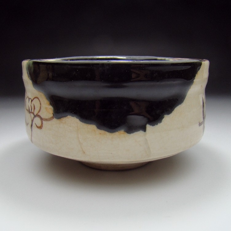
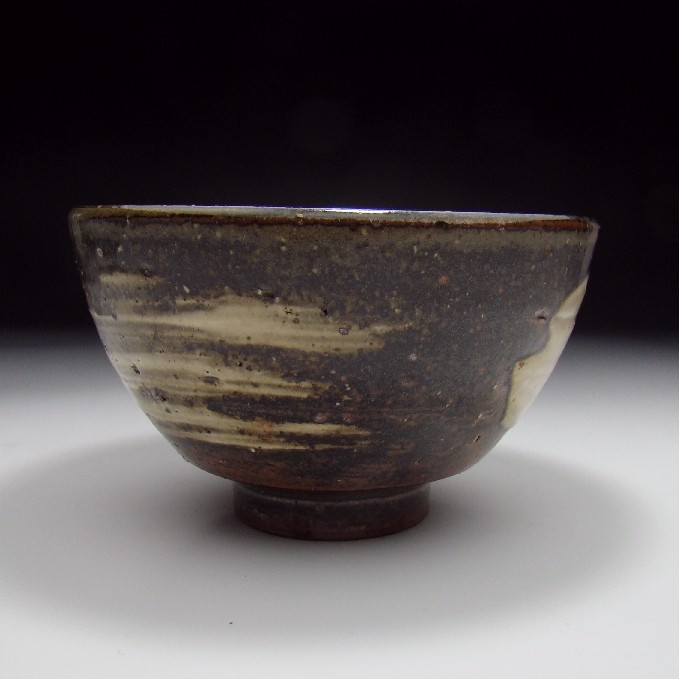
Tell us about that black one.
27.
December 28, 2009, 6:42 PM
It's a tea cup (yunomi) of black Raku ware (kuro-raku). "Raku," by the way, means joy. It's glazed earthenware (fired at a lower temperature and for less time than stoneware). Raku ware originated ca. 1580 in Kyoto, primarily associated with vessels for the tea ceremony. The family descended from Chojiro, the first Raku master, is now in its 15th generation, although Raku-type ware has long been produced by other potters in Japan. A potter’s wheel is not used, and the vessels are hand-shaped. There's a characteristic crackling of the glaze (harder to see in black Raku). There are various Raku substyles, such as aka (red), kuro and shiro (white) Raku, the original three varieties. Other colors have since been added.
28.
December 28, 2009, 8:51 PM
You have to imagine the vivid green of whisked tea in the black one.
29.
December 28, 2009, 9:54 PM
About the "crazing" in raku pots: it is caused by thermal shock. Pots are pulled from the kiln while still glowing hot and exposed to either cool air or even immersed in water.
A friend of mine taught at the Art Institute's Oxbow summer session held at a camp on an ox box lake next to Lake Michigan in the late 60s, near Saugatuck, Mi. The ceremony they used was to strip, grab a pot with some sort of contraption, hold it out away from their bodies, and run naked into the lake with it to produce the crazing, then bring it back out and grab another.
American raku, eh?
30.
December 28, 2009, 10:07 PM
On "logic" ...
From the Merriam-Webster dictionary:
Primary meaning: science that deals with the principles and criteria of validity of inference and demonstration; the science of formal principles of reasoning. Score one for opie.
Secondary meaning: interrelation or sequence of facts or events when seen as inevitable or predictable. Score one for George.
31.
December 28, 2009, 10:10 PM
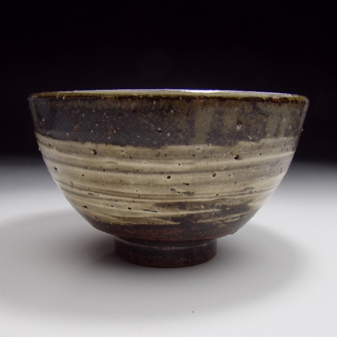
Oribe tea bowl:
Oribe 1
Oribe 2
Oribe 3
Oribe 4
Oribe 5
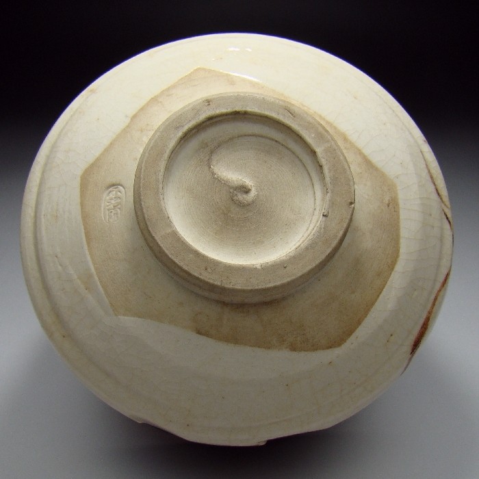
Even the bare, unglazed foot is beautiful.
32.
December 28, 2009, 10:15 PM
BTW, Burr Tillstrom - the sole puppeteer for the Kukla, Fran, and Ollie show - was a regular participant in the crazing ceremony at Ox Bow.
33.
December 28, 2009, 10:32 PM
As usual, clicking on the images once they come up enlarges them. It's especially worthwhile for the Oribe pot.
34.
December 29, 2009, 12:03 AM
"Secondary meaning: interrelation or sequence of facts or events when seen as inevitable or predictable. Score one for George."
Not so fast, John.
George said #122, New criterion post:
"John, I view 'pictorial space' or the 'painting space' as the overall logic which organizes everything in a painting. It's visual and takes its clues from our own visual interaction with our physical world. Most current abstraction is stuck relying on visual ideas based in the last century. I was just looking to see if anyone else was thinking about this, obviously not."
He said the space was the logic. That does not make sense either literally or expressively. Beyond that, space organizes nothing, logical or otherwise; it contains what is organized by the artist.
Furthermore, stating that "space" is "visual" and that it "takes its clues from our visual interaction with our visual world" is about as revelatory as saying the sky is blue.
And then he winds up with a nonsequitur about current abstraction's "ideas".
I think this kind of presentation is eminently challengable. That's why I asked him to say what he meant. I don't find his further explanations compelling, but I don't want to split this hair any finer.
35.
December 29, 2009, 12:19 AM
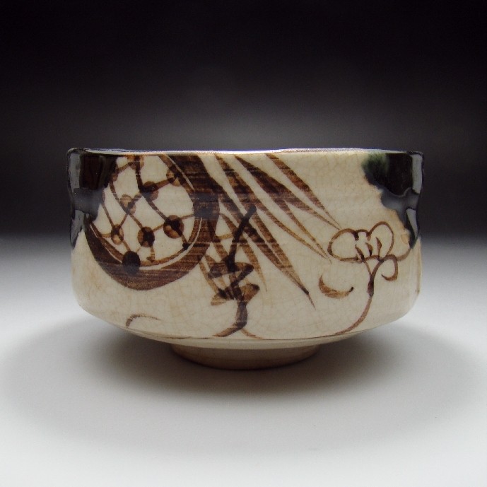
Jack the Hakeme bowl is absolutely beautiful but it should have been left plain inside; that overdramatic swirl is like a string quartet playing "dixie" at full volume after a late Beethoven slow movement.
The raku cup is a little clunky for me, but I like the glaze.
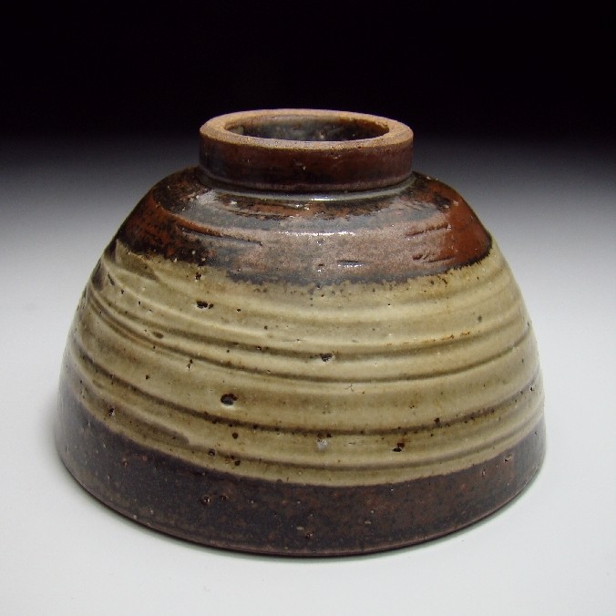
The Tobe bowl is clunky also but the glaze is very interesting. It looks like an iron glaze that someone has worked on to make it as red as possible; it is not the right red for a copper reduction glaze, but someone who knows better should correct me.
The Seto bowl is interesting because the red rim looks like copper reduction but the grainy metallic must be an overglaze at a lower firing temperature.
The Oribe bowl is lovely. Everything is just right. Is that one for sale?
We need a ceramics expert to analyze this stuff.
36.
December 29, 2009, 8:50 AM
OP, the Tobe bowl is unglazed; the clay is just that red. The Oribe is wonderful; interestingly, it uses black instead of dark green glaze, which is more typical. I agree the hakeme (brushed slip technique) bowl is a little over the top, but still packs a punch. Here's a more sober hakeme bowl:
Tanba 1
Tanba 2
Tanba 3
Tanba 4
Tanba 5
37.
December 29, 2009, 9:07 AM
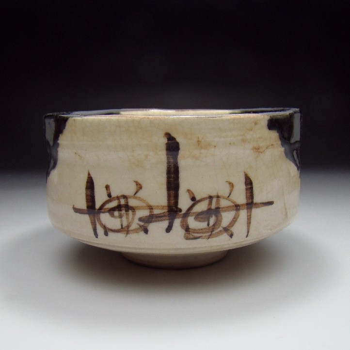
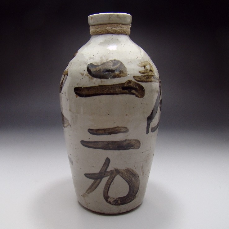
This is an interesting piece. It's a sake bottle, of a kind that was common as dirt before WWII, a purely utilitarian object with absolutely no pretensions to anything except holding sake. The writing on it is just information about the sake shop it once came from.
Tokkuri 1
Tokkuri 2
Isn't it great? To me, this puts "Fountain" to shame, and makes it look exactly like what it was--a common urinal turned into a clumsy, sophomoric joke.
38.
December 29, 2009, 9:15 AM
Yes, real rough beauty on both vessels.
39.
December 29, 2009, 9:15 AM
I can read the back view of the tokkuri. It says "Two two nine."
40.
December 29, 2009, 9:37 AM
That's the shop's phone number, probably. The bottle is from the 1930s, presumably from a shop in a big city like Tokyo.
41.
December 29, 2009, 10:59 AM
If Duchamp really submitted "Fountain" when he claimed he did, back in 1917, then it was actually pretty funny, I think, and made a good point. In 1950 it was still amusing; by 1964 it was sophomoric.
The tokkuri is nice enough, I guess, if you like the Asian shelves in Pottery Barn. I'd hardly call it "great". It's possible, Jack, to overpraise things. Antique Coke bottles are aesthetically pleasing but I'd hardly display one in my home. I might consider putting an antique Coke machine in, though.
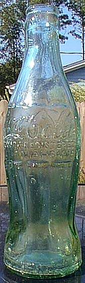
42.
December 29, 2009, 11:19 AM
Chris, I meant great as in great for what it is. Neither your Coke bottle nor Coke machine do anything for me, by the way. And your sense of humor must be rather different from mine. Sophomoric is sophomoris, regardless of when it happened.
43.
December 29, 2009, 11:36 AM
Chris, Duchamp, with his urinal, tacitly posing the question "Why not?" is what threw the barn door open to every charlatan and huckster who wanted to take advantage of the situation. Funny, perhaps, in a college-dorm-room-at-2AM-after-five-bong-hits kind of way.
44.
December 29, 2009, 12:03 PM
Logic in print. I first became aware of it while watching the recent Batman film, The Dark Knight, and found myself struggling to follow a scene in which Batman uses sonar to track the Joker through an empty, multistory office building. The camera’s rapidly alternating movements—up and down, back and forth, micro and macro, aerial and perspectival—employed a manner of spatial navigation more akin to video games than to cinema. It was not the kind of action I had grown up on, yet the effect of this scene convinced me that something about the visual world had shifted. Even though I was ill equipped to navigate the change, I understood that it employed a new logic of form and space.
Railing Opinion
Choke till your blue.
45.
December 29, 2009, 12:55 PM
As for Pottery Barn, it's nice enough, I guess, even though it all looks like imitation and has a vaguely canned, plastic, generic feel. It's basically knock-off props for a certain kind of decorating.
46.
December 29, 2009, 3:51 PM
Two people misusing the word does not make it right. And even if it did, this is a verbal description of a change in the use of space which in itself is logical; it is not space equaling logic, which was your construction.
It might be better for you to just leave this one alone at this point; you are just digging yourself deeper in the hole.
47.
December 29, 2009, 5:12 PM
I have not detected George insisting that he equates space with logic. In fact, he supports the much looser (and different) interpretation, that "logic" refers to a general sort of coherence that is consistent with secondary meanings of the word.
On the other hand, I wish George had never introduced the idea of anyone "choking"; opie was simply objecting.
Coherence within the boundaries of a picture's edge is a fuzzy zone that could use some clarification. I'd like to see someone shed some light on that. This thread is itself fuzzy enough to allow for such a discussion.
Myself, all I can offer is that I'm aware that different "logics" have been used successfully, but I haven't thought enough about them to classify or otherwise differentiate among them.
48.
December 29, 2009, 5:43 PM
Logic: There has to be enough of it to give the viewer reason to suspend disbelief. For example, the vanishing point perspective employed by Renaissance painters cannot usually, except in more drier instances, be resolved. Examples: Anything by Tintoretto, and Las Meninas (Velazquez). Same with Cezanne's planal logic.
Because the logic of a painting consists in whatever elements combine to make the sense of the work, there are or can be as many logics as there are painters to make paintings which are or will be coherent.
Is George R's 'Railing Opinion' article, as thoughtful as it might be, an example of the inmates running the asylum?
The idea of 'choking' was introduced back down the line. Was it Opie who would 'choke'?
49.
December 29, 2009, 6:09 PM
"...more drier..." Excuse me, everyone.
50.
December 29, 2009, 6:49 PM
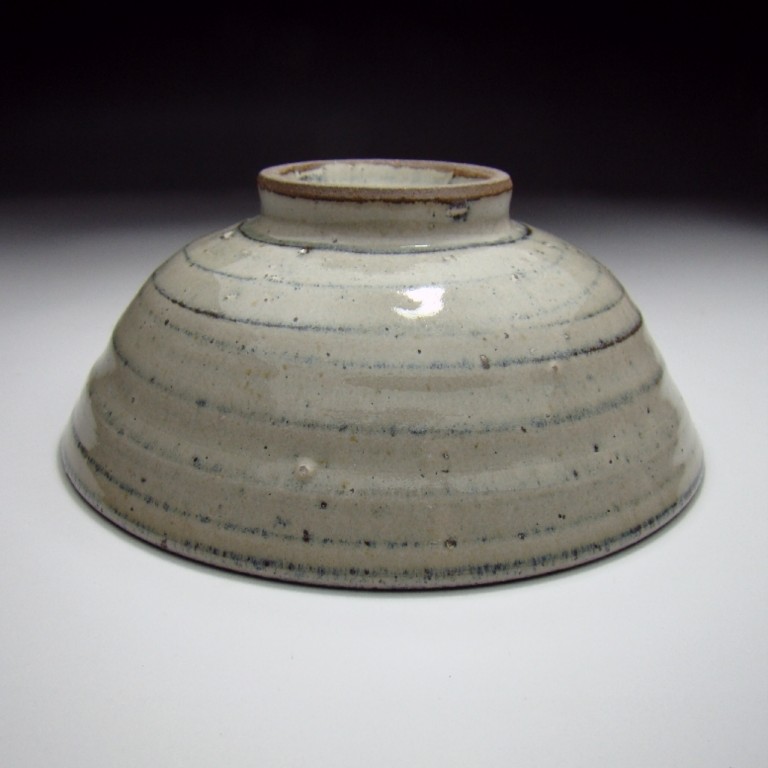
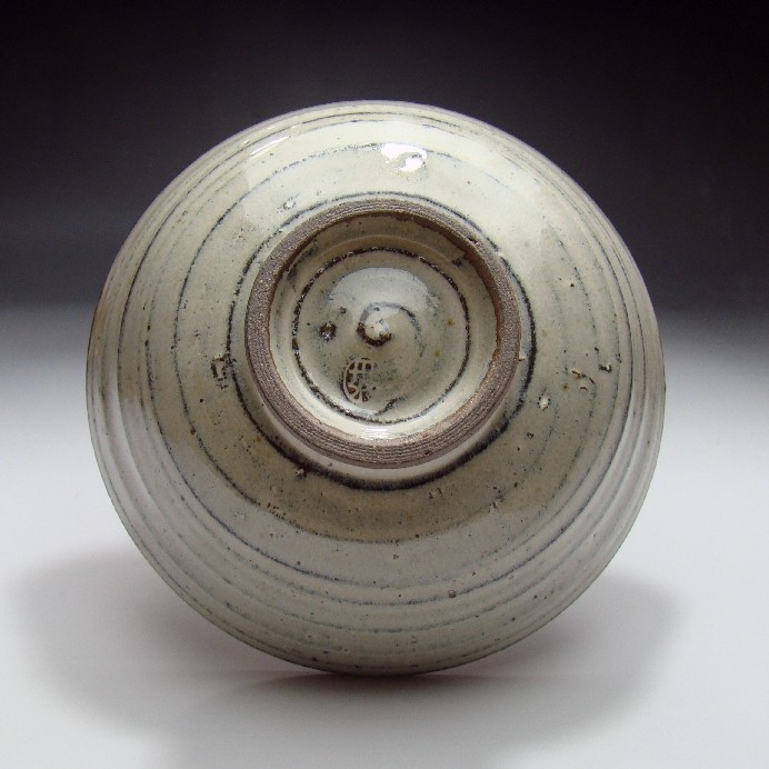
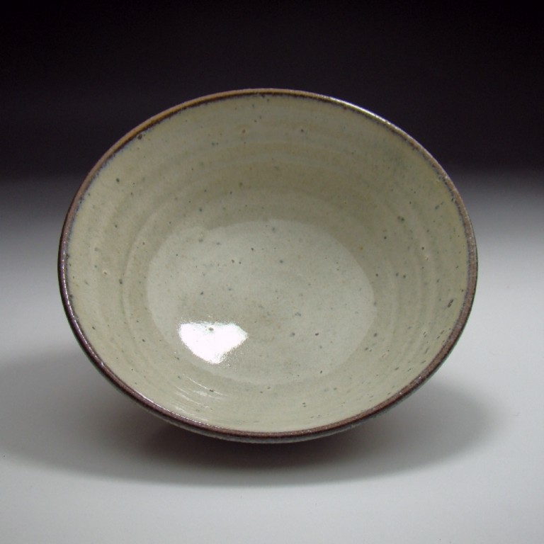
Minimalism (click on images for larger ones):
Tanba 1
Tanba 2
Tanba 3
Tanba 4
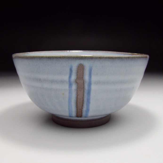
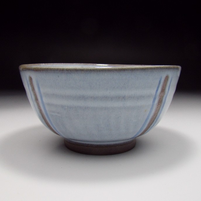
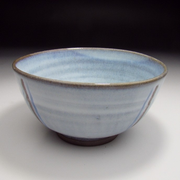
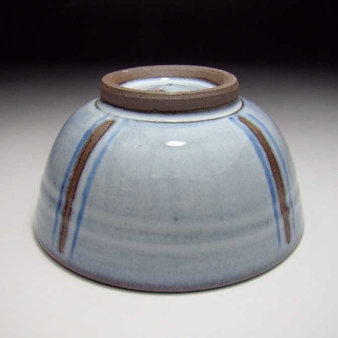
51.
December 29, 2009, 7:00 PM
Minimalism II (same potter):
Stripe 1
Stripe 2
Stripe 3
Stripe 4
Stripe 5
The brown stripe, obviously, is bare unglazed clay.
52.
December 29, 2009, 8:07 PM
"Coherence within the boundaries of a picture's edge is a fuzzy zone that could use some clarification. I'd like to see someone shed some light on that. This thread is itself fuzzy enough to allow for such a discussion."
I'm just getting into Piri's book and I like "the weather" as a descriptive word for the space in an abstract paintings (I think it was used by Dekooning and generally used at the time).
The Rail article is endearing. I read something else recently that described this longing for romanticism and "realism" among students. I'm using realism as an opposite term for appropriation, abjection, irony, conceptualism - the last 30 years.
As for a new spatial logic, I didn't see The Dark Knight yet, but I can see generally how films are moving towards a different kind of spacial experience, having just seen Avatar. With so much manipulation, it is a different kind of presentation of space, but the brain compensates. And it isn't real. For a real experience of a new spatial logic, I would refer back to walking through and around Tadao Ando's addition to the Clark in Williamstown. It's a real space, for one - not digital, where the mind will compensate and translate into something we already know.
It's an interesting mix of modern and traditional Sukiya style, a surprising translation.
53.
December 29, 2009, 9:37 PM
Cool glaze (click on images to enlarge):
Akahada 1
Akahada 2
Akahada 3
Akahada 4
54.
December 29, 2009, 10:27 PM
I hope I am not straining the vague subject of this thread, but Jack's constant bringing in of Japanese pottery plus the occasional doggerel that gets posted here, gave me the boldness to pass along a friend of mine's annual Haiku contest:
==================
It’s time again for our traditional January HAIKU COMPETITION.
Please email your entries to argy@comcast.net by January 31. All entries will be compiled and emailed back to all participants. First prize a free vacation for two in Naples, FL !!!
The theme, as always, is BEGINNING ANEW.
Extra merit is awarded for:
Following the 5-7-5 syllables form, though not mandatory.
A reference to the time of year (cherry blossoms, falling leaves etc.)
Impermanence (the morning dew etc.)
Sudden contrast or comparison.
A sensory experience.
(Google it for further instructions.)
Here are my contributions:
Christmas time is over
The days are getting longer
It’s time to wear shorts.
And:
The ducks are flying south
Are we here or are we there?
Always wanderers.
Andy Argyropoulos
55.
December 29, 2009, 10:44 PM
John (#47),
Logic:4. The relationship between elements and between an element and the whole in a set of objects, individuals, principles, or events: There's a certain logic to the motion of rush-hour traffic.
Coherence:1 : the quality or state of cohering: as a : systematic or logical connection or consistency b : integration of diverse elements, relationships, or values
Choke:2 a : to become obstructed or checked
Choke:4 : to lose one's composure and fail to perform effectively in a critical situation [assoc. with blue]
Joanne Mattera's blog has a nice selection of pictures from ABMB including several examples of 'geometric' abstraction.
Here we are, 10 years into the new century and art is groping around for a direction. The Brooklyn Rail article is only an example of some of the thinking going on not just in art but in general by kids under thirty. In my opinion painters have become lax, willing to settle on what they already knowand are just looking for a way to put a good enough twist on it, establish a brand and then perform endless microscopic variations on it until the end. For examples see the ABMB link.
Throughout history, painting has reflected both its era or the desires of its patrons, usually both. I'm just making simple observations, that the philosophical and cultural ideas help shape what kind of paintings get made. More specifically, these ideas help shape the pictorial space that painters use.
Obviously, there is no real "space" in a painting, it is a flat (or nearly so) object and whatever "space" the viewer ascribes to the painting is a mental construct caused by some logically ordered arrangements of forms and colors on the paintings surface. Perspective is one such logic, an algorithm which orders the forms relative to one another in a way which the viewer can correlate with their own experience of the outside world.
However at the same time, we might consider paintings from the 15th Century, Piero della Francesca, Fra Angelico, or Giovanni di Paolo and realize that their spacial constructions were based on a different logic than the paintings in the century which followed them. In the course of history, it was thought that the development of perspective was an advancement in the art of painting. I would differ with this assessment offering Giovanni di Paolo, Expulsion From Paradise, 1445 as an example.
Moving back into the present day. If we just look around, we find ourselves in a visually enhanced world, one where "images" are a significant part of the visual environment. This changes how we process what we see. It changes what we "recognize," and accept as a valid pattern of forms in a painting. Moreover, it changes the strength of the neuronal connections in the brain allowing us to see the world differently, and to extract meaning differently than was the case in the past.
Contemporary painters need to shed the idea of "abstract" vs. "representational" in order to move away from the mindsets which allowed painting to develop in the past century. In particular the ideas surrounding the notion of abstraction provide a well developed model of the present boundaries for abstraction. The context which allowed the development of abstraction in the 20th century, no longer exists. The reactionary response to move away from the representational succeeded but has now created its own academy. Out of all of this, we have the groundwork necessary in order to find a new visual synthesis of the approaches taken over the past century.
56.
December 29, 2009, 10:58 PM
George says: Contemporary painters need to shed the idea of "abstract" vs. "representational" in order to ...
Admittedly artists need a strategy for each new day, but I am more cautious than you about dictating what I think the future will be. Though, I say in seeming contradiction, I doubt it will be avant-garde for the most ambitious art that is yet to come, and yet to define itself, assuming something like that survives.
I think in the future I will avoid stepping into the middle of fights.
57.
December 29, 2009, 11:08 PM
David, (52) I'm using the term coherence to indicate that the painting space is consistent within the painting. If it's not, then the relationship between the various spatial zones, must be coherent, it must possess a logic which makes sense to the viewer. If not, the painting will feel awkward and generally fail.
You're right about De Kooning and the term "weather" Another simple (landscape) example would be Heade.
I ran across the Brooklyn Rail article by accident this morning and noticed a similar usage of the word logic. References to the movie "The Dark Knight" are purely accidental and were not intended to make any point.
The article was written by an academic, speaking of her students at Hunter and I don't agree with all her conclusions or views. However I do concur that among the brightest of the younger generation there is a lot of soul searching going on. Postmodernist philosophy is not just being challenged but dismissed outright. Some of what what the writer of the article was labeling as "romanticism" feels incorrect. I think her reading of "romanticism" is a result of her own generational bias towards irony which confuses the real issue that these kids are sincerely questioning of their own existence and its future.
58.
December 29, 2009, 11:14 PM
I don't think, George, that human visual processing is as malleable as you seem to think it is. Our environment doesn't really change how we process visual input, not significantly. I have no support at the moment for this assertion except to note that all visual art, from cave paintings to the present, is perfectly comprehensible to us (at least visually; we've lost some of the verbal symbology, for example much of what Bosch was on about). Also, optical illusions developed two hundred years ago still work. Optical illusions, in fact, take advantage of basic visual processing.
I forget who recommended it to me -- someone on this blog, someone else -- maybe Lou Gagnon, he comes to mind -- anyway, I read Donald Hoffman's Visual Intelligence: How We Create What We See, a great book discussing the latest in research into human visual processing. You should read it, too. Scientists are diligently and slowly decoding the building blocks our brain uses to navigate the visual world.
That tells me that the modern visual world doesn't shape how we see; we shape the modern visual world based on very basic rules of perception.
The shift into mathematical perspective led to a lot of paintings that don't quite work; Hockney goes into this in that book of his I'm always referring to. Mathematical perspective didn't really pan out but was quickly replaced by lens-based perspective -- originally convex mirrors and then glass lenses -- and cameras obscura and cameras lucida. Judging by Hockney's book (which I'll do in lieu of researching it myself) the shift is clear and dramatic.
So the trouble is not so much that Fra Angelico arranged his paintings according to a different logic as he was attempting to use the same logic all realist painters use but with more archaic, less accurate tools.
This whole discussion about abstraction strikes me as kind of odd, as if abstraction just appeared in 1900 or so. It's my experience that realism, as a style, is the relatively short-lived school; art has always been abstract, or representational (objective?) but stylized; and it was only the advent of mathematical perspective (around 1400), and later optical perspective, in Western Europe that started the realism line. That ran right up to the invention of photography and Impressionism, so we're talking about less than 500 years. Since painting is at least 11,000 years old and art in general significantly older than that, realism is really new and hasn't been around long. The "invention" of abstraction is really a rediscovery.
59.
December 29, 2009, 11:46 PM
John, Aside for my suggestion of a synthetic approach, my remark does not suggest what a painter should do.
I believe that there is a lot of territory for exploration opened up when one does not get bound up in the idea of "abstract" vs. "representational." I'm not suggesting that other painters give up what they have been doing but that they open up their thinking about it a bit. And, I suppose if another painter is happy with what they are doing than well and good.
I just don't see how we can get through another century with painters putting one colored rectangle next to another and calling it a painting. [as in ABMB] I am sure that this will occur but it's not where the future of painting lies.
60.
December 30, 2009, 12:23 AM
Chris (58) Most of my remarks have nothing to do with the malleability of our visual processing directly. I believe that our memory of what we see is coded into our brain structure physically. I also think that the way we interpret what we see, the way we give what we see meaning, is very malleable. The primary result of this is connected to what we allow to occur in a painting, what we can accept and what we cannot.
I completely disagree with the idea of working with "with more archaic, less accurate tools." My point in bringing up perspective was only to serve as the distinction between one mode of painting space and another. NOT that one was better than another which I do not believe is true.
My point is, that one painting space is not necessarily better than another, and that "better" is about how the painter works with the particular pictorial space.
Finally, I agree that abstraction has been around for centuries, however in the 20th century avant guard painting explicitly explored abstraction and made it a point of distinction.
61.
December 30, 2009, 12:39 AM
George sez:
"I view 'pictorial space' or the 'painting space' as the overall logic which organizes everything in a painting."
John sez:
"have not detected George insisting that he equates space with logic."
Opie sez:
"Gag". Not choke, but GAG.
Enough already.
62.
December 30, 2009, 12:08 PM
It wasn't my intention to say that one pictorial space is better than another. "Archaic" and "less accurate" may sound pejorative but they're not. I think we can say that, for example, Fra Angelico was attempting -- was reaching as hard as he could for -- an accurate depiction of how humans see things -- realism. But due to his tools he was limited in what he could do. If he could've managed the realism of Ingres, he would've.
This is in contrast to, say, the ancient Egyptians, who had no interest in realism per se. Their wall paintings weren't an attempt to portray the world as humans see it; there wasn't much point in doing so, since, hey, any human can see the world! In the days before the Renaissance, the world was considered to continue unchanged -- your grandparents lived in the same world your grandchildren would -- so portraying it accurately wasn't a priority.
This doesn't set one above the other. Fra Angelico's best (but failed) attempt at true realism is far better than, I don't know, pulling a name out of a hat, Cot, with all of the 19th century toolbox at his disposal. Meanwhile Leonardo's realism stomps all over Picasso's mid-career whatever-he-was-doing.
And personally I think they're all better than de Kooning.
Anyway, the style doesn't determine the quality of the painting. An artist, even a great one, can only do so much with what they've been given. It's doubtful, for example, that Fra Angelico could have invented color field painting. (I have similar arguments against Turner's elevation to the first painter of abstraction (or even Impressionism) -- my take is that he was a realist whose poor judge of materials led to so much fading, peeling and cracking that his works only appear to be abstract today.)
63.
December 30, 2009, 2:34 PM
Chris: "If he could've managed the realism of Ingres, he would've." What do you base that on?
I don't believe Fra Angelico's or Pierro's or Massaccio's or Giotto's aesthetic would've worked very well had it been subjected to later terms of perspective, or that their work would've improved had they a more complete set of or better tools. Leonardo was dealing in entirely different terms than the earlier ones.
I don't get the idea that these painters were failed realists, but that they were the best at operating in the conventions of their time and place. Realism was well understood by that age, and by ages before it. As a style or a convention it just was in eclipse, though by the Quatrocento, the terms of picture-making were decidedly turning away from expressing the spiritual to representing the material (or expressing the spiritual via depiction of the material, an idea which I've never seen any basis for).
For me personally, the issue has been whether that turn represented an improvement. A lot of the paintings of those times (Pierro's for example) have more staying power for me than the more sensational work by later artists such as Michelangelo.
In a way, Pierro and Michelangelo are apples and oranges. They can't be approached the same way.
"If (Fra Angelico) could've managed the realism of Ingres, he would've."
64.
December 30, 2009, 3:15 PM
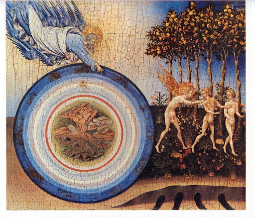
For example, consider Fra Angelico's, "Paradise", 1435-40
This painting is 40.5"h x 11"w and has 32 figures in it. Where would you put the vanishing point, or the tripod?
65.
December 30, 2009, 9:18 PM
I'm not really happy with the term "realism." It's been misused in so many ways, and on top of that stands for a 19th century school of art, led by Courbet. I prefer "representation" and it has been around much longer than pure abstraction as an end in itself. With representation, clear back to cave painting & the Egyptians, there is always one subject that is more identifiable than any other in the image, whereas with a purely abstract easel painting, such as has been created only since the beginning of the 20th century, the image is ambiguous and the viewer is not reminded of any one subject more than any other. But there is this unitary one-on-one association for centuries before, whether we're talking Egyptian cattle or Byzantine icons or Fra Angelico or Piero or Masaccio. The last three, while seeming crude by later standards, were admired by their contemporaries for creating paintings that seemed so much more "true to life" than anything which had gone before (just as Giotto was admired a century earlier for the same reason, and I believe even Cimabue before Giotto).
66.
December 30, 2009, 9:24 PM
French XIX century etching, after a drawing from life by the etcher himself:
Portrait (click on image to enlarge)
The etcher is now only known to historical print types like me, while brazen clowns who couldn't draw anywhere near this well if their lives depended on it make millions on glorified rubbish.
67.
December 30, 2009, 9:29 PM
'I just don't see how we can get through another century with painters putting one colored rectangle next to another and calling it a painting.'
This seems a bit loose, George. What exactly are you insinuating?
Also, unless we can account for the material aspect of present-day painting, this discussion doesn't really have any wheels. Supposing the merits of this spatial order or that one seems a bit overtly speculative, and factual examples are required to get any traction here. I think I get what your saying in these threads, but it just seems a bit moot.
Unity is all that counts, by any means necessary. The abstract vs. representation is a non-issue and has been for as long as there's been painting going on anywhere.
68.
December 30, 2009, 10:40 PM
I know, Dude. It is a meandering and unfocused subject. Good artists will make good paintings and they will be new because invention seems to be built into the process.
Good artists make something new by recombining something old to make something better.
69.
December 30, 2009, 10:43 PM
Here's a XVII century French engraving which, by standards of its day, was at best second rate:
Duc de Beaufort
First-rate work, by the likes of Nanteuil, is now unattainable--nobody alive can pull it off.
70.
December 30, 2009, 10:51 PM
"Unity is all that counts, by any means necessary. The abstract vs. representation is a non-issue and has been for as long as there's been painting going on anywhere."
Right.
"The last three, while seeming crude by later standards, were admired by their contemporaries for creating paintings that seemed so much more "true to life" than anything which had gone before (just as Giotto was admired a century earlier for the same reason, and I believe even Cimabue before Giotto)."
I think 'true to life' has to be understood in terms of the times. And, of course, those contemporary reactions are not why those paintings live.
71.
December 30, 2009, 10:56 PM
Oh, I don't know. I'd bet there are some artists who could, with some training in engraving, manage nearly that level. They're probably not fine artists, though. Probably illustrators. You might even find some good people at the Mint. Either U.S. or Franklin.
72.
December 30, 2009, 10:59 PM
Chris, have you had a look at the latest U S coin designs? Mon dieu! Hardly St Gaudens!
73.
December 30, 2009, 11:07 PM
"Good artists make something new by recombining something old to make something better."
Or something different, to add another facet to seeing.
74.
December 30, 2009, 11:21 PM
A long time ago, maybe 25 years ago, I was asked, as the resident artist, to design a patch for the local Boy Scout council camporee. I had no graphic design training and was handed a few themes -- the anniversary of the Constitution, trees -- and I had zero experience designing an image for embroidery, so I muddled together a confused and cluttered patch which I nevertheless treasure.
The designs for the state quarters remind me of that patch. Each one looks like it was handed to the governor's nephew who was good at drawering. "What do you think of when you think of Ohio? Get the state bird in there if you can."
Anyway, I was thinking engraving, so that'd be paper money, not coinage.
75.
December 30, 2009, 11:25 PM
Whew, Chris, have you seen the latest paper money? Get a load of Jackson. Wooden, flattened, stupid.
76.
December 30, 2009, 11:30 PM
I'm thinking the problem with coins and paper money is that the 'artists' are required to work in media they aren't that directly familiar with or at home with. So, it's not the artists' fault that their work is, frankly, dumb.
77.
December 30, 2009, 11:35 PM
I don't know. The paper money seems okay. I liked the older ones, but then I'm conservative like that.
78.
December 30, 2009, 11:45 PM
"I think 'true to life' has to be understood in terms of the times."
Yes indeed. That's what I was trying to say.
"And, of course, those contemporary reactions are not why those paintings live." Yes & no. Certainly, 21st century observers may find many other things to admire, but part of what gives these paintings such vitality is the awareness of their creators that they were achieving something highly valued by their contemporaries: greater verisimilitude. (However irrelevant it may apear today.)
79.
December 30, 2009, 11:45 PM
The first time I saw one of those new twentys, I thought Hockney.
80.
December 30, 2009, 11:59 PM
Piri, do you really believe these great artists were merely trying to impress their patrons? I can't assume that 21st Century observers have it over observers of any other century.
"but part of what gives these paintings such vitality is the awareness of their creators that they were achieving something highly valued by their contemporaries: greater verisimilitude."
I really don't see that that has anything at all to do with the life of the work in question.
81.
December 31, 2009, 12:13 AM
Verisimilitude is insidental.
82.
December 31, 2009, 12:15 AM
incidental
1.
Franklin
December 24, 2009, 10:33 AM
Also, thanks to James for tweeting his endorsement.