Previous: Standing Figure (18)
Next: It's a blog, so I'm putting up a picture of my cat (98)
July nudes
Post #1418 • November 16, 2009, 8:30 AM • 48 Comments
I had sort of scorned these at the time, but putting them away for a few months seems to have improved them.
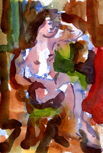
July Figure 1, 2009, watercolor, 12 x 8 inches
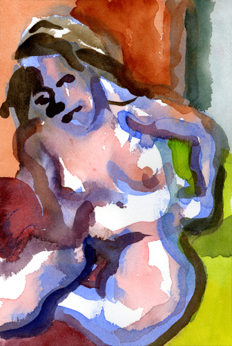
July Figure 2, 2009, watercolor, 12 x 8 inches
2.
November 16, 2009, 9:41 AM
Work that makes me nervous after it is done usually turns out one of two ways: really bad or really good.
These look very good. Second one may have the edge over first, but JPEGs are not the best way to make fine distinctions.
3.
November 16, 2009, 9:48 AM
Side note:
If anyone would like to be considered for the position of secretary at Painttwits Inc. please send three good reasons to the email above. Thanks!
Lucas
4.
November 16, 2009, 10:25 AM
Looks like we will also need somebody who understands those google templates better than I do. If anyone caught that? Press release soon.
5.
November 16, 2009, 12:30 PM
I like them a lot. Loose and bold.
6.
November 16, 2009, 1:49 PM
These are great, very bold and exciting!
http://matthewelliott.posterous.com/
7.
November 16, 2009, 7:09 PM
1 works better for me. In 2, it looks as if you've given her the head and facial features of a dog, literally, which is too distracting. Also, the blue in 2 is too much like some fluorescent or glow-in-the-dark liquid gel, which is also distracting.
8.
November 16, 2009, 7:18 PM
#1 actually has a stained-glass quality to it.
9.
November 16, 2009, 8:24 PM
I was thinking that, Jack. Plus, Emil Nolde.
10.
November 17, 2009, 10:16 AM
#1 actually has a stained-glass quality to it.
...Plus, Emil Nolde.
Plus (in scaleless and media-crippling.jpg's), John Link.
Following up on Jack's comment, I wonder if your subject's faces might gain in evocativeness and more effectively join the rest of the picture were they to borrow from the layered rendering that describes the forms in the rest of the body. Instead of drawing eyes, nose, mouth and chin in four or five consecutive brush strokes, couldn't they come into being accidentally-on-purpose each at a different moment in the drawing of the picture and in relation to some other element that is emerging?
11.
November 17, 2009, 10:26 AM
Maybe a way to do what ahab suggests would be to forget that the faces are faces and conceive the features as shapes, lines, etc. related to other shapes, lines, etc.
12.
November 17, 2009, 11:29 AM
I am repelled by the pictures themselves from having feelings about how they could be done differently. That's a good sign.
Having declared this, I proceed to contradict myself, seemingly. 12 x 8 inches seems a little small. But that's my intellect talking, not my gut reaction - and it is my gut that enjoys pictures, not my intellect. As Ahab notes, the way we read JPEGs on a light emitting screen is detached from any real sense of scale. So I'm merely guessing all this great color would gain by filling my visual field more than I expect 12 x 8 would.
This comment, of course, would apply to these only if Franklin were to make giclee prints from them. Otherwise it might be something to consider in future endeavors.
In any case, they are nicely jammed full of color, a paradise of colour, I would say, with a bow to Ahab and MC.
Photographed with a high resolution camera or maybe scanned on a good flat bed, they are excellent candidates for editioning as giclees. Offering them on this site might be a way to finally return some bucks for the effort it takes to keep artblog up and running.
13.
November 17, 2009, 11:37 AM
Very nice giclee site John. I've never heard of tham. I they would be a good partner for painttwits.
14.
November 17, 2009, 11:38 AM
I hate this giclee racket -- sell cheap reproductions than anybody can afford or sell honest works of art, please. (I don't address this comment to digital photographers or other computer-based artists. They of course need some way of printing out their work.)
15.
November 17, 2009, 11:44 AM
Arthur, you point to a very interesting problem. I don't think most people who read this site would won't giclees in their house. However, giclees do offer some advantages to folks who want a version that is acceptable to artist X at a fraction of the price.
16.
November 17, 2009, 11:52 AM
Typos galore today. Sorry guys, not really paying attention very well today. Franklin could clean those up for me thanks.
17.
November 17, 2009, 1:42 PM
Faces are the bane of this style. These long, broad strokes look great as long as you don't apply it to a face, at which point they either look generic (#1), weird (#2), or stiff (those usually get tossed). And really, there's no good model out there. I've looked at a lot of loose Asian brushwork and they usually go for generic. The oil painting I have going in the studio is getting played a lot straighter, largely for that reason.
18.
November 17, 2009, 1:52 PM
Arthur, I suppose you would have called the frescoes of the Renaissance a racket too, since most of them were 95% executed by assistants. Or maybe Rubens was a fraud for taking off on long trips while his helpers did his paintings for him.
And if the medium is "computer based", then a tight definition of "honesty" requires that you view it on the computer screen that was the mode of its existence when it was formed. There is no "need" to print it; in fact, it should NOT be transferred to a secondary support of any type. Nope, if you fashion your work on a computer screen, that's what you are stuck with, for-f***ing-ever, according to the guidelines you are proposing.
But really, anything that looks good by any means that gets you there is "honest" enough by me.
"Cheap" (as in "anybody can afford") is not an aesthetic consideration, but one of marketing. And if it supports an artist, that also is good enough for me.
19.
November 17, 2009, 2:08 PM
For what it's worth, I seriously considered buying a giclee of Hopper's Nighthawks that was offered by the Art Institute for about $700. It was an inch or so off the dimensions of the original, but I figured that was about as close as I could ever get to "having" its beauty on a daily basis.
I am also planning on doing an outright copy of a Mondrian I have loved all my life.
20.
November 17, 2009, 2:15 PM
In short, if someone is willing to seriously consider a JPEG of something, then a giclee is hardly anything to get bent up about. Instead, judge each instance on its merits, and let it go at that.
21.
November 17, 2009, 2:37 PM
A giclee is simply a more advanced and potentially more convincing form of reproduction. I have no more problem with it than with other modes of reproduction, except when the price "forgets" that we're still talking about a reproduction, at which point I roll up my eyes and go "I don't think so."
The situation is more complex and more interesting with Japanese prints. Even the "originals" were never physically made by the artists, but by a collaborative effort involving block cutters, printers and publishers. "Copies" made using the same manual methods and materials as the originals, without recourse to photographic or high-tech means, are not copies in the usual sense. They're more like recreations, and one could argue they're potentially just as valid because they were made the same way, only involving different artisans still working after a design created by an artist. I've seen some mighty fine "copies" of classic prints which I could never afford (or even find) as "originals" in anything like good condition, and in such cases, a "copy" is more than good enough for me.
22.
November 17, 2009, 2:50 PM
As for the business with Rubens (and other artists), his assistants were actually his students, trained and supervised by him, whose work had to meet his specifications and approval. They were, in a sense, an extension of him, molded by him, not strangers or people off on their own somewhere to whom he contracted out work (as I expect is done by the likes of Koons). There's a very big difference. That carved wood flower vase I linked here recently was made for Koons, but I seriously doubt he could make it by himself. Rubens never had anything done for him that he couldn't do on his own if he so chose, and if he did do it himself, it would obviously be even better. Again, big difference.
23.
November 17, 2009, 5:49 PM
O.K. experts. I have some small conte drawings I;d like to enlarge to 30 x 40. I'm interested in what happens when the scale changes and I like the way the marks work when enlarged and reproduced mechanically. I had cheap ones done to get a snse of the scale but I'd like to research the possibilities for high quality prints. These are the images:
landscape panels
Giclee is a high quality ink jet right? What is a pigment print, or is it the same thing?
and what's wrong with my link?
http://www.facebook.com/album.php?aid=2019764&id=1035558759&l=1b045d6d0f
24.
November 17, 2009, 5:56 PM
"hreff" instead of "href".
25.
November 17, 2009, 6:10 PM
Here, David, let an expert (ahem) show you how linking is supposed to work:
Mingei 1
Mingei 2
Mingei 3
Mingei 4
26.
November 17, 2009, 6:10 PM
thanks Franklin
27.
November 17, 2009, 6:14 PM
Show off. I spelled it wrong in my cheat sheet. Corrected now. Nice bowl. The surface is almost ugly. It looks like Octopus skin.
29.
November 17, 2009, 6:27 PM
landscape panels
Wait. This one works.href right?
Sorry to mess up the thread
30.
November 17, 2009, 6:33 PM
Yes, there's something vaguely reptilian or amphibian about it, like a funky salamander.
This is my new Oribe:
Oribe 1
Oribe 2
Oribe 3
I'm naming it Carrot Cake (you get to name pots, you know).
31.
November 17, 2009, 7:00 PM
The Oribe is nice. The Mingei looks like an extremely poisonous Octopus skin. I know the name Mingei is used to refer to anonymous folk arts in general. Is that how you're using it here? I think I'm going to go lose myself in Corot in Italy after staying up way too late last night to watch the Leonid meteor shower. Bless the RISD library.
32.
November 17, 2009, 7:13 PM
Yes, mingei is a broad term meaning roughly folk pottery. While it is ideally the work of unknown potters, or at least inspired by that, it is most closely associated with the Mashiko area and the work done there starting in the 1920s by Hamada Shoji, the father of the Mingei Movement, who is very famous indeed.
33.
November 17, 2009, 7:30 PM
That's right (as in it's coming back to me.) Mingei was a revival or rediscovery in the 20's by Hamada, Yanagi, and Kawai. Yanagi was the theorist and there has been some criticism of Mingei as colonialist and laying into militarist Japan leading up to WW2. I wonder what current thinking is about Mingei. I visited the Mingei Museum in San Diego several years ago and thought it was wonderful.
34.
November 17, 2009, 8:04 PM
I would steer clear of such political theories, David. They sound rather strained. I see Mingei as primarily about aesthetic and metaphysical considerations, as well as the desire to preserve a certain kind of tradition or heritage. This is technically Kyoto ware, but has a mingei feel:
1
2
3
4
35.
November 17, 2009, 9:26 PM
David, are your panels meant to be incorporated into your furniture somehow?
36.
November 17, 2009, 9:48 PM
David, about # 23:
If you go to GicleePrint.Net you will probably spend $100-150 per print to get them printed after the scanning charges, proofing, shipping, etc. depending on how large the edition. Nash Editions will run you more like $250 per print.
If you want to do it yourself, 30x40 is quite large and you will need expensive printers, cameras, and scanners. The Epson 9880 would be a good place to start for that large a printer (up to 44" wide in the short dimension) - about $6k for the printer, then there is ink at $90 a 220 ml cartridge (takes 9), paper at $15-20 a sheet, and so on. Framing pictures that size is a bitch too. Ink jet paper has a fragile surface that really needs protection and a plexiglass based frame is the only reasonable way to go in anything but the smallest sizes.
Pigmented inks use, well, pigment that is suspended rather than dye that is dissolved. The latest Epson inks last a long time, longer than we will. But like everything else, not forever. If you use a specialized app like QTR you can force the printer to use only carbon based inks if your work is black and white, and they last much longer than any of the other inks. (Carbon is quite stable.)
I use a smaller Epson that goes to 17 inches in the short dimension. Makes nice 17 x 22 prints, most of which are carbon based. That's all my budget can afford.
37.
November 17, 2009, 11:47 PM
John,
Thanks for the info. The Giclee prices are exactly what I've found locally and seem affordable compared with other options since I don't have a market and am only pursuing this as a spec project. My local printer is pretty knowledgeable and loves my work so your info gives me something to talk with him about. Are carbon inks only for b&w ? Which Epson printer do you have for 17 x 22? A friend has one that prints about that size and he uses pigment inks - I think its a $1,000. printer. I'll have to find out more. I could try a smaller size too. Another artist I know here is making large b&w prints from scans of equally large charcoal drawings (30x40 or so) and I'll have to find out what her process is if she'll tell me.
These large prints are a separate project from specific furniture designs although I'm always thinking of ways to use the drawings on furniture. High quality carbon or pigment ink on good paper might be something I could actually use on furniture. I've dreamed up an installation that would incorporate large prints exhibited with furniture pieces that are minimal furniture shapes - simple column like cabinets that also have drawing on them which could be printed, silk screened, painted, etc.. For the last cabinet I made, I enlarged thumbnail sized ink drawings (about 2" square) to 15" square or so and then had silkscreens made and printed on painted plywood panels.
38.
November 18, 2009, 12:03 AM
This is a detail of the cabinet with silk screened drawings.
detail
and this
and the beast itself
39.
November 18, 2009, 9:35 AM
It's a very nice cabinet, David, but I think it would work even better with panels that were somewhat less abstract, basically semi-abstract, like some of the ones you posted earlier.
40.
November 18, 2009, 11:58 AM
David (#37),
1. Yes, Carbon inks are various shades (intensities) of black. Generally, it takes at least two intensities to get a good result. You can go to piezography if you are willing to set up your printer for only B&W and get an even better result. (BTW, the really good software and advanced techniques always work on Epson printers but not necessarily on other brands. Recently Epson has sought to defeat cartridge reloaders and so the latest printers may not work with piezography...yet. However, as a one time hacker myself, I believe any scheme devised by the corporations to prevent users from using their products as they wish WILL BE DEFEATED.
2. I use the Epson 4880, which utilizes 3 intensities of black. Quadtone RIP (QTR) is a neat software package for B&W printing on an Epson printer and usually gest a more accurate result for B&W than the Epson supplied drivers. It comes with an application that lets you profile the specific paper you plan to use AND limit the inks that will be used. That's how I limit my B&W prints to just the three carbon based inks. To fully exploit QTR you really need a densitometer or spectrocolorimeter. While I was at it I bought a combo kit that included a colorimeter as well that adjusts my display to produce accurate color and tones. I got the Datacolor Spyder3 Studio SR because its colorimeter has a sensor on the room side that takes into account the ambient light in your working space, as well as the light coming off the computer display, to make the adjustments necessary to get color right. It is also relatively cheap and comes in a nice aluminum foam lined storage case. (You can pay several thousand dollars for this type of tool, but the Datacolor lists for "only" $600.)
Although the printer makers like to say their inks (which are all pigment based) have a 200 year lifespan, the standard they use is no more than 35% fade. That's too much fade for me. The subset of carbon based inks has a fade expectancy of only 5% for 200 years. It is the "colors" that require relaxing the standard to 35%. Further, I like the warmish tones of carbon ink. If you use a factory supplied printer driver, it will inevitably mix in some color to adjust the tone of the B&W image which is handy especially if you want a cool black. There isn't much color, in any case, and when it fades, the carbon will still be there to carry the image forward.
A paper you might like is Hahnemuhle Bamboo which is made from 90% bamboo fibers, 10% cotton. It has a nice warm tone that should look good against wood, as opposed to the way the super white papers look. They push its "green" aspect, but really bamboo and cotton are both equally renewable resources.
The silkscreened images you are now using are intrinsically more durable than anything an inkjet can produce. But they too are still quite fragile as the ink is probably raised a few smidgens above the surface, especially compared to normally finished wood, where the finish is evenly applied.
Paper, for all its capacity to endure (thousands of years if treated properly), will absorb stuff from the air even if no greasy kids hands touch it unless you glaze it. And it can't survive encounters with other objects like wood can. But properly framed and glazed, it will flex where wood will check.
All things considered, ink jet prints would work beautifully in the installation scenario you seem to be planning. I tell my printer to print in only one direction at 2880 dpi and using an 8x loupe I cannot see any dots. That's in part because they are so small and also because the printer places the dots randomly within the specified region, rather than the way half tone screens, no matter how fine, put them. It is so accurate that when I scan 6 cm x 6 cm Plus X film, it reproduces the grain of that rather fine grained film perfectly. Of course, this assumes a high quality scan, which my Nikon 9000 is good enough to provide. If you get a good scan of your drawings, I think you will be amazed at the fidelity with which your marks are reproduced.
I would scan at 4000 dpi in the image's actual dimensions with a scanner that has a high optical resolution, then expand the digital file to the size you want, hoping to retain at least 270 dpi. Then print at 2880 in one direction only. That sounds like overkill (and may be), but it yields a good result.
If you shoot it with a digital camera, use On One's Genuine Fractals to enlarge the image. It is much more accurate than even Photoshop's "bicubic" approach. Use the best camera you can find and adjust "squareness" with the skew option in Photoshop's "transform" menu.
Sounds like a nice project.
41.
November 18, 2009, 1:28 PM
Please allow me to represent most of the people reading this when I say: HOLY CRAP.
42.
November 18, 2009, 1:29 PM
By which I do not mean "too much information!" or that you should stop. Just amazed at how much there is to know and how much you, personally, John, know.
43.
November 18, 2009, 2:01 PM
"I tell my printer to print in only one direction" and I bet it says "yes sir".
Thanks John. That's all very helpful. I appreciate it.
44.
November 18, 2009, 2:24 PM
Yes David, my printer is very obedient. But my Jack Russell will only go in direction she has figured out that I will be going.
45.
November 18, 2009, 4:06 PM
When I try to order my printer around, it just curls up and goes to sleep. Like a cat.
46.
November 18, 2009, 7:48 PM
Jack, thanks for your comments on the cabinet. The exciting thing to me was that the images got so abstract. They were essentially doodles - quick sketches done in dozens, trying to get Hokusai-like images of rain falling on a water surface, and the upper ones were looking through willow branches at a river surface. I've always loved antique painted chairs that have images of Niagra Falls or romantic neo-classical landscapes painted on their back splats, usually in a naive or vernacular style - say 1800 or so. I was working off these ideas but updating the concept, thinking of Twombly, and also thinking of the tea bowls. The form and details of the cabinet are likewise developed from historical models - in this case a New England step back cupboard.
47.
November 18, 2009, 9:46 PM
This is sort of related to what you're getting at, David. It's a small cup of early Imari blue and white porcelain, but I was struck by how modern, fresh and free the design is:
Cup 1
Cup 2
Cup 3
Cup 1
48.
November 18, 2009, 11:04 PM
Oh yeah. It's art that comes from craft - fast, expressive, not precious at all. It comes from making hundreds, thousands. Maybe this is the best one out of a hundred. A clear thought, a clear action - both the form and the image. It all ties in nicely with Franklin's watercolors too.
1.
David
November 16, 2009, 9:16 AM
Love # 2 especially. I was looking closely at a very ancient painted wall fragment at the RISD museum yesterday - a Chinese Daoist image of a deity riding on a deer with attendant, and admiring the loose brushwork in the deer, which this sort of reminds me of.