Next: Startups in 13 sentences (25)
From the sketchbook
Post #1302 • February 25, 2009, 9:36 AM • 10 Comments
I was sitting in a café on Newbury Street. On my mind were the drawings of Rob Willms, a few of which we have recently acquired.
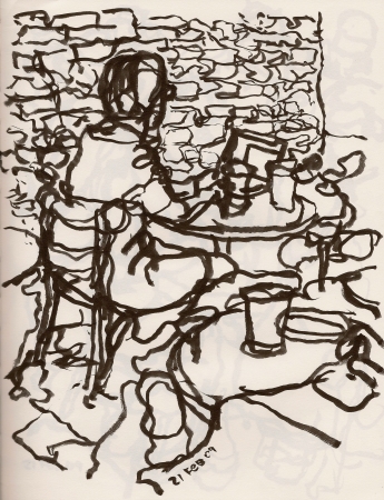
Sketchbook page, ©FE
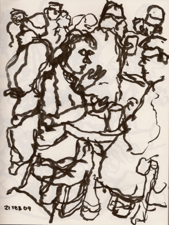
Sketchbook page, ©FE
2.
February 25, 2009, 10:30 AM
I have a Wilms too and it is gorgeous. Shaky and pretty.
3.
February 25, 2009, 11:52 AM
I like the way these push the eyes to the edges. The bold busyness defines and flattens space simultaneously.
4.
February 25, 2009, 3:32 PM
Just a note re a recent topic: if you go to the Christie's site you can see the items in the YSL sale. The guy really did have an extra dose of real taste when it came to modernism, especially the paintings. There is hardly a one I would not like to own and a good half dozen or so out and out masterpieces.
Prices were astonishing, expecially for this ecopnomic climate. What amounts to a pet rock brought $25K and a couple of Narwhal tusks $75K, prices which bear no relationship to market prices whatsoever. I really think a lot of people thought this was a blessed-by-the-pope situation, where anything they bought would carry the imprimature of YSL. Guaranteed goods for the eyeless.
5.
February 25, 2009, 3:36 PM
In the world of the blind, one-eyed men still sometimes step in dogshit.
6.
February 25, 2009, 5:21 PM
I like these much better than the others The bottom oe remi ds me of dubufet
7.
February 25, 2009, 6:36 PM
These are better or stronger than the others, but I think the others were aiming at a different end or effect. They were clearly more decorative, deliberately so, including the use of fancy patterned paper. There was an Art Deco feel to them; at least one reminded me strongly of Maillol. In other words, they weren't meant to be serious or deep, but pleasing to look at, sensuous, relaxed. I think the Japanese would like them.
8.
February 25, 2009, 7:55 PM
pierre berge, YSL's man friend, supposedly is the one who did most of the finding and then, almost always, he got confirmation from YSL. he had some pretty amazing things which all put together made his place beyond over the top. that custom bar was pretty bad ass. but maybe a little gay. or bond. once again 10x the est.
i like these two drawings as well.
9.
February 25, 2009, 8:22 PM
Very nice, Franklin, both of them.
10.
February 26, 2009, 1:19 AM
Franklin, did you use blind contour technique at all for these? I've talked about bringing an ink brush to the exercise, but never followed up. (There are a number of examples of early RW drawings in the first month of studiosavant posts.)
I think the first one here is the better of the two. I like how the brickwork sets a decorative but anchoring backdrop, yet melds with the rest of the drawing's little cells.
1.
Chris Rywalt
February 25, 2009, 10:25 AM
Are the copyrights new or have you been doing that all along?
Funny how different our sketchbooks look even though we're both using the Kuretake brush pen.