Previous: Andrew Wyeth, 1917-2009 (6)
January: Nude (K.G.)
Post #1280 • January 22, 2009, 10:03 AM • 52 Comments
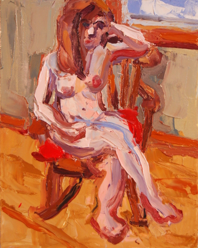
January: Nude (K.G.), 2009, oil on canvas, 20 x 16 inches, ©FE
It's good to be painting again.
2.
January 22, 2009, 11:24 AM
Hey, you put initials on this one. Do you usually?
I'm a little uncertain of that one wild blue line on her thigh, but maybe it works in person. In JPEG it looks like, hey, what's that line doing there?
3.
January 22, 2009, 12:15 PM
Squirmy paint in all the right places. Oranges, dull and not so dull become you. Nice work.
4.
January 22, 2009, 11:22 PM
i love the elbow resting upon the chair and the windowsill. It's good to see a nice, thick , yummy painting!
5.
January 23, 2009, 9:42 AM
Nice painting, Franklin. You are abstracting detail well, how about abstracting/distorting form?
6.
January 23, 2009, 10:25 AM
...how about abstracting/distorting form?
I've played with that quite a bit, really, and I have to be in the mood for it. Lately I've been trying to clarify.
7.
January 23, 2009, 11:17 AM
OP suggested that to me, too, saying that the human form is so recognizable you can really stretch it and still have it read as a person. Or to quote him, "If you want to
experiment try distorting the figure. Make crazy stuff like Dubuffet...." And "It takes a lot to obscure a figure because figures are so recognizeable -- e.g. Dubuffet."
I keep hearing his voice in my head (or more accurately reading his words) but I haven't really pushed it yet, except very slightly with one doodle. It's on my mind. I might do it. I'm feeling some trouble breaking away from the (admittedly already somewhat unrealistic) style I've been using.
8.
January 23, 2009, 11:45 AM
The handy thing about figures and landscapes is that they are so ingrained visually that if you draw a circle with two dots and a curve you have a face and if you draw a hozizontal line on a horizontal surface you have a landscape. It provides support for all kinds of messing around because the viewer puts the picture together for you.
9.
January 23, 2009, 12:08 PM
It's a really interesting insight into the wiring of human beings.
10.
January 23, 2009, 12:29 PM
Clarity is good. Striving for it increases the range of a painter's ability and enables fluid shifts from representation to abstraction and back without loosing a square inch of the surface to sloppy or "panicky" mark making. There is no problematic mark in a good painting - every bit of surface is resolved. (With skill or luck - usually both.)
11.
January 23, 2009, 8:03 PM
August: Nude (A.L.)
acrylic on panel
32 x 24 inches
2003
I love it.
12.
January 25, 2009, 3:08 PM
Franklin you are a hostage to your tools. This painting has nice color but that's about it. As a nude its a feeble attempt - the hair looks like an orange turd. Your other readers are being to nice. Scrape it off and start over.
13.
January 25, 2009, 3:15 PM
If I start over I might do the same thing again. What would you do differently, Oscar?
14.
January 25, 2009, 3:20 PM
Oscar, try an eye transplant.
15.
January 25, 2009, 3:28 PM
You're trying to draw with a blunt stick, it doesn't work. Your paintings looks like sidewalk art (ok, it's a bit better than that but not much)
Frankly I'd ask myself why I was scraping on all that fat paint, to what end?
Then you need to decide to what degree you want to abstract the figure, If you're painting with a blunt instrument the fineness of your drawing degrades into approximation/abstraction. This is where you are at the mercy (hostage) of your tools, you can use a brush if necessary at some point.
If you decide you want to stick with knifing on fat paint, then take a cue from the other guys like Auerbach, who worked the surface until the image and the paint coincide. Pay attention to the edges, even a smear stops somewhere.
It's supposed to be a painting, not a frosted cake.
16.
January 25, 2009, 3:41 PM
The answer to Why? is that I like fat paint. What does "the image and the paint coincide" mean?
17.
January 25, 2009, 4:08 PM
unified.
Excuse me for being frank but the painting looks 'frosted' Like you filled all the areas up with a spatula then quit. Look at Frank Auerbach, he manages to get the drawing and the paint moving around together. Even if his drawing is crude, a zig-zag for an arm, the eye reads it without conflict.
19.
January 25, 2009, 5:03 PM
I like Auerbach plenty but his surfaces often look tortured. It's fine when he does it, but that's not what I aspire to.
20.
January 25, 2009, 5:23 PM
From this painting it's not clear what you aspire to, other than the fat paint look. What do you really care about, the paint? the nude? the color? Whatever it is the painting is poorly resolved and could be reworked.
21.
January 25, 2009, 6:39 PM
I think the main thing wrong with this painting is the same thing wrong with the drawing you posted later: The model's holding her head on her hand like you bored her to sleep. Don't lecture and draw, Franklin!
I used to get yelled at for making the model laugh. Drove some of the painters crazy, trying to catch a likeness when she keeps giggling.
22.
January 25, 2009, 6:50 PM
Oscar, you've said several different ways that the painting is bad. Fine, if you think so. But if your advice consists of paying attention to the edges, unifying the paint and the image, and scraping and starting over, you either can't articulate a solution or don't really know what's wrong with the painting in the first place. Thanks anyway.
23.
January 25, 2009, 7:31 PM
Franklin, no need to look at Auerbach, you have assimilated everything he has and then some. Instead, that a look at HUGHTO.
24.
January 25, 2009, 7:33 PM
Once you get the Hughto, click on the image for the larger view.
25.
January 25, 2009, 8:21 PM
That is worthy. Acrylic scraped onto a dark ground, eh? Hm...
Come to think of it, I think one of these was up in the Golden Paint exhibition space.
26.
January 25, 2009, 9:06 PM
I like the Hughto nudes. I'm a sucker for lights on a dark ground, though. Gets me every time.
I could work kind of like this, but then I'd keep smoothing it out. I've seen myself do it more than once. Something keeps me from leaving it alone. Too much impasto and I'm in there flattening stuff out. I can't understand it.
27.
January 25, 2009, 9:40 PM
Hughto has also done wet-in-wet, impasto style, leveraging a technique common among watercolorists. I can't find an example to point to but will tell you that he starts with a tinted canvas ground temporarily stretched around a 4x5 sheet of plywood, then applies a thick wet coat of slow dry gel. This is placed on a easel in front of the model.
HERE is an example of thin acrylic underpainting finished off with blobs of gelled up paint - a landscape.
Darryl's range of work is startling, He has a very gifted hand that click a lot of clikers.
28.
January 25, 2009, 9:41 PM
Make that "clicks a lot of clickers".
29.
January 26, 2009, 10:10 AM
A. scrape it off and start over???
There is no such thing in painting.
Painting is an add only process. all scrapes or removals change the paint by adding actions or strokes that any hard looker can sense no matter how cleverly disguised.
B. There seems to be too much thought going on here. Dubuffet, distortion frosting? Franklin - let it be. trust your hand and your impulse. I try to touch as little as possible. When working from nature, one thing nature doesn't look like is over worked. Planned, forced. Nature simply exists, it's inevitable. That's what I go for. so sometimes the blob of first laying down the paint shows and so what. It happened like that. and paint will always happen like the viscosity and opacity and mass you mixed cause it in itself is natural material subject to all the natural rules and forces. As John Lennon wrote, "Let it Be". If distortions force your hand because of how you are feeling, trying to express, see in the subject at hand let it happen becuse you want it to feel as you feel it. No need to enforce distortion from outside the painting.
first time commenting here, so I hope I'm not stepping on toes. I'm not sure who I'm talking too except John.
30.
January 26, 2009, 10:24 AM
I'm listening. I've always thought it was kind of funny, the way you can wipe down a panel but somehow so much of what you removed is still visible in some sense. Moving from watercolors to oils, the big change is discovering you can really rework things; but the surprise is that radical reworkings still contain some resonating sounds of the first shot.
As far as trusting hands and impulses, I think both Franklin and I tend to overthink. In my case I think it's a flaw. I can't speak for Franklin.
But for me there's a balance to be had. When I jump in without thinking too much, just being carried along, the results can be really dreadful. But thinking too much ruins it, too. There's a middle path for me.
31.
January 26, 2009, 10:38 AM
on looking again at the painting I have a suggestion for next time.
The sameness of color and the sameness of tool.
On this scale it's hard to avoid, but the brown shadows on the under side of the feet are all the same color and tool and thereby same thickness becomes outline and not intigrel. This is true of other places in the painting. The color of the wall for instance. pressure to vary thickness can change the color and value in a natural and easy way without going back to the palette too many times or getting too fussy with the stroke. Just a thought.
The painting also might benefit from coming in on the left an inch or so. I'd have to see it in incriments to determine. I bet it would benefit from being tighter, less wall to the model's right.
And, as far as reference, I'm reminded of Soutine. Hey, that's pretty good in my book. Way ahead of Dubeffet for figural inspirtation.
32.
January 26, 2009, 10:58 AM
I agree with Darryl -- there is a sameness of tool, of line thickness and flavor. I didn't notice it before, but it may be one thing that's nagging me. Also he's right about the composition -- it's too centered. It should lose some on the left.
I have to say, though, that I'm a big fan of off-centered compositions myself. I like thirds. So don't listen if I'm trying to turn you into me; but using thirds is a rule of thumb I've heard more than once from others. (It might even be a cliche, in which case, sorry.)
33.
January 26, 2009, 11:22 AM
Darryl has a good point about the left side. I'd crop until her elbow feels the pressure. Don't know how many inches that is, maybe 2. Tape it off first and see how it looks. Black tape works best but you have to send off for it.
But the feet, they are done. Maybe try them differently next time. Cropping is something you can do while leaving a gnarly small picture intact. Messing with the feet could lead to a black hole. Besides, I like the model's right foot quite a lot.
34.
January 26, 2009, 11:24 AM
I'm not suggested he mess with THIS painting. Just for next time. The way you abstract guys start cutting things up, man, that's nuts.
35.
January 26, 2009, 11:25 AM
Besides, we wouldn't want Simon Schama to have to spend several minutes bemoaning whatever's missing from Franklin's masterpiece, would we?
36.
January 26, 2009, 11:34 AM
Just noticed the Darryl was talking next time too re: the feet. except for possible cropping, leave it alone.
37.
January 26, 2009, 11:37 AM
forget about the sides, crop 4 inches off the top.
38.
January 26, 2009, 11:39 AM
Chris, "crop" is my middle name. It is as natural as breathing. It is a myth that a "real artist' will "resolve" the exact surface he begins with the first time, every time. Prune, baby, prune. It's good for trees, its good for art.
Sometimes instead of cropping a picture needs expanding - all the reason to leave some extra canvas around the edges.
Darryl, good to have you here.
39.
January 26, 2009, 11:41 AM
Oscar, you are unbelievable. Scrape it all off, now whack off the head?
40.
January 26, 2009, 11:44 AM
In order for me to crop, John, I'd need a circular saw.
Of course Oscar wants to whack off the head. He's uncomfortable with having a nude woman look at him while he's looking at her. This painting truly causes discomfort with practitioners of the male gaze, assured of their normative position within the hegemony of the history of Western European hetero-male-dominant orthodoxy.
41.
January 26, 2009, 11:58 AM
I've used the circular saw and the jig saw, along with the box knife. All of them work fine, depending on the support.
THIS ONE was cut back (in several dimensions) with 25 pound barbell weights, a carpenter's hand saw, and a blow torch.
42.
January 26, 2009, 12:01 PM
Chris, way to go after those male gazers. They are the bane of the art world.
43.
January 26, 2009, 12:47 PM
See what I mean? A blow torch? You guys are completely insane.
44.
January 26, 2009, 12:48 PM
You guys read way too much psychology. Better to read Emily Post. Don't motivate people. It's bad form and gets you into trouble.
Cropping is part of not treating any decision in the making of a painting like it's over til it's over. Not the first one for sure. In a painting, it's a conversation and everything is up for grabs until it's the best it can be incuding most especially it's limits! And what ever doesn't add to the solution detracts. That's what makes going back into a painting so tough. One can only go back in if you are ready to throw it all open again. True, you might only need to touch it a little, but if you go back you must be ready to let go of bits of painting that you had liked in the first instance. this difficulty is what made one shot painting so popular. The trouble is one shot doesn't guarantee anything and what happens if you still have to go back in.
45.
January 26, 2009, 10:02 PM
I believe Chris was clowning with the male gaze stuff. I certainly was. We had some other male gaze joking in another thread. Just saying "male gaze" without saying "I'm sorry" can get you into trouble ... if you a male.
When I go back into a painting it is usually with the intention of severely altering it, not just correcting it. INSOUCIANT CALICO was a four shot. Shooting multiple times - from the hip - is part of my devil may care overlay method. But I didn't crop it.
I did crop THIS ONE and have regretted it ever since.
But LAZY LANGUAGE is a crop and a damn good one. It could not breathe until 2/3 of its former environment was excised. (A box knife project, Chris.)
46.
January 27, 2009, 12:33 AM
I fear power tools. A box knife I can understand. Also hurt myself with, but usually less severely. Or I can handle the first aid on my own, anyway.
If you're not sure whether I mean something or not, just go with clowning. It's usually right.
47.
January 27, 2009, 1:47 PM
The type of painting I sometimes do that John spoke earlier in the discussion can be seen at:
http://www.flickr.com/photos/dhughto/2889026535/sizes/o/in/set-72157607478000910/
I'm not sure if the "sizes" option appears if you are not a flickr member. Don't be afraid to sign up, however. It's free, takes just a minute and they don't pester you to buy more or sell your email address. The only cost is $25 per year if you want to be able to upload unlimited numbers of photos.
48.
January 27, 2009, 6:57 PM
Speaking of nudes, I was reminded today that I haven't updated my online gallery in a coon's age. So I did.
49.
January 27, 2009, 10:02 PM
Darryl, that link didn't go through. Do you have another one? I'd like to see more.
50.
January 27, 2009, 10:39 PM
Darryl's link is just to the size function for the nudes gallery you can see already. It doesn't work, though, you're right. I think he must've pulled one of those author-only links.
51.
January 28, 2009, 12:06 AM
Here is a link to Darryl's "wet in wet" picture that is more standard: STILL LIFE & NUDE.
52.
January 28, 2009, 12:37 PM
I looked at all those after you posted the first link, John. I like the look of Darryl's work -- hey, Darryl, looks good! -- and I'd like to see them in person to make a real judgment.
His work looks like something I could actually draw from for my own. As opposed to someone like Julie Evans, whose colors I could only dream of handling. I had to stop looking at her work the other night because it made me feel so bad about my own.
1.
bethea
January 22, 2009, 10:21 AM
I like it! The shading the figure is good. The blue line too, and the blue out the window