Previous: Walking back to the car twenty pounds heavier (12)
Lost in the arranging
Post #1183 • May 23, 2008, 11:12 AM • 101 Comments
Matisse, from Jazz:
During a walk in the garden I pick flower after flower and amass them in the crook of my arm, gathering them randomly one after another. I return to the house with the idea of painting these flowers. After having arranged them in my own way, what a deception: all of their charm was lost in the arranging. What could have happened? The unconscious arrangement made during the picking, through the pleasure that prompted me to move from one flower to the next, was replaced by a willful arrangement derived from reminiscences of long-dead bouquets that left in my memory a charm of yesterday with which I now burdened the new bouquet.
Renoir once said to me: "When I have arranged a bouquet for the purpose of painting it, I always turn to the side I did not plan."
2.
May 23, 2008, 1:13 PM
Yes, other example, when I shoot four images of my daughter (or any other subject) mostly the first turns out the best.
3.
May 23, 2008, 5:37 PM
Where does the phrase "unconscious pleasure" occur in the above quoted passage?
Oh, nevermind, it doesn't.
Hey Clem, why did you put the phrase "unconscious pleasure" in quotes?
4.
May 23, 2008, 9:34 PM
Just misrepresentin' as per usual!
By the way, I've been running around Millcreek lately, and there is far too much "reclaimed steel" of "an ambiguous, multi-referential nature" in some of those neighborhoods. What gives with the abundance of "visual quality" in such a small area?!
5.
May 24, 2008, 7:31 AM
Misrepresenting? Have I ever accused you of that, "Clem". I'm pretty careful about leveling accusations, you know.
To my recollection, the last time I accused someone of "misrepresentation", it was directed at an art history professor (during a q&a session after she gave a talk), who to her credit, publicly admitted that I was indeed correct.
See, I take care with my choice of words. I think you should make some effort to do the same, Clem, but of course, I can't force you.
As you were...
Franklin, for me, this passage brings to mind a recent sculpture I've been making, soldering brass knick-knacks together. On of my elements was a mantle-piece clock, which made me think, hey, I should make a sculpture with a clock in it! So, the brass clock housing went into the assemblage with the rest of my parts (the clock face and workings were removed for the making of the sculpture), and before long, I was happy with the sculpture. I got a new battery for the clockworks, and inserted the face and mechanics into the sculpture... and ta-da! I now had a sculptural clock. The only problem is, it was better as a sculpture before I put the clock in. So, now I'm left with the choice of having either a cool clock (but not a very good sculpture), or a cool sculpture (without a clock in it).
So much for plans....
6.
May 24, 2008, 7:41 AM
#4 is what we in the artblogging business call "poseur talk."
7.
May 24, 2008, 7:58 AM
MC, I refer you to comments 266, 267 and 269 on the "Importance" thread. You may find them of interest.
8.
May 24, 2008, 8:00 AM
Well, not really, Jack, but I'll play along...
9.
May 24, 2008, 8:35 AM
"A plan is a plan, even if you want to put its origins down as "unconscious pleasure"."
Clem, FYI:
"Functional illiteracy refers to the inability of an individual to use reading, writing, and computational skills efficiently in everyday life situations. When illiterate, one cannot read or write at all. In contrast, one who is functionally illiterate has a basic grasp of literacy (reading and writing text in his or her native language), but with a variable degree of grammatical correctness, and style. In short, when confronted with printed materials, functionally illiterate adults cannot function effectively in modern society..."
10.
May 24, 2008, 9:48 AM
"...formalist dissenting adults cannot function effectively in new modernist society..."
That seems to be true!
11.
May 24, 2008, 4:56 PM
I've been running around Millcreek lately
Did you find a sculpture there that you could admit to liking, Clem?
12.
May 24, 2008, 5:00 PM
I always turn to the side I did not plan is quite contrary thinking to this: http://www.diacenter.org/km/usa/survey.html
Scroll down for a laugh...
13.
May 25, 2008, 6:50 AM
Oops, I guess my point was a bit too subtle, so it flew (once again) right over Clem's pointed little head (a little like all that tricky "logic jargon" and "is/ought" stuff Clem has so muc trouble with, I guess).
"The unconscious arrangement made during the picking, through the pleasure that prompted me to move from one flower to the next..."
Here's a couple of elementary reading comprehension questions:
1: What does the word "unconscious" refer to in this passage?
2: Is the "pleasure" described by Matisse something he is conscious, or unconscious, of?
Here's a hint: Clem managed to fail both of these elementary reading comprehension tasks in comment #1...
I wonder what you do with all those books you say you buy, Clem. I'm sure they all look very impressive on your shelf, at least...
14.
May 25, 2008, 11:39 AM
Marc, we must see about finding you better ways to employ your energies. However, it's gratifying to see you're at least less prone to bother with George than formerly, despite the occasional relapse (even I sometimes still succumb to that two-bit temptation, though it's scarcely worth the trouble).
I'm increasingly of the opinion that some things are best handled with indifference, especially when a desire for notice or "validation" is an important part of the offender's aim. In the big-time art scene, certainly, such an approach would have nipped in the bud quite a few now outrageously overblown though utterly hollow "reputations."
15.
May 25, 2008, 12:11 PM
And here I was trying out indifference for a change!
Deciding to go against a planned arrangement, or sticking with an "unconscious" one is still following a plan. And besides, since when did "unconscious" translate to meaningless or not subject to influence?
And is it just me Jack, or do you seem to have less interest in Art than you do certain in friendships with some of the writers on here?
16.
May 25, 2008, 12:14 PM
I was running, Ahab, and didn't stop to take in the particulars. I wasn't so much critical, as disinterested, but will make an honest attempt to look at them next time I run by!
17.
May 25, 2008, 12:22 PM
Re #15, I'm afraid it's just you, Clem.
My condolences on your affliction.
18.
May 25, 2008, 2:52 PM
Clem sez:
Deciding to go against a planned arrangement, or sticking with an "unconscious" one is still following a plan.
You sound like Neil Peart: "If you choose not to decide/You still have made a choice". I thought this was way cool when I was younger, but nowadays I think it's crap. It's pure sophistry, a quirk of English semantics. Choosing not to choose, or planning not to plan, isn't making a choice or a plan. Not at all. It's opting out of the whole system of choosing or planning.
19.
May 25, 2008, 3:12 PM
Spell out its sophistry, Chris. And there's a second sentence to my argument that's still waiting.
20.
May 25, 2008, 3:27 PM
Oh, I wasn't looking to tackle your entire argument, just that one bit of it. I think unconscious actions are subject to influences and so on. Although I also think that the unconscious is blown out of proportion. All kinds of people use it as a scapegoat.
But I do think there's a difference between unconscious plan and randomness. If you arrange a bouquet from one side and then turn it, the side you didn't plan isn't unconsciously planned. It's just randomly arranged. I mean, I guess if you do it enough, after a while you might be sort of planning ahead towards turning the bouquet around, in which case you've destroyed the exercise -- like peeking during hide and seek.
Even more, if you're wandering in a field of wildflowers, the "arrangement" you're admiring isn't planned at all. And if you're just picking as you go, as Matisse was, then you're still not planning, any more than floating down a river is a plan. Again, you may plan as far as "I'm going to float down this river," but that doesn't mean every turn, pause, and small rapids is planned.
21.
May 25, 2008, 4:39 PM
"Marc, we must see about finding you better ways to employ your energies."
I take your point, Jack, but don't worry about me. When I left my last comment, I was just getting in from an overnight outdoor cancer-research fundraiser. I've got more than enough energy to dispatch a "mentally diminutive coward" like Clemmy.
And, yes, I know, I should just leave Clementine alone, poor thing. Unfortunately, Clem keeps opening themself up to rebuke and, as a responsible and active member of the Edmonton art community, I feel we really need to police our own...
As I've said before, I'd be happy to hash any of this out in person with you, Clem, if you ever want to crawl out from behind your SECRET IDENTITY!
22.
May 25, 2008, 5:00 PM
Address the writing, not the writer. I want to hear what you have to say about the topic at hand, not what you have to say about your fellow contributors. Ad hominems, speculations about peoples' motives, critiques of their fashion sense, and the like will be deleted.
Advance the conversation. Think of the comments as a conversation with other real people. Pick a consistent handle (preferably your real name), aspire to eloquence, use good grammar, and mean what you say. Failing all else, agree to disagree.
Assume community. Even the most opposed factions in the art world still agree that art is important. Begin with that basis and respect other commenters accordingly. Abusive remarks, taunts, boorish language, and the written equivalent of behavior that would get you punched out in a bar will be deleted.
23.
May 25, 2008, 9:54 PM
I did not post #22.
24.
May 26, 2008, 7:39 AM
"When I have arranged a bouquet for the purpose of painting it, I always turn to the side I did not plan."
It's like taking a photograph; it's much more real if the people in it aren't posed.
25.
May 26, 2008, 10:36 AM
What I think you need to distinguish though is what actually corresponds to the real, from that which purposefully tries to. Barthes' essay on the "Reality Effect" takes up this difference in some depth.
26.
May 26, 2008, 12:41 PM
Olympia Diving Sequence
27.
May 27, 2008, 8:01 PM
Twice I've forgotten about comments closing and been tied up. But I wanted to throw my neck out on a couple of painterly picks that I've been taken by lately.
Hilary-Harkness. Particularly her newer work. I'm really hoping to get to this show before it closes!
http://www.maryboonegallery.com/exhibitions/2007-2008/Hilary-Harkness/detail1.html
Lesley Shows. She's about as fresh as they come, but since seeing some of her MFA work I've been following her quiet progress and was happy to see this new work (though i'll admit that it had to grow on me compared to her earlier work).
http://www.jackhanley.com/show.php?show=843
http://sites.cca.edu/gradexhibition/shows/01.html
28.
May 27, 2008, 8:30 PM
Pictures of Peter Hide @ The RAM HERE.
Let's hope their charm isn't lost in the arranging...
29.
May 27, 2008, 9:44 PM
MC, Peter Hide you say? Here are some more images to look at, now that our "care" thread finally escaped speculating what the meaning of is is ...
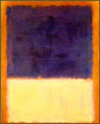
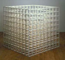
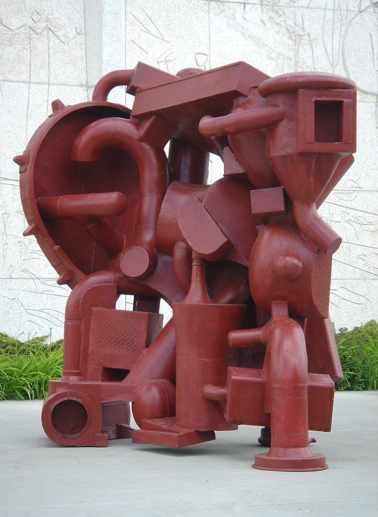
Susan Roth (fixed)
Darryl Hughto (fixed)
Elaine Grove (fixed)
Tony Smith
Mark Rothko
David Smith (with help from CG)
Ron Davis
Joe Goode
Sol LeWitt
Robert Smithson
Noah Purifoy
Steve Achimore
Scott Bennett
Edward Chaplin
Dale Chihuly
Paula DeLuccia
Sam Gilliam
Herb Jackson
Ronnie Landfield
Roy Lerner
Neil Marshall
Carl Plansky
Larry Poons
Kathleen Staples
Jim Walsh
Mason Williams
Mark Raush
Jane Crow
Mike Matthews
Mike Steiner
30.
May 27, 2008, 9:57 PM
"C'mon man, can't you see it? Take off those sunjammers of language'n'culture'n'whatevs, and get back to nature, the way things outta be , uh, i mean really are... You just gotta use your eyes, man, see!?"
Just joshin' (for the time being)!
31.
May 28, 2008, 5:31 AM
There are many bad living painters. There are far fewer okay, pretty good, good, very good living painters. And I judge the value of these painters' work on a case by case basis. I don't have the time to list the names in this fairly broad category. I agree with some of the choices others have made. In my little world all of the profound, life changing painters are DEAD. And even these rarities made the occasional stinker. But 'stinker' is definitely a relative term when I use it in this context. Just to go against the grain...I think there are more interesting sculptors working today than there are interesting painters.
32.
May 28, 2008, 5:54 AM
Eric knowing the name of an artist who makes good work is useful. It is an indicator of where one might be likely to find more good work, that's all.
33.
May 28, 2008, 5:57 AM
Thanks for the list, John. It would be nice if everyone contributed one. Maybe this can be the raw material for the Newmo campaign.
34.
May 28, 2008, 6:42 AM
Susanna Heller
Roberto Juarez
">Arturo Herrera
">Ken Kewley
">David Storey
Jon Elliot
">Manny Farber
Frank Auerbach
Benjamin Edwards
Philip Taaffe
35.
May 28, 2008, 7:35 AM
John,
Was the Mason Quinn a mistake? Did it slip in accidentally with your other Golden picks?
36.
May 28, 2008, 7:35 AM
i would second jim walsh and add john griefen.
37.
May 28, 2008, 7:40 AM
You are getting sloppy with your snarkiness 'Clem'. I assume you meant Mason Williams.
38.
May 28, 2008, 7:45 AM
I think he meant Mason Williams but I didn't see it as a snarky comment. I had the same surprise reaction when the page popped open, it didn't seem to fit.
39.
May 28, 2008, 7:51 AM
Of course you didn't, George...
40.
May 28, 2008, 8:00 AM
Clem: You mean Mason Williams? No, not a mistake. He started seeing the humor in conceptual art before it was labelled conceptual. So that makes him interesting to me. Besides, I grew up in Oklahoma City. where Oklahoma City University told him he would never be a very good musician, and all that. Used to listen to him and Steve Brainard play at the Gourd too in the Wayfarers, I think, along with Judy Collins and Judy Henske who performed at other times.
Not to mention his discovery of "stencilism" and invention of Upclose Glimpse, who is not just an abstract artist, but an abstraction himself, a viral visionist, who has infected Mason for quite some time, and has spread to the stencilist herself of late. "Better to be an artist who is abstract, than to be a real artist whose work is abstract", asserts Upclose Glimpse. Upclose is, in essence, an opportunistic virus who works in the manner of Scorates, "If there can be layers of meaning, why not layers of abstraction?"
It is all about Okie humor as prescient of the absurdities inherent to art that gets too big for art.
41.
May 28, 2008, 8:03 AM
OK. Here is the direct path to Upclose Glimpse (I don't know how to do the umlaut):
Upclose Glimpse
42.
May 28, 2008, 8:09 AM
More painters...
Scott Richter
">Greg Lindquist
">Jeremy Gilbert-Rolfe
Jo Baer
Please let me know when I can provide links for sculptors.
43.
May 28, 2008, 8:10 AM
Franklin, I suggest an addition to the blog Guidelines, thus:
Strained wit is no wit at all. Labored, asinine cuteness is a tiresome imposition. If the shoe fits, by all means wear it. There's too much BS around as it is.
44.
May 28, 2008, 8:19 AM
Mason Williams is also one of the authors of Royal Road Test.
Strangely this book, along with some others authored by Ed Ruscha, are ripped out of their natural context and displayed in museums and have become quite valuable. They are supposed to be handled.
45.
May 28, 2008, 8:29 AM
"Was the Mason Quinn a mistake? Did it slip in accidentally with your other Golden picks?"
George you can't see the sarcasm in the phrase "Golden picks"? Sorry but we must be from different planets.
46.
May 28, 2008, 8:35 AM
Comon Jack, from the Bookride review: "The books were amusing and stylish - conceptual art that also seemed to mock conceptual art." I'd argue that they really weren't styllish, but rather very precisely designed, a nice counterpoint to their "wit", which was unrestrained as opposed to strained. Serious fun, perhaps, but certainly fun. Upclose Glimpse, the "bus", "sunflower", "White on White" in an edition of 13 for private collections only, how can you resist smiling at that stuff?
47.
May 28, 2008, 8:41 AM
John, #43 had nothing to do with you or any of your comments. I apologize for the misunderstanding. The smoking gun is higher up the thread.
48.
May 28, 2008, 8:44 AM
I was guessing Jack might have been referring to #30, or the like... just a hunch.
49.
May 28, 2008, 8:44 AM
Sorry about the dead links. I don't know why some of them worked and others did not. I am at work and don't have the time to fix them. You can google the names if you want to see samples of their paintings. A number of them have wildly divergent styles throughout their careers and I do not mean to give a thumbs up to all of their work, only certain pieces that I saw live at some point in the past. The images I provide links for are not necessarily examples of paintings that I saw live.
50.
May 28, 2008, 8:49 AM
Good to see Neil Marshall on your list, John. Unfortunately, I only learned of his work while reading his obituary last year...
51.
May 28, 2008, 8:59 AM
Eric, you have to make sure that the opening 'a' tag runs right up against the text you want to link. If there's an extra return in there, it will mess the link up.
52.
May 28, 2008, 9:14 AM
The "Golden picks" were from a list of images on the Golden Paint site: these were works donated to an auction Golden sponsored. Mason Williams, however, was not from that list, Jim Walsh was the last.
53.
May 28, 2008, 9:39 AM
Guilty as charged on the sloppiness. And you're right John, the link you'd given wasn't from Golden, I wrongly assumed so after I'd seen a Williams/Webster piece included with their sales gallery list. I definitely agree that most schools/ideologies deserve suitable ribbing from time to time!
Another pick:
Chris Johanson. He had some paintings and installation work at SFMOMA a couple of years ago that I'm going to try and track down that aren't the same the link below...
http://www.sfmoma.org/MSoMA/artists/johanson.html
http://www.deitch.com/artists/selected_works.php?selectedWorksId=9&artistId=6
54.
May 28, 2008, 9:40 AM
"Thanks for the list, John. It would be nice if everyone contributed one. Maybe this can be the raw material for the Newmo campaign."
Step two: who's gonna curate the show, and what's the venue?
55.
May 28, 2008, 10:15 AM
New(est?) Johanson:
http://www.jackhanley.com/show.php?show=440
56.
May 28, 2008, 10:35 AM
Clem, with all due respect, that Johnanson stuff is street fair level, at best.
MC that's next on the list.
By the way, that link you had on your blog of Neil Marshall is some sort of commercial hodge-podge page that has nothing to do with him at all except to throuw his name and a few associated names around, linked to random sites.
It's too bad because he wrote one of the best pieces on Jules I ever read and I wanted to find it.
57.
May 28, 2008, 10:40 AM
Opie, I found that out earlier, too. It used to go to Marshall's own site, but as you say, it is now defunct.
One of you information scientist types out there know how to dig back into the internet way-back machine, and pull up Neil's work, somehow?
58.
May 28, 2008, 10:44 AM
a couple more ...
Amanda O'Connell
John Griefen
Royden Mills
Bill Perehudoff
Dennis Panylyk
61.
May 28, 2008, 11:03 AM
That's a nice O'Connell.
I nominate John Link as the curator...
62.
May 28, 2008, 11:06 AM
Oh, that sucks... my link for Marshall actually worked a second ago. Damn!
63.
May 28, 2008, 11:15 AM
"It's too bad because he wrote one of the best pieces on Jules I ever read and I wanted to find it."
It's tough digging, but I managed to find this, Opie...
(I've cut and pasted it below, in case the link dies).
Jules Olitski: The Critique of Matter
Date: 20 Oct 2005
Entry
For reasons that remain obscure, French painting in the period following WWII plunged into
the material of paint in a way that had never been seen before. This may prove to be its
most enduring, salient characteristic transcending both notions of "art brut" and "matter
painting", both of which now appear off the mark, and perhaps even a little trivial. Jules
Olitski was a part of this moment and the present exhibition at Knoedler�s attempts to
expand upon this participation to draw larger conclusions not only for Olitski himself but for
the history of postwar abstraction in general. The attempt is both audacious and brilliantly
successful. Only in recent years has the connection between the Paris and New York years
prior to 1960 and the painting of the 1970�s been seen as clearly gestative and ultimately
inevitable to the fulfillment of his promise.
Carl Beltz who organized the exhibition with the title Jules Olitski - Matter Embraced
Paintings 1950�s and Now boldly decided to eliminate the paintings that made Olitski
famous, (first the Matissean inspired rolled ellipses from approximately 1960 to 1965 and
then the now classic sprayed paintings that brought Olitski global fame between 1965 and
1970). This has made possible a concision and transparency enabling us to perceive the
radical connections between the two periods and their relationship to his stylistic evolution
When the �new materials� first became commercially available in 1970, the naysayers saw
little more than yet another novelty to be obtained at the art supply bazaar. In fact
something far more profound had been set in motion. Olitski�s use of gels and acrylic media
to gain texture, reconnected his painting to its original sources of inspiration in the postwar
period. At the same time, the light reflective, and material-dissolving micahs and interference
crystals introduced more strictly optical effects that built upon the chromatic achievements of
the rolled and sprayed paintings of the 1960�s. The painter�s longstanding assertion that it
was the Old Masters who were his first love, especially Rembrandt, gained new credibility
as the paintings advanced to ever greater levels of pictorial, textural, and chromatic
complexity.
In this most recent exhibition Paradisio of 2004 leaps out as a masterpiece uniquely
coalescing these qualities. It is not simply that the paint is handled but that the matter of
paint has been engaged, or as Beltz would have it, embraced, in its most elemental form,
reaching deep into a full pictorial plenitude of textures and optical effects from the thinnest
washes and stains to the most chromatically embodied textures. By eliminating the thinner
paint surfaces of the sixties the exhibition reveals through omission Olitski�s career as a
lifelong critique of matter with few parallels in contemporary painting. To even the most
casual observer, nothing by Johns, or Richter, even comes close to art on this level.
Without question, Olitski remains our greatest living painter.
Neil Marshall, New York, 2005
64.
May 28, 2008, 11:22 AM
Perhaps it requires taking the same approach as Pollock. Just "splash" the flowers onto some other object to view how they "arrange" themselves.
65.
May 28, 2008, 11:44 AM
Hey, Clem, want to go see Hilary Harkness with me? We can work out a date. Obviously sometime before the end of June. I'm free on most weekdays, although I usually have to be back to get the kids from school.
66.
May 28, 2008, 11:45 AM
I don't think so, MC. The one I recall was earlier, longer and went into process much more exhaustively
67.
May 28, 2008, 11:46 AM
Sorry I didn't know that "Golden" as it appeared in Clem's comment #35 actually referred to something real. However the comment, "Was the Mason Quinn (sic) a mistake?" is sarcastic so I do not retract comment #37. If Clem had included a painter who painted in a Modernist style would MC say, "Are you kidding Clem?" Of course not. But it is fine with someone who has Postmodern-itis to continually imply that Modernists hate all conceptual art. Double standards indeed. Clem, Johnanson is really awful. What do you like about that stuff?
68.
May 28, 2008, 11:50 AM
MC it was titled "the Paintings of Jules Olitski" and it goes back a while. maybe to the 80s. I have it saved, but it is too long to put on here, and I have not idea how to link it.
70.
May 28, 2008, 12:48 PM
more is better:
Bill Jensen
Jonathan Lasker
Jake Berthot, John Lees at Betty Cuningham Gallery
Merlin James
Amy Sillman
Charline Von Heyl
Joyce Pensato
Corinne Wasmuht
Nicole Eisenman
Jules de Balincourt
Tal R
Dana Schutz
Christoph Ruckhaberle
Beatriz Milhazes
Richard Patterson
Franz Ackermann
71.
May 28, 2008, 1:27 PM
Yes, Chris. Thanks.
72.
May 28, 2008, 1:47 PM
Nice going, Chris. I knew I should have left it to a pro...
73.
May 28, 2008, 2:24 PM
If it's on the Web, chances are, I can find it. I can't always find my house keys or the TV remote, but that's because I haven't figured out how to network them yet.
74.
May 28, 2008, 2:33 PM
We haven't been picking on each other's choices, which is nice of us. Particularly because I'm sure all my choices left everyone with a big bright ? over their heads, if not ?!.
In George's list (most recent list?), though, one name leaps out at me: Nicole Eisenman. Here's what I thought about her last show. Short version: Ugh.
75.
May 28, 2008, 2:41 PM
On the positive side, Milhazes, Patterson, and Ackermann look pretty cool. Can't say much more since I haven't met their paintings, but I would like to.
76.
May 28, 2008, 2:54 PM
Sorry that I didn't know about the "don't pick on each other" rule. I am sure my list did not go over that well either.
77.
May 28, 2008, 4:01 PM
You're perceptive, MC. Apparently all Canadians aren't beer-sodden hockey nuts, as some evil tongues would have it. But you're really Irish, aren't you? Still beer-sodden, of course, but rather more sensitive, eh?
78.
May 28, 2008, 4:08 PM
the "don't pick" is not quite a rule, Eric. Around here detente only goes so far. I have dropped a few acidulous comments on some particularly hideous examples.
I think what we actually agreed was to not fight and get nasty about the choices. You know, de gustibus, and all that.
BTW I agree that John would be a good arbiter for our non-existant Newmo salon de refuses
80.
May 28, 2008, 7:35 PM
re#79
nice!
81.
May 28, 2008, 7:46 PM
Thank you! I am obviously starved for attention. Living in upstate New York, I have no artist friends I can show my work to in person. Good night.
82.
May 28, 2008, 11:40 PM
This is tough, because there are names of people I know and like whose work I dislike; those I know and dislike whose work I like; those I don't know personally but am informed I should like; and how many other combinations.
Regardless, I will not be worried by charges of nepotism or favouritism, but will list artists whose names have not already been mentioned, whose work I am partial to and which I'm (pleased to say I'm) familiar with, and who should (at the very least) not be overlooked. Additionally, I could second about a third of the linked suggestions to this point in the post. This is only off the top and in no particular order.
Now, with all the small print out of the way...
The whacko that is Bony Taker.
Mitchel Smith (not a recent painting I'm afraid), whose "Paintings from 2008" exhibit will be preceding Franklin Einspruch's at the Common Sense gallery. (Opening June 21, the same evening as Peter Hide's afternoon reception.)
Terrence Keller, not to be confused with the 3D artist by the same name.
Bob Christie.
Phil Darrah.
Bob, sorry, Robert Scott.
Clay Ellis.
A painter whose name came up a few posts back: Nola Cassady.
Mentioned but not highlighted: Andrew French.
Also: Ryan McCourt.
Gillian Willans.
Hilary Prince.
Doug Haynes.
Nathan Birch.
After languishing for four years my own website has finally been updated: robwillms.ca.
I would point out other promising Edmontonian up and comers with hyperlinks if they were only up and at'em enough to get themselves web presences. Painters like Scott Cumberland, and Tricia Firmaniuk. Sculptors like Cesar Alvarez.
Fine, enough print already.
83.
May 29, 2008, 4:32 AM
Ahab: thanks for the excellent Canada list. Most of them were familiar to me, all of them very good. Your scupture tradition is truly remarkable; I have never seen Nathan French's work and it looks very good & of course so does yours & Ryan's, which I hope to see some day in person.
84.
May 29, 2008, 4:35 AM
Chris #69 your link has now been blocked through some stupid mechanism. I don't know how this happens but it sucks.
85.
May 29, 2008, 6:39 AM
Opie, #83, did you mean Nathan Birch, or Andrew French? Or did you actually mean Mason Quinn?
Those self-destructing links were exactly what I kept running up against, so I started cutting and pasting text into a new file as soon as I found one that worked. I'm sorry to say I didn't copy that text Chris linked to, though...
86.
May 29, 2008, 6:48 AM
The Paintings of Jules Olitski By Neil Marshall
Whereas the nineteenth century artist took us to the window to look at the view, the twentieth century artist takes us to the window to look at the window. And this represents, in the broadest schema I know, an enormous change in aesthetic experience. But when we look to the specifics of this change, at least as it occurred in easel painting, I cannot help but think that it came about on the artisanal level because painters gradually realized that the pictorial unity of the easel picture is achieved by the canvas rectangle first, and only secondly is it achieved by paint. In itself the unpainted canvas rectangle is a perfectly satisfying (though short-lived) decorative unity. Hence, it becomes the responsibility of paint to restore this unity once it has disturbed it. But if this is the case, then a terrible problem presents itself. How can the pictorial unity of abstract painting be won by paint when there appears to be no necessary connection between the paint and the canvas? The lasting contribution of Jules Olitski's art will be I think his solution to this problem: a problem that has become the most historically pressing one that easel painting has faced since the second world war.
Rather than resist the powerful though evanescent unity of the canvas rectangle, Matisse adapted it to his own ends. And it is the miracle of Matisse's painting that the easel picture was born again through these means. The Bathers of 1917 and the beautiful landscapes he did towards and after the end of the first war, established a new and extraordinary level of attention paid to what had been more or less neglected capacities of easel painting. I mean its capacity for larger size, and to explore colour independently of description. Matisse also demonstrated what the exact texture (or lack of it) meant for the surface. These capacities reached their ultimate expression in his late gouaches dcoupes.
For me, The Snail of 1953 in the Tate Gallery is among the best of these cut-outs. The gouache on paper inevitably interrupted the surface without successfully functioning as collage, but these problems are largely overcome by the way Matisse structured the size of the gouache sections and emphasized their arbitrariness with strategic overlappings. But that Matisse at the end of his life approached the new problems of the easel picture through the quasi-sculptural means of collage - gouache dcoupe - (the physical reasons for his doing so are beside the point), and that he relied to the extent he did on the Cubist grid, tends to mitigate their actual contribution to painting. Their importance lies much more in the great influence they have had and in the way they pointed so clearly toward a new era for the easel picture.
Helen Frankenthaler's perception of Pollock and Hofmann did a lot to resolve certain problems in Matisse's late art. Her use of stained colour to bring about a new emphasis on shape influenced Louis and Noland, and it may also have convinced Olitski of the efficacy of staining techniques, which he adopted in 1960, as did Jack Bush later on. But this renascence of the easel picture found its origins, I repeat, in Hofmann and Pollock, so that for the American stain painters this meant reconciling Pollock's all-over composition and what Hofmann taught them about surface and colour, with the clear colours and clean shapes of late Matisse.
Of the American stain painters, Olitski remained the closest to Matisse in that he, like the late Jack Bush, retained manually drawn cursive shapes whose flatness belied their clean contours. But I suspect Olitski did this only in order to find a way out of shape, whereas this was not Bush's concern. When we compare a picture like Olitski's Chemise of 1963 (1) to Matisse's The Snail ten years before, we find a remarkable schematic similarity between the two. Yet the problems of the Matisse disappear in the Olitski. They are redefined and made to serve new and original ends. It was through these pictures that Olitski announced his arrival as a major artist and evolved the vocabulary of shapes that inhabited the spray pictures he began in 1965. But what is crucial here is the realization - which was also Matisse's -that the rectangle itself could be put to the service of shape, both in the sense of the rectangle being a specific rectangular shape and in the sense that interior drawing would employ the rectangle for its own expressive purposes. This latter is I think the most profound contribution Olitski has made to pictorial structure. In its relationship to colour this is the one feature that so sharply distinguishes him.
Like many other American painters, Olitski moved to Paris after the war through the assistance of the G.I. Bill. This was in 1949. New York possessed a small but exciting body of avant garde painting, and if we look only to the accomplishments of painterly abstraction (which is the most relevant to Olitski) we see a much more advanced level than what existed in Paris. "Abstract Expressionism" was not generally known about then. Neither Matisse nor Picasso were vanguard presences in Paris during those years. And only in the broadest sense and perhaps exclusively in its Cubist phase does Olitski owe very much to Picasso's painting. Today, one only thinks of Dubuffet as having achieved something enduring from the assumptions made about surface and what kind of surface was necessary for schematic representation. Or there were also the abstract painters such as Fautrier, Hartung, Hosiasson, Mathieu and Wols. In retrospect, the painterliness of Paris during the late 1940's was something quite distinct from "Abstract Expressionism" in New York.
87.
May 29, 2008, 6:48 AM
Yet Olitski benefited from this experience and we must ask how. Inscribed drawing and the suppression of interior shapes in the myriad detail of the surface (I think especially of Wols here) brought a new attention to the integrity of the rectangle as a decorative element as well as its specific rectangular shape. These French painters were proposing that the paint surface was not necessarily smooth and even. They demonstrated that paint could be distinguished from its support and that paint could optically disembody that support no matter "material" it was.
This idea made a deep impression on Olitski to the extent that when his first one-man show in New York took place in 1958 it met with the label "Frenchy", which was intended to pejoratively describe the emphasis of the Paris School on thick, rough, uneven surfaces that suppressed discrete shapes. But this audience by that time was looking at Paris art with eyes jaded by Tenth Street.
When he returned to New York in 1951, Olitski's painting met with little attention. However it was during this period that he articulated his mature style. The dramatic originality of Demikov One of 1957 shows how valuable his then European-derived view of the problems advanced abstract art had become to him. It is cabinet size and concerned with one large mottled gray area which inflects the entire surface and ends obliquely against the right side of the frame. It has all the taut, confined Cubist sensibility of Paris during the 1950's, yet in this context the notion of dispensing with obtrusive incident of any kind over so relatively great a part of the surface was a decision of enormous courage. And Demikov One illustrates this courage to innovate dramatically, which has characterized Olitski's painting ever since. By 1959 the situation had become exacerbated, so that when he decided to change his painting methods, Olitski did so radically like those around him, and adopted the staining technique that had freed Frankenthaler, Louis, Noland, and later Bush, from the literal encumbrance of an impastoed surface.
By 1964 in such pictures as Tin Lizzy Green, Olitski was clearly articulating a kind of colour that forced him to re-examine Hofmann's notion of "push and pull". More and more he became interested in letting the colour determine the spread of the picture. Although the rectangle retains much of its traditional proportioning in these pictures, the rationale for selecting this proportion among all others was fatally eroded by 1964.
But if there is one general conclusion to be drawn from Olitski's painting between 1960 and '65,I think it lies in his discovery that the unity of the canvas rectangle could be invaded by paint without physically interrupting the surface. And this was the discovery of all the stain painters. This meant that shape could expand in size with less regard for the consequences. It became possible for drawing to reach into unprecedented areas of the canvas. In this way drawing was enabled to break down many of the traditional limitations placed on shape. But what Olitski alone discovered was that shape could become very large or very small and in Tin Lizzy Green it becomes both. I think this is the most important conclusion Olitski drew from those paintings - dramatic imbalances of colour and shape that have their own equilibrium. Beyond this, the many elliptical passages and shapes in these pictures (reminiscent in their spotted effects of Miro) successfully broke down the tectonic for Olitski, something that had troubled his painting during the fifties. With the expansion of the interior shapes the canvas size grew and overcame the size limitation of the earlier pictures. They had been too small and too plastically ambitious to carry off their effects. Nevertheless, these plastic ambitions did not die with the stain pictures. Rather, I think the stain pictures must be seen as a period when it became necessary for Olitski to question the necessity of impasto. They revealed that impasto was not necessary so long as shapes represented only local colour. When green attempts to merge with red, as it does in Tin Lizzy Green, certain gradations become necessary that spatially, if not physically, interrupt the colour. Olitski solved this problem with sprayed paint.
Just as Matisse had radically approached the rectangle with the Bathers, Olitski carried over into the sprayed paintings those qualities in his work that were the least tectonic, the most open, that were least susceptible of easy visual identification. In short, Olitski introduced a radically defined painterliness through his use of sprayed paint. Being necessarily diffuse, sprayed paint expands to bring the entire rectangle into play. Just as Matisse had assimilated the inherent properties of the rectangle into the expressive demands of his drawing, so too had Olitski but by entirely different means.
The attempt had been made before. Newman had succeeded incorporating large areas of a single hue, as had Rothko and Still in their own ways. But all three of these painters were concerned with the development of a motif: Newman's "zip", Rothko's blurred rectangles, and Still's feathered palette-knifed shapes. Yet Hofmann, who never abandoned the scale of the easel picture is a closer precedent to Olitski's painting than Still, despite the greater schematic similarity with Still's painting. There is the "formless" Hofmann (2) whose expert control of accident integrates colour and design. There is Hofmann's use of the edge of the picture, often near the top, to "explain" the surface and to gather the planes together at that point. That many of these pictures are small oils and gouaches takes nothing away from the strength of their compositional thinking.
During the sixties "reductivism" challenged painterly abstraction. Stain painting had begun a process of questioning as to how few elements were necessary to achieve quality. This was less strict a demand in Frankenthaler than in Louis and Noland, and later with Bush. But with Olitski the demand was strictest of all, and he created some of the sparest pictures of the sixties, such as V of 1963 and Lavender Liner of 1967. This gives pause to remember that whatever degree of painterliness we find in Olitski today represents conclusions that were drawn from this period of radical questioning.
It may at first appear paradoxical that the result of this questioning, at least in the painting of the past few years, should be a return to impastoed effects. Of course, Olitski's recent painting, especially the painting of the past year, amounts to something more than the mere piling-up of material on the surface. Rather, he has reconstituted the paint surface and shown, as he learned in the late forties in Paris, that the paint surface did not have to be uniform in thickness or surface. The paint surface can be made capable of effects that approach bas-relief. It is Olitski's achievement to have arrived at a pictorial structure that is also a plastic structure. The peculiar pictorial logic of bas-relief is brought into a new relationship with the colour, and a kind of imagery is created that depends on the relations of colour with a plastic structure apparently independent of it. These relations constitute the structural logic of the pictures reproduced here.
As a form of sculptural expression the bas-relief has its own "push and pull". Its iIIusionism is always something hard won from such resistant materials as stone, wood, ivory and bronze. Its unity is so strong that only metallic effects of the kind we associate with medieval reliquaries can seriously disturb this strong material unity. (Even the enameled bas-reliefs of the Della Robbia are immune.) When we look to Classical Greek bas-relief, which was painted or that of the Romans during the first century, or again in the Renaissance, the bas-relief of Ghiberti and Donatello, we see a consistent pictorial logic at work which is pictorial without being painted. Actual light and shade alone achieve effects of depth and projection, and shape must define itself in terms of the material the sculptor employs.
With painting the exact reverse is the case. Paint, because of its colour, tends to qualify its material status. For this reason the control over illusionism continues to represent a challenge even for the radically abstract painter. The distinction between green and red lies solely in their differentness of hues. This is independent of any material consideration we may make in distinguishing between the agents of green and red. What is green and what is red does not matter so much as how it is green and how it is red. Matire painting explored this distinction with Cartesian consistency that resulted in an optical divorce of colour and paint, or more accurately, colour and "matter".
This disembodiment of colour is I think the most important contribution French painting made to Olitski's colour. I am not referring here to the hues of Olitski's palette. This is something more difficult to define and it derives more from Impressionism and such individual painters as Matisse, Miro and Hofmann. I mean the "how" of the colour in the sense that sprayed paint resulted in precisely the disembodiment of colour that had been the inevitable consequence of the matire. And that is why Olitski's ambitions toward a more plastic pictorial structure did not die with the stained paintings. Rather, these ambitions were surreptitiously reintroduced with the spray paintings of 1965.
The subtle wettings and spongings of the canvas surface, which the fine mist of paint defines and reveals as interior shape, begin a new relationship between the canvas and the paint surface. Sprayed paint, because it diffuses colour across the surface so finely, also reconstitutes the surface in its own way, drawing attention to the specific texture of the canvas. And yet as the variations of texture emerge as specific interior shapes, the sprayed paint integrates them with itself.
The importance of innovating the large-scale use of sprayed paint can hardly be stressed enough in Olitski's painting. And not only for himself, but for the many painters and sculptors he has already influenced. Although he introduced a mechanical means of painting, this nevertheless remains a traditional question of touch. It is mechanical touch only in the sense that a machine is required to obtain the effect. In itself, Olitski's touch has the lightness of so many painterly artists and he demonstrates this in the brushed or pastelled and varnished streaks of paint at the edges of the picture. In the past few years these streaks have come now and then in the central areas. More clearly still, we see the lightness of touch in the pencil and crayon of Olitski's life drawings, a category particularly relevant to the painting of the past year. With the physical distance required by sprayed paint, Olitski achieves a lightness of touch that brings about coloristic effects we usually associate only with the careful blending of traditional easel painting: I mean the atmospherics of aerial perspective that result in shapes so vague as to be defined in terms of colour alone: the tints, blushes, and glowings that breathe through fine layerings of paint. Olitski continually qualifies and adjusts these paintings, taking months to achieve their colour.
His paint surfaces gradually became more dense during the later sixties as the artist held the canvas to a rain of paint, building layers of spray. Eighth Loosha of 1970 reflects this development. The surface sprayed over and over, with linear drawing at its edges, evolved into something distinct from what it had been only a few years before. As the paint became denser the role of interior shapes diminished just as it had for Wols. And it was at that point that Olitski came to represent some kind of stylistic ultimate for painters working in the tradition of painterly abstraction.
Sprayed paint eliminated all but the most rudimentary forms of specificity: specific shapes, specific colours, specific lines. Throughout the 1960's but especially in the spray paintings Olitski addressed certain questions of "reductivism" that necessitated blankness, blandness, and an emptiness. Linear and painterly qualities fused in these pictures and the fusion appeared to be more than the idiosyncracy of an individual painter; it defined the historical necessities being brought to bear on painterly abstraction during the sixties. In this sense Olitski conserved tradition against the most radical criticism, which happened to come from his friend Kenneth Noland.
Olitski's response to the question whether a line may or may not be interrupted in its passage from point to point was simply that it could. It is permitted to break the line in order to leave the painter with what Olitski calls an "open situation". As he sees it, if he committed himself to continuing rather than interrupting a line he would be forced to go in the direction that the line took him. Symmetry could result and there would be no escape. In an analogous way George Oppen has written of the poetic method in general,
The process by which sometimes a line appears, I cannot trace. It happens. Given a line, one has a place to stand, and goes further. It is impossible to make a mistake without knowing it, impossible not to know that one has just smashed something... (3)
And yet to interrupt the continuity of the paint surface would be as though something had been "smashed".
Knife effects tested the unity of the paint surface introducing shapes where there could have been none before. Olitski began to develop his description of the shapes that within the surface as well as the canvas rectangle. Since 1972 he has explored the potential plasticity of the paint surface in such a way that the canvas lends itself to fresh sources of division, which have in turn lent themselves to shape.
In the past year Olitski has brought all of these aspects of his art to a new level of definition. The attack on "reductivism" is a structural criticism of an art that claims you cannot interrupt a line. He had criticized this notion before, as early as 1951 (4), well before the swansong of French painting in the 1950's. The stain paintings radically abandon the Cubist grid and the spray pictures after 1965 continue this process. By 1972 when it became possible for Olitski to introduce knife effects into the paint surface, he had overcome the old problems of matire with a historically advanced style that could accomodate certain features of French painting that had been discredited by the "reductivist" taste of the sixties.
Chronologically, these ambitions toward a more plastically developed paint surface became more pronounced in Olitski's 1977 exhibition at Knoedler's. Those pictures drew into and upon the surface, creating fresh possibilities for shape. As though to test this he turned in the same year to certain life drawings which suggested to him that these new possibilities for shape could be explored in those areas of the canvas that we associate with the academic nude. As in Nathalie Type I, this meant that horizontals could be brought into the picture without a landscape connotation and that impasto could be developed closer to the centre of the painting. The vague associations one feels with the human figure recall for me the most generous periods of Olitski's painting, such as the '66 spray pictures and the knifed and sprayed pictures of '76. Like those paintings, these new ones equally challenge my taste. I am unaccustomed to so opaque a horizontal line being placed on such aerial, illusionistic space; atmospherically imprecise areas which contain this drawing only by exact relationships of colour. (I am equating linear drawing with impasto here because impasto seems to be an essentially linear phenomenon. Among the few exceptions to this that come to mind are Olitski's thickly sprayed paintings.)
The Nathalie paintings and the pictures related to them are the first of the five distinct manners I distinguish in Olitski's painting of the past year. The second is the Esprit de Baron Ochs group. Chronology cannot be precise here because Olitski frequently continues working on a painting long after its inception, and not all the paintings of a certain group are of the same time; but the Esprit de Baron Ochs generally follows the Nathalie paintings and makes explicit the notion of a plastic structure independent of the paint.
This is true of Esprit de Baron Ochs VI and IX reproduced here, where the entire surface of the canvas has been reconstituted along sculptural lines that draw an unforeseen conclusion from Pollock's black and white paintings. Here, the inflection of both the plane and the shape are made literal, completely relieving the colour of any "material" role. Darks and lights become actual highlights and shadows, and the color tends to be prismatic in the pictures I have seen. Among these, the Esprit de Baron Ochs IV is the masterpiece of this group, where molding paste is replaced by gel and the wonderfully luxuriant shape is use to contrast a series of carefully built pastels in their highest possible key. In this sense Olitski's colour conserves much of reductivist thinking. I mean his careful rationing of colour during the past year that has resulted in these extremely thin and fine pastel contrasts. At the same time nothing could contradict reductivist taste more than the way these hues are related to one another. The colour is laid down with the intention of correlating another colour to it and another colour to that and so on. The painting is finished when as much as possible has been "done", rather than as little as possible. Stopping too soon now becomes more dangerous than stopping too late.
88.
May 29, 2008, 6:49 AM
After he left New York in the spring and went to his summer studio in the country, Olitski seems to have been increasingly impressed by these ideas about painting and expressed them in the very beautiful Tuan Pleasures as well as Passion Flight /, which is related I think to this third group. These paintings are distinct from the Baron Ochs group in that they combine plastically ambitious surfaces with greater density and definition of the colour. Tuan Pleasures II for example contains some of the finest underpainting and patterning I have seen in Olitski, something reminiscent of the way the "formless" Hofmann would pursue and destroy, and finally win pictorial unity from as many sources as possible.
Where, in the Esprit de Baron Ochs group, the shape declares its sculptural ambitions toward independence from the colour, the picture surface Olitski establishes in the Tuan Pleasures serve more as rationale for the placement of the colour. Passion Flight I, which is I think closely related to this group, began at some point as a brilliant red (which can scarcely be seen in a photograph) and ended in this cold thalo-like green. These extremely imbalanced chromatic effects, the descendants of pictures like Tin Lizzy Green of 1964, dictate a ground color of astonishing brilliance which will require another colour and another until once again this aesthetic chain reaction halts at an integrated effect.
The black paintings Olitski did over the summer are a fourth category that seems to have been created in response to the Esprit de Baron Ochs group. In the magnificent Line Passage II and the Tiresias View II and Beckonings VIII which are related to these pictures, Olitski reunites paint and material with dramatic results. A handling of paint-color is arrived at that somehow insures its "material" status. The specific liquidity of the textures in the black-based paintings accounts for much of this, since added material occurs far less frequently here, and sometimes not at all.
The more liquid paint textures convey some of the most expressive drawing to be found in Olitski's work. Of the several black pictures that come to mind, Line Passage II is an especially imposing example; it orients the dragged and rolled paint vertically and convincingly posits a circle in the almost exact centre of the painting. This reinforces the frontality of the plane, which is given as dramatic a definition as possible by being expansively and exclusively black. Moreover, these features are experienced in paintings related to the black pictures such as Tiresias View II and Beckonings VIII with their more liquid, folded, and shaped effects, particularly down the middle of the picture. All of these pictures successfully contain the paint texture in that they unite the relationship between the plastic structure, which is the paint surface, and the colour, which is black. A beautiful integration of colour, "material", and drawing takes place which I think was never done so well in Paris either by Dubuffet or Soulages.
Olitski's pictorial structure here is commodious, flexible, and open, adapting itself to the new formal problems peculiar to each of the distinct manners in which he works. For this reason I tend to think of the larger paintings of the past year, Erotas or Apres Latah, as the fifth group even though I cannot embrace the group under a single term because it is too heterogeneous. But all of these pictures require a big attack, something that seems to go along with sprayed paint. Although this dictated size, Olitski nevertheless created fabulously big spray pictures that relied for their success on the lightness or density of physical touch. And the beauty of this stems from Olitski's armature. But with the knife effects that came with the 1972 pictures, this armature became more clearly defined in a more linear way. Erotas makes the point clearly that painterly conceptions of matire often result in linear effects, as they do here, and as they do in the Esprit de Baron Ochs group. Olitski plastically defines a surface that will determine the colour and not necessarily read as support. In areas of Erotas the thick impasto seems to sit behind the paint surface and at other times on top of it, in a space more indeterminate than Pollock's Autumn Rhythm or Number One. Moreover, these large paintings continue to break down the demands of all-over composition and manage to introduce an enormous variety of line and shape.
This is equally true of Apres Latah even though the paint has been modeled into more indistinct areas so that the colour is concomitantly indistinct, and more characteristic of the "form-less" side of Olitski, when he will develop the surface through specific textures which tend to amalgamate the interior shapes, thereby reinforcing the rectangle's integrity.
Olitski was drawn to painting at a time when the integrity of the rectangle was among the chief concerns of the School of Paris - for a variety of reasons as multiplex as the sensibilities in Europe at that time. These painters perceived that if the canvas surface disappeared into matire, colour and drawing could be brought into a new and necessary relationship. This specific surface, with its particular texture will dictate specific colours, often independently of the paint. These ideas profoundly effected Olitski's vision and when he entered the mainstream of abstract painting in New York during the 1960's he was forced radically to criticize his art once again. Only gradually since then has Olitski reconstituted the paint surface to which his taste initially led him. In the seventies this heroic intransigence has placed Olitski squarely against reductivist art. And I think it is Olitski's painting more than any other that typifies our period style and the unique historical problems that the painting of this decade has faced.
89.
May 29, 2008, 6:49 AM
The Paintings of Jules Olitski By Neil Marshall
Whereas the nineteenth century artist took us to the window to look at the view, the twentieth century artist takes us to the window to look at the window. And this represents, in the broadest schema I know, an enormous change in aesthetic experience. But when we look to the specifics of this change, at least as it occurred in easel painting, I cannot help but think that it came about on the artisanal level because painters gradually realized that the pictorial unity of the easel picture is achieved by the canvas rectangle first, and only secondly is it achieved by paint. In itself the unpainted canvas rectangle is a perfectly satisfying (though short-lived) decorative unity. Hence, it becomes the responsibility of paint to restore this unity once it has disturbed it. But if this is the case, then a terrible problem presents itself. How can the pictorial unity of abstract painting be won by paint when there appears to be no necessary connection between the paint and the canvas? The lasting contribution of Jules Olitski's art will be I think his solution to this problem: a problem that has become the most historically pressing one that easel painting has faced since the second world war.
Rather than resist the powerful though evanescent unity of the canvas rectangle, Matisse adapted it to his own ends. And it is the miracle of Matisse's painting that the easel picture was born again through these means. The Bathers of 1917 and the beautiful landscapes he did towards and after the end of the first war, established a new and extraordinary level of attention paid to what had been more or less neglected capacities of easel painting. I mean its capacity for larger size, and to explore colour independently of description. Matisse also demonstrated what the exact texture (or lack of it) meant for the surface. These capacities reached their ultimate expression in his late gouaches dcoupes.
For me, The Snail of 1953 in the Tate Gallery is among the best of these cut-outs. The gouache on paper inevitably interrupted the surface without successfully functioning as collage, but these problems are largely overcome by the way Matisse structured the size of the gouache sections and emphasized their arbitrariness with strategic overlappings. But that Matisse at the end of his life approached the new problems of the easel picture through the quasi-sculptural means of collage - gouache dcoupe - (the physical reasons for his doing so are beside the point), and that he relied to the extent he did on the Cubist grid, tends to mitigate their actual contribution to painting. Their importance lies much more in the great influence they have had and in the way they pointed so clearly toward a new era for the easel picture.
Helen Frankenthaler's perception of Pollock and Hofmann did a lot to resolve certain problems in Matisse's late art. Her use of stained colour to bring about a new emphasis on shape influenced Louis and Noland, and it may also have convinced Olitski of the efficacy of staining techniques, which he adopted in 1960, as did Jack Bush later on. But this renascence of the easel picture found its origins, I repeat, in Hofmann and Pollock, so that for the American stain painters this meant reconciling Pollock's all-over composition and what Hofmann taught them about surface and colour, with the clear colours and clean shapes of late Matisse.
Of the American stain painters, Olitski remained the closest to Matisse in that he, like the late Jack Bush, retained manually drawn cursive shapes whose flatness belied their clean contours. But I suspect Olitski did this only in order to find a way out of shape, whereas this was not Bush's concern. When we compare a picture like Olitski's Chemise of 1963 (1) to Matisse's The Snail ten years before, we find a remarkable schematic similarity between the two. Yet the problems of the Matisse disappear in the Olitski. They are redefined and made to serve new and original ends. It was through these pictures that Olitski announced his arrival as a major artist and evolved the vocabulary of shapes that inhabited the spray pictures he began in 1965. But what is crucial here is the realization - which was also Matisse's -that the rectangle itself could be put to the service of shape, both in the sense of the rectangle being a specific rectangular shape and in the sense that interior drawing would employ the rectangle for its own expressive purposes. This latter is I think the most profound contribution Olitski has made to pictorial structure. In its relationship to colour this is the one feature that so sharply distinguishes him.
Like many other American painters, Olitski moved to Paris after the war through the assistance of the G.I. Bill. This was in 1949. New York possessed a small but exciting body of avant garde painting, and if we look only to the accomplishments of painterly abstraction (which is the most relevant to Olitski) we see a much more advanced level than what existed in Paris. "Abstract Expressionism" was not generally known about then. Neither Matisse nor Picasso were vanguard presences in Paris during those years. And only in the broadest sense and perhaps exclusively in its Cubist phase does Olitski owe very much to Picasso's painting. Today, one only thinks of Dubuffet as having achieved something enduring from the assumptions made about surface and what kind of surface was necessary for schematic representation. Or there were also the abstract painters such as Fautrier, Hartung, Hosiasson, Mathieu and Wols. In retrospect, the painterliness of Paris during the late 1940's was something quite distinct from "Abstract Expressionism" in New York.
Yet Olitski benefited from this experience and we must ask how. Inscribed drawing and the suppression of interior shapes in the myriad detail of the surface (I think especially of Wols here) brought a new attention to the integrity of the rectangle as a decorative element as well as its specific rectangular shape. These French painters were proposing that the paint surface was not necessarily smooth and even. They demonstrated that paint could be distinguished from its support and that paint could optically disembody that support no matter "material" it was.
This idea made a deep impression on Olitski to the extent that when his first one-man show in New York took place in 1958 it met with the label "Frenchy", which was intended to pejoratively describe the emphasis of the Paris School on thick, rough, uneven surfaces that suppressed discrete shapes. But this audience by that time was looking at Paris art with eyes jaded by Tenth Street.
When he returned to New York in 1951, Olitski's painting met with little attention. However it was during this period that he articulated his mature style. The dramatic originality of Demikov One of 1957 shows how valuable his then European-derived view of the problems advanced abstract art had become to him. It is cabinet size and concerned with one large mottled gray area which inflects the entire surface and ends obliquely against the right side of the frame. It has all the taut, confined Cubist sensibility of Paris during the 1950's, yet in this context the notion of dispensing with obtrusive incident of any kind over so relatively great a part of the surface was a decision of enormous courage. And Demikov One illustrates this courage to innovate dramatically, which has characterized Olitski's painting ever since. By 1959 the situation had become exacerbated, so that when he decided to change his painting methods, Olitski did so radically like those around him, and adopted the staining technique that had freed Frankenthaler, Louis, Noland, and later Bush, from the literal encumbrance of an impastoed surface.
By 1964 in such pictures as Tin Lizzy Green, Olitski was clearly articulating a kind of colour that forced him to re-examine Hofmann's notion of "push and pull". More and more he became interested in letting the colour determine the spread of the picture. Although the rectangle retains much of its traditional proportioning in these pictures, the rationale for selecting this proportion among all others was fatally eroded by 1964.
But if there is one general conclusion to be drawn from Olitski's painting between 1960 and '65,I think it lies in his discovery that the unity of the canvas rectangle could be invaded by paint without physically interrupting the surface. And this was the discovery of all the stain painters. This meant that shape could expand in size with less regard for the consequences. It became possible for drawing to reach into unprecedented areas of the canvas. In this way drawing was enabled to break down many of the traditional limitations placed on shape. But what Olitski alone discovered was that shape could become very large or very small and in Tin Lizzy Green it becomes both. I think this is the most important conclusion Olitski drew from those paintings - dramatic imbalances of colour and shape that have their own equilibrium. Beyond this, the many elliptical passages and shapes in these pictures (reminiscent in their spotted effects of Miro) successfully broke down the tectonic for Olitski, something that had troubled his painting during the fifties. With the expansion of the interior shapes the canvas size grew and overcame the size limitation of the earlier pictures. They had been too small and too plastically ambitious to carry off their effects. Nevertheless, these plastic ambitions did not die with the stain pictures. Rather, I think the stain pictures must be seen as a period when it became necessary for Olitski to question the necessity of impasto. They revealed that impasto was not necessary so long as shapes represented only local colour. When green attempts to merge with red, as it does in Tin Lizzy Green, certain gradations become necessary that spatially, if not physically, interrupt the colour. Olitski solved this problem with sprayed paint.
Just as Matisse had radically approached the rectangle with the Bathers, Olitski carried over into the sprayed paintings those qualities in his work that were the least tectonic, the most open, that were least susceptible of easy visual identification. In short, Olitski introduced a radically defined painterliness through his use of sprayed paint. Being necessarily diffuse, sprayed paint expands to bring the entire rectangle into play. Just as Matisse had assimilated the inherent properties of the rectangle into the expressive demands of his drawing, so too had Olitski but by entirely different means.
The attempt had been made before. Newman had succeeded incorporating large areas of a single hue, as had Rothko and Still in their own ways. But all three of these painters were concerned with the development of a motif: Newman's "zip", Rothko's blurred rectangles, and Still's feathered palette-knifed shapes. Yet Hofmann, who never abandoned the scale of the easel picture is a closer precedent to Olitski's painting than Still, despite the greater schematic similarity with Still's painting. There is the "formless" Hofmann (2) whose expert control of accident integrates colour and design. There is Hofmann's use of the edge of the picture, often near the top, to "explain" the surface and to gather the planes together at that point. That many of these pictures are small oils and gouaches takes nothing away from the strength of their compositional thinking.
During the sixties "reductivism" challenged painterly abstraction. Stain painting had begun a process of questioning as to how few elements were necessary to achieve quality. This was less strict a demand in Frankenthaler than in Louis and Noland, and later with Bush. But with Olitski the demand was strictest of all, and he created some of the sparest pictures of the sixties, such as V of 1963 and Lavender Liner of 1967. This gives pause to remember that whatever degree of painterliness we find in Olitski today represents conclusions that were drawn from this period of radical questioning.
It may at first appear paradoxical that the result of this questioning, at least in the painting of the past few years, should be a return to impastoed effects. Of course, Olitski's recent painting, especially the painting of the past year, amounts to something more than the mere piling-up of material on the surface. Rather, he has reconstituted the paint surface and shown, as he learned in the late forties in Paris, that the paint surface did not have to be uniform in thickness or surface. The paint surface can be made capable of effects that approach bas-relief. It is Olitski's achievement to have arrived at a pictorial structure that is also a plastic structure. The peculiar pictorial logic of bas-relief is brought into a new relationship with the colour, and a kind of imagery is created that depends on the relations of colour with a plastic structure apparently independent of it. These relations constitute the structural logic of the pictures reproduced here.
As a form of sculptural expression the bas-relief has its own "push and pull". Its iIIusionism is always something hard won from such resistant materials as stone, wood, ivory and bronze. Its unity is so strong that only metallic effects of the kind we associate with medieval reliquaries can seriously disturb this strong material unity. (Even the enameled bas-reliefs of the Della Robbia are immune.) When we look to Classical Greek bas-relief, which was painted or that of the Romans during the first century, or again in the Renaissance, the bas-relief of Ghiberti and Donatello, we see a consistent pictorial logic at work which is pictorial without being painted. Actual light and shade alone achieve effects of depth and projection, and shape must define itself in terms of the material the sculptor employs.
With painting the exact reverse is the case. Paint, because of its colour, tends to qualify its material status. For this reason the control over illusionism continues to represent a challenge even for the radically abstract painter. The distinction between green and red lies solely in their differentness of hues. This is independent of any material consideration we may make in distinguishing between the agents of green and red. What is green and what is red does not matter so much as how it is green and how it is red. Matire painting explored this distinction with Cartesian consistency that resulted in an optical divorce of colour and paint, or more accurately, colour and "matter".
This disembodiment of colour is I think the most important contribution French painting made to Olitski's colour. I am not referring here to the hues of Olitski's palette. This is something more difficult to define and it derives more from Impressionism and such individual painters as Matisse, Miro and Hofmann. I mean the "how" of the colour in the sense that sprayed paint resulted in precisely the disembodiment of colour that had been the inevitable consequence of the matire. And that is why Olitski's ambitions toward a more plastic pictorial structure did not die with the stained paintings. Rather, these ambitions were surreptitiously reintroduced with the spray paintings of 1965.
The subtle wettings and spongings of the canvas surface, which the fine mist of paint defines and reveals as interior shape, begin a new relationship between the canvas and the paint surface. Sprayed paint, because it diffuses colour across the surface so finely, also reconstitutes the surface in its own way, drawing attention to the specific texture of the canvas. And yet as the variations of texture emerge as specific interior shapes, the sprayed paint integrates them with itself.
The importance of innovating the large-scale use of sprayed paint can hardly be stressed enough in Olitski's painting. And not only for himself, but for the many painters and sculptors he has already influenced. Although he introduced a mechanical means of painting, this nevertheless remains a traditional question of touch. It is mechanical touch only in the sense that a machine is required to obtain the effect. In itself, Olitski's touch has the lightness of so many painterly artists and he demonstrates this in the brushed or pastelled and varnished streaks of paint at the edges of the picture. In the past few years these streaks have come now and then in the central areas. More clearly still, we see the lightness of touch in the pencil and crayon of Olitski's life drawings, a category particularly relevant to the painting of the past year. With the physical distance required by sprayed paint, Olitski achieves a lightness of touch that brings about coloristic effects we usually associate only with the careful blending of traditional easel painting: I mean the atmospherics of aerial perspective that result in shapes so vague as to be defined in terms of colour alone: the tints, blushes, and glowings that breathe through fine layerings of paint. Olitski continually qualifies and adjusts these paintings, taking months to achieve their colour.
His paint surfaces gradually became more dense during the later sixties as the artist held the canvas to a rain of paint, building layers of spray. Eighth Loosha of 1970 reflects this development. The surface sprayed over and over, with linear drawing at its edges, evolved into something distinct from what it had been only a few years before. As the paint became denser the role of interior shapes diminished just as it had for Wols. And it was at that point that Olitski came to represent some kind of stylistic ultimate for painters working in the tradition of painterly abstraction.
Sprayed paint eliminated all but the most rudimentary forms of specificity: specific shapes, specific colours, specific lines. Throughout the 1960's but especially in the spray paintings Olitski addressed certain questions of "reductivism" that necessitated blankness, blandness, and an emptiness. Linear and painterly qualities fused in these pictures and the fusion appeared to be more than the idiosyncracy of an individual painter; it defined the historical necessities being brought to bear on painterly abstraction during the sixties. In this sense Olitski conserved tradition against the most radical criticism, which happened to come from his friend Kenneth Noland.
Olitski's response to the question whether a line may or may not be interrupted in its passage from point to point was simply that it could. It is permitted to break the line in order to leave the painter with what Olitski calls an "open situation". As he sees it, if he committed himself to continuing rather than interrupting a line he would be forced to go in the direction that the line took him. Symmetry could result and there would be no escape. In an analogous way George Oppen has written of the poetic method in general,
The process by which sometimes a line appears, I cannot trace. It happens. Given a line, one has a place to stand, and goes further. It is impossible to make a mistake without knowing it, impossible not to know that one has just smashed something... (3)
And yet to interrupt the continuity of the paint surface would be as though something had been "smashed".
Knife effects tested the unity of the paint surface introducing shapes where there could have been none before. Olitski began to develop his description of the shapes that within the surface as well as the canvas rectangle. Since 1972 he has explored the potential plasticity of the paint surface in such a way that the canvas lends itself to fresh sources of division, which have in turn lent themselves to shape.
In the past year Olitski has brought all of these aspects of his art to a new level of definition. The attack on "reductivism" is a structural criticism of an art that claims you cannot interrupt a line. He had criticized this notion before, as early as 1951 (4), well before the swansong of French painting in the 1950's. The stain paintings radically abandon the Cubist grid and the spray pictures after 1965 continue this process. By 1972 when it became possible for Olitski to introduce knife effects into the paint surface, he had overcome the old problems of matire with a historically advanced style that could accomodate certain features of French painting that had been discredited by the "reductivist" taste of the sixties.
Chronologically, these ambitions toward a more plastically developed paint surface became more pronounced in Olitski's 1977 exhibition at Knoedler's. Those pictures drew into and upon the surface, creating fresh possibilities for shape. As though to test this he turned in the same year to certain life drawings which suggested to him that these new possibilities for shape could be explored in those areas of the canvas that we associate with the academic nude. As in Nathalie Type I, this meant that horizontals could be brought into the picture without a landscape connotation and that impasto could be developed closer to the centre of the painting. The vague associations one feels with the human figure recall for me the most generous periods of Olitski's painting, such as the '66 spray pictures and the knifed and sprayed pictures of '76. Like those paintings, these new ones equally challenge my taste. I am unaccustomed to so opaque a horizontal line being placed on such aerial, illusionistic space; atmospherically imprecise areas which contain this drawing only by exact relationships of colour. (I am equating linear drawing with impasto here because impasto seems to be an essentially linear phenomenon. Among the few exceptions to this that come to mind are Olitski's thickly sprayed paintings.)
The Nathalie paintings and the pictures related to them are the first of the five distinct manners I distinguish in Olitski's painting of the past year. The second is the Esprit de Baron Ochs group. Chronology cannot be precise here because Olitski frequently continues working on a painting long after its inception, and not all the paintings of a certain group are of the same time; but the Esprit de Baron Ochs generally follows the Nathalie paintings and makes explicit the notion of a plastic structure independent of the paint.
This is true of Esprit de Baron Ochs VI and IX reproduced here, where the entire surface of the canvas has been reconstituted along sculptural lines that draw an unforeseen conclusion from Pollock's black and white paintings. Here, the inflection of both the plane and the shape are made literal, completely relieving the colour of any "material" role. Darks and lights become actual highlights and shadows, and the color tends to be prismatic in the pictures I have seen. Among these, the Esprit de Baron Ochs IV is the masterpiece of this group, where molding paste is replaced by gel and the wonderfully luxuriant shape is use to contrast a series of carefully built pastels in their highest possible key. In this sense Olitski's colour conserves much of reductivist thinking. I mean his careful rationing of colour during the past year that has resulted in these extremely thin and fine pastel contrasts. At the same time nothing could contradict reductivist taste more than the way these hues are related to one another. The colour is laid down with the intention of correlating another colour to it and another colour to that and so on. The painting is finished when as much as possible has been "done", rather than as little as possible. Stopping too soon now becomes more dangerous than stopping too late.
After he left New York in the spring and went to his summer studio in the country, Olitski seems to have been increasingly impressed by these ideas about painting and expressed them in the very beautiful Tuan Pleasures as well as Passion Flight /, which is related I think to this third group. These paintings are distinct from the Baron Ochs group in that they combine plastically ambitious surfaces with greater density and definition of the colour. Tuan Pleasures II for example contains some of the finest underpainting and patterning I have seen in Olitski, something reminiscent of the way the "formless" Hofmann would pursue and destroy, and finally win pictorial unity from as many sources as possible.
Where, in the Esprit de Baron Ochs group, the shape declares its sculptural ambitions toward independence from the colour, the picture surface Olitski establishes in the Tuan Pleasures serve more as rationale for the placement of the colour. Passion Flight I, which is I think closely related to this group, began at some point as a brilliant red (which can scarcely be seen in a photograph) and ended in this cold thalo-like green. These extremely imbalanced chromatic effects, the descendants of pictures like Tin Lizzy Green of 1964, dictate a ground color of astonishing brilliance which will require another colour and another until once again this aesthetic chain reaction halts at an integrated effect.
The black paintings Olitski did over the summer are a fourth category that seems to have been created in response to the Esprit de Baron Ochs group. In the magnificent Line Passage II and the Tiresias View II and Beckonings VIII which are related to these pictures, Olitski reunites paint and material with dramatic results. A handling of paint-color is arrived at that somehow insures its "material" status. The specific liquidity of the textures in the black-based paintings accounts for much of this, since added material occurs far less frequently here, and sometimes not at all.
The more liquid paint textures convey some of the most expressive drawing to be found in Olitski's work. Of the several black pictures that come to mind, Line Passage II is an especially imposing example; it orients the dragged and rolled paint vertically and convincingly posits a circle in the almost exact centre of the painting. This reinforces the frontality of the plane, which is given as dramatic a definition as possible by being expansively and exclusively black. Moreover, these features are experienced in paintings related to the black pictures such as Tiresias View II and Beckonings VIII with their more liquid, folded, and shaped effects, particularly down the middle of the picture. All of these pictures successfully contain the paint texture in that they unite the relationship between the plastic structure, which is the paint surface, and the colour, which is black. A beautiful integration of colour, "material", and drawing takes place which I think was never done so well in Paris either by Dubuffet or Soulages.
Olitski's pictorial structure here is commodious, flexible, and open, adapting itself to the new formal problems peculiar to each of the distinct manners in which he works. For this reason I tend to think of the larger paintings of the past year, Erotas or Apres Latah, as the fifth group even though I cannot embrace the group under a single term because it is too heterogeneous. But all of these pictures require a big attack, something that seems to go along with sprayed paint. Although this dictated size, Olitski nevertheless created fabulously big spray pictures that relied for their success on the lightness or density of physical touch. And the beauty of this stems from Olitski's armature. But with the knife effects that came with the 1972 pictures, this armature became more clearly defined in a more linear way. Erotas makes the point clearly that painterly conceptions of matire often result in linear effects, as they do here, and as they do in the Esprit de Baron Ochs group. Olitski plastically defines a surface that will determine the colour and not necessarily read as support. In areas of Erotas the thick impasto seems to sit behind the paint surface and at other times on top of it, in a space more indeterminate than Pollock's Autumn Rhythm or Number One. Moreover, these large paintings continue to break down the demands of all-over composition and manage to introduce an enormous variety of line and shape.
This is equally true of Apres Latah even though the paint has been modeled into more indistinct areas so that the colour is concomitantly indistinct, and more characteristic of the "form-less" side of Olitski, when he will develop the surface through specific textures which tend to amalgamate the interior shapes, thereby reinforcing the rectangle's integrity.
Olitski was drawn to painting at a time when the integrity of the rectangle was among the chief concerns of the School of Paris - for a variety of reasons as multiplex as the sensibilities in Europe at that time. These painters perceived that if the canvas surface disappeared into matire, colour and drawing could be brought into a new and necessary relationship. This specific surface, with its particular texture will dictate specific colours, often independently of the paint. These ideas profoundly effected Olitski's vision and when he entered the mainstream of abstract painting in New York during the 1960's he was forced radically to criticize his art once again. Only gradually since then has Olitski reconstituted the paint surface to which his taste initially led him. In the seventies this heroic intransigence has placed Olitski squarely against reductivist art. And I think it is Olitski's painting more than any other that typifies our period style and the unique historical problems that the painting of this decade has faced.
90.
May 29, 2008, 6:50 AM
The last one is the whole article minus the footnotes, the article chokes Franklins back end at the foot notes, so I just left them off
91.
May 29, 2008, 6:51 AM
I found a new link to the text, too, but I wasn't gonna put all the text up (as PSA just has), so I emailed it to you, Opie...
92.
May 29, 2008, 6:58 AM
Franklin could delete comments #86-87-88, comment #89 includes all three.
93.
May 29, 2008, 8:29 AM
Ahab #82
Can you set up a fancy link for Jon Forrest from the Robertson site? His regular 'gallery' (their site is so weird) has more of the work in show that opens this Saturday btw.
94.
May 29, 2008, 11:23 AM
Jonathon Forrest @ Peter Robertson Gallery
My pleasure, Roy. I've seen a few of these (Angle Iron and Sunnyside, I think), and they're pretty good. If tight. It's like you have to squint to squeeze colour out of them.
95.
May 29, 2008, 12:19 PM
That's a kind offer Chris! I'll try to let you know once travel plans are finalized. : )
96.
May 29, 2008, 12:23 PM
I certainly agree with you about Tony Baker, Ahab. Though I've always found that digital shots don't do justice to his work. I'm also a big fan of Blair Brennan's work (not so much some of his installations). I picked up a number of his collage/drawings at that wonderful SNAP show last year. I couldn't find much online for his work though, on my first attempt. A lot of David Cantine's work also stands out to me (which if I'm not mistaken is also on the Peter Robertson site).
98.
May 30, 2008, 12:06 AM
Gotta love Bony Taker. Though I've only seen his stuff online. And do you really think he's NewMo or whatever?
Also gotta give props to my man Paul Bernhardt. Don't know how to do the link thang so here's a paste:
http://www.patrickmikhailgallery.com/artists/bernhardt/
99.
May 30, 2008, 6:05 AM
Don't know how to do HTML tags? I thought you were one of those cutting edge new media types, CF?
Tony Baker's work has more than its share of cute gimmicks, I agree, but he's at his best as an abstract painter. I proud to say I curated his first solo show at the EAG...
100.
May 30, 2008, 6:06 AM
Ungh, me some proud.
101.
May 30, 2008, 7:27 AM
Sometimes my apostrophe-em key sticks too.
1.
Clem
May 23, 2008, 1:09 PM
A plan is a plan, even if you want to put its origins down as "unconscious pleasure".