Next: The importance of what we care about (488)
John Link at WMU
Post #1180 • May 19, 2008, 7:54 AM • 132 Comments
Since I'm not likely to get to it before it closes on June 14, here are works by a good friend of Artblog.net, John Link, from his show at Kerr Gallery at Western Michigan University. I call dibs on Day at the Circus.
John Link: Lazy Language, 2007, 36 x 59 inches, acrylic on canvas
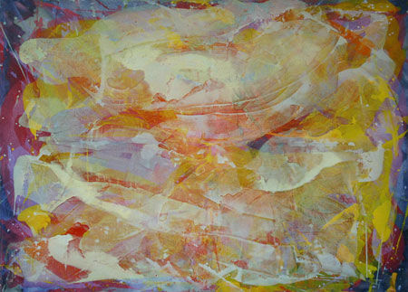
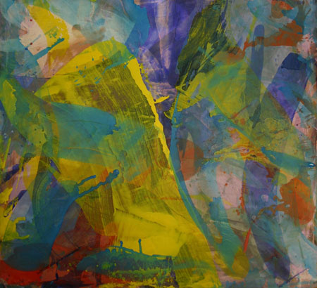
John Link: Precession, 2007, 59 x 67 inches, acrylic on canvas
John Link: Probably You, 2007, 51 x 43 inches, acrylic on canvas
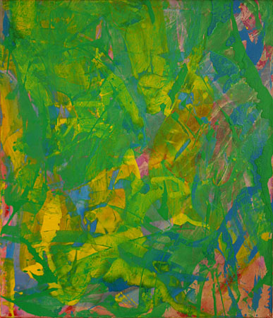
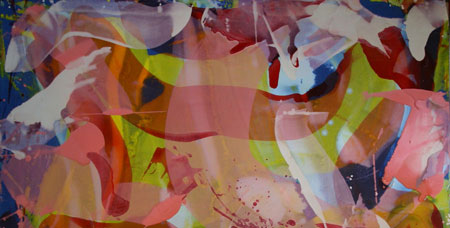
John Link: Color In Space, 2007, 75 x 60 inches, acrylic on canvas

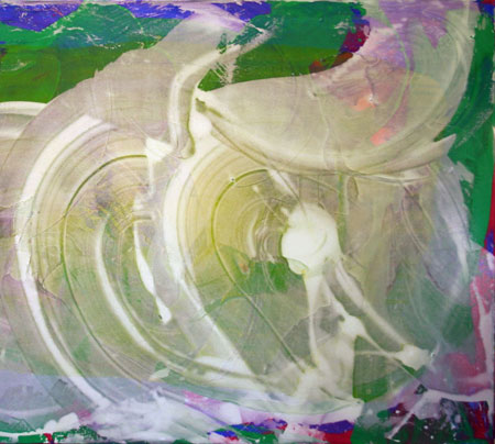
John Link: Saraband, 2008, 75 x 69 inches, acrylic on canvas
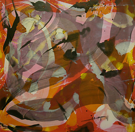
John Link: Battled Ground, 2008, 71 x 51 inches, acrylic on canvas
John Link: Insouciant Calico, 2008, 58 x 59 inches, acrylic on canvas
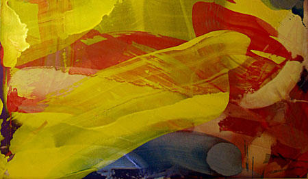
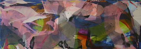
John Link: Day At The Circus, 2008, 39 x 76 inches, acrylic on canvas
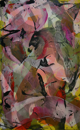
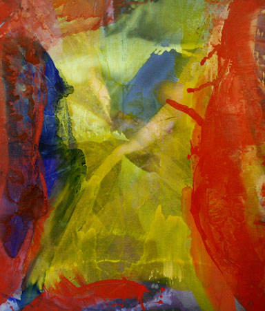
John Link: Color In Peril, 2008, 60 x 37 inches, acrylic on canvas
John Link: Color Squall, 2008, 25 x 74 inches, acrylic on canvas
John Link: Bouquet, 2008, 69 x 75 inches, acrylic on canvas
2.
May 19, 2008, 9:15 AM
Nice paintings, Mr. Link. Thanks for the post, Franklin.
This clearly puts the lie to Peter Schjeldahl's recent characterization of Colour-field painting as "a lackadaisical movement"... Quite to the contrary, these works are bursting with life, spirit, zest...
3.
May 19, 2008, 9:18 AM
This looks like a smashing show...have looked at the work on Link's site before...I'm liking the density in the 2008 works...the weave vs. piece tension getting pretty complex...pix like Color Squall and Circus have interesting shifts in intensity and I like how this and the darker value 'blips' and streaks set things off. They're all amply sized as well. Damn, I wish I could jet off to Michigan.
Beauty, pleasure, and a love of color. What more could a viewer ask for? Thanks for sharing some serious painting.
4.
May 19, 2008, 9:21 AM
Nicely put, MC.
5.
May 19, 2008, 11:07 AM
The picture I would most like to see, based upon the 18.5:1 scale image, is "Color Squall".
6.
May 19, 2008, 11:39 AM
I'm on our PC now with a different monitor and they all look much different. The color is even more lush. And the darks in Calico and Peril sit in the mix better. Good gravy this is lovely painting.
7.
May 19, 2008, 12:06 PM
Thanks Franklin for putting these up.
Ahab, Here is a larger JPEG of Color Squall.
Chris: Lazy Language has grown on me too. At one time I was going to trash it, but am glad I didn't. Precession looks better in JPEG than it really is.
Roy asks "what more could a viewer ask for?" I'm sure someone will come up with something. But that's OK; I'm taking orders.
To all who want to see them live, come on down (up, or over). The gallery they are in is the best one in the university's new exhibition facility. Not much more than walls, a floor, and lights in the ceiling ... very empty looking in itself.
MC: I didn't find anything about colour-field painting in Schjeldahl's article. What did I miss? Sounds like something he would say. though. But I did catch his assertion that AbEx was American art's "greatest generation". I have to wonder, then, why he (and his buddy critics of our own time) finds those who have directly used that tradition so wanting and those who ignore it so good? Does he reject rococo because it grabbed stuff from baroque?
8.
May 19, 2008, 12:17 PM
Roy, most of the color is "out of the tube" (or can of dry pigment). The mixing, if it takes place, is due to looking through multiple layers of transparent paint.
The medium is indeed "acrylic" but not what most people mean by acrylic - which is waterborne acrylic. Instead this is acrylic resin dissolved in turps, with a dash of alkyd resin thrown in to stabilize it so the next layers of paint do not re-dissolve it. Thus it does not muddle up like repeated layers of watercolor can. This stuff does not yellow either, like oil, and a glass of it looks like a glass of water, it is that clear, thus preserving the intensity of the pigment. Also, because it is clear when wet, there is no "pastel effect" like you get with waterborne acrylic, where you must let a glaze dry before you see what you have. It is WYSIWYG to the core.
9.
May 19, 2008, 12:23 PM
Okay, I'm a bit of a materials nut, so bear with me as I as vaguely technical questions.
John, what is this acrylic resin you start with? How is it made and where do you get it? When you dissolve it in turps, do you mean literal turpentine, or some kind of OMS? How much alkyd resin are you using and how does it stabilize the paint?
10.
May 19, 2008, 12:57 PM
Chris, I get the basic material from Golden Paint. They call it MSA. Originally I got it from Leonard Bocour, who called it Magna. It came out before waterborne acrylic came out.
It is NOT a drying oil, that is it does not oxidize. It drys when the solvent evaporates, but remains susceptible to being re-dissolved if solvent is reintroduced.
It will dissolve in both mineral spirits and turps. I use turps because it is twice as "hot" as mineral spirits, that is, for a given ratio of solvent to resin, the mix with turps flows out much thinner. Some mineral spirit formulas will cause it to thicken, even, and others create reticulation. I also like the smell of turps and the fact it comes from trees instead of oil. Mainly, though, I like its power to cut.
Alkyd resin also has a great smell - like butterscotch, I used to tell my students as I inhaled deeply from a bottle of the stuff. (So one of my students brought me some Petowsky famous butterscotch fudge and said it was really alkyd fudge.) You can add up to 25% alkyd resin without messing up the chemistry of MSA. I add about 5%. Because alkyd is chemically altered linseed oil, once it dries it is not susceptible to attack from turps, and thus adds stability to a layer that otherwise would mix up into the next one, especially layers that are loaded with as much turps as I use. It is also extremely sticky, which might improve adhesion.
Pure MSA is a great final varnish for both waterborne acrylic and oil paintings. I use the version that includes UV protection, for added durability of my saturations. MSA does not attack canvas, like oil does as it oxidizes. Alkyd is supposedly safe for unsized canvas too, but I'm not so sure. Whatever, I sized all the pictures in the show with rabbit skin glue. I have some GAC 100 "pure" acrylic that I'm trying out. May wind up mixing GAC 100 with rabbit skin while it is in the heating pot, because rabbit skin, for all its shortcomings, makes the canvas tight and lets the paint slide easily across the sized surface. GAC 100 is not a protein and therefore does not encourage mold. I stained most of these paintings with thin waterborne acrylic before the sizing - carbon black, cadmium red, napthol red, cadmium yellow, or ultramarine blue (sometimes dioxine purple too - Lazy Language, for instance). I like a color buzz to get me started.
11.
May 19, 2008, 1:56 PM
Whew! Thanks for the technical details.
I guess you like your turpentine. I don't like it because of how ridiculously toxic it is. I'm familiar with alkyd resins since I use Gamblin products, but I've never known them to smell like butterscotch. Gamblin is always trying to eliminate any kind of vapor, though, so maybe their alkyds have fewer aromatic compounds.
I use rabbit skin glue, although I'd rather not. But I've been painting on wood panels, so my ground is a traditional gesso -- rabbit skin glue and powdered marble. I'd like to find a replacement for the glue that's less hygroscopic but I haven't been able to.
Reading about MSA on Golden's site, I'd say the stuff sounds pretty evil (chemically speaking). The results look excellent, though -- I can see how your unusual media adds to your work.
12.
May 19, 2008, 2:03 PM
MC: I didn't find anything about colour-field painting in Schjeldahl's article. What did I miss?"
Page Two...
13.
May 19, 2008, 2:20 PM
Further research indicates that this isn't unusual media at all, especially for color field painters.
14.
May 19, 2008, 2:29 PM
How could I not like these!
15.
May 19, 2008, 3:08 PM
Excellent pictures. I'd go for CALICO for now. It is very 'clean", has a nice illusion of depth for the colors to fly about it and the colors themselves have a good range of value and intensity and stay out of each other's way.
I have noticed in Link's paintings that when he interposes a strong graphic form, like the circular forms in PRECESSION, it gets a real grip on the color.
Anyway, onwards and upwards with "New Modernism"!
16.
May 19, 2008, 3:24 PM
How about good old Neo-Classicism?
17.
May 19, 2008, 3:32 PM
Page 2 exists, thank you MC ... and drove home that Schjeldahl's essay was more about the two critics than the art in the show. All in all, that seems suitable if not agreeable. If you must write, why not write about people who write? Or wrote? At least you don't get twisted in cross media. He is kind of long on words and short on seeing anyway. But the opening sentence flies against common sense - that the show is more an essay than an art exhibition - when it assembles work by Pollock, de Kooning, Newman, Rothko, Still, Mitchell, Frankenthaler, Johns, Stella, Gorky, and so on. That's twisted. Why doesn't he just say he'd rather write about writers than painters and get on with it.
Ed Moses: I'd say the same thing about your pictures.
Chris: Liquin, the Windsor Newton version of alkyd resin, smells more like butterscotch than Gamblin's version. As you say, Robert is at war with the way things smell. The toxicity of artist's materials is greatly exaggerated, if you ask me. I use rather large quantities at a time (for an artist), but compared to the methods used in industry, my exposure is quite limited. The safety warnings assume that you are exposed 40 hours a week in large quantities. Generally speaking, I leave the studio soon after a big pour. It needs to dry before I can continue anyway. But I respect those who seek to reduce their exposure to as near zero as possible.
18.
May 19, 2008, 3:56 PM
Opie, Precession just didn't seem that good to me when I last looked at it. FLOAT seems to do the graphic thing better by intertwining it with the rest of the paint, for instance. Maybe I'm reticent because Precession is titled after modern bowling ball motion. Maybe I need to look again.
19.
May 19, 2008, 4:25 PM
John, your color work still makes me swoon, and I love it. I get a little light-headed when I look at these paintings and wish-to-hell you would Go West, Old Man and have an exhibition of those superior Chromactions here in L.A.
Keep 'em coming!
Paul Ruscha
20.
May 19, 2008, 4:46 PM
Actually, precession is a term from physics. I like the term because Bucky Fuller, one of my favorite thinkers, chose it to describe the directions in which Nature works. For example, he liked to cite the honeybee, which flies around picking up nectar for its hive. But the effect is that the bee pollinates thousands of flowers. The bee's focus on nectar-collecting has effects at an angle from its intent -- that's precession.
The point is, it's not just bowling balls.
As far as toxicity goes, well, certainly Robert Gamblin is slightly insane, and I suppose to sell their products they might exaggerate the toxicity of turpentine. Then again, you say you like that turps come from trees, when your acrylics are a major industrial petroleum product! Setting aside toxicity, though, I worry about spontaneous combustion, too. Mainly because I'm really disorganized and lazy and would probably blow myself up.
Hey, if it works for you, it works for you. Can't argue with that.
When are you going to have work in New York City?
21.
May 19, 2008, 5:06 PM
Mssrs. Link, Moses, Ruscha: Have you seen James Lecce's work? I think it'd be up your collective alleys. I sure liked it when I saw it.
22.
May 19, 2008, 5:10 PM
James Lecce's work looks quite bad. None of the finesse of Link!
23.
May 19, 2008, 5:52 PM
Chris: Have not seen James Lecce before, but thanks for the URL. He has some ways of imposing "form" over the top of his pictures that are worth "borrowing" - a la opie's comment in #15. I could do without all those eyeballs, though. They take a lot of control, and he might be advantaged if he gave up some of the control along with them. But it is a provocative go at tight painterliness.
About work in NYC: I don't have any idea. As Franklin said last week, I'm someone that "you may never have heard of". Not that NYC itself doesn't have a few you-never-heard-of-them too.
24.
May 19, 2008, 5:54 PM
there is no doubting the beauty of some of these works. mainly, "color squall" and "a day at the circus". "probably you" is my least favorite.
i remember the first time i saw an Olitski painting: a huge orange/pink mist of a thing (of the like i have not seen since). and my first Poons: a heavily encrusted mass of dense color. I was taken aback, blown away, one big "wow!" i think part of the reasons i was so struck was that i had never had such a visual experience before. and i gather these pictures from the 70's seemed pretty radical at the time.
Link's pictures seem to follow a convention. a good way to make a good painting if you do it long enough. but there is no surprise.
Link's work makes me think of the salon that Manet was facing. This approach to painting has been around for a while.
have we run out of options?
25.
May 19, 2008, 5:55 PM
Chris: MSA is not a drying oil, nor does it oxidize. Thus it cannot "spontaneously combust". Alkyd can, though. You are right that I owe a lot to the petroleum products industry.
26.
May 19, 2008, 6:08 PM
swimmer: Yes my approach to painting has been around for a while. So was Manet's.
27.
May 19, 2008, 6:23 PM
Seeing these images this morning was energizing--a welcome charge on a Monday after a subpar weekend. Very good stuff, Mr. Link. Wish I could see them in person, like everyone else.
Apart from the color per se, which is enough of a treat, I like the transparencies, the sharpness/cleanness of the contours, the clarity of definition, the apparent lightness or fineness of the layers despite the chromatic richness/intensity, the elegance of the overall effect. I suppose a case could be made for this being a "purified" form of AbEx. I'm tempted to say "pasteurized," except that would carry an unintended negative connotation, but maybe I'm responding to the sense that everything seems to be mixed with very pure milk (at least in reproduction).
Of course, it is all resolutely out-of-it, which is no doubt one reason it's such a pleasure to see. Congratulations.
28.
May 19, 2008, 6:38 PM
Neither oxidation nor the chemistry of a drying oil are necessary for spontaneous combustion; all you need is a reaction which generates enough heat. A big enough pile of wet hay can spontaneously combust. No, I was just thinking of the turpentine, which can and does spontaneously combust, usually if you crumple up enough wet rags and drop them in a garbage can. Which is what I'd probably do, without thinking, and whoosh! There'd go my house.
Then again, assuming the family wasn't in it at the time, I don't think I'd miss much if my house burned down. I can always do the paintings again (assuming they'd be worth it).
29.
May 19, 2008, 6:56 PM
Link has a point, swimmer. The later Academy's refined, polished handling of detail can be looked at as a "new development", an "exploration of the limits of oil paint", a "going beyond conventional limitations", if you like that kind of terminology. It worked better for Ingres than Bougerueau, for instance, but they both (and others) had a legitimate claim to "newness".
Manet, on the other hand, robbed the renaissance for his "innovations" re: subject matter. His famous use of the nude woman in LUNCHEON was borrowed from PASTORAL CONCERT. And the pose for OLYMPIA comes from Titian's VENUS. Also, Manet's coarser handling of paint was more from the past than participating in the then contemporary refinements of the Academy. Interestingly, Manet wanted to show with the Academy and did.
Having roots in the past does not guarantee anything in itself, but it is fairly certain that art with no roots will not succeed. Art does not come from nowhere. At least not anymore.
30.
May 19, 2008, 7:12 PM
Chris: wet hay can combust precisely because it IS oxidizing and trapping the heat that is generated by that process. MSA, on the other hand, dries by evaporation which is cooling, not heating. But you are right, any chemical reaction that creates heat can give rise to fire.
The safety officer at WMU, who used to gripe at the students for using rags to pull oil paint off brushes when they changed colors, herself did just what you say with her garbage can at home. She was refinishing furniture with oil and threw the rags in her garbage can and it caught fire. It didn't take many. Another friend crumpled exactly three rags saturated with linseed oil in the open, on a table outside on his porch, and burned his house severely before he could get it out. Without a fire alarm that went off, it might have gone down completely. The stuff is nothing to fool around with. Because there is a small percentage of alkyd in my mix and because all the chemicals in it are very flammable, I spread every rag and paper towel out carefully and separated from all others, until the paint dries. Then I discard.
I know what you mean about wondering whether your paintings are "worth it". I've destroyed many of mine. Often times correctly, too.
31.
May 19, 2008, 7:20 PM
Purified AbEx: that's an interesting characterization, Jack. They are a little rougher in the flesh, than in JPEG, I think. The roughest looking are Space, Saraband, and Bouquet. But they all go down very smoothly. The effect of the room-full is a lot of pretty color, even if some of the surfaces are a little tortured.
Myself, I would rather have my milk pasteurized than raw.
32.
May 19, 2008, 7:47 PM
Nobody asked for it, but the challenge of finding words that respond to each of these is something I can't resist.
"Lazy Language" reminds me of the '06 ECAS entry (which was situated near my own contribution to the show that year): a simple arrangement of primary sweeps, relative to these others.
"Precession" is striking, but I'd like those thinnest areas of spooge to be even thinner, allowing underlying colours to punch through a little stronger - opie's comment regarding colour-grip notwithstanding.
Saw "Probably You" last fall, and it occurs to me that it sorta seems like looking at the backside of one of your others painted on plexi. It's as though the green that appears on top were actually the underpainting, somehow. I don't like it.
"Color in Space" is reminiscent of the '05 ECAS piece, which I remember thinking at the time could've/should've been two paintings. I like the sense of vertigo I get staring into this one.
I'm indifferent to "Saraband".
"Battled Ground" delivers a strongly bordered effect, and I think I generally prefer those paintings of the group that are more nearly all-over.
I'm tempted to like "Insouciant Calico", but in the end though attracted to its southwestern colour scheme find myself putoff by the way the white acts as antacid neutralizing its spiciness.
I don't like "Day at the Circus", but only because the clown smiling behind the veil creeps me out.
The change in mark-making, the black splatters and their relative reduction in scale of "Color in Peril" mark this painting as least like the others. Figures emerge and give it an automatist's surreal feel.
As confirmed by the 9:1 digimage I like "Color Squall" best, I think it likely is the best. It totally fulfills Jack's great comment: Apart from the color per se, which is enough of a treat, I like the transparencies, the sharpness/cleanness of the contours, the clarity of definition, the apparent lightness or fineness of the layers despite the chromatic richness/intensity, the elegance of the overall effect. Though I would wish to change the spelling of 'Color'.
"Bouquet" is very good, too. However it just doesn't match, for me, the potency of "Color Squall".
33.
May 19, 2008, 8:51 PM
About Color Squall: That picture has an odd history in the studio. Originally it was part of Day At The Circus, almost half of it. But I decided that the 30 inches of canvas it once occupied was unnecessary and cut it off DAY. Then I flipped DAY and DAY was finished.
The 30 inches, by themselves, had too much "air" and so I painted more one it, trimmed it back to 25", and came in on the picture a couple of inches on one end - now I had what I call a "twofer". Two paintings where the had once been just one. The birth of Color Squall.
I had taken a casual, somewhat unevenly exposed snapshot of the whole deal before I did the cutting. After I was finished I began to have regrets, and still do, every time I look at that snapshot.
To stoke the conversation about these pictures I have uploaded the snapshot of THE WHOLE THING to Flicker, if you want to see it. I often think I should have just left the picture alone, despite its being somewhat Kenny Scharf like. The Kenny Scharf thing might be why I got so nervous around the thing. But nervous is not always bad.
So ahab, do you think I should have refrained from the "cut and continue", or are you still satisfied with SQUALL? All I can say is it did not turn out too badly, but I wish I had looked a little longer before taking the knife to it.
Bouquet went through a similar process and I have no regrets about it whatsoever.
Color in Peril is the best one, as far as I am concerned. It came very quickly, though there was a fairly intense struggle at the very end to keep it from turning into a mess.
Thanks for your other comments too.
34.
May 19, 2008, 8:55 PM
"Color In Peril"
35.
May 19, 2008, 9:05 PM
& " Insouciant Calico"
36.
May 19, 2008, 9:13 PM
The space is more open in those two, it's like you're in the space instead of looking at it, has something to do with the dispersion of the black areas.
37.
May 19, 2008, 9:46 PM
Hi George. The black, which is actually ground up graphite dust, transformed both those paintings from flaccid pastelish doodles to a complicated, but crisp space full of pretty color that twisted here and there to form variations of itself. My plan for CALICO was to wrestle with it for a long time, but after the graphite I said to myself "what have I done?" I never touched it again.There isn't much paint on it, but there is a lot of space because the very limited palette forms quite a few different colors where they cross. You've got to look underneath the graphite to see a lot of this stuff.
38.
May 19, 2008, 10:03 PM
40.
May 20, 2008, 3:00 AM
Good grief, George and I agree!
These pictures must have magical powers!
41.
May 20, 2008, 4:18 AM
Good morning swimmer. I forgot to respond to your question about running out of options. We never run out of options.
Kaprow's essay shortly after the death of Pollock, about how Pollock took painting to its own burial ground, was romantic, very appealing, and reflected the loss many felt not just about Pollock's premature death, but also the vacuum created by the clear decline in Pollock's work which preceded his death.
Pollock, more than any other AbExer, is treacherous to quote. If you grab too much you wind up looking like a Pollock junior. Yet there is stuff there for the grabbing as George observed. I still love Kaprow's essay, even though it was seriously wrong.
Unlocking that which seems sealed in the past fertilizes the present and opens up "options" rather than closes them off.
Just as Aristotle talked about a "first cause" there may be such a thing as "first art". The Venus of Willendorf could be such a work. The earliest image in the cave at Lascaux could be another. Or perhaps there were sources primary to them that played the role of "first art". But it is too late to be first now. We are part of a tradition in which the best is handed from one generation of artists to another not by art historians, but by the artists themselves. Transformed a bit, yes, of course. But still full of the life that a purely historical perspective cannot convey.
42.
May 20, 2008, 4:24 AM
Holy courageous, John, cutting paintings apart!
43.
May 20, 2008, 4:36 AM
Yes Chris, the box knife is one of my most useful tools. A white Lennox trimmed in brass that quickly loads a new blade is my fave. The cutting edge of the blade itself is also trimmed in brass. It has a supple curved handle that feels just right in the hand.
44.
May 20, 2008, 4:37 AM
From the Jewish Museum exhibition Action/Abstraction (www.jewishmuseum.org)
Details: Jackson Pollock
Convergence, 1952
Oil on Canvas
93 1/2 x 155 in.
This painting is 13 feet wide and can't be comprehended from a jpeg.
45.
May 20, 2008, 5:18 AM
"Yet there is stuff there for the grabbing as George observed."
Well, not exactly. The drip paintings were the end of the line, Pollock knew it and was looking for a way out when he died.
The problem I was addressing is space, finding a painting space to work in. A working space which acknowledges the paint as material, but does not close up and flatten out. The working space will shape what's inside it, and visa-versa. The problem is that the forms might coalesce into something recognizable and we wouldn't want that, would we?
46.
May 20, 2008, 5:30 AM
Well, back to the usual, George. Re your final sentence, none of us "New Modernists" have anything against recognizable imagery. Not as far as I know, anyway. I find it in my painting all the time, and if I thought it gave me a leg up I would grab it in a minute.
47.
May 20, 2008, 5:48 AM
John, email me if you have further comments.
48.
May 20, 2008, 5:49 AM
George, the drip paintings may have been the end of the line for Pollock, but they were not the end absolutely - nothing is as far as I can tell. Like anything else, they can and should be used. Convergence is not a classical drip painting anyway. There is a some puddling and messing around, particularly in the color saturated areas. The black is playing a different role than it did in the first all-overs.
When Pollock died he was not looking for much else than another drink and someone to have it with. He was down to a couple of pictures a year, I think, if you want to put a metric on it. Historians tell us painting was still very much on his mind, but he wasn't doing much in the studio.
Were you going tongue in cheek with your last sentence? For some reason it feels like you were.
49.
May 20, 2008, 5:53 AM
George you use juxtaposition in your paintings and recognizable imagery.
John sorry if this fills you with regret all over again but I love "Day At The Circus" in its pre-mutilated state. The splatter of red towards the center is really powerful.
50.
May 20, 2008, 6:15 AM
It might have been a case of thinking too much, Eric. What was to become the SQUALL portion of the canvas could not survive on its own, but the other side could. Ergo, cut it off. But one part of a picture being dependent upon another is not intrinsically bad. Nor is a Kenny Scharf influence.
Studio life is full of errors. I still go back and forth about whether this was one of them.
51.
May 20, 2008, 7:01 AM
Do you come up with your titles by free association while you look at the finished painting?
52.
May 20, 2008, 7:10 AM
Ahab, you do know, of course, that "color" is the American English spelling of the British/Canadian "colour," barbaric though it may seem.
53.
May 20, 2008, 7:14 AM
As for the Kenny Scharf thing, it's tenuous at best. Certainly the essence of Scharf, such as it most regrettably is, is thankfully nowhere in evidence.
54.
May 20, 2008, 7:17 AM
How about this:
Layers of transparent silk drenched in colored milk?
55.
May 20, 2008, 8:11 AM
Chris, often I seek help for titles. I also keep a list of weird words that I use to stimulate. Other times it is from looking at the picture or from its studio history.
LANGUAGE was a result of my conviction the picture had no narrative.
PRECESSION has to do with the overlay, which vaguely resembles a bowling ball giving up its side rotation and wobble as it rolls out and maxes its grip on the lane just before striking the pins.
PROBABLY was from my list.
SPACE was because there is some deep space in the picture.
SARABAND was from a helper and the fact the central gesture looks like it is dancing.
BATTLED is because it was a battle.
CALICO was from two helpers combined.
DAY was thanks to a helper.
PERIL was because it rapidly went from being a tepid doodle to almost a mess.
SQUALL was from the look of it, as was BOUQUET.
56.
May 20, 2008, 8:19 AM
Somehow I could tell "Color Squall" and "Circus" belonged together, but because I couldn't make a case for how I didn't comment on it.
Yes, for me, "Color Squall" survives. The thick wormy noodles (clown smile) that bother me in "Day at the Circus" are just as irksome to me in "The Whole Thing".
Because of george and opie's comments I'm looking again at "Insouciant Calico" and "Color in Peril". I think I think (sic) that the graphite black knocks out the subtle veils of colour, while the skimmed-milk white has seeped a little far and wide. It's the unequally yoked black and white that leave me worried.
The whole batch is really quite good. Where's the old-timey sex and stuff?
57.
May 20, 2008, 8:41 AM
ahab,
As catfish has observed, sex is everywhere.
Yes, the "squall" in COLOR SQUALL put the hurt on Scharf's worms.
PERIL is still the one that is going into my living room. I don't really see any problem with the white-ish parts or what unequally yoked even means.
58.
May 20, 2008, 8:58 AM
John,
I also like most of these. Would you say that there are any explicit ideas or themes that are central to any of them?
59.
May 20, 2008, 9:03 AM
Thanks Clem. The only idea is to paint like there is no tomorrow, because there may not be. The methods, though, are complex and have been touched upon above. Some are technical, others, like taking stuff from other artists, are cultural.
60.
May 20, 2008, 9:04 AM
I'd say the theme is SQUEEGEES RULE!
61.
May 20, 2008, 9:06 AM
I never use a squeegee Chris. But things like that - old pieces of framing, trowels, spatulas, paper towels, to name a few. But I have never owned a squeegee. Maybe I ought to.
62.
May 20, 2008, 9:10 AM
Thanks for the reply John,
I guess I'm more interested in any of the ideas/themes of the individual works themselves. Is it your intention to communicate with an audience?
63.
May 20, 2008, 9:16 AM
brushes are good ;-)
64.
May 20, 2008, 9:25 AM
This is a pretty good run-down of some of the more "explicit" themes:
"color... transparencies... sharpness/cleanness of the contours... clarity of definition... the apparent lightness or fineness of the layers despite the chromatic richness/intensity... elegance of the overall effect."
Thanks, Jack...
65.
May 20, 2008, 9:38 AM
Don't mention it, MC.
66.
May 20, 2008, 9:54 AM
Re the figuration issue, sort of:
Saraband could represent the tail of a pink Moby Dick diving into a sea of cadmium yellow.
There, is that better now?
If anyone doesn't believe me, ask Ahab. He should know.
67.
May 20, 2008, 10:03 AM
'The only idea is to paint like there is no tomorrow, because there may not be.'
That's right new mods. Ain't nothin' to it, but to do it.
68.
May 20, 2008, 10:06 AM
Re the sex issue, sort of:
Color in Space could be seen as the abstract, Technicolor version of Courbet's L'Origine du Monde.
If anyone doubts that, ask Georgia O'Keeffe.
69.
May 20, 2008, 10:14 AM
unequally yoked black and white
I'm not sure I can provide a cogent argument, so I'll try to say it another way:
The use of blackest black and whitest white necessarily sets up the highest degree of overall contrast. Yet the blacks and the whites do different tasks (fine detail vs. fine glaze) and, in my opinion, pull the picture in different directions.
70.
May 20, 2008, 10:17 AM
But seriously, folks, I see a definite difference between the 4 images from Calico through Squall and the rest of the group shown. Those 4 are tighter, more controlled, more linear, more orchestrated and less gestural. They're more patterned, less organic, and also, dare I say it, more tasteful (make of that what you will). I'm not implying one approach is necessarily better or worse, but they are different approaches.
Apologies to anyone who thinks I'm merely stating the obvious.
71.
May 20, 2008, 10:39 AM
These paintings are sexy enough, for sure. My insolent question about "old-timey sex" was intended as an oblique poke at jello-lurkers, and seems to have gotten them jiggling.
72.
May 20, 2008, 10:44 AM
Jack's 66:
I'm afraid I already claimed indifference to "Saraband", so y'all'll have to make up your own minds about its Moby Dickishness.
73.
May 20, 2008, 12:28 PM
Jack, re: 70...
I also make a distinction btwn the 2008 (except the last one) work and the other stuff. To my eye the structure is a little more overt in the 2008 pictures and they seem to benefit. Incidentally, Calico was my first pick of the bunch, but the darks looked maybe a bit too dark on my laptop. On our other monitor they sat fine where I'm sure the contrast was closer to the original.
Also...I was wondering whether fl*ckr could function as a decent place to upload images in lieu of a website and I see that it's already getting plenty of use. Thanks again for sharing folks. Looks pretty straightforward to use too. Excellent.
74.
May 20, 2008, 12:33 PM
I'm with you, Jack. The first ones are wetter (you say Georgia O'Keefe, I say Andreas Serrano).. the last ones call to mind a cut-tissue paper collage, whereas the first ones are paint, for sure...
75.
May 20, 2008, 2:32 PM
re: fl*ckr
I thought this set up looked pretty straightforward but then I just found a 'help' thread where Bannard seems to be having some trouble getting images to upload off his mac. I am probably as computer literate as a rock, so maybe John or Darby or anybody else...does this thing actually work well enough to spend the money on?
76.
May 20, 2008, 2:48 PM
Let me try it again. Can in fact someone react to your work as the salon of today as Manet did to it at his time. As a convention to make "pretty" work?
77.
May 20, 2008, 2:50 PM
Calico is growing on me big time.
I probably wouldn't have chopped Day. Oh well...
78.
May 20, 2008, 3:10 PM
Thorn: if you think "pretty painting" is today's version of "salon painting" you really need to get out there and see what has been going on for the last 30 years.
79.
May 20, 2008, 3:18 PM
Roy: My thinking as I struggled with Flickr was why the hell did Yahoo pay a lot of money to buy a site that is supposed to simply allow you to post pictures but which is in fact one of the most overcomplicated, impractical, user-unfriendly sites imaginable. I can't even put a simple headline over my paintings! And look at the hundreds of people posting daily HELP inquiries (including me).
However, as I understand it, the others are worse.
BLOGSPOT is a good example of a really intelligently worked-out do-it-yourself website. You can post photos on it, but the problem is it is set up to be for bloggers, not photo posters.
80.
May 20, 2008, 3:30 PM
Re: 76
Er, please try again.
81.
May 20, 2008, 3:35 PM
Quite a few people with more visually-inclined content have been using TUMLR(.com) of late.
Franklin, the comments are closed (and a time-limit doesn't seem like such a bad thing, this being a blog and not a message-board). This also hardly seems like the post to keep our particular argument going in. As I mentioned, I do like these samples of Link's work and don't want to get too far off focus. Should I just stay tuned for continued manifestations of NewMo?
82.
May 20, 2008, 3:35 PM
your question is poorly phrased, no one knows what you mean.
83.
May 20, 2008, 3:39 PM
Clem, thanks for your consideration. One week typically has been enough to get through a conversation in the past, but we've never hit 348. The danger is that older posts turn into spam traps, but now that I have some spam filtering in place, I might let it back out to two weeks. In the meantime, stay tuned. Maybe I'll start something newmo-related this evening...
84.
May 20, 2008, 3:47 PM
My oh my, took a trip and a ton of questions and issues popped up.
I'll go down the list as best I can.
Clem (#62): I primarily communicate with my audience aesthetically. That is, I seek to click their clickers. But there is no reason that abstract work could not get involved in "themes". Some viewers, like ahab seeing a clown's smile in DAY, go pretty far with it. Others experience it more vaguely. The title of DAY points to subject matter that is a part of that picture, even if it is not primary subject matter and was not "intended" apriori as in I'm going to paint a circus picture. But anyone who loves color like I do ... the circus is part of our purview. MC's #64 states truths, I think, and none of them rule out the circus as possible subject matter, even if it is remote and not explicit. Abstract music (no lyrics) certainly conveys thematic subjects - no reason abstract art can't either.
george (#63): I use brushes to apply the size and the initial stains. Forgot that.
ahab (#69): my working characterization of a great painting is one that wants to break apart but does not, one that tries to split, but does not, without any compelling explanation why it did not. "Pulling the picture in different directions" is a good sign to me, and that is exactly what I asked myself about when I took CALICO off its back. Neither the black nor the whites are that "pure" in that picture, but they tend to look that way anyway. Even a picture that is all about color benefits immensely from value contrast. It is hard to include copious value contrast and keep color spiking up at the same time.
Jack (#70) and others: You are absolutely right. The 4 pictures Jack references are the last four I completed before the show. Interestingly, when you walk into the show room, there is a distinct chemical odor from the various ingredients attached to the various canvases, most of which are but a few months old. I liken it to the smell of a new car. Robert Gamblin would liken it to the smell of smog.
roy (#73/75): Flickr is far from perfect. But I can upload and set up more pix in an hour there than I can code into a web site in several weeks. WBannard has a much different view, as you note in #75. You do not have to pay a cent to use it. The main limit is that you can only have 3 "sets". It sure was a handy place to put up the pre-digested DAY to explain my regrets ...
thorn in your side (#76): no, the salon of today does not readily accept pretty work. So, given that my stuff is pretty and I think it is, setting it up as the straw man that today's anti-salon art kicker can kick, doesn't ring true. In fact, pretty work is on the rebellious, unconventional side, as far as what's in control of seriously regarded art these days goes.
Franklin (#77); Sigh, neither would I. What's done is done, though.
About computer monitors: Dell's 30" job is the one I use. If you have $1200 or so to spare, it is a whole lot of bang for the buck.
85.
May 20, 2008, 4:15 PM
Roy: re Flickr, pleased be advised that John is extremely computer-adept, and I am more or less on your level. I was pestering him with questions all through the process.
86.
May 20, 2008, 6:12 PM
Perhaps Mr. Bannard would like a custom site for his uploading. Just saying. Because there are those of us who do that kind of thing.
87.
May 20, 2008, 6:55 PM
Well, what can I say. I like "Color Squall" best.
88.
May 20, 2008, 7:25 PM
Ahab: Then I will rename it COLOUR SQUALL in honor of you.
89.
May 20, 2008, 7:26 PM
from the photos on this artblog page i would probably fall in line in most part with the others and put calico and color squall at the top. DAY as originally composed would probably come out on top if it had not been cut. Day in that original form made me think of when greenberg said something along the lines of .."that somebody would really be on to something when they could put pink next to yellow".
all of the picks do have redeeming qualities though. saraband, while not complete and refined as some of the later pics, does show a nice recklessness and roughness with the application of the yellow. and that pink/white ghost swoosh up the middle works for me too.
i don't like the fact that color in space makes me think of jenkins.
as ed moses noted i can see why he would like all these pics.
among others, your pics as noted also tie in with pollock as well as frankenthaler, and in a strange way bannard and dzubas too.
color in peril is nice and complete. the black drawing and accents are very strong here. background color is a little muddy.
looking over on the flckr link i was surprised to see that you had 2 (39 x 53 and 49 x 56 )other very nice 2008 pics that i guess did not make the cut. they seem to hang with the other 2nd or maybe even 1st tier from the artblog page.
of the older pics on flckr i really like 1993 bloom. if that writer we were talking about the other day found this in a garage he would think it was one of the better frankenthalers he had seen. jacks 1997 seem like a close transition from bloom and is also very nice.
after the rain and sidewave were cool too.
90.
May 20, 2008, 7:34 PM
In no particular order, the best three are:
"Lazy Language," "Calico" and "Color in Peril."
I sort of want to make the latter horizontal; the slender vertical format vaguely bothers me here. I also see visual echoes of cave painting in it, especially if it's rotated 90 degrees clockwise; the black forms suggest animals.
Calico is probably the best constructed or most "well-made" picture of the group. It's like a floating collage, with very effective placement and balance of the different color areas (and the color is more interesting, if less lyrical, than in Peril).
Lazy Language is hard to resist; it is both sharp and sensual. The blue-gray passage at mid bottom (and to a lesser extent the right lower corner) is absolutely crucial to the picture. It's sort of like a marriage between Frankenthaler and Hofmann--and the union is a fruitful one.
91.
May 20, 2008, 7:39 PM
Consider me honoured.
92.
May 20, 2008, 7:41 PM
"that somebody would really be on to something when they could put pink next to yellow".
I can't believe you said that ;-)
93.
May 20, 2008, 7:54 PM
As usual, George, I don't know what you are driving at, but understand that "could" means "and make it work".
94.
May 20, 2008, 8:02 PM
op, just goes to show ya...
for the last 6 hours I've been working on my 2nd painting with a pink and yellow color scheme, I just thought it was a funny coincidence, that’s all.
95.
May 20, 2008, 9:38 PM
I think Graham Peacock has made some pretty nutso pink and yellow pix in his time.
96.
May 21, 2008, 5:31 AM
1 said: "looking over on the flckr link i was surprised to see that you had 2 (39 x 53 and 49 x 56 )other very nice 2008 pics that i guess did not make the cut."
The show opened April 3. The two pictures you saw on Flicer without titles were painted after that date - UNTITLED 39x53 and UNTITLED 49x56. There is not enough room in the Kerr Gallery to have added them anyway.
At one time I thought seriously about trashing BLOOM, but I soon saw what a grave mistake that would be, thanks in part to a comment Darby Bannard made about the picture. Now I am reluctant to part with it, even, but would, of course, under the right circumstance. (I'll part with anything, under the right circumstances.)
JACKS is in a peculiar circumstance that might appeal to Clem and others who favor the presence of subject matter and/or themes. It is owned by someone who is not allowed to display it because the women in his family insist it is a celebration of one or more penises.
97.
May 21, 2008, 5:54 AM
Finishing up with 1's comment:
AFTER THE RAIN is a large watercolor I made in my first painting class, using thin acrylic rather than traditional watercolor on a slick surfaced Strathmore cold press paper that traditional watercolor could not stick on.
SIDE WAVES was a response to visiting the studios of Susan Roth and Darryl Hughto, after Clement Greenberg introduced me to them. They were very generous to spend a day showing their stuff to me, feeding me, and putting me up overnight before I continued on. Clem did not like the two semi-circles in the lower right corner, BTW. I subsequently trashed the picture, sensitive soul that I am. I think we were both mistaken and wish I had the picture back from the dump. The two semi-circles were my first shot at the "overlay of graphic form" that opie commented on in #15 that is a feature of PRECESSION.
98.
May 21, 2008, 6:17 AM
Wow. I love the paintings your provide links for in #96 and #97.
99.
May 21, 2008, 6:44 AM
#97 those two look awfully good. I hope AFTER THE RAIN (good title) is truly large - a picture like that looks better the larger it gets.
100.
May 21, 2008, 6:50 AM
I have to disagree with Clem about the semicircles. They spark the picture.
I have a graduate student who is painting large painterly abstract pictues and he puts discordant elements like that in all the time, and they work. I think this is something we can learn from the (mostly not very good) paintings of the 80s. Sometimes a "contrary" element pushes the painting harder. Its like scratching an itch. It is also not unlike Jules's "extra" touches along the edge, or the cracks in the late pix.
101.
May 21, 2008, 6:55 AM
AFTER THE RAIN is 28" x 38", done on a sheet of 30x40 paper stretched on a masonite panel that was braced to resist the tension from the paper as it shrunk. Large for a watercolor, but not that large as paintings go. The title was inspired by the way color looks dull but nonetheless intense right after a long slow rain when it gets steamy, as it would in Oklahoma.
102.
May 21, 2008, 7:22 AM
WHAT?! You threw away "Side Waves"? That's one I'd have kept. And talk about pictures that successfully house opposing forces, well...
Non-extant is a mournful word.
103.
May 21, 2008, 7:55 AM
opie (#100): There was not a damn thing wrong with SIDE WAVES, may it rest in peace. It was one of the first pictures I did that "seemed" to want to break up, but didn't.
Clem, BTW, did not say to destroy it; that was my doing. I just pulled out the letter from him and he was actually very positive, except for the semi-circles: "As you know, I don't trust slides, but all the same, these look real good to me. My distrust still keeps me from making qualitative distinctions. I'll only question the scimitar shapes in the lower right-hand corner of 'Side Waves.' Anyhow, what a move!".
I hope this clears up any misconception that this was another case of Clem coercing an artist to destroy work or change direction.
104.
May 21, 2008, 8:09 AM
Yes ahab, I chucked SIDE WAVES. My bad.
In another letter from the same year (86) Clem said: "The best new sculpture in the world's coming out of Edmonton, I think, & a lot of the best new ptg too--and Saskatoon's not far behind." Were you making sculpture in 86?
105.
May 21, 2008, 8:15 AM
My team won my school's grade 6 Science Olympics in 1986...
106.
May 21, 2008, 9:26 AM
#103 the Clem coercion thing didn't even occur to me but you are right, it would occur to others.
107.
May 21, 2008, 10:27 AM
I've got a few years headstart on MC age-wise, but he's got a few on me sculpture-wise.
In 1986 I thought t-shirt logos were the be-all end-all of art. It wasn't until I dropped out of art classes at a community college in 1991/2 that I began to realize there might be more to it, and 1999 before I bothered myself to figure it out a little better.
108.
May 21, 2008, 4:25 PM
hate to keep twisting the knife, but you should have been kicked in the head for cutting up DAY. new DAY while still pretty good has lost a good bit of that airy openness and depth. the layers and depth from in your face to very deep best all the picks and made even more impressive within the range of colors used. the picture really opened up. it really had those colors/forms floating in space (i think george said this as well). similar to olitski wanting to spray paint in the air and have it just hang there. cut, it now does teeter towards scharf in a cartoonish way especially with those colors. original DAY was quite an achievement to make those colors work with a little medium blue and no black.
the 2008 untitled picks noted above atleast show that you have a decent grip on this thing.
another older painting that i forgot to mention in my previous post was gator gait. it is also very nice although probably not quite up to some of the better ones already mentioned. this pick also shows the hughto/bannard influence, as well as the sweeps of color that greenberg dismissed.
109.
May 21, 2008, 5:13 PM
Where did you see "original DAY", 1?
110.
May 21, 2008, 5:32 PM
opie;
Comment #33 click on the link The Whole Thing.
111.
May 21, 2008, 5:38 PM
see post #33 "the whole thing" link. this will take you directly to the precut version of DAY. once here you can hit the upper left hand link to see all the pictures on flickr.
the 2 parts of DAY alone look more like a take home fish tank compared to the original which is more like the atlanta acquariums deep sea main viewing room.
112.
May 21, 2008, 6:24 PM
Here is the original DAY AT THE CIRCUS.
You are probably right, 1. But all studio work is a process of doing some things right and others wrong. There are plenty more DAYs where that one came from.
113.
May 21, 2008, 6:35 PM
GATOR GAIT, for those who are interested. In other correspondence, CG suggested that I tone down the contrast level, a la Olitski, who he said was the leader in containing contrast. GATOR GAIT contained the sweeps, but not the punch, that I had used in SIDE WAVES. It is a good picture that has survived many culling sessions. I am, however, congenitally drawn to contrast. It threatens to bust every picture apart, but when it works, it is part of the dynamite.
(Flickr is damn convenient.)
114.
May 21, 2008, 6:47 PM
Also, 1, I have a bias in favor of smaller pictures. If all things are equal, smaller is better. Hence I keep my Lennox at the ready if I feel some part of the picture is unnecessary. DAY is not the the first casualty of Mr. Lennox that I came to regret. At least ahab likes COLOUR SQUALL.
But big pictures are difficult to store, and even more difficult to unload. They take over the room. A gallery in Columbus approached me to do a show, but said my size and color would kill everything else they were carrying. So it became conditioned upon doing smaller and more muted stuff for their "market". (Appeared to be a conflict between the director who was the one who approached me and the owner who stepped in and of course won the conflict.)
115.
May 21, 2008, 6:51 PM
Not to mention Franklin, who started this out with a dibs on DAY AT THE CIRCUS.
116.
May 21, 2008, 6:53 PM
Damn I'm wordy tonight. The full sized DAY does have the Scharf look, much more than either of the two-fers.
117.
May 21, 2008, 7:20 PM
WhatzaSharflLook?
119.
May 21, 2008, 8:33 PM
Original Day does fit your description 1 but I thing the two smaller pix are tighter.
120.
May 22, 2008, 6:30 AM
John, I'd stop worrying about Scharf if I were you. The guy's crap is so pitiful it should only "threaten" someone like Miami's own Mr. Britto.
121.
May 22, 2008, 6:30 AM
The spaces suggested by the internal rhythm of the swathes of paint in the original Day work for me.
122.
May 22, 2008, 9:01 AM
Jack, it isn't Scharf per se, or a threat. Rather, the colored up worms seem, at times, to be too much. I believe in grabbing from other artists, but that is not an absolute, you gotta be a little choosey. Scharf doesn't offer much that's worth grabbing. On the other hand, he does demonstrate how colored worms can deflate a picture - big time.
123.
May 22, 2008, 9:17 AM
I understand where you're coming from, John, but my point is that Scharf is joke, so even referring to him in a serious art context is giving him undeserved credit.
124.
May 22, 2008, 9:39 AM
Scharf is a joke.
125.
May 22, 2008, 9:59 AM
opie, yes the 2 pics made from the original DAY (oday) are tighter, as i mentioned in the fish tank and acquarium comparison. but are they an improvement over ODAY?
new day to me definitely is not, especially since the central form now becomes so much of a focal point (as ahab mentioned). it is also tighter, as we both agree, but it loses a lot for it. it is true that ODAY is a lot to take in at once, maybe this is what you dislike in comparison as well? the picture has some of the quality of matisse in the way his medium to large pictures can feel to expand right off the canvas. and have a light, ethereal, open, uncontained feeling. in contrast to the tighter picasso. oday really breathes for me.
oday in comparison to color squall is not so easy for me to say which is better, but at the moment i still would go for ODAY.
John, in making color squall from ODAY it looks like you just used the black chalk in various levels of opaqueness and tranparency, is that correct?
color squall is still a good picture. a muted version of that part of ODAY with some black accents and drawing. and that is not to say that i don't like the introduction of the chalk/black because i do in a number of the other pictures. but it can mute the colors when used all over.
126.
May 22, 2008, 10:22 AM
It is hard to tell. The original has a nice open flow; the crops are better composed. It may be that John's paintings need to be briad and open, in keeping with their character. I'm not sure. It definitely is not a clear-cut matter, so to speak.
127.
May 22, 2008, 10:54 AM
Texas is calling you, again, Opie...
128.
May 22, 2008, 11:56 AM
1 asks: "John, in making color squall from ODAY it looks like you just used the black chalk in various levels of opaqueness and tranparency, is that correct?"
Yes, in essence. When I picked up "ODAY" from its back I was struck at how strongly colored and wormy it was. I also realized there was something in it that I had not seen before. I wanted to see how the "chalk" (graphite, really) would go if I put some on it, but was not at all sure I should sacrifice this new look to satisfy that curiosity.
Then I noticed that a good part of the picture could survive "as is". So eventually the part that could not survive "as is" was cut off, and continued with an application of graphite, to be called COLOUR SQUALL. (I call this method cut and continue.) Thus I had my cake and ate it too, so to speak. However, I was initially very disappointed with SQUALL when I put it up on the wall and thought seriously of trashing it, rather than building a stretcher for it. Franklin convinced me otherwise.
Despite my ambivalence about this whole set of decisions, I am glad for one thing: COLOUR SQUALL gives hints about how the graphite process can affect a more saturated, Scharf-like underpainting. To paraphrase Carl Andre, Scharf goes out the window.
129.
May 23, 2008, 7:22 AM
test site
130.
May 24, 2008, 6:48 AM
after reading from the bannard archive (art quality and the formalist controversy 1974) it came to me that these paintings have a lot of louis connection as well. in relative terms they could be called all-over veils.
also, in the way you are using black, it could be argued that it is closer to the way hofmann (he used it extensively and effectively from the early forties to the end- from 1959-1962 in ink form over oil)used it than pollock.
of course hofmann is always great to look to, but this makes me want to go check out a few veils.
131.
May 24, 2008, 12:35 PM
Louis and Hofmann are great to look at. Louis is perhaps the more dramatic of the two. The way I use the graphite is kind of hard to describe, but its two most important effects are to modulate color and to isolate color. In practice, moving the graphite around is like wrangling a reluctant steer. Essentially I am trying to get one wet color to do two things at once.
132.
May 24, 2008, 12:42 PM
In one of my interchanges with CG, I argued that the very first set of veils Louis did were his best series. Clem did not fully agree, but said he could not refute it either. The point I made was that each of them was individuated, each solution is the necessity that arose from the painting in which it resides, rather than a solution that starts from the series, as the later veils seemed to be.
1.
Chris Rywalt
May 19, 2008, 8:05 AM
These look awesome!
I'd take the lead-off painting, or maybe Precession, over Circus, Franklin, but they all look great. I'd love to be able to see them live.