Previous: Tom Wesselmann at Forum (79)
Olitski at Knoedler
Post #1140 • March 13, 2008, 12:51 PM • 18 Comments
New York - We caught the last day of the Olitski show at Knoedler on a brisk day in January, and firey canvases greeted us there, burning with a strange heat.
That strangeness has occupied my thoughts about Jules Olitski. Some people associate modernism with a kind of autocratic rationalism, one that precludes consideration of natural processes, chaos, and intuition. These paintings evince an embrace of such things. He saw, with the kind of certainty that comes from a six-decade career, that he could bring a composition into being with the barest elements: a circular foreground splotch, a wobbly stretch of something or other in the middleground, and a reiteration of the rectangle at the edge. You need more than to merely know this to pull it off, though - you have to know it biblically.
He didn't just paint - he owned painting, or at least a handsome property on the real estate of creative understanding. His core knowledge of the workings of painting revealed to him that within a few flexible constraints, he could get as weird as he wanted to get. And he did. The surfaces crackle with garish hues and brittle textures. By combining them he achieved a vibratory excitement that recalls violent cosmic events. They look strange, because they grind decorum underfoot. They could only have come from someone who had accepted unforseen possibility as a natural state. He poured paint, sprayed it, glopped it on, brushed it, blew it around with a leaf blower, and generally made a happy mess. And yet he elevated that mess into art, some of the best art we have.
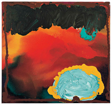
Jules Olitski: Revelation: Red, Black and Turquoise, 2006, acrylic on canvas, 34 x 36 inches
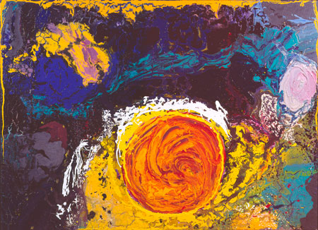
Jules Olitski: With Love and Disregard: Zeus, 2002, acrylic on canvas, 60 x 84 inches
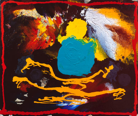
Jules Olitski: Prince Patutsky Memoir: Turquoise and Yellow, 2004, acrylic on canvas 59 1/2 x 72 inches
2.
March 13, 2008, 8:11 PM
Pieces are interesting. Seems like the exhibit was a little convoluted. The paint mixing is somewhat tonally inadequate. But I can see the desire.
3.
March 13, 2008, 9:56 PM
These three images cause recall of Kandinskys, in their vibrancy, punchy colours and lilting arrangements - especially that last.
4.
March 14, 2008, 4:37 AM
Yes, very free and great paintings, my favorite is the first one ! Best regards, Hans
5.
March 14, 2008, 4:50 AM
It makes me so happy that someone made these paintings.
6.
March 14, 2008, 6:20 AM
Me too, Eric. Olitski's late paintings are a triumph of pure painterly power over the evasions and niceties of ordinary painting, even good painting.
The eccentric compositions, garish color combinations, large patches of uniform color and occasional too-obvious allusions to celestial imagery - the kind of thing I would steer any student away from - are subsumed into an overwhelming Olitskian joyulness.
To me they are physically and spiritually akin to Hofmann's late pictures, which have a similar all-out disregard for the usual amenities and plunge fearlessly into the sensuous pleasures of paint and color. They are a glorious culmination of a career that was as inventive and masterful as any in the last century.
7.
March 14, 2008, 6:28 AM
Hans Hofmann was a genius. I love his entire oeuvre. Pollock got him all wrong.
8.
March 14, 2008, 9:01 AM
relating these late olitski paitings to previous greats i would definitely think late hofmann first as well for many reasons. he just traded the square for the circle. but they also evoke somewhat of an old master feel and even a little van gogh or gotlieb (but painterly) for format with the disc and line (or other) motif. hosiasson and olitski's french days also deserve a mention.
9.
March 14, 2008, 9:09 AM
a consummate sensibility decided at the last that he'd show us how 'bad' painting, which lesser artists have been struggling to make something of since the eighties, can be willed into something wonderful and giving and powerful. these look like very generous paintings (i've not seen any in the flesh) and the more i look at them i'm 'scared back to my studio'. i must admit i cringed a bit when images of this work started circulating a few years back, hoping this wasn't a decline. but these works were muscled and aimed right at the boundaries of painterly taste. either they would flop or soar. glad to hear from those who've seen the work that olitksi's quality is obviously shining in these works.
10.
March 14, 2008, 9:15 AM
playfulness seems so paramount in them. a constant search .it's very fearless painting.
11.
March 14, 2008, 9:32 AM
who better to steal from than titian, rembrandt, vermeer, cezanne, hofmann and olitski. those are some deep waters to mine from. mother nature would probably top that list though.
some of the best of today like darby bannard, george bethea, jim walsh and john griefen follow in the foot steps of olitski/hofmann.
12.
March 14, 2008, 12:43 PM
there's also that matisse guy. i hear he's pretty good.
13.
March 14, 2008, 12:58 PM
btw, i am a fan of all the younger (griefen, bannard, etc)artists you mention, but access to their work seems a bit limited. WDB has a good site which has stuff up to about 2005 or 06. griefen and walsh i can't find much current info on. maybe i'm not looking in the right places.
for what it's worth, i have been thinking of noland and olitski as representative of appollonian and dionysian poles.
14.
March 14, 2008, 1:24 PM
yeah that matisse guy could be on the list as well. another one of my favorites. although some periods being much stronger than others.
griefen has a site and he also can be found through fenton's site.
not much of walsh online, but he and griefen will send you pictures and brochures if you are interested. in nyc i saw a bunch of walsh's newer stuff and i thought it was consistently strong. but that was after more than a couple drinks.
15.
March 14, 2008, 2:08 PM
can you give me the address to griefen's site? i've already been through all the stuff on the sharecom/fenton directory.
we've got quality up north in canada too. there's robert christie and jonathan forrest spring to mind. joseph drapell in the east. he and graham peacock are both with the new news.
16.
March 14, 2008, 2:08 PM
mitch smith is another way underrated canadian.
17.
March 14, 2008, 2:54 PM
I really love that first painting.
18.
March 15, 2008, 6:31 AM
ex, i think you are right. the page that i thought was griefen's site was actually found through fenton/sharecom.
terrrence keller is another one on the site and up your way. i am familiar with the other names you mentioned as well.
1.
1
March 13, 2008, 12:57 PM
after i left this show i felt there were definitely some good pieces, especially some of the larger ones, but overall it was an OK show for being Olitski. i even felt that some of the pictures should not have made the cut.
of the 3 pieces you have downloaded, zeus and turq and yellow were 2 in my top 5 or 6 at the time of the show, and i wavered from ok to very good on the latter, while my belief in zeus(it looks a little washed ot here) remained constant.
rev, red, black and turq did not make much of an impression on me at the time of the show, but it looks pretty good hear and better than the photo that i am looking at in the catalogue.
in addition to a few of the other larger pieces that i thought were strong, he had 2 or 3 paintings from the "pleasure whirl" 2000 series that were interesting. very fautrier in set-up and execution. the color, while wild, was non primary and strangely subdued in a more monochrome "gun-metal" delivery. they spooked me.
looking back at these picture and then flipping through the catalogue to review the rest of the show i am mostly impressed with how much this guy loved paint, the medium. he is really all over the place to see what it can do next.