Next: Kent Williams, second draft
Kent Williams
Post #1050 • September 12, 2007, 11:20 AM • 21 Comments
Los Angeles - It has been a long time since I went to a gallery exhibition of a living artist and saw work so good that I got angry about it, convinced that it was time to put the computers in a box, go in the studio, and not come out until something half as adequate came into being. Normally I'm trying to soft-pedal criticism. Here I'm trying to soft-pedal praise. But it's hard, because Kent Williams draws as well as Egon Schiele and his exhibition at Merry Karnowsky is a stunner.
Williams comes out of comics, and in 2005 he illustrated the graphic novel version of The Fountain by Darren Aronofsky, producing an interpretation that was in many ways superior to the film. An illustrator's fondness for toys and text pervade the works, but the artist's brute-force facility and an obvious feel for the luscious qualities of oil make them more than illustration writ large. There's a set intersection between illustration cranked up to fine-art ambitions and fine art racheted down to illustrational ambitions, turning the fuzzy gray line between the two pursuits into a road big enough to provide passage. (Showing Williams alongside Hernan Bas would be instructive in more ways than one.) Williams is one of the heaviest vehicles on that road. Now excuse me while I turn the computer off.
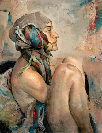
Kent Williams: Pilot, oil on linen, 28 x 22 inches
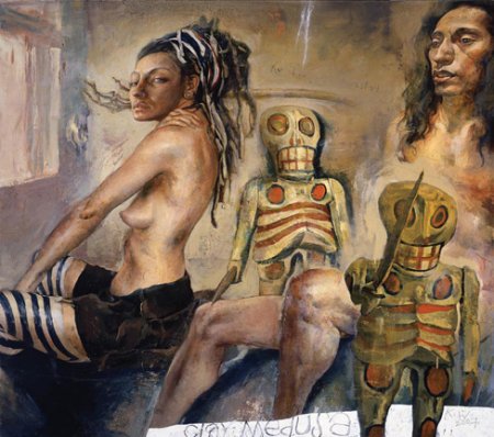
Kent Williams: Clay Medusa, oil on linen, 46 x 52 inches
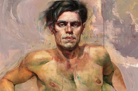
Kent Williams: Rajiv, oil on canvas, 24 x 36 inches
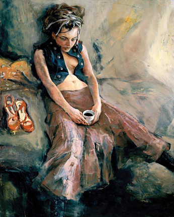
Kent Williams: Coffee, oil on linen, 50 x 40 inches
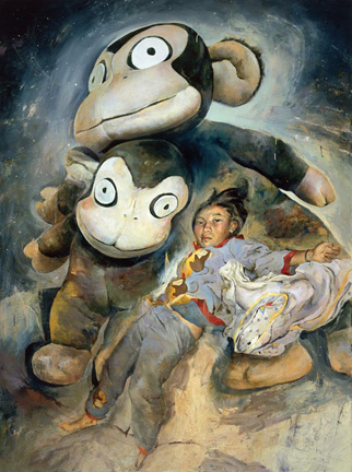
Kent Williams: Becoming Sena, oil on linen, 82 x 61 inches
2.
September 12, 2007, 1:34 PM
Franklin: Has the sunny garden of eden that is southern California softened your eye? Draws as well as Egon Schiele? I don't think so. Schiele's drawing can't be separated from his art, this guy's can - which is the problem. Stay in that studio, though. Computers appear to be intrinisically defective, as far as being an adequate medium for serious art goes.
3.
September 12, 2007, 3:08 PM
Well, I wanted to jump on this, but I was pretty sure I wouldn't be the only one, so opted to let others do the dirty work for me. They have, pretty much. Now all I have to do is agree. Call it stealth criticism.
4.
September 12, 2007, 4:28 PM
I'm sorry, this is illustration disguised as art. Oh yeah, he's got a way with paint and brush, like a million other skilled realist painters. And so I've seen this a million times.
There's this kind of stylish and self-consciously romantic "I'm finally making some serious art here" sentiment. I use the word sentiment intentionally here in connection to my criticism of the The Moon Fell on Me strip of a couple days back, because frankly, I'm surprised by your reaction to this work. But, I wonder, now that I think I see a streak of the romantic in you perhaps I can see why you like this stuff. I think that's OK for your personal life, but it's a bit disheartening to see that in your art, or your appreciation of the work of others. What next, Thomas Kinkade? (An obvious dig, but, well, hopefully you get the point.) This stuff is awfully close to fashion illustration.
Just some loose associations, none of them good: a kind of fantastic, angular, baroque, stylized compositional quality that might be found in a very toned down Frank Frazetta; the self-conscious "I am a master of paint" surface of Odd Nerdum, plus the nods to hunky, sexy tribalism; the unoxygenated atmosphere of Wyeth (take your pick of any of the clan); those careless de Kooningesque backgrounds with the drips, that say, "Oh baby, you know I've got chops so great I don't even have to try."
I wouldn't bother looking at these no matter where I saw them- wall, magazine, poster, greeting card...
5.
September 12, 2007, 4:51 PM
Yes, Chris; "unoxygenated atmosphere of Wyeth" especially.
Franklin, go look again at the woman figure in "clay medusa", the sour skin tone, the skin flap on the elbow, the shading in the small of the back and forearm, the placing of the head & rib cage. This is not "expression", this is simple inability to articulate a figure.
6.
September 12, 2007, 5:18 PM
Yes, OP, "Clay Medusa" is the smoking gun here (well, the smokiest). I'm afraid it's quite dreadful. OK, I'll be more cruel: it's the sort of thing I used to run across (in my High Masochist period) at the dusty, dingy, airless Bakehouse complex in Wynwood (yes, I was that compulsive about seeing everything out there). Franklin, get some rest. I'm sure it's just a passing viral syndrome.
7.
September 12, 2007, 6:16 PM
Chris said Oh yeah, he's got a way with paint and brush, like a million other skilled realist painters. And so I've seen this a million times.
That statements sounds like a cliche. Where are all these skilled realist painters? Because god knows most proffessors long ago gave up on teaching realist skills.
8.
September 12, 2007, 7:29 PM
OP, if you thought "Clay Medusa" was poor, take a look at "Arms Akimbo" in the Williams website (I think it's the fifth image in the Paintings section). Smoke gets in your eyes, as the song goes.
9.
September 13, 2007, 9:32 AM
asian persu asian
10.
September 13, 2007, 10:02 AM
I’m with Franklin on this post. I thin k most painters have very successful and less successful paintings. For my eye the first, third, forth paintings are very good, the one having “magical” theme are so, so. I agree the flap (this stands out badly) on the forearm and the upper torso is skewed more towards deformity. Leaving a skin flap as an artist’s mistake but how anybody can tell that torso deformity wasn’t intentional? Personally, I don’t see much artistic and intellectual challenge in the coping photographic picture on the canvas as some of the people are calling for, here. I think, if it is done moderately and within the specific esthetics of painting, the distortion of human body can inject originality to the art piece and can be powerful, grabbing attention visual statement. I love photography and I’m doing it a lot but I try to separated (I struggle with this issue, too) in my mind photographic esthetics from esthetics of my oil paintings. The painting gives me choices and freedom which photography can not deliver but both media are powerful visually.
I don’t like second and fifth painting for different reason. They are incoherent visually and look like artist act on the spur of the moment with giving extra thought for final concept of each painting.
I like the tones of the skin in the first and third paintings. Although the tones are not natural, they appeal to my esthetics.
You can’t dismiss Kent Williams as a joke. He is on his way to find his own style and esthetics. The mistake here and there doesn’t indicate artist’s inability it says only that painting is life long struggle. I think, being mean like that to other oil painter is unfair to him and unfair to the painting medium as a general. It confuses only audience and may them think that abstract expressionism is the highest achievement of human brain in the history of visual art.
11.
September 13, 2007, 10:28 AM
All of these paintings have a slippery "wow" factor of facility and for me that is where they stop. This is not enough. This is what makes them more illustrational and superficial. Van Gogh is the marrow to this guys fat.
12.
September 13, 2007, 11:14 AM
JS wrote, "That statements sounds like a cliche. Where are all these skilled realist painters? Because god knows most proffessors long ago gave up on teaching realist skills."
Man, just look around. Ever look at American Artist magazine?
I mentioned one, Odd Nerdum. Here's three that come to mind: Bo Bartlett. is a widely shown painter whose excessively romantic subjects and self-conscious painting licks get lots of kudos- that's a mystery to me; Michael Gregory's atmospheric effects are measured, forumulaic, and stilted; Mark Stock paints these kinds of frozen moments that feel staged and stiff. These are just three that come to mind. All of the work is mannered, overly romantic, infused with a suggested meaning that feels obvious and trite. There are lots of painters working these veins. Part of the problem here is subject- it's like these painters have no politics or religion or other belief, even barely science, in their work, so they turn to the personal, the moment; when you look at Courbet, you see that he is battling his culture.
And just look at the list of fine art faculty at Franklin's new employer.
I realize I'm perhaps being a bit harsh, but good painting- something that is conceptually rigorous, visually inventive, stylistically original but not fashion-oriented (I mean fashion as in popular culture, what is thought of as good taste, fine living, reaffirming of privilege), and is made with skills that aren't merely tricks and mannerisms, or doesn't simply rely on natural ability or tendencies- is hard to come by, whether it's realist, abstract, or somewhere in between.
Two "realist" painters I genuinely admire are Wayne Thiebaud (example) and Robert Bechtle. (I placed "realist" in quotes because both of these painters' work is quite abstract). To my eye and mind someone like Michaël Borremans slips a bit higher in my esteem than the three I criticized above (and anyway, he seems like a Luc Tuymans who has simply put more time into each work).
I could think of more names if I put my mind to it and had more time, and they wouldn't all be men, as this post contains. I'll quickly mention Marilyn Minter, like her work or not, whose work has an interesting subject and whose paintings are really working the paint. Out of time.
13.
September 13, 2007, 12:03 PM
Which is better, the postmodern schlock or the academic schlock?
14.
September 13, 2007, 1:23 PM
Scchlock is schlock is schlock is schlock.
15.
September 13, 2007, 2:31 PM
I agree with Chris its a bad attempt at illustration.
16.
September 13, 2007, 2:54 PM
The issue, obviously, is not how realistic or abstract the work is, or, if the painter happens to be a realist, how perfectly photorealistic it is. The issue, always, is how good it is. It's very simple, or should be.
This Williams stuff, despite the sad fact he can outdraw quite a few current "stars," strikes me as slick, clammy, overwrought (not so much emotionally as design-wise), essentially glorified illustration. It feels kitschy and lifeless, or airless, or plastic. It's good outdoor art fair material, basically. I'm not saying there's no accomplishment in it, but the stuff simply doesn't breathe or live; it leaves me cold.
17.
September 13, 2007, 5:03 PM
Such opinionations! I don't like these paintings, but since they're on Artblog, maybe I should reconsider.
- "Pilot" might be better with the face erased. It has such a flatly stylized profile next to the full and naturalistic forms of the ribbons and limbs.
- "Clay Medusa" has no redeeming qualities that I can perceive.
- "Rajiv"'s face has none of the skewed flatness of the previous three, though I can't really place the expression. Maybe his scalp is itchy? It is better when I crop it down to a small square image - just head and shoulders.
- "Coffee" suckered me for a sec, but I think that was just due to its porno qualities. I'll admit that I like what I can see of the handling in the dress and pillow.
- "Becoming Sena" I just plain don't like to look at.
I can appreciate that with realism and/or figuration on the teaching platter this term there might be something in them to study, look at, and draw from for future projects. I am interested in how these might influence your work, Franklin. Of course there's no accounting for taste, and to each his own, and all that.
18.
September 13, 2007, 5:31 PM
Your 4th paragraph is a nice accounting of characteristics, Chris, and, no, you are not being too harsh. Of ther painters you mention only Bechtle - who has skill - and Thiebaud, who has not only skill but can bring off a painting just as delicious as one of his cupcakes (one of which I have downloaded and it is delightful). He's no Velasquez, and he's no Pollock or Olitski, but a pleasure just the same.
All the rest are so heavy handed; they seem bursting with the need to make "art", something heavy, deep, muscular, "meaningful", and in the process just cook the soup until it burns.
As for this Williams person, poor Franklin's ears must be burning, but, what the hey, that's what happens on the old blog. I like the paintings less every time I look at them, so I won;t look any more. I just plain don't like what he does with paint.
19.
September 13, 2007, 6:55 PM
This may qualify as a minor variant of the John Currin syndrome. Currin is no doubt more cynical and calculating about his shtick, which makes it more grating and offensive, but Williams is just trying too hard to be something he's not. I expect if he kept his talents within a more suitable sphere, the work would come off much better.
This also illustrates how, in the land of the blind, the one-eyed man can be king. Standards are now so low, and we've become so used to that, that we tend to overestimate what is really nothing all that special--but seems that way relative to the prevailing norm. Furthermore, when standards are low and quality goods are definitely not standard fare, we can get so hungry for better fare that we'll grasp at things with less discrimination than we would otherwise.
The fact is that there are any number of now quite forgotten 19th century painters who make Williams look quite out of his depth. I'm afraid he is.
20.
September 13, 2007, 8:31 PM
The examples, of “good” paintings or “better” artists above, don’t appeal to me. Each of us can pull from own sleeve samples of the favorite paintings as a guiding reference. But so what? They are guiding reference to you but for other eyes it can be piece of crap. This attitude of personal preferences as the valid criteria to destroy someone’s work is unfair to any artist, not only Kent Williams. I am not admirer of the illustrations or fashion in the oil paintings, either. But I won’t dismiss artist work and his effort because someone by His/Her own association see illustration or fashion there. The third painting Rajiv- my first association in my mind was with the Lucian Freud rather than the fashion or illustration.
This eruption of negativity (out of proportion to quality of presented work) places poor Kent on equal foot with fashionable and PoMo illustrationist Dammien Hirst. The flashy and shiny jewelry studded skull deserve such harsh critisizm but not Williams work. Probably, this not anybody intention here, but being so harsh and dismissive is equal to pronouncing that contemporary oil painting is dead except the paintings from the glorious past. This is not acceptable criticism. I think the best solution for all of us, artists, is to stop painting at all and stop annoying some people here. To ostracizing artist skills and then provide, at best, mediocre example of “better” work suggests rather glorifying own personal taste or own work.
21.
September 13, 2007, 8:49 PM
You are really overeaching, XY. "Poor Kent" is doing just fine. And no one is saying "contemporary painting is dead" just because we think his paintings are no good. Where did that come from?
We are a tough audience. (Thank God there is one!) I have been making and teaching art for more years than you have been alive, I'll bet. I know the difference. And there is a difference and it is possible to tell the difference if you are an artist and look at art you do it all the time yourself. That's what art is thre for. Think about it.
1.
opie
September 12, 2007, 12:35 PM
Calm down. He's not that good. He's slick and some of the drawings and parts of the sketchy paintings on the gallery page are good but his color sense in the paintings is below freezing and he over-activates the surfaces so much that they just don't scan sometimes. As illustration, that is. As art they are only so-so.