Previous: Hopper's Drug Store - prelude (1)
Next: It's nice to be missed (21)
Drug Store
Post #1002 • May 9, 2007, 10:13 AM • 36 Comments
Boston—On the occasion of his show at the MFA, many writers have already opined about Hopper's rendering of a certain slice of America and its importance to the American imagination. So I'd like to begin by making a case for him as an abstractionist. Hopper was a classmate of George Bellows, and the difference of between them was like the difference between Vermeer and Pieter de Hooch: an ability, in each former case, to tone down the realism for the sake of the overall composition and graphic impact. In Drug Store, he set up a network of triangles in a skewed but apparent grid; Georges Braque could have painted those shadows on the pavement, which echo the sashes in the window and the dark, knife-like shadow on the building in the upper left corner. The brick-colored bars across the top resemble Sean Scully. The shadows have enormous binding power in the picture, partly because they're drawn so well, and partly because he has eliminated all detail within them, leaving nothing except the natural variation of the oil paint on the canvas.
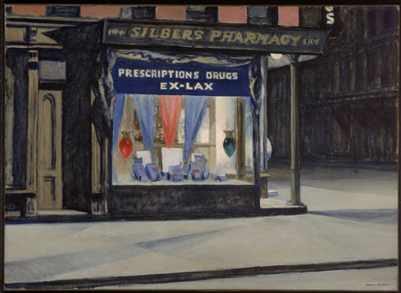
Edward Hopper, Drug Store, 1927, oil on canvas, Museum of Fine Arts, Boston, bequest of John T. Spaulding, photograph © Museum of Fine Arts, Boston
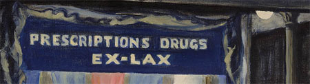
detail
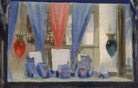
detail
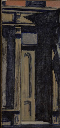
detail
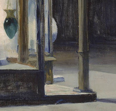
detail
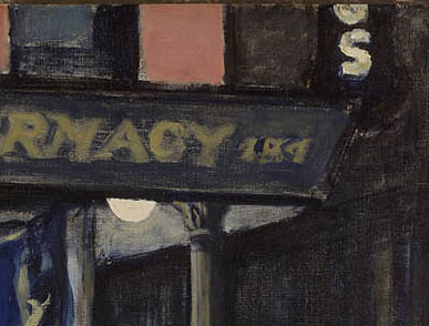
detail
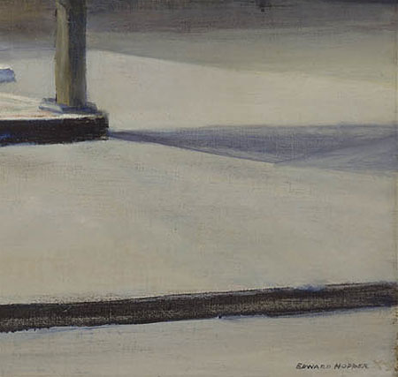
detail
2.
May 9, 2007, 7:00 PM
yup, I agree with jack.
3.
May 9, 2007, 7:56 PM
What an ineresting description of "Drug Store." The close up details are very helpful. I haven't seen the original. Will look at the details when I get the chance.
4.
May 9, 2007, 9:39 PM
...and this one is even busier than some of his simple interiors with raking light, little to no furniture or "subject". What a great painter of the "nothing". Dali could have learned from this.
5.
May 9, 2007, 10:42 PM
It was the Nytimes or the New Yorker that showed an obvious preference for the Hooper works (like your example) that contain no melancholy women figures. The women are so blankly redered that they too can be easily seperated out from any cinematic sentimenality--they work as forms.
If anyone's interested, check out my review (the above url) on Chicago's big art fair, this year dubbed Artropolis. Nytimes may rag on Hooper, but there was hardly anything at this international fair that even merited a debate.
6.
May 10, 2007, 12:18 AM
Yes beWare,
Cape Cod Morning.
;)
7.
May 10, 2007, 3:40 PM
I'm especially amazed how he managed to paint a "Mood"
Rendering mood is not easily achieved. Perhaps Giorgio DiChirico was a master of mood, but he was a bit over wrought.
8.
May 10, 2007, 4:17 PM
hopper is so frequently immitated, and never well. what makes these paintings so great is their honesty. hopper is truthful in his construction of every component; as faithful to observation as to the potential dynamics of composition. is this what happens when one paints the way one is "called" too?
9.
May 11, 2007, 12:01 AM
I think that the sign of a good figurative pantinting can be discerned with one's observation of the contours, edges, and separations that exist between forms and spaces - here the delecacy of touch can be appreciated.
One problem that I have with most abstraction is that there is an apparent heavy handedness that is too reliant on material and not enough on good drawing.
10.
May 11, 2007, 7:14 AM
Each work of art is unique as is gold- wow !
11.
May 11, 2007, 2:57 PM
Jordan's comment can be inverted as well: many figurative painters rely too heavily on drawing and do not consider the material of the paint sufficiently so that the work comes off as illustrational.(i.e. the Wyeth clan, Philip Pearlstein)The trick , wheher one paints in an objective or non-objective fashion, is to get that balance just right so there is sufficient scalffolding in the picture plane from the drawing, and an absence of unnecessarily thick paint application, to make it all work. Artists who have done this miraculously well in my view (off the top of my head) are Bonnard, Bacon, of course Hopper,Matta , Fairfield Porter, Alice Neel Jane Wilson,Gorky and de Kooning.
12.
May 11, 2007, 3:59 PM
look at that receding facade on the right. the intensity and temperature changes subtly as the form approaches the storefront ,capturing the glow of the lit window.
13.
May 11, 2007, 6:12 PM
Good point Germain - do you speak from personal experience as well with your own work ?
14.
May 11, 2007, 7:50 PM
Yes, absolutely. My focus these past few years has been how to make a non-objective painting work as both a "'picture" and as a sensuous, visceral experience of paint itself. Bacon, whose work I greatly admire, once said something to the effect that the best abstract paintings still function at a level of mere decoration. I wonder about this constantly. Can an abstract work convey the power and emotion of , say, a Hopper? Rothko would certainly have felt that it could, although I have never been very much moved by Rothko's work. I guess I am hopeful that someday I will make something that satisfies me on both levels and that's why I continue to paint.
15.
May 11, 2007, 8:59 PM
Incidentally, I just got back from an overnight trip to NYC. Saw Darby's opening at Jacobson Howard, and three shows at the Met - the new Greek & Roman galleries, the Chinese painting show (Journeys), and Stella on the Roof. More soon.
16.
May 11, 2007, 9:03 PM
Links:
Jacobson Howard
New Greek and Roman Galleries
Frank Stella on the Roof
Journeys: Mapping the Earth and Mind in Chinese Art
17.
May 12, 2007, 2:32 PM
re: bacon's comment about abstract paintings functioning decoratively
(rather)re: my ignorance
What is the negative association with decoration? Is it a high art/low art thing? It seems to me that decoration is one of the premier functions of art. the compulsion to decorate and respond to our environment seems reletively universal. (Im no anthropologist) I am aware that some art in the 70's was interested in this idea, but criticized later for having a vacuus social quality.
18.
May 12, 2007, 3:55 PM
DA: It seems to me that decoration is one of the premier functions of art.
You are absolutely right, DA! It has been that way ever since the good cave painters in France out painted the rest of the world's cave painters ... apparently without knowing who the bad ones were.
19.
May 12, 2007, 11:23 PM
The real problem is the word "mere"... get rid of that, and you got rid of the perjorative...
20.
May 13, 2007, 1:05 AM
...decoration may mean something to a collector, but should not be the intention of the maker - regardless of thick or thin, lean or fat, light or dark...
21.
May 13, 2007, 7:51 AM
The only problem with decoration is that to a small extent it implies function - just as images might decorate a vase, painting might decorate the wall. Painting really ought to be thought of as an autonomous object, independent of the wall.
Otherwise the idea of it being decorative is fine, even productive. I'm pretty sure the Nabis said that their job began where the architect's ended.
22.
May 13, 2007, 8:00 AM
Being a collector, my concerns are with political objectives and Western agendas; and not whether the art is "thick or thin". I want to re-sell what I have bought or have told my freinds to buy. If we can't re-sell the work, then we must kill the artist(s) and then make up a story so that the Japanease or Germans will buy it - or maybe even the Mexicans. Art belongs in my bank.
23.
May 13, 2007, 10:16 AM
"Painting really ought to be thought of as an autonomous object, independent of the wall."
Taken a step further, should sculpture be thought of as autonomous, independent of the floor?
Art experience decorates life... Cheers to Decoration!
24.
May 13, 2007, 11:08 AM
I wonder what Matisse's "intentions" were. Not that intentions really matter. He was certainly a decorative artist who made pretty pictures that made the walls upon which they hang look nice.
25.
May 13, 2007, 11:10 AM
Like everything else in art, it is not a matter of deciding whether "decoration" is good or bad. It is the art itself that is good or bad.
26.
May 13, 2007, 3:04 PM
For great insight into Matisse's intentions, I highly recommend Hilary Spurling's two volume biography of him. (It was recently awarded the Whitbread prize--hope the link works...)
http://enjoyment.independent.co.uk/books/news/article340815.ece
27.
May 13, 2007, 10:26 PM
step 1 : buy art
step 2: kill artist
step 3: ???
step 4: profit!
28.
May 13, 2007, 11:31 PM
Bonnard, Vuillard, Matisse - all nice to look at, pleasant on the eyes.
29.
May 14, 2007, 11:03 AM
Hopper’s is an art of illuminated outsides that bespeak important insides. He vivifies impenetrable privacies. Notice how seldom he gives houses visible or, if visible, usable-looking doors; but the windows are alive. His preoccupied people will neither confirm nor deny any fantasy they stir; their intensity of being defeats conjecture. Imputations, to them, of “loneliness” are sentimental projections by viewers who ought to look harder. They may not have lives you envy, but they live them without complaint. Another mistake that some observers make is to quibble with Hopper’s crudeness, notably in his renderings of flesh and foliage. His insults to taste are even instrumental to his art, focussing attention on what matters, which is drama. Clement Greenberg got it right when he remarked that if Hopper “were a better painter, he would, most likely, not be so superior an artist.”
- Peter Schjeldahl
30.
May 15, 2007, 9:13 AM
Love Hopper and Bacon and aside from (in their different ways) the masterful spatial innovations they both created a sense of mood that isn t the sole element of the work (as it seems to be in aforementioned ce Chirico) but is inseparable from the spatial construction use of shadow (in Hopper) and color ( in Bacon) .
In my book this puts them both in the super -master category of Vermeer and Giorgione-where several highly succesfully renderred elements addup to a piece of canvas (or wood) with arranged colors that can elevate our experience so much.Compposition, co;or and light, subject matter are all mutually reinforcing. Bacon really stands out because his spatial constructions are so innovative and his mood and subject matter are so horrifically characteristic of our experience.
31.
May 15, 2007, 10:52 AM
Decoration and intention are just words. They do not matter as such. The only thing that counts is the art.
Because I was in New England last weekend I was for once able to see a show (Hopper) so I can comment on it without having to look at reproductions. I'll say for now only that the Greenberg quote above is, as usual, trenchant and accurate, but save more comment until later after I take care of some business I have to tend to.
I also saw a Monet show at Wildenstein (NY) which was so good I had to pay $85 (aargh!) for the catalog.
32.
May 15, 2007, 11:24 AM
What!? We missed Bannard's opening? And we were so close too. Alas, that's what happens when you forsake the internet for a week.
33.
May 15, 2007, 11:33 AM
re:23 Taken a step further, should sculpture be thought of as autonomous, independent of the floor?
Caro might say yes. Olitski might've said no.
34.
May 15, 2007, 3:46 PM
Ahab - Caro takes in the fact and presence of the support (floor, table) more directly and literally than any sculptor I know. It is one of the basic characteristics of his art, along with the feeling of effects of gravity (which is related) and the somatic associations.
35.
May 16, 2007, 2:56 AM
I think you've described the actual effect of Caro's sculpture quite eloquently, opie. Material necessities are never bypassed or made light of in a Caro.
Yet I recognize in much of his work a redundant support (whether table, plinth, leg or baseplate) that operates like a sort of buffer between the main sculpture-object and the real-ground. Too, his work, including the largest, is generally not rooted visually to any single site but works in many locations.
In contrast, for example, to Eduardo Chillida's large sculpture, which is rarely "autonomous, independant from the floor".
36.
May 16, 2007, 9:26 AM
Every sculpture needs some kind of literal support, so none are independent. The sculpture of Chillida, or Smith, for that matter, sits on the floor or support, or often on a pedestal, to invoke some sense of separation from the surroundings.
Caro's, on the other hand, rejects the pedestal idea, because it usually tries to incorporate the character of whatever it rests on as part of the piece, makes a point of it, takes it in. This is most obviously true with the table pieces, of course.
It is not so much independence from the support as it is the nature of the relationship with it.
1.
Jack
May 9, 2007, 5:15 PM
This is a good example of what would seem to be obvious:
What really matters in art is not subject matter per se, but what the artist does with it, or how it's handled. If this exact same scene had been painted by someone with no significant talent (or a talent suited to something else), it would hardly be worth a single glance.