Della Robbia: Virgin and child with lilies
Post #982 • April 4, 2007, 12:01 PM • 16 Comments
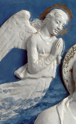
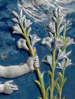
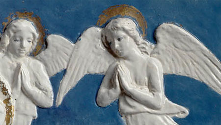
Boston—I don't know what challenges a sure attribution of this piece - visually, I say it passes. The acanthus-like pattern on the lilies appears in other della Robbias and the feeling in the faces is right, although I guess I could be talked into a certain awkwardness in the background figures. In Donatello to Giambologna it shows alongside traditional folk maiolica, kitschy but charming, and demonstrates how the della Robbia workshop refined the technique to unprecedented levels of aesthetic achievement. In fact, high-end maiolica techniques all but died with the workshop and they could not be replicated again for a couple of hundred years.
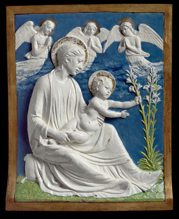
Attributed to Luca della Robbia (Italian, Florence, 1399 or 1400-1482), Virgin and child with lilies, Renaissance, about 1460-70, glazed terracotta, Museum of Fine Arts, Boston, Gift of Quincy Adams Shaw through Quincy Adams Shaw, Jr., and Mrs. Marian Shaw Haughton, photograph © Museum of Fine Arts, Boston
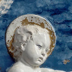
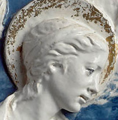
detail
detail
detail
detail
detail
detail
detail
2.
April 4, 2007, 6:16 PM
I'm not referring to the words "hostile environment," this is hardly a hostile place, but the design on the upper left hand corner of this particular page looks really good Franklin, perhaps you should consider doing this for every post. A detail for the background and a sub-title for the foreground. Much better than the yoga mats you had before.
3.
April 4, 2007, 6:30 PM
So that's what those things were! Well, yoga mats or carpet swatches, good riddance.
4.
April 4, 2007, 8:51 PM
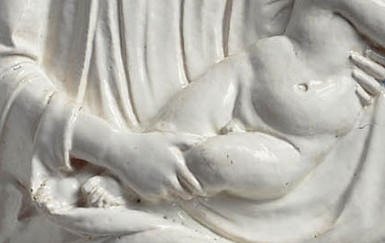
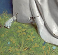
I wonder if the polychrome must not be more recent than 550 years. Regarding possible awkwardness of the angels: I don't think so. But I'm not satisfied with the distant horizon that is too strongly implied by the alignment of their lower blouse hems with the Virgin's hairline. I concur with Jack's observation about the drapery, but would add that I feel the Madonna's right leg seems rather skeletal. It's like it was carven in shallow relief, then sawn out and tilted forwards. I'd like to see a side-view detail of the thing because the ground part of the picture, frame and all, seems to roll forward; and I can't tell whether this creative solution is to good effect or not.
But Della Robbia or not, what a relief!
5.
April 4, 2007, 9:12 PM
Ahab (#3), I completely agree with you. I just thought, while I was cooking... It would be great to see a profile. My eyes keep fussing, between the "feeling in the faces," and lack of the same quality in areas such as the background (angels included) and the very foreground (especially that right leg, minus the drape.)
6.
April 4, 2007, 9:15 PM
Sorry Ahab! Your comment was #4, however I also agree with Jack in comment #3... Good Riddance!
7.
April 5, 2007, 5:19 AM
May your day be as pleasant as Robbia's ageless patina.
8.
April 5, 2007, 11:00 AM
Ooooh, this is good, the left hand corner of the page keeps getting better. Keep ticking!
9.
April 5, 2007, 12:04 PM
The detail with the hands holding the baby Jesus is wonderful also. The right hand placement, especially, is beautifully observed.
10.
April 5, 2007, 12:06 PM
Franklin, Marc's quote should be on a solid dark backgound band. Given the small size of the print, that would enhance readability.
11.
April 5, 2007, 12:52 PM
Re: 10, I think it's fine the way it is. The color is fine and the font size is fine. It has a subtle look. If I hit refresh will different pictures and quotes pop up? That'd be nice.
Overall, a huge improvement. It gives me a better sense of what the website is all about.
Bravo.
12.
April 5, 2007, 12:58 PM
Still, the "home, posts, comments, publications" are still kind of interfering with the list of posts. I don't know if theres a better way to place those or distinguish them in some way that's asthetically pleasing to one's eye.
Maybe place the list of posts directly under it?
Since your in the mode of redesigning the page, how about adding a much needing feature: "Artblog.net SINGLES"
That's right, a place for art lovers to "hook up." Maybe it could even be along the lines of e-harmony. Then again, maybe it'd be too much work.
But from reading some of these posts, I've determined there's some people who frequent this board that need to get laid.
But I'm not naming names.
13.
April 5, 2007, 3:17 PM
"Tin glaze [(maiolica)] gives artists a brilliant white, opaque surface to paint over. The colours are applied as metallic oxides to the unfired glaze, which absorbs pigment like fresco, making errors impossible to fix, but preserving the brilliant colors of the Renaissance in a way that paintings cannot."
So says the Wikipedia, putting to rest my doubts about the colours.
14.
April 5, 2007, 3:54 PM
Re #10, etc. the new page layout.
FWIW, The left side is still very awkward looking, There doesn't seem to be any reason for the two columns of type other than you figured out how to do it. It's ugly.
I'm glad to see the swatches gone.
15.
April 5, 2007, 5:19 PM
On my screen, the two text columns at upper left are colliding. Messy. Also, when I try to cut and paste something from a posted comment, I can't do it anymore. What I want to highlight and cut is NOT what winds up highlighted. Annoying.
16.
April 5, 2007, 7:58 PM
To be more specific, when I try to highlight part of a comment to cut and paste it, everything in the thread preceding that part is highlighted instead. I'd say this is a job for Supergeek.
1.
Jack
April 4, 2007, 1:35 PM
It passes for me, too. The handling of the draperies below the Virgin's right leg is especially fine.