Previous: Now even more on the Internet (5)
Degas - Pagans and Degas's Father
Post #936 • January 11, 2007, 2:38 PM • 23 Comments
This graces the entrance of The Romance of Modernism, recently called "dreary" to some cheers and more than a bit of well-deserved booing.
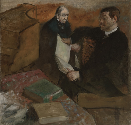
Edgar Degas (French, 1834-1917): Pagans and Degas's Father, about 1895, oil on canvas, Scott M. Black Collection, Photography © Museum of Fine Arts, Boston
The timing of the creation of this work is intriguing, as pointed out in the catalogue: Degas was in his early sixties, and his father had been dead for over twenty years. The scene recalls the salon performances that used to take place in the De Gas home by Lorenzo Pagans, a Spanish tenor, during the late 1860s and early '70s. Degas, himself only a bit younger than the age at which his father died, is recalling his origins in culture and erudition, permeated with music, a shared love between father and son. I've seen it proposed that Degas's name change from his father's version, a more aristocratic De Gas, represented some kind of Oedipal break, but contemplating this work makes me think that the idea is twaddle. His father is a man whose decline he recounts with great sadness, albeit enlivened with the vigorous presence of Pagans, and a warm atmosphere of material and aesthetic comfort.
At this point Degas was concentrating increasingly on the visual effects of pastels. He seems, in certain passages in this work, to be trying to turn off the oily qualities of oil in favor of a dry stroke that would have come naturally out of a pastel crayon.
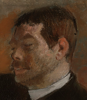
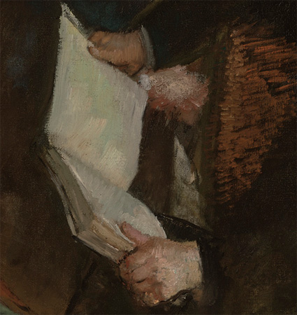
Detail.
He is known to have put his paints out onto rags to soak the oil out of them a bit, and then reconstitute them with turpentine. That gives oil paint a chalky quality that one can distinguish from its native buttery state.

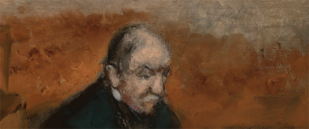
Detail.
Degas claimed to know nothing of spontaneity, but the background behind his father's head is applied impetuously with his thumb.
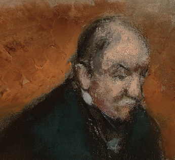
Detail.
The portrait itself is a marvel. The paint very much resembles pastel on close inspection. We're gazing at a strong man, but not a hard one, someone who bends with thoughtfulness and absorption as well as age.
Detail.
Degas is especially admirable for being able to turn Impressionist handling on and off at will. The hachure, in less able hands, turned into an all-over mannerism. Not with Degas, who could reinvent it as needed depending on the angle and surface of the depicted object.
Detail.
Just to show you who's boss, here's some unfinished canvas in a close part of the foreground. Not an easy thing to pull off.
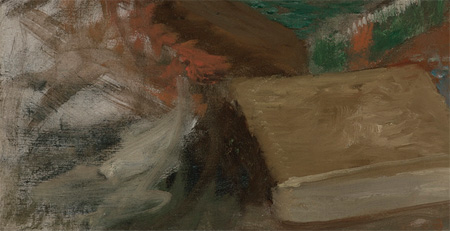
Detail.
And for all of the credit that Cézanne gets for inspiring Cubism, I have to wonder how much we ought to be thinking about Degas in similar regards.
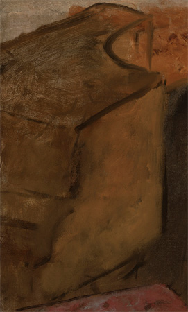
Detail.
2.
January 11, 2007, 6:21 PM
Degas is certainly the most underrated Old Master painter out there. In another couple of centuries he'll have Da Vinci's reputation without the technocratic code bunk, but it seems he's still too close to us to be widely appreciated except by those who know what it's like to work a brush.
3.
January 11, 2007, 7:05 PM
Part of this is his own fault, Timothy, because he insisted on working indoors making pastels of ballerinas, which, like Renoirs nudes, became enormously popular and helped establish his reputation, but on a rung lower than the "classic" Impressionists. He was much better with a brush and paint, and if he had just gone outdoors and painted along with the rest of them he would be right up there. He was a wonderful painter, very sure-handed, and his color was as good or better than any of them - just look at those racetrack paintings. His pastels, the drawing and the color, as Greenberg pointed out, never quite came together. It is a casebook example of personality cramping talent.
5.
January 11, 2007, 10:10 PM
I feel differently about those pastels. The late ones look like they prefigure not only Cubism but Expressionism. This is a horrible representation of the piece but compare it to this. He discovered via pastels how to break up a surface and still have an image hold together. Fascinating, great stuff, however uneven across the board.
6.
January 11, 2007, 11:15 PM
They prefigure a number of things, Vuillard, the Nabis, some of Gauguin's effects, but I don't think they work very well. He was trying to draw and "paint" at the same time, and, as I recall Greenberg pointed out, this created two systems that do not get togeher. They have always looked unresolved and mushy to me. Here is an example:
http://www.ibiblio.org/wm/paint/auth/degas/ballet/degas.danseuse-assise.jpg
7.
January 11, 2007, 11:21 PM
A better pic of Bather Stretched out on Floor
Bigger view
Degas- side door
9.
January 12, 2007, 12:21 AM
The person who can answer your question about the change from the De Gas name to Degas is one of his descendants, a niece, who gives tours here: http://www.degashouse.com/history.html#history I hope the house is still intact after hurricane Katrina. When we stayed there in April 2005 we had a very informative tour with all sorts of inside dirt on the Degas/Musson family. We saw the cramped room in which Degas resided (and somehow painted in that space). We also stayed in the room where he painted the Portrait of Estelle Musson (his cousin who was married to his brother, near blind, of whom he was in love with). He finished 22 paintings in a one year period at this particular residence. One may think of it as a cheesy B&B, but in actuality it is a very historical residence in need of financial support. From what I recall from the tour, his father was involved in the cotton sales business that the Musson family operated (maternal family side). His father wanted him to work for the family business, but Degas felt stifled and wanted to be a painter. Not a major rift, just the usual father/son career conflict. In addition, Degas apparently had a fear of going blind and preferred to paint indoors with the natural sunlight filtering in, rather than outdoors in bright sun. Does it seem plausible that a connection exists between the trouble may have been having with his eyes and his beginnings as an Impressionist?
10.
January 12, 2007, 7:21 AM
There is no doubt that Degas was a great artist. Agreed. Were the pastels less than the paintings? Probably, just like Michaeangelo's drawings were less than his frescos. But the pastels also happened to be the best pastels I have ever seen. They are airy and fugitive looking, except they so solid at the same time. A visual mystery, if you ask me. I'm glad he did them.
11.
January 12, 2007, 7:37 AM
Opie: the picture you linked to is not "two systems" as Clem suggested. It is simply a pastel, a very dense one. I like it a lot, garish color included. It is tough to reconcile orange with yellow green, but it is done masterfully in this picture.
My experience of it is a good example of what you say about the judgment/experience of art proceeding without criteria. Most times, I can't stand orange with yellow green, as a historical fact of my encounters with art. Knowing that is not a criteria, of course, it is just a memory of my past. In this picture, orange and green hang together fiercely and delight me, to the point of being an inspiration to try them in a picture of my own.
I'd say, take another look at this one. It might get to you.
12.
January 12, 2007, 8:22 AM
Mek, thanks for that link. It looks like the house is fairly close to the New Orleans Museum of Art, which was largely spared damage from Katrina, and they seem to be taking reservations. We'll have to check that out one day.
13.
January 12, 2007, 8:42 AM
I think it has the same problems, Franklin. Let me be clear that I think Degas was an absolutely top notch artist, pastels included,and I am being excessively critical, I know. I just f feel that his is a case of making non-art choices that limited his art (I didn't know about the sunlight fear that mek mentions in her interesting comment).
I like the color too, Catfish, but my eye can't get most of the pastels to resolve. Every material does something well - Redon, though he is a lesser artist, used pastels effectively - and I think by making that kind of picture with pastel he was to some expent working against the material, making oil paintings with a medium that did not want to make oil paintings. I recognize how good the pictures are but whenever I look at one I feel it would have been better done with the continuous blending capacity of oil paint.
14.
January 12, 2007, 9:25 AM
Opie says "it would have been better done with the continuous blending capacity of oil paint".
I take it you recognize it would no longer be the same picture. It is hard for me to imagine an oil-blended version of that orange-green pastel being as powerful. The play between all the air and all the solidity would disappear. This is speculation, though. He didn't do it in oil.
15.
January 12, 2007, 9:35 AM
As I read this great post, I got to the image of the book and thought "Cezanne, Cubism". Then you said it.
When I read the headline of the post I expected some kind of Bacchanal picture! Pagans as in real pagans, not a guy named Pagans.
This kind of "review" is really great and I think could only happen easily on the internet - in a paper you would have one, maybe 2 images with the piece. I guess in a magazine it could be done.
16.
January 12, 2007, 10:11 AM
Yes, I realize it would not be the same picture, Catfish, and I realize that something would be lost. It is just that whenever I look at one of those pastels I get the strong feeling that the picture is struggling against the medium, and it frustrates me.
17.
January 12, 2007, 8:51 PM
Yes the home is about one mile away from the museum on Esplanade. However, one cannot fully express the poverty level in New Orleans, and this was before Katrina. What one might think would be a pleasant walk from the Degas house up to the museum would more than likely be a quick pistol-packing jaunt. Better to cab it.
18.
January 12, 2007, 10:22 PM
The pastel Degas danseuse-assise in orange, green and blue surprised and pleases me.
19.
January 12, 2007, 10:36 PM
Oh, and I wanted to point out that what I perceive to be an anatomical error in the dancer's wrist (along the right edge of the picture) somehow survives such scrutiny to contribute positively to the picture, unpredictably. It may possibly be due to that same sort of surprisingly successful skimpy-canvas-coverage in the Pagans and Father picture.
20.
January 13, 2007, 12:22 AM
Re the oil vs. pastel issue, check these out:
http://www.artnet.com/picture.asp?date=19980130&catalog=8427&gallery=110889&lot=00216&filetype=2
http://www.getty.edu/art/collections/images/l/11468301.jpg
They're 17th century French pastel portraits by Nanteuil (who was also a great portrait engraver, typically after his own drawings, done from life).
What do you think, OP? They look a good bit like oils to me.
21.
January 13, 2007, 7:58 AM
I would never know they were not oils unless you pointed it out, Jack. That is very interesting.
I find that it is difficult to articulate why the pastels don't resolve for me. These pictures obviously demonstrate that it is possible to use them to render an oil-like surface, so it is not the medium itself but what Degas was trying to do with it. I still feel a conflict between a picture that is basically a drawing gone over with color, but this is done to great effect in oil all the time, so it is probably not the technique-mixing that is the problem. I'll have to think about it.
22.
January 13, 2007, 10:39 AM
Here's another Nanteuil pastel that looks more pastel-like, possibly because it's a female portrait (Madame de Sévigné) and he wanted a softer, fluffier look (he was, however, better with men):
http://www.herodote.net/Images/SevigneRobertNanteuil.jpg
And here are some of his incredible engravings, pure burin work, which led Louis XIV to issue an edict declaring engraving to be a fine art, as opposed to a mechanical business or craft:
http://libserv2.princeton.edu/imageserver?filename=/mnt/libnetapp1/gc016/00000008.jp2&res=3
http://libserv2.princeton.edu/imageserver?filename=/mnt/libnetapp1/gc016/00000037.jp2&res=3
23.
January 13, 2007, 10:43 AM
P.S. In 17th century France, the King, of course, was always right.
1.
opie
January 11, 2007, 2:51 PM
Once again, if only you were writing criticism for the Times...