Previous: The Artblog.net Guide to Shooting Totally Adequate Digital Images of Your Work (31)
New art
Post #869 • September 13, 2006, 12:19 PM • 29 Comments
Newish, anyway. This one is the first out of the new flat pieces.
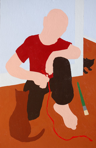
Painting Break (Self Portrait), 2006, 36 x 24 inches, acrylic on canvas
This is the newest.
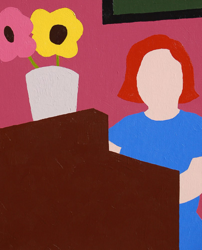
Hostess, 2006, 20 x 16 inches, acrylic on canvas
2.
September 13, 2006, 3:24 PM
I instantly thought she was playing a piano too... it was only Nobody's comment that made me think that wasn't the intention...
3.
September 13, 2006, 3:40 PM
I didn't intend it to be, but that's three people who thought it was a piano including Supergirl. What the hell - it's a piano.
4.
September 13, 2006, 3:59 PM
I have issues with the flowers in Hostess. Warhol flashback. Sorry.
5.
September 13, 2006, 4:05 PM
I'm glad somebody caught the homage.
BTW, thank you, Nobody.
6.
September 13, 2006, 4:15 PM
I didn't even for a second consider anything other than it being a piano...
7.
September 13, 2006, 4:30 PM
Dear Franklin,
Maybe it's a piano thing (I play piano), but I did not consider it to be a piano because every piano player I know would never place a pot filled with flowers (especially live flowers with water) on their piano. Also, considering the fact that a lot of piano players own cats, placing a water-filled pot on your piano is just begging for an accident!
A flower pot filled with water on an electric piano? Maybe...for those pianists who are more daring, of course! Most of your electric pianists tend to own dogs. :)
James
8.
September 13, 2006, 4:57 PM
Well, if this is a domestic interior, the piece of furniture in question could certainly be something other than a piano, like a chest of drawers or some sort of armoire. If she's a professional hostess, such as some lounge singer, then a piano would fit better, and the presence of the pot with flowers would be quite plausible, if not predictable. However, I favor a domestic interior here. Franklin?
9.
September 13, 2006, 5:19 PM
I knew I recognized those flowers from somewhere...
Part of the 'piano' thing is due, I think, to the low viewpoint... she must be on a stage... unless she's just the hostess at Denny's, and the viewer is cast in the role of a small child and/or midget, waiting to be seated (please).
10.
September 13, 2006, 5:51 PM
Actually, Marc, the flowers could just as well be coming from some cheesy plastic shower curtain at K-Mart, which is partly why I have issues with them.
11.
September 13, 2006, 5:56 PM
Ah, where's Henri Fantin-Latour when you need him (not to mention the great Dutch flower painters)...
12.
September 13, 2006, 7:53 PM
Franklin, for me, the first painting is more successful than the last one. It's clearly more visually stimulating, both in terms of composition and pattern. Given the "faceless" approach, and the relatively mundane subject matter, there is the danger of intrusive banality if the formal elements are not sufficiently interesting, and they are not in Hostess. The nod to Warhol only heightened that, to my eye (and mind). He's not where you want to go to make your work stronger.
13.
September 13, 2006, 8:12 PM
I like the first painting more than the second. Since you use only simple colors as major visual expression in your paintings, the dark brown piano is too heavy. It makes picture unbalanced. I like the relationships of colors in the selfportrait, their harmony. The different shades of brown (shirt vs floor vs cat) the skin tone vs blueish wall play well in the whole picture. The nice break down from "too much harmony" is the puncture of the black color (sneaking cat vs pants). It introduces element of surprise.
14.
September 13, 2006, 8:25 PM
maybe i've worked in restaurants more than your other readers, but when i first saw the title i saw the shape as a front desk ("do you have a reservation?") and never as a piano. though without the title i don't know what i'd think.
also, i had the same response with these new flat pieces that i had the last time you posted them: colorforms. the early ones that are just shapes, from the 1950's. i think it's the flat color and the way the shapes seem to be laid down on the picture plane. and the sense that i could just peel off an arm here or the flowers there and place them somewhere else. i can almost smell the plastic...
(i don't mean these comments in a negative way--it's just an observation about the memory that they trigger...)
15.
September 13, 2006, 8:31 PM
Necee got it!
16.
September 13, 2006, 10:55 PM
The green brush is necessary IMO for 2 reasons: 1, because he put the brush down to play with the cat, and you would do the same, wouldn't you? and 2. the green stains the red (hmmm, red studio) and without it the jolt wouldn't be there.
Hostess, piano, restaurant, the brown is fabulous and so is the shape, it is like a big staircase...it doesn't matter, the color is so good.
Question, is the paint textured?
17.
September 14, 2006, 1:28 AM
It strikes me that the figures all seem to loom especially large in these paintings, not so much in a close-up as in a giant or giantess kind of way. But why....? Maybe because of the absence of discernible facial or muscular details; like how a cliff face looks flat and featureless from a distance, which is part of what informs you how far away and how big the thing really is (which is what usually tells me how relatively little I am). Maybe because of the way bare flesh body parts in these pictures feel so mass-y: not massive, and not fat, but kind of chunky.
This treatment of the body sets up an odd scale relationship between me (the viewer) and the figures in the scene: odd in that I don't quite find myself believing the verity of the painted environment as much I'd like. I keep wondering what I'd look like if I were stylized so - would I recognize myself? As well, the relationships between depicted objects seem somewhat messed up too because each panel of colour is obviously made of exactly the same stuff (I mentioned inlaid rubber in an earlier post) regardless of the sort of material it is intended to describe - solid colours creating solid forms are good references of course, but maybe not enough here.
I still like the contours, those implied lines. I like the gentleness of the settings. I like the interplay of shapes and colours with other shapes and colours. It's not like I don't see the scene or feel the situation or have an interpretation for these paintings, but I'm trying to find words that accurately express some deeper sense of (slight) discontent with the degree of representation. I haven't been able to shake it, and these new ones confirm it.
I wonder if anyone else gets what I'm trying to say, or if I just have to have "JERK" tattooed on my forehead.
18.
September 14, 2006, 10:08 AM
I’m with ahab, tattoo "Jerk" on my forehead too.
Franklin, I’m confused about why you are putting these up on the web now, especially when you are so close to an upcoming exhibition. I suspect it might be because of the move and you want some feedback, a cyber studio visit, if you will. The problem is that everyone knows you have a show coming up and as a result, I think they are being polite.
I feel the direction you have taken may have unrealized potential but from what I can see in a jpeg, "unrealized" is the operative word. These feel like castrated painting, they are a victim to an idea and maybe a material. It feels to me like you have an "idea" for the paintings but have fallen into the trap of stopping there. They appear pat, nice designs just colored in without any sense of a struggle in their resolution.
The surfaces feel "dead", to use Opie’s term, this may be a side effect of switching to acrylic which without some working can just appear totally lifeless. Flatness of the color areas can work but I think hooking up this approach with a figurative scaffolding is problematic. You obviously have paid attention to the contours but I question why you have chosen to eliminate any sense of line in the process. The resulting lack of detail, especially in the figures makes the images feel disconnected psychologically and not in a good way. It voids any sense of your engagement with the painting, any sense of your interest in these people, they are just tokens in a design, not real people.
In the first go around, Opie made the comment "This approach opens up opportunities for lots of color weirdness." I thought he made a good point. Unfortunately, this didn’t stick, the color is pat, simple and expected choices without surprise or sense of containing light like your earlier paintings.
These paintings feel safe, without the risk of engagement. If you are going to fail, fail because you pushed the paintings off a cliff and they broke when they hit the ground, not because you were to timid to look over the edge.
I apologize for being so harsh, but if I was making a studio visit, it’s the crux of what I would say. I think you can do better than this.
19.
September 14, 2006, 10:16 AM
Part of the reason you see the figures this way, Ahab, is because they are not shaded. Without shading the whole width of an arm, for example, comes up flat against the picture plane, looks closer, has no volume and therefore seems larger. This applies to other things, for example the table the lady sits behind looks so massive because there are no features to invoke illusion of depth; the whole thing is right in your face - it is hard to get "past" it.
What Franklin has started here is a basis for making paintings which beg for invention in color and edge and using juxtaposition for depth illusion because that is what the pictures are - there is nothing in the way of radical improvisation. Certain Milton Avery paintings come to mind. As they are now they are essentially realistic paintings without features.
20.
September 14, 2006, 11:23 AM
thats a piano Franklin, i don't care what anybody says. maybe it's becuase her arms are reaching towards the piano keys or mabye it is the angle. i dont know but thats a piano and i am renaming it "The Pianist".
The first painting is much more interesting. I think the power in this type of painting is to suggest some motion or gesture with those very simplified forms. the cat peeking around the wall ready to pounce, accomplishes that.
21.
September 14, 2006, 12:06 PM
Ahab, I like "implied lines." That's apt. I'm going to posit that the degree of abstraction will look less weird in aggregate.
George, the show is a full month away, from today, in fact, so now's the cutoff point for showing new pieces. (Maybe I'll post one more in a couple of weeks, but that's it.) I learned my lesson from last year's PDF catalogue that people don't like the surprise getting spoiled. No need for anyone getting JERK tattoos. I appreciate the feedback.
If they're the victim of an idea, I'm not sure what it is - it's a different approach to the same problem I was working on before, to get a good abstract and a good figurative painting to happen simultaneously. Your point about timidity is a good one - I feel my previous work, or rather, my continuing to work in the style of my previous work, had become timid. I've been in the same mode for seven years, and I'm totally confident about my ability to get a model in the studio, throw down an assload of paint, and get a good painting off of it. I was bored with it. These actually feel like progress, personally, and I would claim that they're not timid, but they are pleasant to a degree that might be eliminating some psychology. I'm okay with that for now - I want them to work as simple formal compositions, and I'm figuring that psychology will find its way back into them as I make more. I would also claim that the surfaces are richer in person. (EC, they are textured. Sort of like old rubber.)
Opie, Avery has been on my mind a lot with these, obviously. One thing I don't like about Averys is that they don't push implied depth enough, the colors sometimes appear mousey, and the drawing sometimes just looks heavy handed. My opinion of him dropped a tad after seeing his show at the Boca Museum - his figure paintings sometimes look like Henry Moore sculptures condemned to inappropriate lives as 2-dimensional objects. I intended to make the underdrawings above looser (with a mind towards radical improvisation), but they didn't seem to want to go that way. They wanted to smarten up and order themselves. I'm going with it. I know from working otherwise that you can't assert looseness until a certain amount of experience builds up. So, more paintings! Which is great, because I'm having a really good time making these. I hope that comes through.
Thanks to all for the feedback, for and against.
22.
September 14, 2006, 12:30 PM
Avery painted all the way from awful to great, and his clunkers, unfortunately, can leave a sour taste that may affect seeing the good ones. Also, curators often can't tell the difference.
These factors may have been a problem with the show you mention.
At his best and broadest, when the color is good, as in some of the late landscapes, he can be an excellent model of how to make an essentially segmented and simplified realist painting work. Of course so can his main source: Matisse.
It ain't easy, for sure.
23.
September 14, 2006, 12:49 PM
Based on the images I've seen so far, I think the general approach you've taken, or more specifically, the degree of realism you're employing, works better with greater complexity or more intricate interplay of elements. If you simplify too much, as in Hostess, it becomes too bland and prosaic. Pleasant, yes, but too reminiscent of a still from a TV cartoon show. If, on the other hand, you go for a less realistic, more stylized approach, greater simplicity would work better. Think of Matisse's blue nudes, for instance.
24.
September 14, 2006, 1:57 PM
Franklin, have you looked at Alex Katz's early collages. He cut out construction paper to make some interesting compositions with the simplified forms. I think it relates to your new paintings.
25.
September 14, 2006, 2:43 PM
this kinda pictures you are working on are strictly composition and color. in that order. they do both need each other though. sure the paint may show some texture, only slighltly visible over the net, but essentially that is not a big factor with these pictures.
"painting break" comes off overall better than "hostess". my favorite part of that one is the compositional aspect of the cat around the corner part. the whole pic has more visual interest than the other. color on both needs some work. on hostess the only thing that works for me is actually the way the hostess stand cuts into the rest of the picture, everything else you could improve upon.
i think you could really help yourself out by first setting up the composition. this is crucial. unsure what you artists would call this, but i would work with the shapes you are using almost like is done with collage. keep repositioning and varying size and relationship until you get it right. because these are pretty simple in your format, if you had them cut-out manually or on the computer you could float the forms in the space all-day until you felt good without having to make many mistakes on the canvas. of course matisse did this with his similar collages. hofmann also did this with his paintings. he would pin different colored shapes all over the painting before he put on the paint. moving them completely across the canvas or only a milimeter. many of his paintings still have the experimental holes.
26.
September 14, 2006, 2:58 PM
of course the line of each object is important as part of the overall composition.
27.
September 14, 2006, 3:41 PM
1, the compositions are preplanned fairly thoroughly. If they're not working, spontaneity isn't to blame. The collage idea is a good one. I have considered it already, but haven't gotten around to trying it yet. I ought to.
28.
September 17, 2006, 11:42 PM
I like them both.
29.
September 21, 2006, 12:53 PM
re-reading my post i can see i was little off and harsh in talking about your color.
some of the individual colors are actually quite nice.
on the upper i do really like the wall and trim and only queation the skin and floor colors, independently and as they play with the others. i like the red string too.
on hostess, which i thought was a hostess stand before looking at the title as well (with having the advantage of much time both eating and working in many a restaurant), everything seems to be going off in it's own direction. does not come together as comp or with colors. seems a bit boring, empty or childish (not always bad). the colors while taken individually are fine, except maybe for the skin again and the "brown" stand, while nice compositionally, does not go at all with the rest. also taken independently, the back wall, flower pot and greens alone are great. independently hard to fault the blue dress, red hair and flower colors, but they, like the color of the skin and stand fight unforgivingly with the other colored forms. but they are fairly basic pure natural colors.
if you were to limit the # of colors and range the pictures would probably be more of a success without even cropping or reshuffling the comp. think you would speed up the learning process with these new pictures if you kept it more simple at first.
i'd be curious to see how different "hostess" would be if you just used the back wall color, the pot color and greens (or variations on these 4), with maybe choosing one from your yellow flower, red hair or blue dress, and then re-cropping.
keep knocking them out.
1.
Nobody
September 13, 2006, 1:46 PM
I'm thinking about the importance of the green object [paint brush ?]
And my feeling after looking and relooking is that it does not seem right.
Compositionally it is a distraction.
the title says it with out having to see the brush.
The Hostess appears to be playing a piano.
other than that both works are Perfect.