Next: Somebody think of the children (23)
The Key to modern art
Post #875 • September 25, 2006, 12:56 PM • 38 Comments
From A Sweeper-up After Artists by Irving Sandler:
John [Ferren] would particularly needle friends who claimed to have some privileged insight into art's purpose and destiny. He humorously recalled that on two occasions he had come close to discovering The Key to modern art. On his first trip to Paris, where he lived from 1931 to 1938, he encountered Picasso and Braque in a café in one of their rare meetings. Now, he thought, he would get The Word. He sat down at a table near them and overheard Picasso say: "Now Georges, that's not the way to put in plumbing." At another time, John recalled: "I dreamt that I had solved painting. I forced myself to wake up, found a pencil, and wrote my dream on the wall. In the morning I remembered what I had done and found the spot on the wall. It read, 'Dream 76. Green.'"
3.
September 26, 2006, 12:05 AM
Green is a very underused color in abstract painting. I don't know why. Maybe it is imprinted on our psyches as common and inexpressive because throughout our evolution was was basically background and the only interesting color was one that contrasted with it.
9.
September 26, 2006, 1:34 AM
Come on guys, you all must be kidding! Green is the easiest color to 'get' in your painting, as it's one of those accidental hues simular to grey and brown, which just happen when 'smooshing' color around -looking for a form or composition. I prohibited green from all the painting classes that I've advised in the last few years because of it's general usage. Seriously, not one abstract painting created without advisement has been devoid of the predominance of green as a 'tie it all together' hue. Every painter gets green to dominate somehow. Think about it how many variations are there? More than any other hue - we respond to nature and this hue sits well - we think it's done then...
Black contours - woops some yellow there...
Blue horizon - and just a bit of chrome yellow that... fuck!
Well this ochre should 'work' over the umber underpainting - damn...
When I varnish this atmospheric cobalt field ... augh!
" But I don't understand, I used the compliments of blue and orange, and then when I tried to cool it down I got..."
"In that light, I thought that it looked warmer, but when I tried to neutralize it..."
Lets leave green for delicate touches, not for smothering and dominating the picture!
Art is to remind us not of the nature we are, but of the culture that we have created and our alienation from it.
Bring on the fake tits!
12.
September 26, 2006, 2:23 AM
George, what I'm mentioning here deals with process abstraction - not perceptual imprimatura, alla prima, or lean over fat, or wet on wet, or impasto, or impressionistic observation/responses to observed things as such.
Franklin started the post with (bad) abstraction; it then went to 'green' and thus Van Gogh's paintings are beside(s) the point. (Anyhow, his paintings are more illustrative of form concieved through mark-making; just look at how well they read in black-n-white!)
Brian Gefen and David Marsh are two damn good young local abstract painters that illustrate ( perhapes the wrong choice of words) a manner in which an abstraction can be made without the reliance on green.
If they were looking at trees, plants, or grass, they would probably use purple to paint it/them and the work would look better visually.
Green looks good to tired snowboarders who can't wait to mountain bike and hike.
13.
September 26, 2006, 2:32 AM
Is'nt it interesting though, how 'stiff' his paintings are compared to his ink drawings - thus painting is the hardest to control; because of color and mark...
Everyone wants 'smoothism' and 'slickism' now-a-days (regardless of color) they want to imagine thier own hand making the piece; kinda like pulling on 'it' with your left hand inverted in order to make it seem as if it's someone else...
14.
September 26, 2006, 7:49 AM
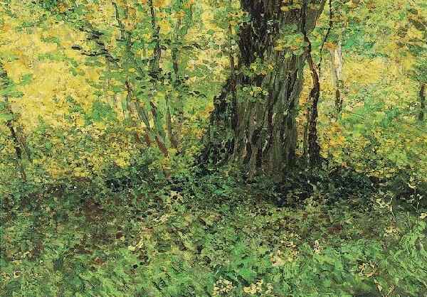
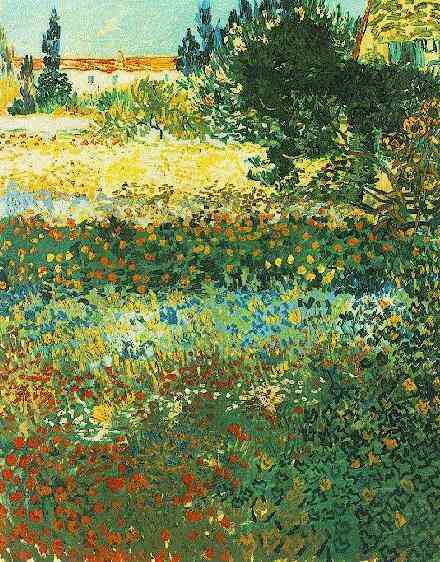
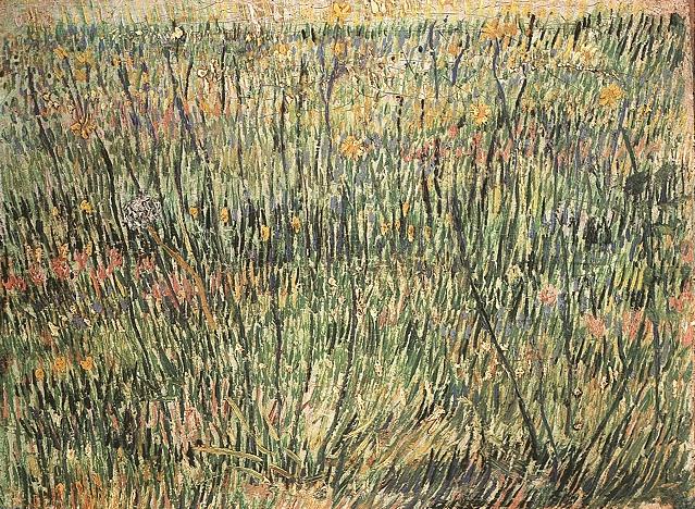
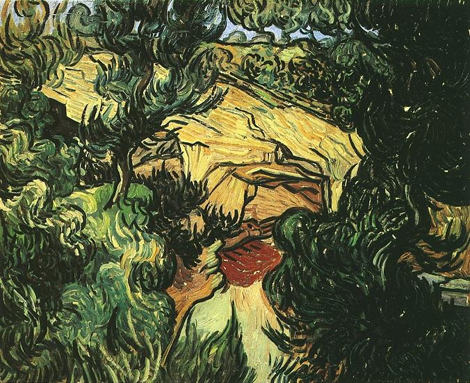
Jordan, you and I must be in a different painting world. I simply have never seen anything like a prevalence of green in abstract work. Just the opposite. It is common in landscapes, of course, because everything is green anyway, as George & Vincent keep demonstrating. But not abstraction.
15.
September 26, 2006, 8:22 AM
The reason I put them up, aside from the fact I was just looking at them, is that they're quite abstract, green was a side issue.
16.
September 26, 2006, 9:55 AM
Ok, here is a real greenie: Sweep
And another that has a great deal of green: Jam
And sort of green: Forest
This has a big green spot floating on top (maybe I'm pushing the point here): Swirl
And some dull landscape green sans the landscape: Gator Gait
I must disclose, however, that I do not like green.
17.
September 26, 2006, 11:43 AM
That "Sweep" is pretty hot, John, the green notwithstanding.
But the only reason the green is there, George, is because the pictures were intended as realism, or at least drawn directly from it.
I think this is interesesting. Franklin could have a whole set of post ideas for any slow day, colors, subjects, sizes, shapes.
18.
September 26, 2006, 12:02 PM
green and red jump out at me when i think of hofmann, especially green. maybe he does not use it the most in his pictures, but that color really stands out to me in his pics, as well as red. but his green is what prevails for me somehow. of course he is very primary with color and uses straight blues and yellows too.
http://images.google.com/images?svnum=10&hl=en&lr=&q=hans+hofmann+green
http://images.google.com/images?q=hans+hofmann&svnum=10&hl=en&lr=&start=20&sa=N&ndsp=20
http://www.hanshofmann.net/art/art.html
http://images.google.com/imgres?
noland also uses green often. but he uses every color with wide range.
opie, you use green often and well too.
19.
September 26, 2006, 12:13 PM
Yes, Hofmann used green in the late paintings in a wonderfully expressive way, so that it was warm, and even felt "glowing" sometimes.
I guess I may have to retract my no-green observation somewhat. Nevertheless, I repeat, this is interesting, as all really specific discussions are.
20.
September 26, 2006, 12:16 PM
http://images.google.com/imgres?imgurl=http://www.atelier-rc.com/Atelier.RC/b-dayCalendar/03.21-HHofmann-ThePainter.jpg&imgrefurl=http://www.atelier-rc.com/BirthdateYear/03.21-Hofmann.html&h=450&w=352&sz=54&hl=en&start=139&tbnid=cRHoplqEGTnZCM:&tbnh=127&tbnw=99&prev=/images%3Fq%3Dhans%2Bhofmann%26start%3D120%26ndsp%3D20%26svnum%3D10%26hl%3Den%26lr%3D%26sa%3DN
never saw that before...
sander was very primary too, but used green often
http://images.google.com/images?svnum=10&hl=en&lr=&q=ludwig+sander
dzubas not afraid of green
21.
September 26, 2006, 12:47 PM
"Alan Ebnother makes only green paintings."
http://minusspace.com/ebnother/ebnother.html
22.
September 26, 2006, 1:06 PM
Thanks, #1 & Chris. Ebnother is a real treat. they are green for sure!
We need a beige day and an orange day and a dog day and a cloud day and a not much there day and a small day. Somehow this idea brings real art out here.
23.
September 26, 2006, 1:37 PM
I saw Ebnother speak anout two weeks ago in a panel discussion about "concrete" artist, concrete in this case meaning art which is entirely physical in nature, without any attempt at imposed narrative or transcendence. He takes his cues from another artist who was on the panel, named Joseph Marioni. (The third artist was Danielle Frankenthal, who draws in acrylic paint on plexiglas, mounted just off the wall).
Marioni is an articulate gent who believes strongly in what I think he called the modernist impulse, and thinks we are about 1/2 or 2/3 of the way through a 150-year transition period, after which postmodernism will fizzle out in favor of concrete art. Don't quote me on any of this, but this is the gist of what I took away from the discussion. Anyway, his works are layerings of intense color applied quickly with large rollers, in sizes from a few feet to over eight. (See a review by Michael Fried on his reviews page).
But never mind all this. The best part is that some of them are even green!
24.
September 26, 2006, 1:57 PM
re#17,
But the only reason the green is there, George, is because the pictures were intended as realism, or at least drawn directly from it.
Sure but so what? I was looking at them as abstractions.
25.
September 26, 2006, 2:43 PM
Interesting thoughts about the reasons for the absence of green.
26.
September 26, 2006, 2:59 PM
Re#23 Hovig,
Gee, you haven't been around for awhile, good to see you back
I saw the Joseph Marioni show at Peter Blum. It's not particularly the kind of painting I tend to like but I have to admit they had an impressive presence. My favorite was the greenish (really off white) one at the far end of the gallery (pic upper left). The "green" one was really green, like Paris green, darker though and approaching the bilious. It wasn't clear to me how they were made, the paintings appeared to be made with a single pass mark, top to bottom but I really couldn't tell.
For the most part I thing monochromatic abstraction is a cul de sac, but these were ok.
27.
September 26, 2006, 3:37 PM
Re #24, George, I was speculating on the reason green seemed to be absent from abstract work. Art derived from nature that "looks abstract" is an interesting side issue which appeared in the guise of a response to that speculation but was not.
In any event, having been inundated with green, I better revise my opinion.
The Marioni paintings are made with rollers, which I also use, along with other commercial tools. Rollers are great: quick and anonymous.
28.
September 26, 2006, 3:45 PM
The Marioni's at Peter Blum were big, maybe 8 feet high.
I don't doubt that he might have used a roller, betcha it was a big one
29.
September 26, 2006, 5:39 PM
Thanks John Link - nice work!
30.
September 26, 2006, 7:24 PM
Thanks for your comments opie and Jordan. SWEEP is now located in Alaska where it is kept cool by a guy who loves green - it's his fave color.
31.
September 26, 2006, 8:18 PM
jl...from that group, forest looks pretty good too, in addition to sweep. obvious connections to morris louis (less poons) with forest. does the photo contain the entire painting? i'd be curious to see how the edges really looked. that would have a big impact on this painting, did you ever not go to the edge with these on all sides or draw in the edge? or handle it some how differently? because all the first seven of this style look good as is, but i have wondered what would happen if the edges were handled differently for some time now.
from 1987 to the later ones, jenkins, griefen, bannard, hughto, frankentahler cross-overs. i like stubby, bloom, sweep, gras, yellow canal and the way you use the yellow in some from 2005.
32.
September 26, 2006, 8:26 PM
although he handled everything well, cezanne was a master with green. sure it was mostly landscape, but it was about green. he had green down, along with blue and that earthy orange / brown ochre color. it seems like most of his pictures were cenetered around those 3 colors.
33.
September 26, 2006, 8:43 PM
nice cezanne page,
lanscae:
http://www.expo-cezanne.com/1_3.cfm?ID=-1848703774
http://www.expo-cezanne.com/1_2.cfm
and to think he was the king of the still-lie too!
http://www.expo-cezanne.com/1_2.cfm
34.
September 26, 2006, 10:14 PM
Hey 1: The paint went around the corner down across the edges of FOREST, as paint is want to do. But the photo contains the whole painting; what you see is what was there. It was cropped from a larger canvas. FOREST no longer exists, which is why I use the past tense.
I like to take stuff from other artists, as you noticed. When I teach beginning painting, I have a project that forces students to steal. I explicitly excuse them from the unviersity's plagiarism policy, so they don't get nervous about what I'm asking them to do.
35.
September 30, 2006, 12:07 PM
Hey Hovig,
In response to your coment that " He takes his cues from another artist who was on the panel, named Joseph Marioni." , made me a bit sad to hear thats how it appeared. Actally we work in such different venues that there is not much common ground between us. Guess I should have been a bit more vocal.....! Not being a public speaker and not even being in the show wich fronted the panel event, I viewed my role as a back up.....
Good that you said something.....! Thanks.......! Seems that words and brush marks are two very different words........Grun....has had its problems historicly. If ever their was a form of color predjudice, green certainly has had its share of it........Green...................................
36.
September 30, 2006, 12:42 PM
Dear Bloggets,
Sorry about my spelling skills...see above...(wich=which, actally=actually, word [writen the second time]=world).........grun=green
37.
September 30, 2006, 2:44 PM
Green and Vincent van Gogh’s work ...If you closely study more of Vincents work the use of strontium yellow becomes apparent in almost all of the work. This yellow was very easily pushed into the greens with some of the new pigments that became available during his lifetime, such as emerald green......
Few realise quite how significant his contribution was to painting, that his adventurous use of colour changed the direction of art. Van Gogh deliberately set about using colours to capture mood and emotion, rather than using colours realistically. At the time, this was completely unheard of.
This is not new information but somehow all this use of the word (green), sparks me to think once again about ...........his work.
38.
October 9, 2006, 4:32 AM
is abstract art the most dominant art form of the 21st centrury?
1.
jordan
September 25, 2006, 7:40 PM
What's the jist of the book? I don't get much from the Ferren paintings - is this another 'see them in person' thing?