Previous: Body Worlds 2 at the Museum of Science (39)
Next: Feeling that New Times love (23)
Painting Summer - Alex Katz considered harmful
Post #848 • August 9, 2006, 2:40 PM • 35 Comments
Painting Summer in New England at the Peabody Essex had three of them. With apologies to JL, who liked them, every time I see his work, the awkwardness only ever looks more pedestrian. To me, the great size suggests not painterly heroism, but that they would be more effective as carpets.
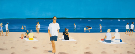
Alex Katz: Harbor #9, 1999. Oil on canvas, 96 x 240 inches. © Estate of Alex Katz/Licensed by VAGA, New York. Photo: courtesy Pace-Wildenstein, New York.
Why have Katz when you could have Kuniyoshi instead?
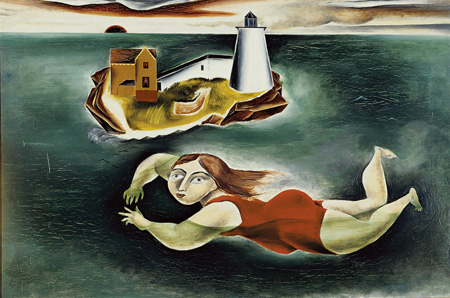
Yasuo Kuniyoshi: The Swimmer, ca.1924. Oil on canvas, 20 x 30 inches. Columbus Museum of Art, Ohio. Gift of Ferdinand Howald. © Estate of Yasuo Kuniyoshi/Licensed by VAGA, New York.
I understand the Modernist impulse to make figures a little dumb and clunky. A particular expressiveness becomes available, such as in the Kuniyoshi, or the requirements of drawing take a back seat so that the artist can work with broad areas of color, such as in the Katz. But the guy who got both of these right most often is Milton Avery.
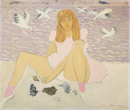
Milton Avery: Artist's Daughter by the Sea, 1943. Oil on canvas, 36 x 42 inches. Brooklyn Museum, bequest of Edith and Milton Lowenthal.
Maybe not my favorite Avery, but a beaut nonetheless. Imagine the same pose in the hands of Balthus, and how it would have none of this charming innocence and whimsy.
2.
August 9, 2006, 4:52 PM
The Katz is a dog, clunky and badly set up. The color/value balance between sand and sea is all out of whack, and it really cannot be in a painting like this. It's just sloppy painting.
The Avery is sweet, although I am not a great fan of his figure paintings, and I like the Kuniyoshi - it has that typical late-20s/early 30s type figuration and better color than his later work..
3.
August 9, 2006, 7:17 PM
OP, I doubt Katz is aiming for an audience that worries about color/value balance or other such things. He's the perfect artist for one of those Banyan Trail galleries up in Boca which sell pricey, upscale decorator art to those who who'll pay for it as long as it's got the right brand name. It's ultimately tony kitsch, but it's big and easy and has "blue-chip" credentials. What more could one ask for?
4.
August 9, 2006, 8:07 PM
To be precise, I'm ambivalent about the Katz shown here and liked the large landscape late in the show (I'm indifferent-to-negative about the early double-sided piece of his in the show--I don't like it much, but it's too hard to see the way it's installed to really judge.) I get a sort of a thrill out of the size of this one, and the broad areas of color, but it's much too awkward, even if intentionally, and never really comes together. The idea of locating heroism or some other enduring value in such a mundane scene is one I find attractive, and perhaps wish were there, but it's not actually achieved (compare, across the arts, to Philip Larkin's "To The Sea"--sorry that's the best online copy of it I could find.)
I'm very disappointed now that the PEM staffer interrupted us just as you were asking me about the Milton Avery and we never ended up getting back to it. Of course it can't help but make one think of Balthus--not a bad thing, in my book--but the technique is pure Avery and very pleasing. I never completely warmed up to the Kuniyoshi, I'm afraid.
5.
August 9, 2006, 8:16 PM
Now I know what the Katz above reminded me of: one of those old cigarette print ads, especially on billboards. This guy, for all his preciousness, is basically doing fancy advertising graphics. He's not as crude or overwrought with it as Rosenquist, but it's more or less on the same level, essentially.
6.
August 9, 2006, 8:17 PM
Hm. I should try to remember what I've written. When I talked about the show earlier this summer, I did, in fact, praise this Katz, though mostly for being evocative of summer, which it undeniably is. I can't say right now if I liked it better then, or if misgivings about it only surfaced recently; probably a mix. I would say that I always have preferred the Hans Hoffman and Neil Welliver paintings hung in the same room, and a number of others in the show as well.
7.
August 9, 2006, 8:17 PM
I had forgotten about the double-sided one, which would make three including Turds on the Beach. It's fixed above.
8.
August 9, 2006, 8:27 PM
The Kuniyoshi has a certain period charm, but it's a little too much of its time. It looks a bit stale, and the color, while interesting, feels strained.
9.
August 9, 2006, 11:17 PM
The Katz is pleasant enough, in a New Yorker cover way.
The guy in the foreground looks like he really has to go pee.
10.
August 10, 2006, 8:57 AM
Precisely, OP. It's slick magazine-cover graphic work, which is perfectly valid, as long as it doesn't try to pass for something else. As we know, however, it's marketed and sold as something far superior, which it isn't.
11.
August 10, 2006, 10:54 AM
Oh it just hurts to hear all this Katz-bashing. Everywhere it seems--backlash? I revel in his abbreviations. Sure they can bomb, but when he hits it, he reframes or at least captures a way we see. I'm thinking about the pink and blue striped Maine sky, or that awful dog and canoe painting in Milwaukee--these are blunt paintings, going for the obvious. I love that because it is so verboten. Thin paint, obvious subject matter, thank God for someone just living a life. I prize his bluntness. But clearly, in solitude!
12.
August 10, 2006, 11:17 AM
For the record, I want all disagreements with my opinions to be as well written as EC's there. If you don't ask, the answer's No, right?
13.
August 10, 2006, 12:48 PM
That's right, Franklin. Someone you can talk to.
For the record, ec, thin paint, obvious subject matter, someone just living a life, bluntness --- all good things, and infinitely preferable to the pretentious horriblisme shoved in our face with such nauseating regularity. My only problem is that the paintings need to be better.
14.
August 10, 2006, 1:00 PM
the Katz doesnt work 'cause nature is chaotic and you cant impose order on nature.... thats why it looks like a billboard....no exhilaration for me...yawn
15.
August 10, 2006, 2:43 PM
I wonder why no seems to own this ginormous cartoon painting. !?
It's certainly no Manet, but as a small web image it makes me think of Daniel Clowes in it banality.
16.
August 10, 2006, 2:46 PM
...in its banality....there's a woman about to kidnap that child in the background. Quick someone call the police!
17.
August 10, 2006, 3:04 PM
Harbor #9: The good things about this jpeg image include a nicely wavering horizon line that gives away just the right amount of information about the distant shores; and how the guy's head contributes positively to the effects of the horizon while remaining firmly in the foreground; and the polkadot effect of the boats and waders. Bad things: the canvas-splitting water line with its flatness and head severing arhythmia; all three groups of figures sitting on scale-upsetting table napkins; the predictable double parentheses of the walking groups; the beach that alternately looks shell-pocked and rock-strewn -- that lower edge of the painting is just bad. And the way that guy is trying to unwedge his swim trunks is just painful to watch. The colours look better when I tip my laptop's crystal display way back.
The Swimmer: I kindof like this picture's colours and the style of the forms, but am bugged by the finicky nature of the glinting wavetops next to the chunkiness of the the building and figure features. I'm also bothered by the tidy framing of the figure and island. I am seeing how Kuniyoshi has made a better tight summer seaside painting than Katz, but the longer I look at The Swimmer the less I care about it.
Artist's Daughter by the Sea: Overall I think the dark-drawn lines work pretty well with the translucence of the scene. There are two things I can't get past on my way to liking this image: one, the solid almost carven block of wood that the girl wears on her head like a wig; and two, her too-blue zombie eyes drilling unseeing through to the back of my head.
Though I of course haven't seen the real things, I won't be saving these digimages to my harddrive -- 0 for 3 this time.
18.
August 10, 2006, 3:34 PM
just throwing this out on instinct...was avery pulling a 'modigliani' here with the face and eyes??
19.
August 10, 2006, 3:38 PM
on that same note ..was yasuo hanging out @ chagalls b4 he did this??
20.
August 10, 2006, 3:41 PM
When you sit down and paint a beach on a bright summer day you can simplify and pose things all you want but it just isn't right to correctly approximate the values on the beach and the figures and then paint the water and sky a blue so dark and saturated it looks almost like Magrittean exaggeration. As I say to my students "go look!"
Yes, the barrister's wig on the Avery girl does make an unfortunate clunk in the middle of the picture. He was best with a big canvas and broad swaths of color. He and Katz should have switched scenes.
21.
August 10, 2006, 7:17 PM
My problem with Avery's painting of his daughter may be quite unfounded, as it may be a case of false guilt by association with Balthus. However, she strikes me as a high-school girl dressed to look younger; her attire feels deliberately or stereotypically hyperfeminine, or hyper-little-girlish. The seemingly inordinate size and prominence of the thighs, combined with the pose, rather invites prurient thoughts (again, my view may well be distorted by a Balthusian lens). I just can't help but wonder, unfair though it may be.
22.
August 10, 2006, 10:08 PM
Yasuo, Avery and Katz all have a simular sensibility regardless of their stylistic differences. Recently, Katz in Philly was a pleasant surprise.
23.
August 11, 2006, 12:50 AM
The Avery is disturbing because it is so bad.
Bad as illustration... so why go any further?
Funny to read the dances around that...
The Kuniyoshi is interesting - something
I'd like to see in person.
The Katz image probably looks much better
reduced here. I find the color evocative. (The
least of its problems) Think sitting on the beach
wearing polarized sunglasses wondering if you'll be picked
for the Block Island race crew...additionally the format isn't
right for a magazine cover - without some major cropping -
so I think that suggestion is off the mark.
24.
August 11, 2006, 1:59 AM
additionally the format isn't
right for a magazine cover - without some major cropping -
so I think that suggestion is off the mark.
Well, there's always Harper's...
25.
August 11, 2006, 7:56 AM
Yeah. So crop it. And it was not a suggestion, it was a comparison.
26.
August 11, 2006, 11:12 AM
The Katz reminds me of Graham Nickson, anyone else? Another oddball whose work somehow captivates: epic narrative with big Modernist agenda. Bring it on, I say, French painting rules! Kitsch plus ambition-uniquely modern.
Opie, perception yields uncanny results so I don't disbelieve the harsh darkness of the shoreline. I'd have to see the locale to think it was a bluff...but that said, it's not one of Katz's best.
The Avery hair looks like Thomas Trosch or Florine Stettheimer. It's a weird example.
The chrysanthemum from the Sackler a few days ago...when I think about that in relation to Katz, the delicacy of the harder line and the soft shadows in the chrysanthemum balance with ease; with Katz the balance is struck by the linear and geometric aspects of his forms with the amazing solutions he finds for tiny sand hillocks and reflective water.
Okay I'm rambling, not that invested in any of these paintings overall.
27.
August 11, 2006, 12:34 PM
Nickson does not remind me of Katz, ec. his paintings are very "loaded", lots of red and such like, and katz's are deliperately thin and cool.
Also, you don't have to see the locale to know the sky is too blue. just look out of your window. That reminds me of the old hipster joke:
Stoned hipster: "Hey, man, is that the sun or the moon up there?"
Straight hipster: "Dunno, man., This ain't my neighborhood"
28.
August 11, 2006, 4:00 PM
Sorry, opie; skies look different in different places. Different times, too. Could be the right blue after all. Looking out your window won't help.
Sometimes trying to be true to the visible can hurt a painting too.
29.
August 11, 2006, 4:08 PM
Obviously you don't look at the sky much. piet. There is no such thing as a sky that even approaches that saturation at that value, especially the lower part of the sky, which is lighter. It does not exist. especially on a bright, clear summer day. Same goes for the water. Go look.
30.
August 11, 2006, 6:29 PM
The more I look at that Katz, the more I think of a Joe Camel cigarette ad. Not a good thing.
31.
August 11, 2006, 6:47 PM
Sometimes trying to be true to the visible can hurt a painting too.
This is absolutely true. The colors are out of whack as OP observes, but the problem isn't those colors individually. It's that Katz isn't pulling them off.
32.
August 11, 2006, 7:25 PM
The Katz above feels mechanical, inert, shallow and ultimately lifeless. It is not entirely unsuccessful on a certain level, that of a big decorative piece or mural, but it's basically artsy wallpaper.
33.
August 14, 2006, 9:28 AM
Nickson's Georgia Bathers on the NYSS website. Differs in all the ways you suggest, Opie, facture, form and light--but there is an impulse to make the ordinary architectonic in both and looking at one conjured the other.
Not my favorite impulse in painting, either way.
Glad you're not dead.
34.
August 15, 2006, 12:41 AM
[Deleted spamming nonsense. - F.]
35.
August 15, 2006, 1:32 AM
iybhwk akzivdn, you're just bitter... you should try to be more open-minded...
1.
Jack
August 9, 2006, 3:11 PM
"Heroic" is a word that has never come to mind concerning the work of Katz. He's a glorified illustrator, effective enough as such and decoratively "stylish," if you will, but I don't buy him as a painter. The Avery is far better work, of course, but I find it a little disturbing, precisely because it 's unmistakably reminiscent of Balthus.