Previous: MIT is going to save art from what, exactly? (16)
My first silkscreen print
Post #828 • July 12, 2006, 3:46 PM • 57 Comments
Silkscreen, as a method, is totally obvious, unless you've never done it before, and haven't discovered the myriad ways to screw something up. Errors compound, unless you get lucky and something covers something else. By the time I got the result below, I had, in order of appearance:
- Decided that my first print of my own image was going to have five colors (three would have been plenty)
- Allowed old ink to dry on the screen
- Failed to remove old emulsion, which is now permanently stuck in the screen in the form of little specks
- Put on new emulsion too thickly, causing the one of the exposures - the drawing - to tear open upon being washed out
- Didn't clean the glass of the exposure table, causing a less than perfect exposure
- Mixed up way too much ink
- Didn't register with sufficient care
- Forgot to cover one of the other exposures with freezer paper while printing the last color, gacking a print
- Left the acetate I was using to register down during one of the pulls, causing ink to crawl around the front of the screen and blob onto three successive prints
Like the t-shirt says, oh no, another learning experience. The teacher pointed out that for a professional grade print, you make 15% extra prints over the edition for every color. Working backwards with that calculation from the 12 I printed, one might predict eight successes. One would be about 100% too generous in this case.
But I enjoyed it. It's a lot of fun. The colors used full-strength have a velvety intensity that is hard to describe, but is easily distinguishable from offset printing. It translated the method I was using in the Taichung Diary drawings into color to my satisfaction for the first time. Perhaps best of all, this paves the way for an Artblog.net limited edition poster.
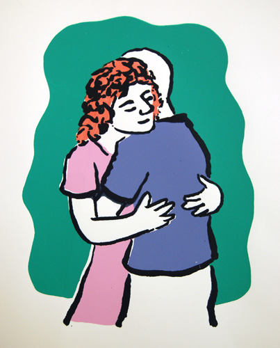
Embrace, 2006, five-color silkscreen, about 8 inches high
2.
July 12, 2006, 5:56 PM
Beautiful!
What's it printed on?
I saw a Chuck Close silkscreen that had 124 colors - it was an edition of 45, or something like that. I was amazed that you could even get 45 good ones after that many pulls.
3.
July 12, 2006, 6:56 PM
hey franklin! nice print, but man you had Kristen Theile down here in Miama she is an excellent silkscreen teacher! oh well guess you'll just have to pay extra dues to the screen gods he he
So there is a small museum in concord ma, (concord mfa? i forget) that has the best collection of barbizon and hudson river school paintings. You would love that, and the museum itself is charming, not too far from walden pond i believe. (?)
glad to see you printing!
4.
July 12, 2006, 8:25 PM
My eyes teared up when I saw this! Content CAN be beautiful ...
5.
July 12, 2006, 11:35 PM
Ugh.
an obviously trite and manipulative attempt at begging for empathy from the viewer, or at Art Therapy lite.
really, this is just plain dull and tired. Is the bald guy you? Is the red head your feminine side? feeling guilty about the anti feminine stance Artblog.net is starting paint for itself in the greater blog-world?
with all those incredible paintings you've seen latetly, you'd think something would rub off.
6.
July 13, 2006, 12:03 AM
Jack, you'll notice that he disses the Scully, which is handily the best thing in the museum. With the exhibition title and CSdJ's track record, it's amazing that he made it through the whole thing without referencing any body fluids.
Anna, thank you. It's on bristol. The colors were all cut out of bristol, except the drawing, which was drawn on newsprint in ink with a brush, and oiled. The Close show came through Miami and I saw some of these huge silkscreens with five dozen colors in them. Technically they're amazing.
C, thanks, and yeah, that would have been sweet. I'm already in talks with Kristen to do the Artblog.net extended edition poster. I recommend Kristen's Postergirl Press services exuberantly. I'll check out the Concord museum - there's a lot to see up here!
Jordan, yep...
Redress: to answer your questions, yes, no, and no.
7.
July 13, 2006, 12:05 AM
It looks like she is flipping you the bird.
8.
July 13, 2006, 12:13 AM
No, Anonymouse, that's a special message to you.
9.
July 13, 2006, 12:29 AM
I'm glad you linked back to those ink drawings. They've played a role in my own drawing. I still like "Woman Mopping a Storefront" best of them all.
This first print makes screenprinting look easy, in spite of your declarations to the contrary. I actually like the crudity of screenprinting because mistakes are unavoidable and they're the things that give the final product it's touched feel.
10.
July 13, 2006, 12:50 AM
Or its "felt touch"?
The problem with screen printing is whatever goes through any one particular screen is completely dead flat and uniform. It is absolutely ideal for certain kinds of image making and impossible for others. It is perfect if your image is made up of flat colors in layers and terrible if you want subtle surface inflection and shading. Studying Japanese woodblock printing is helpful if you want to use silkscreen.
11.
July 13, 2006, 2:31 AM
This first print makes screenprinting look easy
Amen to that, Ahab. I particularly like the woman's hair.
Also, the Taichung Diary is really fascinating. Seeing those images makes me want to draw, which I haven't done for a really long time - not that I could create anything like that, obviously, but I'd love to even try looking the way I guess you must have been looking.
12.
July 13, 2006, 8:40 AM
I'm not sure he meant it that way, Franklin (#6). Maybe that's just the best he could come up with; maybe he thought it was a least semi-clever, and presumably felt the statement was worth making. The fact that it's an utterly useless statement which has essentially nothing to do with the actual painting is apparently not his concern. But it should concern those who read art criticism as such, as opposed to riffing for the sake of effect.
13.
July 13, 2006, 9:06 AM
Ahab, thanks.
OP, the inks are basically acrylic paint, and as such there is a transparent medium for it. The red of the hair is printed transparently above. Shading is possible, but it's a perverse thing to do with the medium. (You probably know already, but I figure I'd say for anyone else.) I found the flat hues so attractive that I decided to use a strong drawing layer to organize the color areas in back of them, an idea I flat-out stole from ukiyo-e.
Bunny, that's the highest praise possible. By all means, draw again. I'm honored.
Jack, that's been the problem with his writing, historically - it's hard to guage his sincerity. But yes, if you like art criticism, and know what it looks like when done well, there's a lot of cause for concern, and not just in Miami.
14.
July 13, 2006, 11:04 AM
Oldpro, I understand "touched feel" to mean a human made it by hand; while "felt touch" that the human made it with an investment of emotion. Both seem to me accurate descriptions of the effect of Embrace.
I've done some screenprinting, and some graphic work used in screenprinting. I much prefer other methods of imagemaking. I'm not sure the medium is suited to anything but iconic images and text. Each successive layer needs to be finer in detail so that earlier swipes aren't erased; the final layer often stands out as such because there is so little interaction between layers; and the final product can often seem of ambiguous origin - is it a digital print or a factory product?. All things which errors in process can help overcome. Basically, I'm just agreeing with the more concise criticism of the medium in #10.
15.
July 13, 2006, 11:48 AM
Soviet Era propaganda art , the posters, etc, are also a good source...
16.
July 13, 2006, 12:35 PM
Be careful of "embrace", Ahab. It and "passion" have redently joined the long list of vogue words losing their effectiveness through overuse.
The powerful influence materials have on results in art is something that is undertaught and is particularly necessary to understand in this time when we have so many highly developed techniques and when anything can be called "art". The Abstract Expressionists had a terrible time making large non-object paintings with a medium which simply was not designed to to what they wanted it to do, for example.
Most printmaking techniques were originally evolved for practical image-making, not for art, and they did what they were intended to do well. The first thing to ask when we take up any medium is to ask what is does well and what it does not do well, and then put aside the old ego and go with the materials.
17.
July 13, 2006, 1:09 PM
Re # 16. oldpro
The Abstract Expressionists had a terrible time making large non-object paintings with a medium which simply was not designed to to what they wanted it to do, for example.
Can you flesh that out a bit?
18.
July 13, 2006, 2:18 PM
George, the medium was oil paint, of course, and the ambition of the time was to paint big, expressive, all-out "undisciplined" paintings.
However, oil paint had evolved for hundreds of year to accomodate fairly detailed, carefully-rendered, highly blended realist painting, and had the slow-drying character to accomodate this. The first thing that happens when you try to paint big, expressive paintings with oil paint is that you end up with either a smudgy, undifferentiated mess or a draw-and-fill, area-by-area picture with little expressive character.
Probably the only AE painters who had the basic skills to paint large & expressive with oil paint without changing the basic structural dynamic of the small realist painting were De Kooning and Hofmann. De Koonings imitators just made low-saturation messes - the "10th Street Touch". Most of the others founds ways out of the quandry by inventing brand-new ways of putting paint on: Rothko large colorful scrubbed areas, Clyfford Still large contrasty knifed areas, Tomlin simple open strokes of varying value in an illusion of depth, Pollock by eliminating brushing and filling altogether in favor of flung colored line, Louis by eventually pouring separated areas, and so forth.
Acrylic paint has helped because of its fast drying time, but this creates problems of its own because the artist is forced away from blending into layering. However, from my experience at least, it is much more accomodating for large abstract painting and offers a lot of new and exotic materials to play with.
19.
July 13, 2006, 2:38 PM
speaking of acrylic use,OP,
check out Lucinda Parker's work.
she's a bit older than you.
A Nor'wester.
uses acrylic at the grand scale.
you can try at www.portlandartmuseum.org
or www.laurarusso.com
etc.
20.
July 13, 2006, 2:57 PM
Re#18, Op
Thanks, thought that's what you were getting at.
It makes the big waterlilly paintings by Monet all the more amazing.
21.
July 13, 2006, 4:31 PM
Thanks, Stalin. They are pretty good. In fact I am impressed with the generally high level of the rest of the art in the Russo Gallery.
22.
July 13, 2006, 4:59 PM
George. the waterlilies are wonderful, for sure, but remember that any proportionate depiction of the external world, no matter how distorted or adapted to style, makes it much easier on the artist because the painting, in essence, is already present, and the work can proceed a section at a time with the confidence that something will come across, even if it sucks as a painting.
The problem for non-objective painting is how can a normal-sized person can get paint on a very large surface and keep it clear and interesting and full of life without the benefit of either depiction or the illusion in depth it affords. Pollock broke through with the Guggenheim Mural in 1943 and then refined that idea by learning to paint in such a way that line defines areas but the areas are left out, thus creating a "see-through" rather than a recessive illusion of space to make the picture hang together.
Newman, (and Still and Rothko, less dramatically) did just the opposite, simplifying and thereby unifying the picture by denying much incident or illusion of any kind.
23.
July 13, 2006, 5:59 PM
BTW the most egregious example of not knowing how handle large scale is "Guernica".
24.
July 13, 2006, 7:13 PM
re# 5 - come on, please - I guess you do'nt appreciate the relationship with/between aesthetics and love. 'Redress adress - what kind of spelling is this...
I've got a new cigar cutter, come on over and I'll show it to you...
jordanmassengale@hotmail.com - contact me you dumb ass !
25.
July 13, 2006, 7:23 PM
OK. Forget Carlos Suarez de Jesus and his pointless riffing.
Guess what, kids? Cassandra was right (yes, again; she can't help it). Go to http://www.miamisunpost.com/editorial.htm
Seems the Museum Park project is looking remarkably similar to the disreputable, disgraceful and inexcusable debacle known as the Miami Performing Arts Center. Of course, it's nobody's fault. Mere mortals couldn't possibly have foreseen, much less planned for, progressively rising construction costs. Nobody was inept, irresponsible, opportunistic or self-serving. Nobody misled the public or failed to provide full disclosure. Any appearances to the contrary are purely coincidental.
What a bunch of...well, they know what they are, even if they don't care.
26.
July 13, 2006, 8:51 PM
Hey franklin! I LOVE the silkscreen; forgive my ignorance, but couldn't the same screens be repurposed to print up some t-shirts? 'cause I've got $25 that's just burning a hole in my paypal account.
Not sure you've seen it, but an article in this month's Wired magazine (Which doesn't appear to be online, i don't follow the recent wired.com/wired-print deal) would seem to be very relevant to many many many past conversations here: "What kind of genius are you?" by Daniel H. Pink, regarding the work of David Galenson.
p.s. Hmm... some quick googling reveals at least part of the article here. More on Galenson here and here.
27.
July 13, 2006, 9:25 PM
Re #22. oldpro:
and the work can proceed a section at a time with the confidence that something will come across
Hmm, I don't think that's how Monet could have painted the big Nymphea's. Sure he sketched something out roughly, but he must have worked on the entire surface at once.
I think it's almost the same problem as how can a normal-sized person can get paint on a very large surface and keep it clear and interesting and full of life without the benefit of either depiction or the illusion in depth it affords.
Yes he had an image and illusion but I think so did Pollock. What Monet did was based on observation but a good part of this was observing what was happening in the painting space. It was a little pond but he turned it into a vast optical field. The're better than the latecomers I think.
Towards the end of his career his work was almost abstract, some were more expressionist than impressionist.
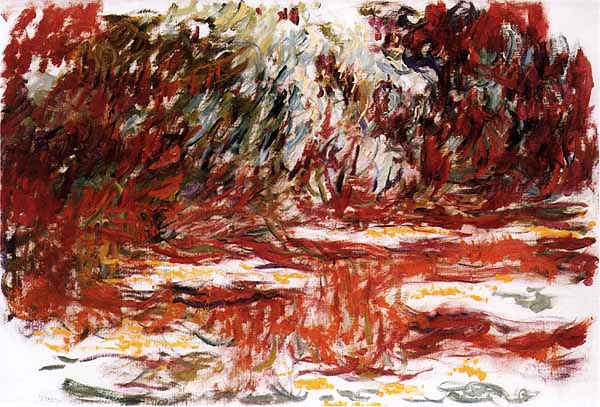
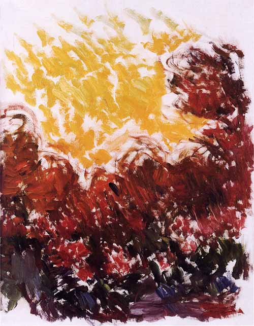
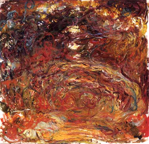
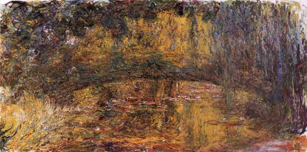
Blue Water Lilies, 78.75" x 78.75", 1916-19
Nympheas
Monet 1
Monet 2
Monet 3
Monet 4
Monet 5
Monet 6
Monet 7
Another Nympheas
29.
July 14, 2006, 11:20 AM
This image has all the charm of a hallmark greeting card. Please stop!
30.
July 14, 2006, 12:19 PM
Okay, Nipper! I take all of my artistic cues from anonymous haters.
31.
July 14, 2006, 12:39 PM
George, clarification. Whether or not Monet or any other artist painting a large painting depicting worked all over or a part at a time, or both, or neither, is beside the point I was making. The point is that there is a prior accepted visual rational for getting the paint on wherever you are in the painting. How it is done or whether it becomes a "vast optical field" is also beside the point.
As for Pollock having an image and an illusion: I thought I had explained. the idea of my comment was not that he did not have an illusion or an image but that he had to create them in the first place. That was the whole point, the whole difference between the two.
I always seem to be in the position of explaining everything to you over and over until finally one of us gives up. It is tedious
Are those images accurate? They don't look it to me.
32.
July 14, 2006, 1:35 PM
Re: #31. oldpro
I'm not sure about the scale or quality of the images. Some may be sketches. I have seen one or two very brushy late works by Monet, at that time he was nearly blind, saw in yellow-red with one eye and in blue with the other.
You're thinking like a professor, I don't need to have it "explained" to me. I understood what you were getting at. The thing is, I don't think it ultimately matters whether "there is a prior accepted visual rational for getting the paint on..." It's just a painting after all.
Certainly attitudes towards a painting were different during the two periods in question but just inventing a different way to make a painting is a moot point. The question is whether or not the result is any good.
So regardless of the methodology behind the works, I still think that Monet's large Nymphea paintings are better than nearly any color field painting (or Newman et al) from the 50-60's. There is just more there to see, more surface incident, more space, better color. They (Monet) are just a thousand times better visually, the others are not even playing in the same league. Sorry, but this is not a theoretical opinion, it is based on my own "experience", my instantaneous gut response. A hundred square feet of red has an impact, but it is not the same.
33.
July 14, 2006, 4:15 PM
"It's just a painting after all"
Once again, George, you leave me speechless.
34.
July 15, 2006, 9:29 AM
I ain't no hater...I'm just being brutally honest. Get real. Step back. Look again. I'm sure your proud of you cute little silksreen print. Now go check a book of Durer prints out of the library.
35.
July 15, 2006, 10:25 AM
Who? Durer? Wasn't he that German guy who did all those nifty silk screens of peoples moods, and like that?
36.
July 15, 2006, 10:37 AM
For your next trick, Franklin, do a silkscreen of Melancholia in 25 colors.
37.
July 15, 2006, 1:43 PM
Funny you should mention melancholia, Jack. I've been thinking lately about an art that is missing those elements of angst and fussiness that the Nippers of the world latch on to as a mark of seriousness. Actually, I'm thinking of doing a Leda and the swan.
38.
July 15, 2006, 1:52 PM
You ought to do some research oldho, I don't believe Durer was using silkscreen, but he was PRINTING was he not? He could serve as a good motivational tool for Franklin, or Franklin could license the image to the Hallmark greeting card company....jeez don't get so testy. When you put your work up on the www don't expect that everyone is gonna call you a master or love what your doing....truth be told I was making more elaborate and detailed silkscreen prints when I was a teenager, printing grateful dead tee shirts, selling them on the road to pay for my gas money and food.
39.
July 15, 2006, 2:17 PM
Gee, Nipper, you don't "believe" Durer was using silk screen? Maybe you should be the one to check outthat book!
Better yet, try a basic book on the history of art, with an emphasis on the evolution of printing techniques.
I am responding the way I do because here is someone who puts up a screen print accompanied by a very self-effacing account of a first try, and how hard it is and how many screw-ups he made on it, as a good-natured post for discussion only. He was not making any claims. Under the circumstances I think your response was inappropriate.
Furthermore, I am sure Franklin knows about Durer. And I am equally sure he understands a tongue-in-cheek comment when he sees one, and knows that silk-screen printing did not exist in the 1500s.
40.
July 15, 2006, 2:38 PM
Jeez Louise again with the testy comments!
I don't need no art history book to refresh my memory about Durer's engravings.....I'm only suggesting Franklin look at them for motivation.
...and was commenting on how great Franklin's cute print would look on a Hallmark greeting card and everyone gets all hot under the collar....have you ever actually read some of the mean spirited comment on this blog?
He can take it, as he sure as hell can dish is out.
41.
July 15, 2006, 2:44 PM
You are the one making the harsh comments, Nips.
42.
July 15, 2006, 3:10 PM
Harsh or True?
Franklin's cute first attempt at silkscreening would be a great Hallmark Greeting Card?
The card would say "I'm Sorry. Here's a little Hug"
Even R. Crumb did greeting cards before finding his voice in comics.
43.
July 15, 2006, 3:17 PM
correction
I'm sorry. Let's EMBRACE.
44.
July 15, 2006, 4:12 PM
Leda is always good. So are Io, Danae and Europa. Then, of course, there's Susanna and the Elders, if you want to go that route. There's certainly no shortage of opportunities for a good nude.
45.
July 15, 2006, 4:42 PM
I forgot Daphne, but you have to show at least parts of her becoming a tree, naturally. Oh, and Andromeda chained to the rock; she's also very good. Then there's Diana and her nymphs at their bath, or Venus at her bath, or just Venus being Venus, or Psyche...
46.
July 15, 2006, 4:53 PM
Or even better for this blog.
narcicuss and echo
47.
July 15, 2006, 5:20 PM
It's remarkable, not to say amazing, how some people torture themselves (not to mention others) when the solution to their problem is perfectly simple and all too obvious. Don't like a particular blog? Can't relate to it? Then ignore it and stick with what you do like. Works for me. But then again, I was taught that, if I disliked certain people, it was really not appropriate to barge into their house and insult them. Bad form and all that. Maybe mores have changed.
Oh, and that's Narcissus.
48.
July 15, 2006, 5:44 PM
It's alright, people. Nipper's right about one thing - I can take it. Really, all I have to do is consider the source.
Nipper, I have a background in illustration, so I don't take the Hallmark bit as a pejorative. But in all my writing - 50 articles, 800 blog posts, untold comments - I have never, ever told anyone to stop making art. That's what makes you a hater. Thank you for criticisms. I'm not sure how I might use them, but I doubt you know yourself.
Jack, it's definitely time for me to read some Ovid.
49.
July 15, 2006, 6:07 PM
Here's the Jupiter and Io, by Correggio, in case anyone hasn't seen it (original now in Vienna):
http://www.ijs.co.nz/images/jupiter_and_io_correggio.jpg
50.
July 15, 2006, 6:21 PM
And here's an engraving of Susanna and the Elders (not on Correggio's level, but still kind of sweet):
http://i8.ebayimg.com/03/i/07/a9/3c/ed_3.JPG
51.
July 15, 2006, 9:41 PM
....Finite la Comedia.....
52.
July 15, 2006, 11:45 PM
Nipper, one of our guidelines is to contribute to the discussion, to add to what is going on. You are encouraged to disagree with anything at all or to not like the art other people like, and disagreement often gets heated, but we don't tolerate "drive-by shooters": people who comment by simply throwing brickbats and taunting and baiting at random with no backup or support, and in your case, disingenuously protesting that people get "testy". The clear indication that you did not know that Durer could not have used silk screen betrays the kind of depth of ignorance which is usually the case with people who behave like this. It is just pollution.
If you don't like Franklin's picture, fine; say so. Beyond that your comments need to be more substantive.
I think Franklin is being altogether too tolerant.
53.
July 17, 2006, 10:36 AM
"Please stop" was a figure of speech. i meant please stop being so trite.
I brought up Durer, R. Crumb and made a critical statement regarding the saccharine nature of the prints subject matter and I get swatted down cuz I'm not a member of this "boys blog club".
I guess I should have pointed out that the womans' head resting on the man's shoulder is very well executed as I can really sense the weight of her skull, the green background may be unnecessary but does help pull the composition together. Perhaps a sky blue ink for the background would have given the print a more spiritual lift, as opposed to the green which gives the print an ominous jealous tone. Her hands are a bit chunky, but I think it is more about the "embrace" and less about the minor detail of the fingers.
54.
July 17, 2006, 10:47 AM
Nipper, c'mon! Don't try to pull that kind of BS. You got 'swatted down" for the reasons I gave.
55.
July 17, 2006, 11:20 AM
Franklin:
"Please stop" was a figure of speech. I meant please stop being so trite.
I brought up Durer, R. Crumb and made a critical statement regarding the saccharine nature of the prints subject matter and I get swatted down cuz I'm not a member of this "boys blog club".
I guess I should have pointed out that the womans' head resting on the man's shoulder is very well executed as I can really sense the weight of her skull, the green background may be unnecessary but does help pull the composition together. Perhaps a sky blue ink for the background would have given the print a more spiritual lift, as opposed to the green which gives the print an ominous jealous tone. Her hands are a bit chunky, but I think it is more about the "embrace" and less about the minor detail of the fingers.
56.
July 17, 2006, 1:41 PM
That wasn't clear that "please stop" referred to what you meant, Nipper, and that's why you got swatted down. We're not all boys here.
Saccharine might be applicable, but trite is DOA. I've had "trite" and "tired" applied to my work in the past, but not because of the subject matter. Rather, because it was painting or drawing. Period. And painting and drawing themselves are overdone to some people. Idiots.
But let's say you didn't mean that. This wouldn't make a good card for Hallmark. Hallmark needs something less ambiguous and more message-oriented. This is simply a tender image. I want that on the table, because it's a deliberate insult to contemporaneity. In the larger art world, it's okay to use a cartoonish or illustrative style and sweet colors as long as the image ivolves irony, commentary, or some negative aspect of existence. I would predict that someone who thinks that the image above is trite would not be able to think of similar example by someone else that succeeds. Durer's not cartoonish, and Crumb is wonderfully perverted, but perverted all the same.
57.
July 17, 2006, 3:59 PM
I never thought of actually estimating your picture as a Hallmark card, as Nipper suggested, but actually it is an improbable comparison.
I don't think it would get past the first round. The lines are too roughly applied, the colors too saturated and blunt - no airbrushed bluish pinks and easter yellows and pale blues - and for God's sake the guy has no hair!
1.
Jack
July 12, 2006, 5:27 PM
My PC is being difficult and blurring the hell out of the image above. It will eventually relent (same thing happened recently with one of the images from the Americans in Paris show) and let me see it properly.
Moving right along, the latest issue of that epitome of cheesy sleaze, The Miami New Times, has a review (of sorts) of MAM's current Big and Juicy Painting (and more) show. Yes, it's by Carlos Suarez de Jesus ( http://www.miaminewtimes.com/Issues/2006-07-13/culture/art.html ). I chose to read it because I'd seen the show and was seized by a fit of morbid curiosity. I don't know where to begin, and if I did, I probably wouldn't know where to stop. Just read it. And weep.
I fully expect, however, that the MAM people are quite happy with it. Natch.