Previous: The problem with standards (78)
Next: Laura McPhee at the MFA (29)
Degas to Picasso at the MFA
Post #803 • June 5, 2006, 6:48 PM • 50 Comments
Other writers have noted that the MFA's collection of early Modern works demonstrates, above all, the degree to which the institution dropped the ball on acquisition after the end of the Nineteenth Century. But in fairness, its holdings of Impressionism constitute one of the best collections of anything, anywhere, made possible by an anomalous alignment of taste, money, and connections. Its earliest Impressionist purchases predate those of the Met, and it's not hard to imagine that sensibilities formed on Monet found themselves inequipped to parse the art surrounding the world wars.
Degas to Picasso covers examples in the collections from the turn of the last century to the mid-60s, and that's its main problem: the work has little in common except that it was all made on the same planet during that time. Evidence abounds of the museum's coming late to the party: the vast majority of the work is on paper, works by some of the greats don't show them in top form, and artists whom fame bypassed appear, only to seem to disappear. The hanging is cluttered and occasionally odd. But taken for what it is, it provides a view of the sprawling landscape of styles that proliferated in the first half of the century.
The show begins with two Degas pastels, one of which eats the lunch of every other work in the show, some 280 pieces that never match its luminosity, compositional snap, or psychological tension. Pass it quickly and return to it, or the 20th Century as represented thereafter will look even more bleak than it was. Even though the exhibition reminds one frequently of what isn't there, it can't be enjoyed that way. Instead, one ought to look at it as an opportunity to get in front of some handsome if minor-league work; a show of semi-precious stones, if not jewels. I jotted down a list: Ossip Zadkine, Felice Casorati, Henri Gaudier-Brzeska, Gerhard Marcks, Herbert List, Julius Heinrich Bissier. Expats and little masters show up in force. The Marcks statue sings with tuneful Etruscan quirkiness. The Bissier, an egg-oil painting on unmounted linen, made me wonder why he wasn't afforded the acclaim given to Klee.
Working drawings by the perpetually underrated Kathe Kollwitz accompany a plaster sculpture by her, and the drawings show how she collaged her own work in order to develop her imagery. A wall of Beckmann works on paper leads up to a nerve-assaulting still life with three skulls and scattered playing cards, oozing wartime dread. A little drawing of Schiele's wife and her nephew pictures them doll-eyed and lovingly entangled as only Schiele could manage it. A haunting woodcut portrait of a beautiful girl, by Munch, will stay with you a while if you give it some time.
Much of the rest, especially Picasso, has to be viewed as blowing off steam, working out ideas, falling off the horse, or heading towards better works in other collections. A stronger, smaller show or two want to come out of this one: Kollwitz, Beckmann, Kokoshka, and Corinth in the grips of war, or the increasing artistic strain on the human body as illustrated by Degas, Matisse, Gaudier-Brzeska, Munch, Marcks, Picasso, and Giacometti. Instead, we get a demoralizing scramble of work, albeit one with many sublime moments.
Degas to Picasso: Modern Masters runs through July 23.
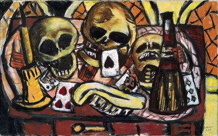
Max Beckmann, German, 1884 - 1950: Still Life with Three Skulls, 1945, Oil on canvas, Museum of Fine Arts, Boston. Gift of Mrs. Culver Orswell, © Artists Rights Society (ARS), New York / VG Bild-Kunst, Bonn, Photograph © Museum of Fine Arts, Boston
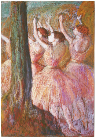
Edgar Degas, French, 1834 - 1917: Dancers in Rose, about 1900, Pastel on paper, Museum of Fine Arts, Boston. Seth K. Sweetser Fund, Photograph © Museum of Fine Arts, Boston
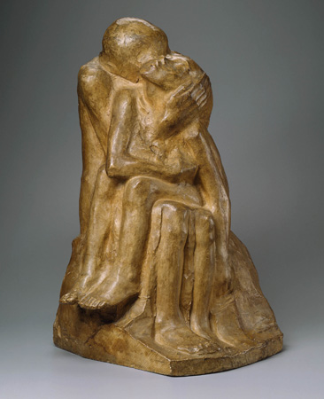
Käthe Kollwitz, German, 1867 - 1945: The Lovers or Mother and Child, 1913, Plaster, Museum of Fine Arts, Boston. Gift of Mr. and Mrs. Hyman W. Swetzoff in memory of Mr. and Mrs. Solomon Swetzoff, © Artists Rights Society (ARS), New York / VG Bild-Kunst, Bonn, Photograph © Museum of Fine Arts, Boston
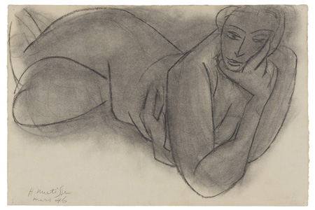
Henri Matisse, French, 1869 - 1954: Reclining Nude, 1946, Charcoal on cream laid paper, Sheet 16 1/4 x 24 inches, Museum of Fine Arts, Boston. Charles H. Bayley Picture and Painting Fund, © Succession H. Matisse, Paris / Artists Rights Society (ARS), New York, Photograph © Museum of Fine Arts, Boston
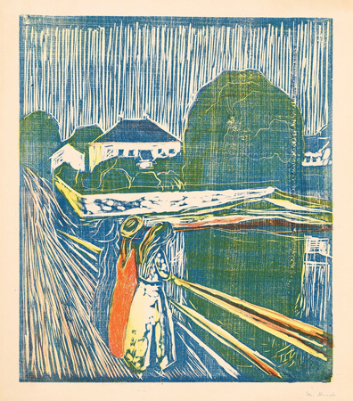
Edvard Munch, Norwegian, 1863 - 1944: The Girls on the Bridge, 1918, Woodcut printed in blue and lithograph printed in red and yellow, Block: 19 11/16 x 16 7/8 inches, Museum of Fine Arts, Boston. William Francis Warden Fund, © The Munch Museum / The Munch-Ellingsen Group / Artists Rights Society ,(ARS), New York, Photograph © Museum of Fine Arts, Boston
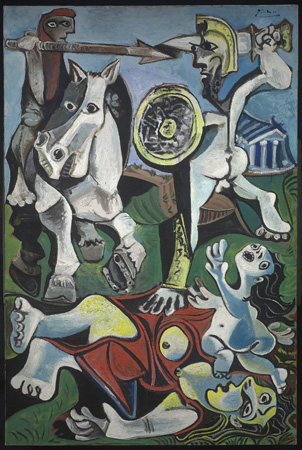
Pablo Picasso, Spanish, 1881 - 1973: Rape of the Sabine Women, 1963, Oil on canvas, Museum of Fine Arts, Boston. Juliana Cheney Edwards Collection, Tompkins Collection, and Fanny P. Mason Fund in memory of Alice Thevin, © 2005 Estate of Pablo Picasso / Artists Rights Society (ARS), New York, Photograph © Museum of Fine Arts, Boston
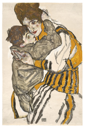
Egon Schiele, Austrian, 1890 - 1918: Schiele's Wife with her Little Nephew, 1915, Charcoal and opaque and transparent watercolor on paper, Museum of Fine Arts, Boston. Edwin E. Jack Fund, Photograph © Museum of Fine Arts, Boston
2.
June 5, 2006, 9:01 PM
I like the Beckmann too, and I wonder if "Pieta" couldn't be added to the list of possible titles for the Kollwitz.
I like the Picasso... I dunno, something about freshly-raped Sabines always appeals to me.
OP, I know you choose your words carefully, so I'm wondering, by 'ludicrous', do you mean:
1 : amusing or laughable through obvious absurdity, incongruity, exaggeration, or eccentricity
or;
2 : meriting derisive laughter or scorn as absurdly inept, false, or foolish?
3.
June 5, 2006, 9:32 PM
Well, the Picaso Sabines is no worse than the Dora Maar, even though it's a good bit later. It's just that, for obvious reasons, more can be read into the Dora Maar as being more "personal," which can make it at least seem more interesting. I think a horizontal format would work better for the Sabines, but it's really not a good subject for him. This is something for a Poussin or a Guido Reni. Delacroix would be interesting, but he'd probably overheat it. David did it, but it was too cold. Now Rubens...
4.
June 5, 2006, 10:02 PM
Both, Marc, but mostly #2. The guy was amazing. He got away with anything and everything. He also made some of the great masterpieces of all time, during the Cubist period one after the other, like a machine, bang, bang, bang, without stopping. He was our resident jester/genius for the better part of a century, the iconic artist, just like Einstein was the iconic scientist.
5.
June 5, 2006, 10:28 PM
Surrealism is a very nasty, noxious virus. Too bad Picasso got infected.
6.
June 5, 2006, 10:30 PM
Well, I'll go along with 1, but 2 goes too far... even when Picasso tosses one off, 'inept' just doesn't seem to apply. Picasso at his worst is still head-and-shoulders over much of what passes for contemporary painting.
Or, maybe I'm just letting my attraction to the nude soldier's taut buttocks and pronounced scrotal cleavage sway me.
Either way, I'll take the Sabines over that Munch print for sure.
7.
June 5, 2006, 10:32 PM
Really? I much prefer the Munch print.
8.
June 5, 2006, 10:35 PM
I should mention that tomorrow night is my first continuing ed class at MassArt - silkscreening. Whee!
That buzzing effect that Munch is getting out of the mixed printing techniques is fascinating. The Sabines looks like a big dumb Picasso. Maybe it's just the expression on that horse's face.
9.
June 5, 2006, 10:40 PM
Of course, you've seen them in the flesh Franklin, and I haven't, so all the usual disclaimers apply.
If we ever decide to rob the place together though, at least maybe we won't fight when we split up the loot.
11.
June 5, 2006, 10:57 PM
That's the problem, Franklin. He cheapens or trivializes the subject, reducing it to what had by then become a more or less pat and vaguely silly formula. He had to know that he was up against some pretty serious competition with this particular topic, but either he could no longer see that this sort of treatment didn't cut it, or he just didn't care--because, as I've said, he didn't have to. It would be a Picasso, and that's all that mattered, for practical purposes. Yes, there is still some power in it, some scent of authority, some reminders of greatness, but it's largely degenerate--not in the Nazi sense; rather in the sense of venido a menos.
12.
June 5, 2006, 11:08 PM
Ah, yes, Marc. Not to mention Bernini's Rape of Proserpine. Then, of course, there are all those great Rape of Europa pictures, like Titian's. It's really Old Master-ish territory, or seems that way because so many of them did it. It's a lot to go up against, and by 1963, Picasso was way too comfy and smothered in adulation to do much more than coast.
13.
June 6, 2006, 12:15 AM
That dumb horse looks like he broke his nose against the picture plane.
14.
June 6, 2006, 12:52 AM
Thanks for the peekaboo into the MFA, Franklin. I'm not someone with the depth of experience viewing A-list paintings required for respectable pronouncements of "second-rate", though I've sullied my name with such blather many a time before. Instead I'll just rely on my gut response to these pictures (and concisely):
Seeing these together, I think Beckmann's Skulls is the best of this group of jpegs.
I am not catching the glory of Degas' Dancers.
I thought at a glance that Kollwitz' Loving Couple was beautifully carved from wood, but still like it pretty well as plaster
Can't decide whether I'm as bored as the Nude seems to be with Matisse' charcoal technique, or as Matisse seems to be smudging yet another one.
I really like the Munch print, even if it is another Bridge fraught with tension. I just wish he'd dealt with that little patch of vertical line action to the immediate right of the girls with some other bit of less ambiguous patterning. I blends with and obscures the group of figures too much. And in such a crucial point in the picture, that's too bad.
The Picasso should be titled Ouch.
And despite the "I think I saw Picasso do this once" feel of the thing, I still kinda feel warmly embraced by Schiele's Wife.
15.
June 6, 2006, 1:13 AM
Mixed printmaking techniques? Silkscreen?
Hmmm. Very interesting, Franklin.
16.
June 6, 2006, 7:30 AM
I thought you would pick up on that, KH. Yes, I'm finally addressing a self-inflicted inadequacy in my art education - a lack of printmaking classes. Something about watching people grind litho stones kept me out of the print shop...
17.
June 6, 2006, 7:58 AM
Ahab, we should go to a museum sometime and rank pictures. I am about 100% with your take on #14.
18.
June 6, 2006, 8:09 AM
I expect the Degas has reproduced poorly. I'm sure it's significantly better live, particularly in terms of the exact coloring and the texture or feel of the pastels.
19.
June 6, 2006, 8:13 AM
Jack, re #5, Surrealism is a virus, as you say, but art has mysterious ways. When the Surrealists bolted from Europe in the early 40s and came to NY the virus sprread among the second-rate talents but was transmuted into gold by the really good ones. It's all in what you do with something how it turns out in the end.
20.
June 6, 2006, 8:27 AM
MOMA recently had a large exhibition of Munch's works, paintings and prints, around 80 in all. With a few exceptions I thought his prints were better than his paintings. I think there may have been something about the printmaking technique, especially with the woodcuts, that enforced a discipline on his image making. The paintings often felt lazy, like he really didn't push them to a resolution or point of clarity. They often looked muddled to me, lazy. The printmaking technique introduced a structure on his drawing, a crispness of focus, that many of the paintings lacked.
As for the Picasso it points up Picasso's weaknesses as a colorist, in this respect Matisse was the clear winner. The painting illustrated here, relies structurally on Picasso's drawing, it is on the picture plane, within a relatively shallow cubist space. The color feels filled in, especially the background, which reverts to a deeper landscape space, for me, this doesn't work with the spatial structure of the rest of the drawing.
Seems like Beckmann wins the jpeg war, I concur.
21.
June 6, 2006, 9:30 AM
It seems that the Beckmann is running away with this one but no one has said why. Could someone go into a little depth as to what they like so much about the picture? To me it looks like a jumbled mess and I personally don't care much for the yellow, red, orange and black color scheme. I'm open to the possibility that it's a great piece but I'm just looking for some direction why.
The more I look at this set of images the more I'm drawn to the Munch... though Ahab is right with his assessment.
22.
June 6, 2006, 9:56 AM
As you must know, JT, about all you can do when asked why you like something is give necessarily inadequate verbal approximationbs. How about "rough strength"?
A "jumbled mess" it isn't, not to my eye, anyway.
23.
June 6, 2006, 10:04 AM
It's true that the Degas doesn't reproduce all that well. The colors much richer, with a cascading effect from the texture of the pastel (you can see a little bit of this in the dress of the middle ballerina, but it's much more prominent in person.) It's also fairly large, which surprised me after seeing it on the computer screen.
Ah, the Picasso . . . what you have to imagine is that there's a whole lot more like that among the various prints and works on paper by him in the show. And that the painting was acquired in 1964, one year after it was completed. That means someone at the MFA really wanted it, they went right for it--and I'm guessing they did so for many of the reasons it's so bad. Ze great modern master, taking on one of the greatest themes of mythology and the grand tradition of history painting! Guernica was good, but watch him turn his style and talent to a theme worthy of him! Think of what one could have bought in 1964 for the money spent on that dog. I should note that the painting is also quite large, and is very prominently displayed.
I like the Beckmann a lot as well, and it certainly does reproduce well. Black is his thing, and he uses it well here. The inky holes of the eye sockets, the black holes of the mouths surrounded by grinning white teeth, add just the right sort of menace. The different angles of the skulls' arrangement, along with the background elements, give the painting an nicely unsettled feeling. I rather liked the colors in person--I remember more a smoky, black and gold feel to it.
I really loved the Matisse drawing in person, but I'm not feeling it here. Don't know why.
Fish(es) out of water: the wall of early 20th century British painting. I rather liked the William Orpen self-portrait, or at least the windows and landscape in the background, but I couldn't help but wonder why any of it was there. I mean, I knew the literal answer--because the MFA owns it, and it's 20th century European (if barely) art--but none of it had a connection to anything else in the show.
24.
June 6, 2006, 10:33 AM
Thanks JL. Not sure if you intended to respond to my inquiry about the Beckmann but you did a nice job describing why you like the piece. I guess it can be done after all.
It's still muddy and jumbled to my eye but I'm curious how large it is. Maybe if it is a nice size it will have room to breathe more versus the tight jpeg here.
25.
June 6, 2006, 10:37 AM
J.T.: Yes, I was responding to your comment--sorry for not making that clear. The painting is not too large: according to the MFA's website, its dimensions are 21 3/4 x 35 1/4 in.
26.
June 6, 2006, 10:49 AM
Thanks JL. When viewing jpegs there are two big problems to truly seeing the work, in my opinion: color and scale.
That may not be a huge painting but it's certainly big enough to free it up a bit. I guess I'll have to wait until I can see it in person...
27.
June 6, 2006, 11:02 AM
JL, yes, what you could have bought in 1964. Painful! But of course the reason stuff was cheap in 1964 was that nop one was buying it. They were buying "School of Paris". When I had a little gallery/frame shop back in the late 50s/early 60s I used to get good stuff from the NY galleries - mostly drawings and works on paper from the AE painters - and hung them in shows in my place. I think the highest price was $1200 for a big Gorky watercolor/crayon. I once offered a collector a medium sized Stella stripe painting for $75. I never sold a thing.
29.
June 6, 2006, 11:22 AM
If I recall correctly, a similar Gorky recently sold for a little over a million dollars.
30.
June 6, 2006, 11:28 AM
re#29,
That's reputation inflation.
31.
June 6, 2006, 11:43 AM
JT, to try to go into why I think the Beckmann is good would be the kind of blather I'm trying to restrain myself from indulging in and boring you with - but I'll endorse about half of JL's comments on the Skulls. However, if we were standing in front of the thing having face to face back and forth we might get somewhere of value.
Speaking of which, it'd be great to tag along with you at some art repository one day, oldpro.
In a way, an art blog and its accompanying jpegs are matched pretty closely in character to the imperfectly typed snippets of thought that make up its coversational thread. All a step or two removed from the actual. Inadequate. Insufficient. But still intriguing and fun.
32.
June 6, 2006, 12:02 PM
Nice observation in your 3rd paragraph, Ahab.
33.
June 6, 2006, 12:10 PM
Seconded.
34.
June 6, 2006, 12:20 PM
Ahab,
I certainly wouldn't find your "blather" to be "boring." I wouldn't have asked the question otherwise. Why is it that we assume that a) it's far too difficult to talk about what we like, and b) that it might be boring?
We've all had the significant other who in a sad moment asks you, "why do you like/love me?" It would be insufficient to respond with A or B above. It'd certainly put you on the couch for the night. He/she expects you to identify something that you like/love about them and you should be able to do just that. But they also should understand that words will never be adequate enough.
I'm not seeking some revelation when it comes to the Beckmann. Even if you said red is your favorite color and you've always been fascinated by skulls, that would say something.
To build on Ahab's analogy, discussing why you like something surely won't convey a complete reasoning for your feeling, but it perhaps can still be "intriguing and fun." Or so I think.
35.
June 6, 2006, 12:24 PM
JT, I wondered about that question myself because there were a couple of other Beckmanns there, and I didn't like those at all, but this one jumped out. Here, he managed to get a lot of graphic momentum going with that black line of his, and in this case it looks good in a Medieval way rather than just plain wack, like the others. I didn't expect to like the color either, but it works here, in sort of a charbroiled way.
36.
June 6, 2006, 1:01 PM
JT when "significant others" asks "why do you like/love me?" they are not asking for truth they are asking for reassurance. If you are a smart "other'" you will have the answer worked out beforehand.
37.
June 6, 2006, 1:48 PM
Thanks Franklin! I see what you're saying.
Oldpro - OK, don't give me "truth" about why you like the Beckmann, give me "reassurance" instead. I'll accept that too. Pretend I'm the Beckmann painting asking you why you like me.
38.
June 6, 2006, 3:54 PM
Oh, 'cuz you're so dark and handsome, and tough but so gentle, and so abslutely, like, centered... know what I'm saying? And your strokes, are so, well, assured, and the way you handle the surface is ever so strong and subtle...
39.
June 6, 2006, 4:12 PM
Oldpro - I think I'm turned on over here! I feel so reassured!
- Speaking as the Beckmann painting of course
40.
June 6, 2006, 4:15 PM
At JL #23: I meant to remark on that. There was Orpen and Augustus John outflanked by Matisse on both sides, and they went down. It was a bit like a fight between a pug and rottweiler. I was thinking, get these things the hell away from each other!
41.
June 6, 2006, 4:40 PM
It's funny. I agree with Jack that Picasso "trivializes the subject", his nude soldier is deliberately a 'degenerate' version of David's. I agree with oldpro that it's a "ludicrous" (in the first sense) image, and that the horse looks like he's pressing his face against the glass in the frame. While I disagree with ahab's suggestion of a name change, I can understand the sentiment behind it. Yet, I keep going back to look at it. I also keep thinking of Beckmann (the dark line, and the vertical format, the clumsiness, compressed space, etc...), like Pablo is ripping Max off after outliving him.
I know I'm running headlong against the esteemed consensus here, but there you go... there's no arguing taste. The controversy makes me want to see the real thing even more.
42.
June 6, 2006, 4:42 PM
Oh, and Surrealism is more like a drug than a virus.
43.
June 6, 2006, 5:02 PM
The whole painting is kind of a ripped-up rearrangement of David. it should be called "the Oath of the Whoratii"
I hesitate to say this, but maybe the painting affects you because you are a sculptor and because of the kind of sculpture you do. Boiled down to pictorial organization and the way the forms fit and the highlighed areas help organize things it is very well put together. Picasso could do that with his eyes closed. What he couldn't see was that he was bringing all the inherent overblown preposterousness of the David-type history painting right out in the open.
44.
June 6, 2006, 5:24 PM
good or bad usually depends on composition, color, line, application and the interplay of these components. i could be missing something, but these seem like the obvious elements(pick a better word) that make up a painting and thus which success or failure can usually be traced to. good pictures have the mojo with these elements that cause them to come alive. for some reason , more often than not, when i really like a picture it seems to take on a sense of "class". as in being "classy". even with good pictures that at first seem apparently gnarly. the good ones usually seem to rise above in a "classy" sort of way. the class and grandness seems to build and swell as well. they take on an air and power. sometimes subtle, sometimes not, but i can't get away from that innate enduring class.
so how then did beckmann succeed within this framework of components that make up a picture?
that beckmann brings up images and links to baziotes (mid late 40's) and pollock (from she-wolf time period 1943-drawing , color, flatness and boldness and liberty of line) for me.
while it does not completely come alive, the line and composition interplay (contorted with bulbous and straightened line)l work well for me in the matisse above, thus i like the picture. yes ahab, the nude does seem a bit bored and it appears that matisse may have been more concerned with the body than the head based on the success of the overall drawing. the head is kinda squished into the remaining space. i actually thought you and marc might like the matisse based on it's overtly sculptural look.
as it has been for a few years or so, i currently believe that composition is the most critical element to a good picture.
45.
June 6, 2006, 5:50 PM
Beckman's style of painting does have visual similarities to Pollock's mid-40's painting (much more than Baziotes, I think) probably more from some similarity of temperament than influence. Beckmann came to the US after the war but if he had any influence on our painters it was probably more on the social realists, and more pre-war than later. Someone who knows the history better can correct me on this.
Don't get too involved thinking about "painting components", 44.1. Sometimes it is a help to think this way when making art, as a kind of crutch, but a work of art is only everything it is, all together. There aren't any "components", not when its any good.
46.
June 6, 2006, 6:28 PM
the baziotes comparison from that mid 1940's to late 40's was based on the rich often darker bold colors with strong outlines and the compact composition of chunky components in a still-life set-up. baziotes' subject matter was more amiguously abstract, but comes across similarly as a composition during the coinciding time frame. they also both feel very much like easel pictures and modest in size.
of course the picture needs to come together into one cohesive whole to be good, but those "components of a picture" are always going to be evident to label and identify as such.
47.
June 6, 2006, 6:32 PM
add on to previous...
even if part of the whole
48.
June 6, 2006, 7:19 PM
Yes, but all you've got is a little flag that says"red". If it gets more complex than that, say "composition", what are the components of composition? It goes on and on. It's worthless, and it can be very misleading, because you start using your head instead of your eye. Believe me, I tried doping it out for years and all I got for it was a headache and pictures which could have been better. But, suit yourself.
Baziotes doesn't feel like Beckmann to me, while Pollock does. Baziotes pix were smooth and had "tense" colors that were radient and not earthy, and he didn;t use black much. He was a surrealist at heart who was sharp enough to see how what the AE painters were doing could help his art. And of course he was very talented. Pollock was reckless and unrefined and gave his pictures an energetic jammed-up feeling which was not unlike Beckmann. Neither of them used color for much more than area-differentiation, though both had a good color sense.
49.
June 6, 2006, 7:28 PM
I saw a picture of an anonymous 15th century German woodcut recently, and the first thing I thought of was Beckmann. There was a kind of Germanic coarseness to it which was striking, even though it was an Adoration of the Magi. There was no prettying up of anybody, not even Mary, let alone the lesser figures. I don't mean that it looked "primitive"; the composition was actually pretty skillful and the style fairly distinctive. It was actually vaguely disturbing, because it seemed somehow irreverent, yet I'm sure that was not the intent. The resulting tension was just...odd.
50.
June 8, 2006, 10:17 PM
Why not try to meet JT's challenge: "What about Beckmann's Still Life... makes it a gooder (at least as a jpeg)?" What with old Three Skulls staring out at me from my desktop wallpaper for the past week now, I can say my original declaration has stood the test of time - I like it still.
"SLwTS" is clear enough in its representation that I cannot easily look at it simply as shapes and lines and areas of value. I find it difficult to analyze this composition in strictly geometric terms or as alternating fields of colour. It occurs to me that this may be partially why the image is successful - it doesn't sit still as a mere zero-sum equation, but neither is it so chaotic as to be unsettling. Upsetting maybe, but not unsettling.
The picture tips and turns in spatial reference. It pushes and pulls between flatness and depth. This is less a depiction of objects on a table in a room by a light, than a blind groping in a long unused drawer of fascinations with special notation of fingertip-felt alternations between thicks/thins, squares/rounds, fulls/empties. And it delivers the smell of must with concussive power.
So I've convinced myself at least. I like it still.
1.
oldpro
June 5, 2006, 8:43 PM
Interesting show, I think. I don't mind hodge-podge shows with odd and lesser stuff; sometimes it is a relief and sometimes there are discoveries to be made. I think the Beckmann is the best picture above, by far. The Degas is nice but doesn't do that much for me. The Picasso is ludicrous.
How do you find the pictures on the web site?