Previous: New RISD mission statement (35)
Next: Slightly lazy long-weekend roundup (3)
American Watercolors and Pastels at the Fogg
Post #797 • May 25, 2006, 10:15 AM • 35 Comments
Organizers culled this scintillating exhibition of just over four dozen images from a collection of six thousand American works on paper in the Fogg, with a few loans thrown in. Concentrating on works from the late 19th and early 20th century, it takes up one room, split into three bays, and nevertheless compensated a good long look.
A DeKooning drawing opened the question of whether cubism could have effectively utilized more color, in the right hands.
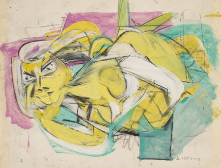
Willem de Kooning (1904 - 1997), Reclining Woman, c. 1948 - 49. Oil, graphite, and black and green crayon on cream illustration board, 40.4 x 43.4 cm. Fogg Art Museum, Harvard University Art Museums. Gift of Lois Orswell, 1996.26. Photo: Peter Siegel © President and Fellows of Harvard College. (70134)
Otherwise, the abstractionists came off rather poorly. Rothko, here, is noodling around with hapless forms that he would eventually discard in favor of those long rectangles behind them. An Ad Reinhart, not pictured, resembled an overworked Sam Francis.
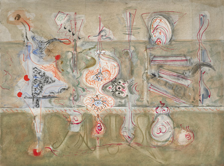
Mark Rothko (1903 - 1970), Untitled, 1944 - 46. Watercolor, ink, tempera, and scratchwork on white wove paper, 53.6 x 71.3 cm. Fogg Art Museum, Harvard University Art Museums. Gift of The Mark Rothko Foundation, Inc., 1986.464. Photo: Katya Kallsen © President and Fellows of Harvard College. (79111)
This is one of my favorite watercolors of all time, and I'd only ever seen it in a book. Demuth applied Precisionism to watercolor with a luminosity that evokes stained glass windows. This thing just took over the room...
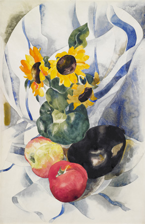
Charles Demuth (1883 - 1935), Fruit and Sunflowers, c. 1924 - 25. Watercolor over graphite on white wove paper, 45.7 x 29.7 cm. Fogg Art Museum, Harvard University Art Museums. Louise E. Bettens Fund, 1925.5.3. Photo: Photographic Services © President and Fellows of Harvard College. (79109)
...even with this nearby.
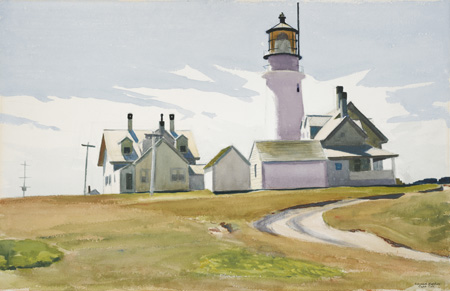
Edward Hopper (1882-1967), Highland Light, 1930. Watercolor over graphite on rough white wove paper, 42.3 x 65.3 cm. Fogg Art Museum, Harvard University Art Museums. Louise E. Bettens Fund, 1930.462. Photo: Photographic Services © President and Fellows of Harvard College. (79422) (Cape Cod)
My estimation of Marin's watercolors rose. They don't look as smoky as his paitnings, and the dagger-like slashes make more sense on paper.
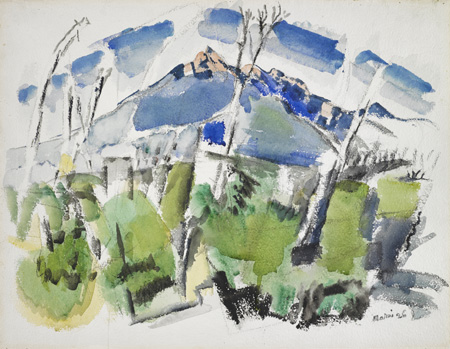
John Marin (1870 - 1953), Mt. Chocorua No. 1, 1926. Watercolor and charcoal on heavy white wove paper, 43.7 x 56 cm. Fogg Art Museum, Harvard University Art Museums. William M. Prichard Memorial Fund, 1928.5. Photo: Photographic Services © President and Fellows of Harvard College. (79110) (New Hampshire)
Here you can witness Homer's eureka moment when his prodigious drawing skills gave way to pure fluidity.
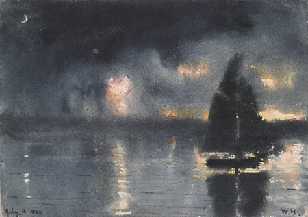
Winslow Homer (1836 - 1910), Sailboat and Fourth of July Fireworks, 1880. Watercolor and white gouache on white wove paper, 24.5 x 34.7 cm. Bequest of Grenville L. Winthrop, 1943.305. Photo: Allan Macintyre © President and Fellows of Harvard College. (51254) (Gloucester, MA)
He spent the rest of his career capitalizing on that viscous rush even within his more careful watercolors.
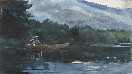
Winslow Homer (1836 - 1910), Adirondack Lake, 1892. Watercolor on white wove paper, 30.1 x 53.5 cm. Fogg Art Museum, Harvard University Art Museums. Bequest of Grenville L. Winthrop, 1943.302. Photo: Katya Kallsen © President and Fellows of Harvard College. (51658)
One might fairly prefer La Farge's oils, but his watercolors have a luscious atmosphere irreproducable in other media.
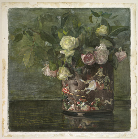
John La Farge (1835 - 1910), Chinese Pi-tong, 1879. Watercolor and gouache over graphite on off-white wove paper, 43.3 x 43.2 cm. Fogg Art Museum, Harvard University Art Museums. Bequest of Grenville L. Winthrop, 1943.310. Photo: Allan Macintyre © President and Fellows of Harvard College. (62098)
Sargent, getting everything exactly right on the first try, over and over again. I used to tell students, I can show you how to draw, but I can't explain how to do that. I can do it, rarely, on a good day, but I can't explain how.
John Singer Sargent (1856 - 1925), Group in the Simplon, 1911. Watercolor over graphite on white wove paper, 36 x 50.9 cm. Fogg Art Museum, Harvard University Art Museums. Gift of Sir Joseph Duveen, 1927.7. Photo: Allan Macintyre © President and Fellows of Harvard College. (61956)
Whistler had an odd sensibility when it came to pastels, as if he was trying to apply the line of his etchings to them. Consequently they don't seem to take advantage of the medium. When you draw this well, though, it doesn't much matter.
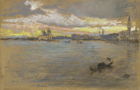
James Abbott McNeill Whistler (1834 - 1903), The Storm - Sunset, 1880. Pastel on brown wove paper, 18.6 x 29 cm. Fogg Art Museum, Harvard University Art Museums. Bequest of Grenville L. Winthrop, 1943.624. Photo: Katya Kallsen © President and Fellows of Harvard College. (50880)
I hadn't heard of Whitman, a protegé of William Morris Hunt who enjoyed a productive career as an painter, book designer, and stained glass artist.
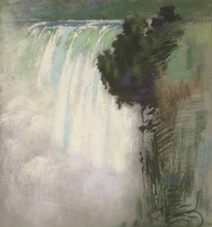
Sarah Wyman Whitman (1842 - 1904), Niagara Falls, 1898. Pastel on beige wove paper attached to canvas wrapped around stretcher, 47 x 43.2 cm. Fogg Art Museum, Harvard University Art Museums. Gift of Mary C. Wheelwright, 1939.252. Photo: Katya Kallsen © President and Fellows of Harvard College. (50780)
Other notable works not pictured include a William Meritt Chase pastel self-portrait that could give any pastel by Manet a run for its money, and a lovely Maurice Prendergast watercolor of a canal in Venice. In summation, see this. Paper has a particular charm, and this assembly of masterpieces has enough charm to levitate you off the floor.
The show runs through June 25.
2.
May 25, 2006, 12:21 PM
To view/download images, go here:
http://www.artmuseums.harvard.edu/collections
3.
May 25, 2006, 1:34 PM
Thanks, Daron.
4.
May 25, 2006, 5:39 PM
Thanks, Franklin. Excellent post--unfortunately, hardly the sort of thing you could have done here with local material. Wonderful works, of course. If they reproduce this well, they must have been stunning live.
The Rothko is interesting for the nervous or hypersensitive delicacy, but the whiff of Dali is unmistakable; it's the piece that would fit in best in the current art scene. Marin was better on paper than on canvas. Hopper on paper is lighter and airier than on canvas; lovely piece. The Homers are simply superb. Sargent was just being Sargent; his facility is breathtaking, but making things look too easy usually has a price (of not being duly appreciated or being dismissed as shallow, especially by those who could never match such technique). Whistler is trying too hard here (I think watercolor suited him better), but if one's going to fail, this is the way to do it.
I agree with OP about O'Keeffe, but the fact is sometimes an artist gets, or is given, too much mileage for reasons other than the actual quality of the work as such. Of course, nobody has to buy into that, but all too many do. Still, it's not like the Kahlo business (and mighty good business it is these days).
Keep it coming.
5.
May 25, 2006, 6:45 PM
That's is certainly surrealism you are seeing in the Rothko, Jack, but not Dali. Dali was the surrealist they loved to hate. More likely Matta or any number of other expat surrealists hanging around NY in those days - it was in the air.
I'm not sure Marin was consistently better on paper. I keep getting surprised by his oils. It would be an interesting study. Let's wait for the major retrospective at MAM.
(We should live so long.)
6.
May 25, 2006, 6:52 PM
I saw some Marin oils at the MFA last week. They just keep right on bumming me out.
7.
May 25, 2006, 7:01 PM
They might have hated Dali, OP, but this reminds me more of him than of early Matta (which was quite good, far better than his later stuff). This is less heavy-handed than typical Dali, but more precious and/or more effete than the Mattas I've seen from that period.
8.
May 25, 2006, 7:54 PM
Jack, I am not saying that Matta is the influence. As I said, this kind of thing was in the air. Gorky (who was directly influenced by Matta) was an example. Go look at early 40s Mattas and you will see the absolute similarities: the organic shapes, the abstract, open forms, the careening lines, the vertical/horizontal building - unmistakeable visual parallels. Matta was visually, philosophically and personally close to therse people and Dali and the "uptown" surrealists were not, not even a little bit, not for most the AE painters. I just got through teaching a seminar on the period and all this stuff is very fresh in my mind.
9.
May 25, 2006, 8:57 PM
I'm sure you've seen more of Matta's work than I have, OP. I suspect his early works on paper, which are not the sort of thing normally shown, may be closer to this Rothko than the work I've seen. In any case, yes, this was obviously in the air then.
Matta's later work is a sad business verging on caricature. It was commercially successful, and still is among the autograph collectors, but there was a major decline in quality.
10.
May 25, 2006, 9:05 PM
I know, there was a cartoonist in Mad Comics way back when who was directly influenced by Matta (Harvey Kurtzman?). The cartoons were wonderful, but it did not work in the other direction.
11.
May 25, 2006, 10:41 PM
I think when an artist can sell pretty much anything just because of the name, it's bound to have a bad influence on the work. To a more or less significant extent, that happened with Picasso. It doesn't have to happen, but human nature being what it is, there's certainly a danger there. Of course, some artists just lose it at some point; some stagnate; some gradually decline. The latter may be relatively natural; it certainly is in sports and a number of performing arts. And yet, in some instances, an artist may go mad and still create superior work (not just van Gogh). There are well-known examples in the graphic arts, even in something as technically exacting as line or burin engraving. It raises the issue of talent being in some respects an "autonomous" faculty, which can still operate even when the driver is not all there.
12.
May 25, 2006, 11:30 PM
Picasso's is an interesting case. He was hugely talented, but before he latched onto Braque's insight into Cezanne he was doing basically sappy sentimental stuff (some of it, during the "Rose Period", exquisitely painted) and then terriblisme a la African and Iberian sculpture. Braque roped him in with Cezanne's example and this focused his talent into what became Cubism, knocking out one amazing masterpiece after another as they evolved it.
After Braque went into the army in 1914 Picasso coasted for a long time on his talent. He could do anything, but he tried to do everything. Look at the early 20s, from virtually complete abstraction to classic realism and back again with side trips along the way. The focus was gone. In the 30s he settled into the woman-as-arabesqued-monster and made what I consider to be to the grandest failed painting in existence: Guernica. After that it was pretty much down hill. The only really good stuff was what he really could not do badly: drawing, printmaking, whatever he could manage in small size, with his hands. This is the only place where the talent carried him when the driver was gone, because the driver left in 1914.
No one has really traced this accurately, in my opinion, and i don't think anyone ever will as long as paintings like that miserable 1938 portrait of Dora Maar bring 95 million bucks at auction. If is costs that much, it has to be good, right?
13.
May 25, 2006, 11:37 PM
I don’t mind selling “pretty much anything.” If people want to buy my “crap,” that’s not my problem. An "autonomous" faculty, which can still operate even when the driver is not all there? --- That’s just so wonderful!
14.
May 26, 2006, 6:17 AM
The Demuth does look like a show stopper. Regarding Marin, there are three oils by him up in Salem right now at the Peabody Essex for their painting show. One of them ('My Hell Raising Sea') is undoubtedly among the best things on view, while the other two aren't all that far behind. Wish I had some images to share.
15.
May 26, 2006, 10:26 AM
I basically agree with your assessment, OP. The trouble is that anytime an artist becomes a sacred cow, even if it's a minor deity, the general tendency is to suspend or deny critical judgment. This can be overcome, but it can take a long time. It's much easier and more comfortable to go along with the established official view. That, of course, plays into the huge prices for even bad work by a big name, let alone a currently hot commodity like the starlet du jour.
I suppose it's more Romantic to engage in idol worship or adore blindly than to look with a hard, cold eye and judge accordingly. It seems more generous, kinder, nicer, but it's still refusing to accept reality.
16.
May 26, 2006, 10:38 AM
That's why Picasso is such an interesting study. He may be the best known name in art, he lived a long time, made thousands of works and some were absolute masterpieces and some complete botches.
But if it has that signature on it it is a highly desirable product no matter what. In fact in Picassos case some of the worst work (the 30s & 40s paintings like the Dora Maar portrait) and some of the middling work (blue period) is generally worth several times more than the best work (Cubist) on the market.
17.
May 26, 2006, 10:43 AM
Fabulous exhibit! And you raise an interesting question about color and cubism. I'd always assumed the two didn't mix, because I've seen so many awful paintings that misunderstood the whole point of cubism and tried to make it "pretty" by using dainty pastels or bright happy colors. Ugh. But the deKooning ... Hmm. You may be right. Maybe I'll have to rethink my bias.
Thanks for the great post.
18.
May 26, 2006, 11:18 AM
It isn't a bias, Lisa, it is a mechanical reality. Cubism as it evolved could not accomodate color variety and do what it did. There are technical reasons for this, having to do with the increase in complexity and problems with shading, but it is probably best not to inundate the blog with complicated explanations.
Color was brought into Cubist-based painting later by Leger and Juan Gris, and by Picasso himself, although his efforts were less convincing. Later in the century, as Cubism became a general support for AbEx, for example, color was worked in by accomodation.
19.
May 26, 2006, 11:41 AM
The short technical reason is that intense colors pop up out of the cubist facets and refuse to adhere to the grid. Picasso, Leger and Gris got around that by opting for a much simpler version of cubism that didn't fragment the space as radically, one with figures more clearly separated from grounds. You're right, Lisa, that cubism doesn't pretty up too well. Someone almost got away with it is Roger de la Fresnaye, who I far prefer to Leger - you might go have a look. Thanks for your post.
20.
May 26, 2006, 11:52 AM
Well, it is just a wee bit more complicated than that, but that's OK.
De la Fresnay and Delaunay and the Orphists and others got color into Cubism but with much less effect and success than Leger's 1914/1915 pictures, which are far and away his best work.
22.
May 26, 2006, 12:15 PM
Not me. The Leger gets it all together for me.
23.
May 26, 2006, 12:21 PM
And, by the way, the Leger is a "hand painted reproduction"
24.
May 26, 2006, 12:22 PM
My bad.
25.
May 26, 2006, 1:06 PM
An easy mistake to make.The site says "Reproductions" in big letters, which to me always means photolithographic copies; unless you read the fine print you don't really know. I only looked closer because I couldn't understand why they were so expensive. And the paintings are well done. It must be quite an industry.
26.
May 26, 2006, 4:50 PM
OP, I think the reason the relatively schlocky Picasso stuff sells better than earlier Cubist pieces is because it's more eyegrabbing and artsy, or "artistically weird" like some people think art is supposed to be. As you've already noted here, that's an essentially immature concept, which helps work like the worst Dali. When you add the major brand name or sacred cow aspect, all you need is someone with plenty of money and little art sense--and as you know, such people are all over the place.
27.
May 26, 2006, 5:45 PM
Absolutely right. Artistically weird + big name = big bucks. Works every time.
28.
May 27, 2006, 7:59 PM
The more I look at the Whistler, the more I like it. The rendering of the water and clouds is wonderful, as is the yellow in the sky, and the placement of the gondola in the right foreground is masterful--the whole composition hinges upon it. Yes, Whistler could draw, which is why he was such a great etcher and lithographer, and obviously it also helps here.
29.
May 28, 2006, 12:10 AM
A nice picture, Jack, but it doesn't quite do it for me, especially in that company. The foreground turns up flat and the recession doesn't read right.
But it certainly is nice to talk about real art for once.
30.
May 28, 2006, 9:17 AM
Speaking of Leger,
Here's a great site link to 177 Leger drawings and paintings with 800 pixel jpegs
The home page can be found here http://pintura.aut.org
This is run by a foundation in Spain which hires the handicapped to do the work (I think that's totally fantastic) so it is in Spanish but relatively easy to navigate. They have hundreds of pictures.
32.
May 28, 2006, 11:14 AM
George, that is an absolutely fantastic site but the problem is that every time I try to open an individual image I get the spinning soccer ball and no image, and eventually I have to force quit. I suppose it must be my computer. Any ideas?
33.
May 28, 2006, 11:50 AM
OP,
dunno, I'm set up like I think you are, Mac OS9 and Internet Explorer.
I've seen some wierdness lately with IE but not there.
Might try Navigator. Or shut down and restart the computer.
34.
May 28, 2006, 12:19 PM
It works better at the office, where I have OS10, but I don't know if that is the reason.
That is some site. Too bad it does not have English translation and that the descriptions are in white instead of blue on black. The organization is good except for the odd catagories in some of the more famous artist's section; I thing there are several dozen's in Picasso's and I cant make sense of all of them. I'm going to give it my "obscure artist" test and then write it up for newCrit.
35.
May 28, 2006, 1:28 PM
OP, it seems to work fine for me at home. It looks like a very good site indeed.
1.
oldpro
May 25, 2006, 11:00 AM
Real art! Wow!
DeKooning before 1950 is usually wonderful, and his color was often good then. Later it got more mechanical, although I like the pasty pastels of the ealry '60s that the critics seem to dismiss. I like the Rothko better than you do; it's pretty jivey. Demuth has this nervous, crystalline quality which just sings and puts the similar and better-known Georgia O'Keefe to shame. Marin was a big deal 60 years ago but not so celebrated now, but a damn good painter in both mediums and did some dynamite abstracts early in the century. I never tire of looking at Homer but what is it with Whistler? I can't get into his work. Compared to the Homers above it the Whistler really suffers.
I'm going to go to the site and see what I can download. Thanks!