Previous: Dear Miami Art Guide (20)
Next: Art market analysis from the Ming Dynasty (5)
Jeffrey Bishop at OHT
Post #794 • May 22, 2006, 11:32 AM • 21 Comments
Jeffrey Bishop has some rather handsome works up at OHT, part of the unfortunately named SoWa Art District, called that because it lies to the east of Washington Avenue, but Wash Ave runs sort of north by northeast to south by southwest at that particular segment, and, besides, EaWa looks like Hawaiian and sounds too much like "ewok," and we don't want to go there, but it would have helped me find the district a lot faster if they had called it that instead of trying to crib cute neighborhood names from Manhattan.
Right! Jeffrey Bishop. Mr. Bishop is making curvilinear biomorphic abstractions, distantly recalling Arshile Gorky through a prism of scientific diagrams. The recent images incorporate of areas of digitally printed textures that he has overpainted with surprising seamlessness. As a result, the works land at an intriguing midpoint between man-made and machine-made. Some of the compositions seem a little locked up or inert, but Bishop's excellent color sense and ability to draw attractive curves tend to carry them over the wall anyway.
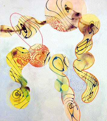
Jeffrey Bishop: Untitled, acrylic on canvas, 36" x 32", 2004.
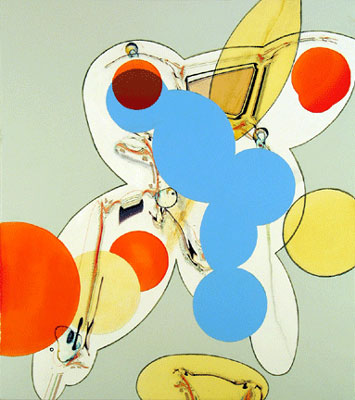
Jeffrey Bishop: Untitled, oil on canvas, 36" x 32", 2004.
Jeffrey Bishop: Recent Paintings runs at OHT through June 24. Images pulled from the website. Hey, we have to get the ball rolling somehow. Big thanks to Necee, without whose directions I would still be walking around Chinatown.
2.
May 22, 2006, 12:26 PM
Nothing to get excited about, though it's OK for what it is.
3.
May 22, 2006, 12:35 PM
I bet they're way nicer in person! I like them decently enough, but really seeing them could push them over that edge. I am really excited to see them on artblog.net! Newness!
4.
May 22, 2006, 5:28 PM
These things don't wear too well. I was better disposed to them at first sight. The more I see them, the more slight they seem.
5.
May 22, 2006, 9:10 PM
Interesting work....perhaps if they were still frames from an animated work I would like them more....they remind me of the early abstract films of Harry Smith...
They are actually collage and oil on canvas no?
6.
May 22, 2006, 10:12 PM
They are actually collage and oil on canvas no?
I was wondering that myself. The ones I saw were definitely collaged but I don't think they were labeled as such on the website.
Jack, in person, they gained on me.
7.
May 22, 2006, 11:02 PM
Franklin,
I spent a moment looking at the other artists on the websites of OHT, their neighbor Clifford/Smith and the Kidder Smith Gallery. It seems like maybe Boston has a style, kind of a loopy, crisp cartoony look, do you find this to be the case, or am I just not seeing enough jpegs? Maybe it's a virus, loopy flu?
For what its worth, I think Fonseca messes more with the figure ground relationship than Bishop does. It's hard to tell for sure, but parts of Bishops paintings looked filled in, the blue area in the second pic especially, it's kind of flat looking in the jpeg. Same for the grounds in the other 2004 paintings.
I think one of the problems caused by a hot market is that paintings can become products. They become handsome, look like a painting, good or bad, but lose a visual edge or lack a sense of risk, something, I'm not sure, they just seem plopped on a wall saying "hey, buy me, buy me" No grit.
OP, FWIW, I use the term "wimpy abstraction" but I think we mean the same thing. If you recall in the late 60, a good show of Stellas, Nolands, Olitski's, Poons etc, these were, at the time at least, big, tough, brash statements. There was a clarity of intent, that somehow at the moment, is lost in an approach which reflects cluttered sensibility. More is not always more, sometimes it's just a mess.
8.
May 22, 2006, 11:08 PM
What I was pointing out with the Fonseca comparison was the technique of isolating a "figure" by painting out a lot of the "ground".
As for your comment about the 60s re "clarity of intent", I agree , of course. Also the paintings were not only big and bold and brash they were so much better.
9.
May 22, 2006, 11:20 PM
Franklin, it may be your interest in comics at work, at least partly. There is something cartoonish about these images, although they have a certain charm or make a certain impact--but it's a shallow business. The color is "grabby" but facile, and the whole thing feels a bit too hyped up or excessively perky. In a way, it feels like a cleaner, sleeker, more sophisticated (or less infantile) version of, say, Kenny Scharf. It's certainly more respectable than Scharf, who's basically embarrassing, but it still strikes me as suspiciously slick and rather too synthetic for comfort.
10.
May 22, 2006, 11:29 PM
OP,
I knew what you meant. I saw two of Fonseca's shows at Kasmin and what I was suggesting that was different, as I remember them, when Fonseca "painted out a lot of the ground" he was making two interlocked spaces, where either layer could be the ground, Bishop's just defines the ground. It's a simple idea but he's fairly good at it.
Regarding the 60's, I saw a show with that group of painters. There was this incredible Noland stripe painting, a long horizontal painting with just horizontal stripes of varying width painted in solid colors, to this day I still remember that painting. Maybe that's what it's all about?
11.
May 22, 2006, 11:35 PM
OK Jack,
For once we agree. Appologize for saying "shut up"
12.
May 23, 2006, 7:06 AM
I far preferred these to the last Fonsecas I saw. Am I the only one who thinks that Fonseca's not that great?
Jack, they could have cartoonish aspects but they read quite a bit more seriously than that. Sometimes they seemed to have more of a Mehretu schematic quality to them.
George, I really haven't seen enough of the galleries to make broad pronouncements about a Boston style. You could be right, but I suspect there's more variety out there and you got a partiuclarly loopy sample.
13.
May 23, 2006, 8:36 AM
I only invoked Fonseca as a type of worked-out method. The paintings are only middling, paintings for people who are desperate for respectable painting. Just about anything seriously conceived and evolved looks good these days.
Noland is remarkable, George because all he does is set flat colors next to each other and makes great art out of it. There are Nolands I have downloaded (which I have also seen directly) I look at sometimes just to be knocked out by the mysterious effectiveness of those simple interactions. He is a great artist, for sure.
14.
May 23, 2006, 9:31 AM
The top one does have a very Mehretu feel. Also a little bit Laurie Sloan (who I think teaches up in the region, which is interesting).
Laurie Sloan here:
http://www.art.uconn.edu/faculty/sloan/index.htm
15.
May 23, 2006, 9:57 AM
The comparison is appropriate and helps show how this style has caufght on but the Sloan stuff is particularly anemic and makes the Bishop art look better by comparison; much more intricate and involved, and the space is worked so much better. Mehretu seems wildy overrated to me. It is frustrating how vitiated abstract painting has become. it makes the worst of the 80s "New Expressionists" look like geniuses. (Well, maybe not.)
16.
May 23, 2006, 10:07 AM
Franklin, you are indeed not the only one who thinks Fonseca's not that great. He's nothing special. OP is about right in his assessment: anyone who's not awful tends to look better than s/he is in the current scene, essentially by default.
Noland has done excellent work, but I've seen bad Nolands. Of course, there are bad Picassos and so forth. The thing is to see the individual work for what it actually is, not who made it or how good that artist may have been in other work. Same goes for performers of any sort--anybody can be off or go somewhere s/he shouldn't have. It happens, and it should be recognized, not glossed over.
17.
May 23, 2006, 10:10 AM
P.S. I meant to say that "having a Mehretu quality" is hardly a guarantee of real quality, regardless of how many Swiss (or whatever) major collectors lust after her stuff to the point of pathological obsession.
18.
May 23, 2006, 10:16 AM
Just followed the Laurie Sloan link. Bishop is clearly better, though that's not saying much. The Sloan images there are dull, drab and soporific. Not even remotely interested.
19.
May 23, 2006, 11:33 AM
Yes, Bishop is managing the picture much better, variety of marks & color, some linear part, soft parts, hard edges. He has skills. It's that all-important matter of the "life" in the picture that seems lacking.
20.
May 23, 2006, 11:58 AM
Vitiated... good word.
Thanks.
21.
May 23, 2006, 7:27 PM
I refuse to say "SoWa". It's part of the South End (which is, of course, to the south and west of South Boston.) "SoWa" is part of the attempt to define away the area's history, most especially that part of it represented by the Pine Street Inn.
If I remember correctly, James Panero of The New Criterion reluctantly panned a Fonseca show a couple of years ago--wanted to like it, but just couldn't.
I myself am woefully uninformed, but I wouldn't say there's any dominant Boston style.
1.
oldpro
May 22, 2006, 12:13 PM
It's interesting how styles and methods spread and get interwoven. These are of a type I call "anemic abstraction", which features soft, organic contours and pale colors, coupled with the "paintout" technique of isolating areas, a ala Fonseca. I see a lot of it coming from California. It is slick and well worked out, definitely a cut above the usual dreck. The color is better than most. Nothing that makes me run to the studio to deal with, however.