Previous: Special report: College Art Association Blog (31)
Next: Damien Hirst at the Norton (22)
Mount Vision Pastels
Post #740 • February 27, 2006, 12:18 PM • 4 Comments
Warning: heavy art geekery ahead.
I got a sample of Mount Vision pastels and took them out for a test run during a figure drawing class last Friday.
I've been using a mixture of Rembrandts and Senneliers, mostly the latter. I have the Rembrandts from an old set and I keep them around for laying in base areas and occasional detail work. Otherwise I find them unacceptably hard. Some of the colors won't even draw on top of the Senneliers.
The MV pastels are whole higher order of softness. Sennelier makes some of the best pastels available, but certain Sennelier colors wouldn't draw on top of the MVs. They're even fatter than Schmincke pastels, so they don't suffer from crayon-wide crumbling like the Senneliers, and feel better in the fingers. I wouldn't want to try detailed work with them, but for my usual broad treatment they were perfect. Now, the Senneliers are going to become the backup brand, and the Rembrandts may get donated to a student.
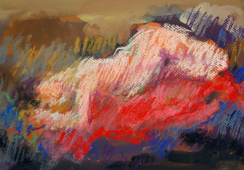
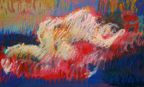
(Above: Nude 1 and Nude 2, pastel and gouache on paper, February 24, 2006, both about 10 inches wide. Update: New color-corrected images as of Tuesday morning.)
2.
February 28, 2006, 10:53 AM
i agree with ahab, i was curious about the underpainting also.
nice to know what this brand of pastels feel like. would like to try them.
3.
March 2, 2006, 1:35 AM
Even as images of drawings Franklin, they look fresh. How would you tranfer paint -to - surface while maintaining this luminosity and economy?
1.
ahab
February 28, 2006, 10:21 AM
The top image has very intriguing underpainting. But it is obscured by the red magic carpet flying figure, which, in many areas seems to be sprung violently from it's environs. I don't find the figure or ground to exist in the same atmosphere or medium. That is my only concern with this picture. I like the range of colour, contrast and I like the head-downward slope of the figure. A good composition, even with the central, boundaried orientation of the subject.
The second is more bothersome to me, not least because of the aura of fire that envelops the figure. I also find the white and red to hover (more gently) between the blues and yellows. Just don't like it much.
And I'm out of time to say any more.