Previous: lynne golob gelfman at snitzer (13)
Next: there's no minute like the last minute (4)
peter barrett at ingalls
Post #712 • January 19, 2006, 10:46 AM • 8 Comments
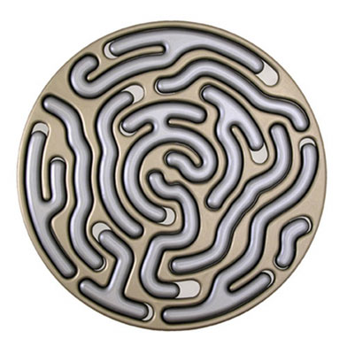
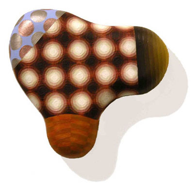
As I mentioned previously, Peter Barrett and I were classmates at the European Honors Program at RISD, and I note with interest how an underlying Renaissance aesthetic has influenced our paths differently. I developed a love of neutral colors and figuration, while he picked up a Trecento meticulousness and a reverent attitude towards form-making that he now applies to geometric abstraction. He paints on sculpted wood surfaces in patterns of flat colors, carefully adjusted from one area to the next, in a manner recalling Op Art, psychedelic posters, and religious mandalas. They have a simultaneously disconcerting and charming effect, as if blobs of psychic matter had oozed out of someone's head and had become the raw material of a late-1960's furniture designer. A wheel of interlocking, routered maze pathways, painted in subtly modulated grays, dominated the room.
Ingalls is also showing a giant circle of black lights by Matthew Schrieber. It would go over great at Burning Man, but as art it didn't do so much.
2.
January 19, 2006, 2:11 PM
I agree, and I'm particularly interested in these pieces - going to have to check them out. To me, though, this format wants to be integrated somehow with go see art, which unfortounately -though understandably- isn't being used as much as it should be... I wonder how such an integration might look?
3.
January 19, 2006, 2:26 PM
I first saw this work at Scope 2 years ago (or 3). The paintings and drawings on his website that recall some early medieval book illuminations are graphically interesting, certainly intricate and obsessive, yet still playful. The ones that are less rigidly geometrical work better, especially if the color mix is more imaginative. The trick with this sort of work is to make it look organic as opposed to machine-generated, to give it a kind of life or character of its own that doesn't boil down to a more or less mechanical construction or pattern. I'm sure Barrett is aware of it, but something like the Book of Kells should prove very, well, illuminating.
4.
January 19, 2006, 3:45 PM
OP, this works for me too, it's just a matter of getting out to the shows and finding something to write about.
Alesh, I agree with you about GSA - I'm competing pretty hard with myself here and I am probably going to have to break down and put the two together. It might make more sense that way.
5.
January 19, 2006, 4:03 PM
There may be duplication but they are not competing but supplementing each oither. I wouldn't even worry about it.
6.
January 19, 2006, 7:40 PM
i especially like the reliefs and the photography.
i like this format as well franklin.
7.
January 20, 2006, 1:07 PM
I followed your Peter Barrett link, Franklin, and was struck by the iconographic nature of his work. Every piece seems to be self-contained, most severely, some even hermetically. Jack's comment about medieval illumination was appropriate. Even more so, I thought, when I clicked to look at the larger images.
Under Barrett's "Objects" page are photos of some spherical "Nodes" and cubic "Squinches". The thumbnail images of these are really intriguing, but, as I find myself saying all over the place these days, scale is everything. Upon image enlargement to nearly actual size (the things are only around six inches big) they fall apart. They are more engaging to look at as icons than as discreet, material objects.
But then again, I'm restricted to virtual viewing, which makes my comments no less virtual. Nonetheless, I am left to expect that the most recent work (posted above) might suffer the same fate - "Their album is good, but their live show sucks." Photogenic work is a phenomenon that I don't understand. Who would purposely make art that looked better in reproduction than in actuality? But then again, if the photo or the webpage is the target, why not?
8.
January 23, 2006, 5:47 AM
Drugs.
1.
oldpro
January 19, 2006, 1:30 PM
Franklin, what you seem to be doing recently is a concentrated format of quick successive reviews with images which people can comment on. I don't know if you intend to keep this up but it really is exactly the kind of forum and presentation which seems to be missing everywhere, not just in Miami. Good idea.