Previous: scalise and ware at dorsch (292)
ware, bethea, weinacht at dorsch
Post #452 • January 12, 2005, 5:12 PM
Kerry Ware is officially outpainting nearly everyone in Miami, which shows you what diehard focus on your core convictions can get you. His new works at Dorsch show him surmounting, at last, a longtime difficulty in which his pictures wanted for more contrast, but his attempts at introducing it led to the compositions breaking up in unfavorable ways. Here, they work, and now over the hump, he's knocking out paintings that could give any mid-size abstraction a run for its money. They're up there with James Brooks, at least, maybe even a touch better a times. The colors terminate at edges that resemble torn paper, as dowels embeded into the plaster surface punctuate the fields. Two larger pieces, eight feet square, have Ware working in an angular manner that seems alien to his sensibilities, but they still command the rectangle with authority.

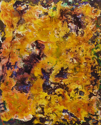
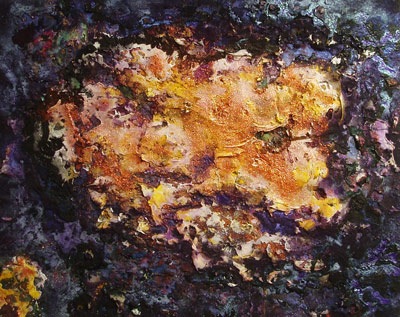
George Bethea is using a motif derived from images from the Hubble telescope - a sparkling, warm organic area floating in the middle of a sea of violet. Bethea continues to employ a high paint volume, and has introduced glitter onto the surfaces. Bethea works in a ferociously repetetive manner that succeeds over the long haul, but doesn't always appear to when we look at short stretches of paintings like the samplings here - their lack of differentiation makes the weaker images aggregrate and drag the show down. But when he hits, he hits good, particularly one work in which a supernova of orange takes up the whole area, with bits of purple ground showing through all over. The glitter seems charged and appropriately stellar.
Dan Weinacht's long horizontal panels with three identical photographs mounted on each of them don't work for me nearly as well. (Images forthcoming.) The battleship green behind all but one of them is preventing the photos from joining into a geometric statement that might activate the whole area. In fact, the most successful one is uses a field of mocha brown and slightly differentiated photos, and the greater variety on the more neutral background gives the most satisfying sense of compositional completeness. An obvious solution for further works would be to match the background color with one of the colors in the photos. Despite the Zen aesthetic of the present ones, duly noted by the artist, many of them feel merely empty.