Previous: I am very moved by one detail (22)
Next: Friday roundup, Monday edition (57)
Some results from the moku hanga workshop
Post #1398 • September 30, 2009, 9:38 AM • 89 Comments
Printed in the traditional Japanese method, more or less, at Zea Mays under the able guidance of Annie Bissett.
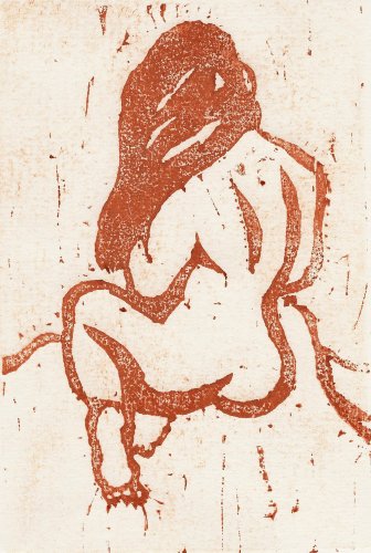
Figure with Long Hair 1, Japanese-style print, 4 x 6 inches
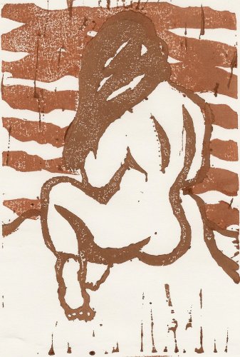
Figure with Long Hair 2, Japanese-style print, 4 x 6 inches
Figure with Long Hair 3, Japanese-style print, 4 x 6 inches
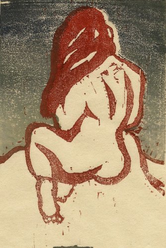
Figure with Long Hair 4, Japanese-style print, 4 x 6 inches
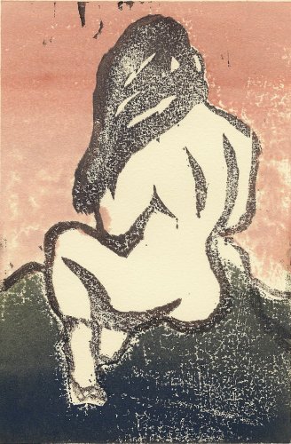
Figure with Long Hair 5, Japanese-style print, 4 x 6 inches
2.
September 30, 2009, 11:34 AM
Very nice indeed. So sorry to hear about Fergus, by the way; haven't been online since meeting him. Glad to have known him.
3.
September 30, 2009, 12:32 PM
Franklin,
Very nice.
My favourite is #4 because of the colour combination.
I also like #1 for its simplicity.
I love the textures.
m.
4.
September 30, 2009, 1:12 PM
1, 4 and 5 are better than 2 (figure blends into sky) and 3 (too jivey). It's a toss-up beteween 4 and 5 for the best one, but I'd give the edge to 5 (which I also think is the most Japanese).
5.
September 30, 2009, 2:16 PM
I as well was thinking #'s 1 and 5 are the winners. This printing technique complements your fat brushstyle very nicely, Franklin.
6.
September 30, 2009, 4:25 PM
From a Western standpoint, 1 is probably the best or purest, and it doesn't hurt that it recalls a sanguine drawing against cream-ivory paper. From a purely graphic standpoint, 5 has more impact and presence. The little black marks at the top edge, which were probably accidental, suggest foliage from an overlying tree; that strikes me as very Japanese, as well as very effective.
7.
September 30, 2009, 5:02 PM
Could this technique lend itself well to the library poetry project?
8.
September 30, 2009, 5:09 PM
A little more Japanese flavor:
http://zipang.web.infoseek.co.jp/t/t85304.JPG
http://zipang.web.infoseek.co.jp/t/t85305.JPG
http://zipang.web.infoseek.co.jp/t/t84904.JPG
http://zipang.web.infoseek.co.jp/t/t84905.JPG
http://zipang.web.infoseek.co.jp/t/t84903.JPG
http://zipang.web.infoseek.co.jp/t/t84402.JPG
http://zipang.web.infoseek.co.jp/t/t84403.JPG
http://zipang.web.infoseek.co.jp/t/t84407.JPG
9.
September 30, 2009, 5:29 PM
Regarding the texture, the medium just won't make a bad mark. Graininess or smoothness is controlled by the proportion of rice paste to pigment (more pigment = more grain) and the possibilities offered subsequent layers are immense. (You can, eventually, make the color pretty disgusting, though.) #5 is probably my favorite - I like how the bokashi (gradation technique) layered up on the bottom.
Tim, I was thinking about that very possibility. Probably, though, I'm going to use it on a similar but different project.
Jack, I enjoy the urls. It would be great if you could turn them into links. Here's how.
10.
September 30, 2009, 5:48 PM
it all works, but the lines of the body and spine really come together well.
just playing around, if you crop off the hair and the feet you are still left with a very interesting form.
11.
September 30, 2009, 6:11 PM
I like 1 best, then 5. The volume on the form is more pronounced on 1, and the various blips all over the surface are very lively.
The lowest hightlight on the hair should angle down to the left more.
12.
September 30, 2009, 6:32 PM
I've tried linking, Franklin, but even though I generate a link, it doesn't go to the right place (or doesn't go there the right way).
13.
September 30, 2009, 6:47 PM
Jack, try one. Let me see if I can figure out what you're doing wrong.
15.
September 30, 2009, 8:03 PM
You're not far off. Make sure the second quote mark is right next to the end of the URL. It should look like this:
<a href="http://zipang.web.infoseek.co.jp/t/t85304.JPG">Bowl 1</a>
16.
September 30, 2009, 8:30 PM
I'm curious to know what distinguishes 'moku hanga' from 'woodcut print'?
17.
September 30, 2009, 8:32 PM
Nothing. Moku is wood. Hanga is print.
18.
September 30, 2009, 8:35 PM
Although, that said, the combination of pigment and rice paste on the block is particular to the Japanese method as far as I know. It also seems that moku hanga are always hand-printed, never press-printed.
19.
September 30, 2009, 8:42 PM
I'll guess that rice paste protects the wood from ink stains?
20.
September 30, 2009, 8:46 PM
Drumroll, please:
Bowl 1
Bowl 1a
Bowl 2
Bowl 2a
Bowl 2b
Bowl 3
Bowl 3a
Bowl 3b
21.
September 30, 2009, 8:46 PM
Rice paste is the binder for the pigment. Annie was using water-dispersed pigments from Guerra. A few dabs of rice paste, a few drops of pigment, brush it all over the block with a horse-hair brush, and you're ready to print.
22.
September 30, 2009, 8:48 PM
Bravo, Jack!
23.
September 30, 2009, 8:51 PM
Well, if a computer geek holds my hand long enough, I can eventually perform very basic tasks.
24.
September 30, 2009, 8:57 PM
The third bowl is the best all-arounder of the bunch. Now that you've got the hyperlink thing down, Jack, you've gotta put up what we've generally agreed are the best of each group of ceramics we've looked at over the last little while so we can bestow a best in show ribbon.
25.
September 30, 2009, 9:01 PM
So the block's natural or carved aperatures don't clog up with pigment over time? How many prints before the picture degrades over much?
Have any of the old Japanese masters' woodblocks survived to print another day? I'll bet they were ritually burned.
26.
September 30, 2009, 9:11 PM
This is shina plywood, which has only the barest hint of grain. (Here's the rice paste Annie was using.) One ought to be able to print on it for a long time. Since it's water-based, the ink washes off the block in the sink.
I am told by my friend Tom Virgin that Takuji Hamanaka has been entrusted to print blocks carved under the direction of Hokusai.
27.
September 30, 2009, 9:50 PM
Did you carve from a stencil, or freeform?
In case you couldn't tell, I'm feeling moved to attempt some woodblock printing myself. Maybe a little relief printed graffiti - I'm thinking I'll carve a block, then carry it, a rattlecan and a handsledge to the nearest concrete wall.
28.
September 30, 2009, 9:57 PM
I drew a ink drawing intended for a 4 x 6 inch rectangle, scanned it, flipped it in GIMP, printed it out, and transfered it to the block with carbon paper. Relief printing is a good time - give it a whirl.
29.
September 30, 2009, 10:21 PM
Hey Ahab, about graffiti, do you know of the work of Paul Chelstad? We were hobnobing buddies in New Orleans back in the 1970s. We'd go thumbing around the country. Once we ended up in Eugene, Oregon with $10 and a blanket. Don't ask how. Anyway, he moved to New York in the Reagan era and quickly emerged as one of the graffiti artists up there. Most of that stuff was frivolous in my opinion, but he did some fine things using stencils as a base. He moved to Sioux City, Iowa, his home town, where he now makes really fine murals on the sides of old brick buildings. The Sioux City Art Center recently mounted an exhibition of his graffiti things, commissioning a stenciled work for the exhibition. It was really fun to see that work presented in the context of Official Artdom complete with academically and institutionally correct labelling. Chelstad is a very capable artist, and even though he knows well how ridiculous that exhibition was, he is such a social creature that he knew exactly how to play it for mileage. I marveled.
30.
September 30, 2009, 10:46 PM
Ahab's right. Bowl #3 is the aristocrat of that bunch.
I remember seeing a TV show about graffiti artists about 20 years ago, and after I got through listening to tehm describe their intricate techniques and watching then compare notes and notebooks full of tests and designs and then seeing them work I had to conclude that they acted more like artists than most artists I knew. Some of them are damn good.
31.
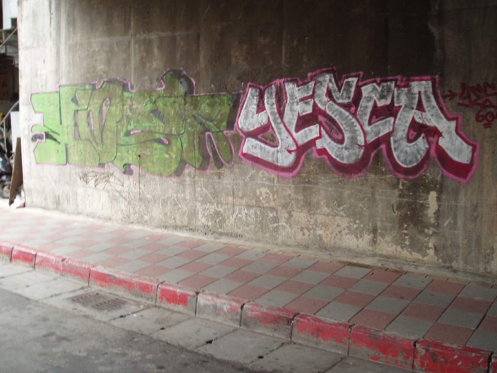
October 1, 2009, 6:56 AM
The problem with graffiti is that it's insanely conformist. Where would you guess that this example was made? The answer is Taipei. Graffiti invented an amazing arsenal of nifty visual devices and then squandered its potential by trying to look a certain way.
32.
October 1, 2009, 7:32 AM
Nice bowls and well done on those links. I'll have to take some shots of a cup that was given to me in the Japanese prefecture of Iwate by a damn good artist. It reminds me of your #3.
33.
October 1, 2009, 7:39 AM
Right, Franklin, that kind of graffiti I equate with dogs peeing on fire hydrants. Chelstad was in with a group known as 'stencil writers.' You can see some of his things if you go to the Sioux City Art Center's web site and look in the 'past exhibitions' section. You may not care for it; it tends toward pop art. Though, to me, what it led to is irritating as hell, I don't have as much of a problem with pop art as some do.
34.
October 1, 2009, 8:10 AM
The essay that Michael Betancourt wrote for that exhibition is a riot because it's so serious.
35.
October 1, 2009, 8:21 AM
Ahab, try reading up Baren Forum (which is, admittedly, intimidatingly scattered), in particular David Bull's Encyclopedia of Woodblock Printmaking. I've swapped e-mail with Mr. Bull. He's very open and interesting.
Somewhere in the vicinity of that I read about someone's finding an uninked woodblock from a couple of hundred years ago. It's very rare to find the old blocks; they were printed until worn out, and they wore out fairly quickly due to the extremely fine carving. The discovery of this uninked block from a master was something like unlocking the Rosetta Stone or finding Atlantis. I forget who wrote about it -- it may have been Mr. Bull -- but his tones were exceedingly reverent. He did a good job of evoking the scene.
Ah, here it is.
36.
October 1, 2009, 9:14 AM
You all know, of course, that the blocks themselves were virtually never carved by the "name" artists who designed the prints, but by specialized artisans or craftsmen. The carvers are occasionally identified on the prints, but usually not. The quality of the final product also had much to do with the printer and/or publisher. In other words, classical Japanese prints were always a collaborative effort.
37.
October 1, 2009, 9:35 AM
David Bull's Web pages make all that, and far, far, far more, painfully clear in excruciating detail. But some people like that kind of thing.
My favorite image out of all the reading I did on Japanese woodblock printing -- I went through all this about a year ago -- was of the printers oiling their barens. You need to keep the baren oiled as you're printing but it has to be the right kind of oil so it doesn't stain the paper and so on. "...the older printers here in Japan (the ones who still have hair), easily get a quick 'recharge' of the oil on their baren by wiping it across their head..."
From Breaking in a New Baren.
All of my research led me to get a linoleum block (I couldn't find any plain woodblock supplies nearby) which I got partway through carving before realizing, hey, I'm not a patient Japanese craftsman at all! I'm an instant gratification gaijin with better things to do, like have a bowl of Lucky Charms.
38.
October 1, 2009, 9:54 AM
But, which bowl in Jack's #20 do you choose to put the cereal in, Chris?
39.
October 1, 2009, 10:16 AM
MC, please, these are not cereal bowls. I mean, I realize in Canada they'd probably be used for anything imaginable, from ice cream to (in a pinch) beer, but these are tea bowls, meant for the tea ceremony. Barbarians are so, well, uncouth.
40.
October 1, 2009, 10:24 AM
Also, I'm an American. A big fat uncouth American. Those tea bowls are way too small for cereal. I need...I need something BIG.
41.
October 1, 2009, 10:29 AM
Chris, I think what you may need is gastric bypass surgery.
42.
October 1, 2009, 10:32 AM
Ha! Gastric bypass is a half-measure. I need my tonsils connected directly to my anus.
43.
October 1, 2009, 11:55 AM
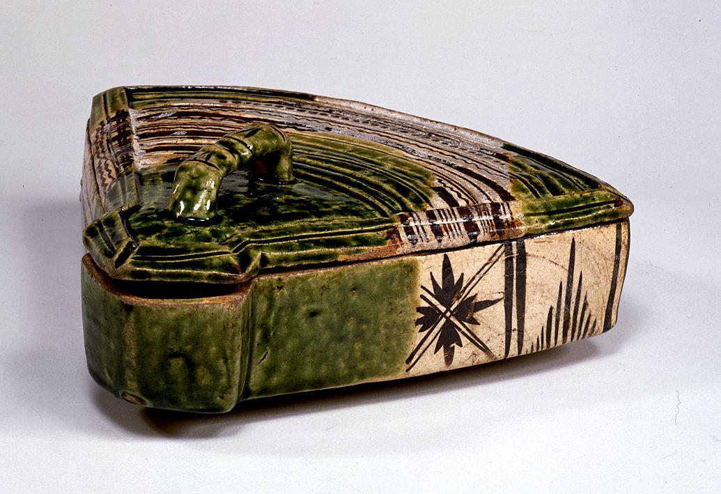
Right. So moving right along, here's a Shigaraki bowl:
Bowl S
Bowl S1
Bowl S2
Bowl S3
44.
October 1, 2009, 11:59 AM
About the rice paste again: the finished prints are not water fast? Could wheat paste be a substitute binder?
45.
October 1, 2009, 12:16 PM
Oh, and by the way, Chris, I stopped by your blog and saw the Richard Prince tirade. I hope you know that you are now officially banned from the Miami art world (such as it is). Some of the most major Miami collectors are major Princeheads (which should tell you a thing or two about the Miami art world).
46.
October 1, 2009, 12:18 PM
And Ahab, you mustn't obsess about these things. It's so, you know, Occidental.
47.
October 1, 2009, 12:21 PM
Franklin, re 31, cool sidewalk.
48.
October 1, 2009, 12:30 PM
When I see crap like that extruded by Richard Prince being lauded and sold -- for record-breaking sums -- I realize I have absolutely no idea how the work works.
49.
October 1, 2009, 12:37 PM
I assume you meant "how the worLd works," Chris, because the work, in Prince's case, doesn't work at all (except, of course, for pinheads, I mean, Princeheads).
50.
October 1, 2009, 12:40 PM
Oh, yes, how the WORLD works. I can see the WORK doesn't work at all. Anyone should be able to see that. Which, I guess, is part of why I'm mystified.
51.
October 1, 2009, 12:44 PM
As for the record-breaking sums, whether for Prince or comparable claptrap, I no longer let it upset me (at least not nearly as much as I used to). Rich idiots must be true to their nature, after all. Besides, it's a great excuse to sneer and laugh. When I think of how little money can buy a superb Japanese pot, which is aesthetically light years beyond Prince & Co., all I can do is smile like a Zen monk who's having a really good day.
52.
October 1, 2009, 12:53 PM
There's too much idealist in me to be truly Zen.
53.
October 1, 2009, 1:00 PM
Maybe it's just too much damn cereal, Chris.
54.
October 1, 2009, 1:04 PM
When dealing with the art world, a diet high in fiber is essential.
55.
October 1, 2009, 1:11 PM
Well, yes, you've got a point there. Of course, if you told the art world to stuff it, as I have, you wouldn't have these high-fiber issues. Of course, you might not have any issues, which could be a problem (unless you're a Zen monk).
56.
October 1, 2009, 1:15 PM
As an artist who has discovered recently he's unemployable in any other profession, it's rather more problematic for me to tell the art world to stuff it. People -- Franklin especially -- like to talk about working around the art world, being able to ignore it, but I'm afraid I haven't reached that state yet.
57.
October 1, 2009, 3:08 PM
i think the moku hanga workshop results are so elegant that i was very impressed by them.
58.
October 1, 2009, 3:16 PM
I think it's a mistake to think of the art world as a monolith in the first place. It's not Richard Prince aficionados through and through. It's my job to connect with the segments of it that will support and appreciate my work. I can certainly ignore the segments that won't - what harm is there in that?
60.
October 1, 2009, 3:50 PM
No, you're right. That's a good plan. I'm just cranky as usual.
62.
October 1, 2009, 3:56 PM
Chris, I'm always cranky, probably because I'm too aware of reality as it actually is. Once you accept that as a normal state, a state of appropriate awareness, it ceases to be an issue.
64.
October 1, 2009, 4:39 PM
jack has got the bug. that is good.
not too jivey to me. you can position it to whichever composition proportion you like viewing best while it rests on the table in between sips.
65.
October 1, 2009, 5:01 PM
I wouldn't be able to make my art cartoons if I didn't treat the art world as monolith. But you are right Franklin, you need to find your niche and work hard. I like no. 3 best. Excellent bowls. Thanks for sharing Jack. Anyone here like the work of George Ohr. I sure do.
http://www.georgeohr.org/ohr_gallery/index.htm?detectflash=false&
66.
October 1, 2009, 6:56 PM
I can now announce that the first black Oribe I posted (Plagens thread, before I was able to link properly) is now mine:
Jack's Oribe 1
Jack's Oribe 2
Jack's Oribe 3
I got it for under a Franklin (Ben, that is), and could have had it for a third of that if others had not been after it also. However, they were no match for my cunning. Amateurs.
67.
October 1, 2009, 7:03 PM
EAG, that link leads to an image, but no further movement or activity is possible. Anyway, the image shown is definitely too jivey and harsh for my developing taste, which is becoming more Japanese all the time.
68.
October 1, 2009, 9:33 PM
Franklin, this printing medium seems a natural for your brush drawing; you seem to have an affinity for it. I like these a lot. I like how the brush work is mediated via cutting the block and the added roughness in the resulting print.
The bowls to which Jack linked are sublime. There is wonderful "painting" on many of those.
69.
October 1, 2009, 10:25 PM
Congrats on the pot, Jack.
the blue isn't too jivey. If anything it is a little timid. I don't think it stands up to some of the others.
70.
October 2, 2009, 8:05 AM
I am hunting another excellent pot. Stay tuned.
OP, the blue pot is nice but doesn't have enough character. It's a little amorphous.
71.
October 2, 2009, 11:47 AM
Character is right, Jack. It's a little placid, like a blue-haired lady, especially compared to the wacky off-handed quality of the Oribe pot.
72.
October 2, 2009, 12:18 PM
Well, Oribe was apparently a "wacky" guy. The stuff he designed was not only distinctive in terms of the decoration but also of the vessel's shape, which tended to be bold, quirky and striking. I guess it's what one could expect from an artistic samurai.
74.
October 2, 2009, 1:01 PM
The most appealing set so far, Jack. Swaggering confidence in the brushing, and daring asymetry.
75.
October 2, 2009, 3:50 PM
http://www.metmuseum.org/special/se_event.asp?OccurrenceId={5BC229A8-FC6B-11D6-94C7-00902786BF44}
for jack. i think it has one of the pieces that you just linked to.
76.
October 2, 2009, 4:34 PM
Thanks, 1. Starting with #9 at the linked site, those are all Oribe pieces. They are also listed as Mino pieces because Mino is the region in which Oribe ware originated (along with other famous styles like Shino and Seto wares).
77.
October 2, 2009, 5:26 PM
I bagged it; it looks good enough to eat, and I love it:
K1
K2
K3
K4
K5
K6
It's a XX century rendering of an early 17th century e-Karatsu jar with a persimmon tree design, now in a Tokyo museum. This one, made by hand the same way as the original, suits me just fine.
You think I'm gonna waste time, let alone money, on hyped-up, overpriced nonsense from some "hot" artist du jour? FAT chance.
78.
October 3, 2009, 9:44 PM
I have thought long and hard about how to get the look of those ceramic glazes using paint.
79.
October 3, 2009, 10:41 PM
I've seen some things of Ralph Albert Blakelock and Albert Pynkham Ryder which approach those ceramic glazes. I know that both Blakelock and Ryder loved on each of their little canvases for years and years, so that the paintings look like organic accretions that you can see into, like gemstones. Ryder's paintings are hopelessly unstable. He was known to have used boot black and dirt from the bottom of his shoes to color them.
80.
October 3, 2009, 11:07 PM
Yes, I know his middle name is Pinkham, not Pynkham.
I think Ryder's "Dead Bird" in the Phillips Collection is very close to the glazes I'm thinking of. Inspired smears and blobs.
81.
October 4, 2009, 6:25 AM
There may be some possibilities in acrylic, between Golden's various iridescent colors and its glazing medium. I think I know what I'm going to be doing at the studio today...
82.
October 4, 2009, 7:04 AM
There are lot of colors in the earth-yellow-red range, like transparent oxides, quinacridones, azos, etc., which when used with polymer mediums are quite like ceramic glazes. Guerra has a lot of them, too, but they are expensive.
However I have not been able to make these effects amount to much as art in painting, except for small touches here and there.
83.
October 4, 2009, 9:19 AM
It may not be appropriate to focus on a surface effect like glazing and isolate it from the pot as a whole. The pot is a sculpture, really, a functional sculpture meant for use, and the glaze or decorative elements act in concert with the three-dimensional form and its peculiar characteristics.
85.
October 4, 2009, 9:35 AM
the size of that piece is very deceptive too
86.
October 4, 2009, 10:41 AM
If I ever get to teach again (not likely), I think I'll just borrow some of Jack's pots and leave them on a table in the front of the room for the whole term. Any time a student has a question I'll just point to the pots. That's after I smack them with my bamboo pointer.
BTW, I think Oribe was the first postmodern or pluralist to actually get anywhere.
87.
October 4, 2009, 12:23 PM
The pot in #77 is 7 inches tall. The pot in #84 is 6" tall. They're both water jars meant for use in the tea ceremony.
88.
October 4, 2009, 6:39 PM
Dude, some Oribe pieces are so funky it's very hard to believe they date from early 17th century Japan. That's one of the things I like about Japanese ceramics, their personality.
89.
October 4, 2009, 7:44 PM
#77 seems like it would be larger if you did not know that it was for a tea ceremony
1.
1
September 30, 2009, 10:42 AM
very nice