Next: Ukiyo-e at the Boca Museum (13)
Whistler at the Boca Museum
Post #772 • April 11, 2006, 10:24 AM • 7 Comments
This week we'll be looking at shows you didn't see at the Boca Museum that came down last weekend, including James McNeill Whistler: Selected Works from the Hunterian Art Gallery. The exhibit brought over 131 works spanning the artist's career, some ephemera (including a note written to Whistler from Monet, addressing him as "Mon cher ami") and some of his silver collection. Supported with nice biographical details, generously supplied in the wall labels, the exhibition portrayed him handsomely and traced his development as he culled techniques from Rembrandt and distilled them through his romantic sensibilities. I have at times detected a lack of muscularity in Whistler's work, but seen through his prints, he takes on a rigor that reinforces the soupy atmospheres of his oil paintings.
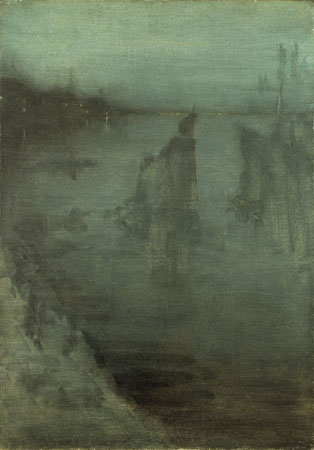
James McNeill Whistler, Nocturne, c. 1875 - 7, oil on canvas
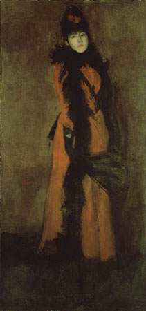
James McNeill Whistler, Red and Black: The Fan, c. 1891 - 4, oil on canvas
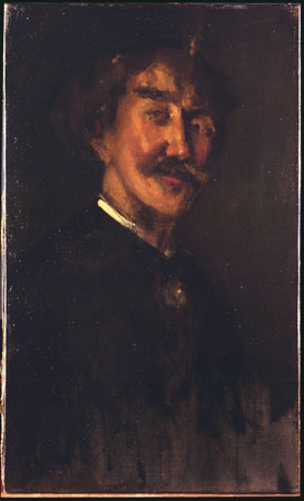
James McNeill Whistler, Self-Portrait, 1896, oil on canvas
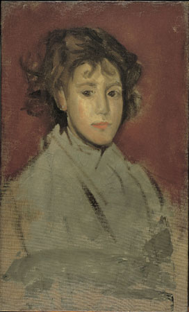
James McNeill Whistler, Little Lizzie Willis, 1896 - 1899, oil on canvas
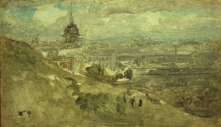
James McNeill Whistler, A Distant Dome, 1901, oil on canvas
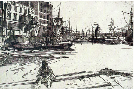
James McNeill Whistler, Eagle Wharf (from the "Thames Set"), 1859, etching, printed in black laid paper
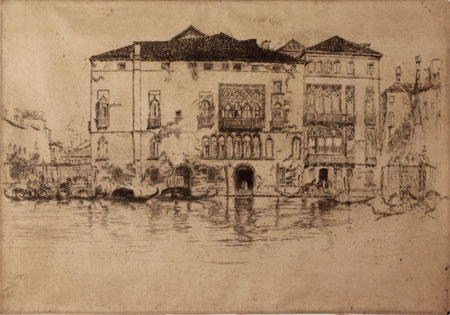
James McNeill Whistler, The Palaces (from the "First Venice Set"), 1879, etching, printed in brown-black on laid paper, trimmed to platemark, and signed on tab with butterfly
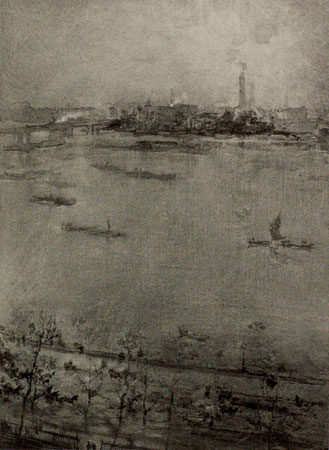
James McNeill Whistler, The Thames, 1896, lithograph, printed in black on laid paper
2.
April 11, 2006, 11:21 AM
The graphic work is more consistently high caliber. The paintings above certainly don't show him in the best light. The self-portrait is especially poor, even though painters tend to rise above their usual level when they portray themselves.
3.
April 11, 2006, 11:24 AM
The Thames was the best piece in the show.
4.
April 11, 2006, 12:57 PM
The lithograph above is indeed superb, even as a reproduction. It was probably made with technical assistance from Thomas Way, who ran a major lithographic firm in England and was a distinguished lithographer himself. Way was the one who got Whistler into lithography in the first place.
5.
April 11, 2006, 10:15 PM
I like the etching "Eagle Wharf", though the one thing that bugs me is the white of the pantlegs and bootsoles on the guy sitting in the foreground - they feel neglected compared with the rest and require some degree of value.
I am no less intrigued by the oil painting "Nocturne".
By way of the jpeg, "The Thames" lithograph might as well be charcoal, smudged here and there with water, but I'll gladly take Jack's and Kathleen's word on its excellence in person.
"Little Lizzie Willis" looks like it was painted with the canvas tiltiing away and down to the right. I find the optical distortion distracting.
I disclaim that these comments are seriously diminished by the digital remove that simultaneously connects me to and separates me from the real things.
6.
April 12, 2006, 12:29 AM
I was thinkin' the same thing about little Lizzie, ahab... slightly anamorphic, like the skull in Holbein's Amassadors...
7.
April 12, 2006, 1:38 PM
I think ahab's catch of the bootsoles and pantlegs is a good one, also.
1.
oldpro
April 11, 2006, 10:34 AM
I have always thought Whistler's graphic work much better than his paintings, which seems confirmed agan by this small sample.