Ruisdael at PMA
Post #719 • January 31, 2006, 11:30 AM • 17 Comments
Try not to think about all the landscape painting you've seen when you go to Jacob Van Ruisdael: Dutch Master of Landscape, up at the Philadelphia Museum of Art through February 5. Back in the 17th Century, the shafts of light from Heaven, the emerald canopy of capital-N Nature, the cracked trees as stand-ins for the Reaper, and so on had not yet become clichés of Western painting. At that point they had visceral symbolic impact, and in the hands of Ruisdael, became the motif for innovative compositional daring and expressiveness. Despite their verisimilitude to specific castles, trees, and waterfalls, the images come together by as much force of invention as that which produced Bosch's scenes of hell. (One bay of the gallery gathers his Scandinavian paintings together, depicting a land that the artist never visited.) They became the basis for 400 years of similar, inferior work, but don't hold that against them; they directly inspired Constable, also in this show with a half-dozen paintings. A bit of prolonged, unanalytical looking brings back their ability to arouse the same kind of thrill that nature, capital-N or otherwise, provides, with its majestic indifference to human worries and its refreshing reminder that we live in a similar manner to all living things, nurtured by soil and water, at once finite and continuous.
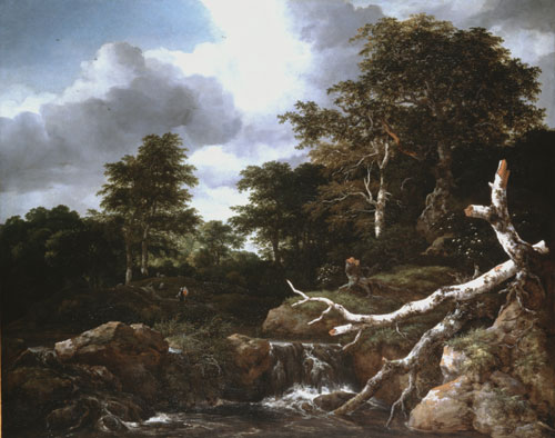
Waterfall in a Hilly Wooded Landscape, c. 1660, by Jacob van Ruisdael (Dutch, 1628/29-1682). Oil on canvas, 41 9/16 x 48 9/16 inches. National Gallery of Art, Washington D.C.: Widener Collection, 1942.9.80
2.
January 31, 2006, 10:53 PM
Dear Ahab,
I think that Alice K-Mart Walton may have just found her new permanent collection catalogue writer for the Crystal Bridges Museum of American Art. :)
James
3.
January 31, 2006, 11:12 PM
If he leaves out the stumps part, maybe.
4.
February 1, 2006, 10:18 AM
No disrespect intended, especially not to the blog-master. I appreciate the van Ruisdael for its germinality, and it seems to be a pretty well-made picture. At 4 foot wide it must be quite a window to stand in front of.
Stumps come part and parcel with me, what with my wooden-leg and all.
5.
February 1, 2006, 10:42 AM
Yikes, a painting from the glory days of realism before photography.
The Fra Angelico's at the Met were ten times more interesting, even the kid artists in NYC went nuts... 'wow, what great color!'
6.
February 1, 2006, 11:25 AM
Interesting, George. Everyone that I have talked to that saw the fra Angelico show loved it excessively, me included. Is something in the air?
7.
February 1, 2006, 11:51 AM
re #6. Might be. I saw it four times, it was packed every time, even on the usually slack day (Wed) I went with another artist each time, who had the same positive reaction I had, but my comment was primarily based upon what I'd read on the blogosphere. However, I have a tendency to get into conversations with other museum goers, mostly just regular folks and this exhibition really seemed to strike a chord.
In comparison with oil paintings, made later in history, which can have a mucky brownish tone the Fra Angelicos have incredibly brilliant and saturated color. This is, as you know, a result of the tempera medium which doesn't seem to darken as it ages. Even so, some colors seemed, well modern, which considering the choice of pigments available at the time was interesting. As a result, I think these 'old religious paintings' look extremely modern, Pope Pop, if you will. They look like the everyday images we see, like magazines, video games, television, bright and glowing.
I think it was an important show because it brought to the forefront a 600 year old master again closing the loop that painting has with it's history.
8.
February 1, 2006, 12:00 PM
I'm really sorry I didn't get to write about the Fra Angelico show before it came down. I teach egg tempera, and you get that modern coloration from being obliged to lay down flat local colors everywhere before modelling them. And George is right - unlike oils, temeras never darken. Usually when something goes wrong in a tempera, the fault is with the panel or some kind of unadvisable varnish added by a conservator. Otherwise, they tend to look like they were made last week, forever.
9.
February 1, 2006, 12:53 PM
Another interesting thing about the Fra Angelico exhibition was the range of condition of the works, from 'I can't believe it's untouched' to "what happened here?" In some panels you could see the wood support, the gesso layer 1/16' thick and the painted surface which is very interesting if you're a painter. Also, in some of the panels, the gesso is carved in a very low relief and then painted. The ones I remember had carved clouds painted like a cloud but also with a highlight and shadow that matched the relief. In others, the gesso under the gold leaf was carved for the halos and 'rays' which made them function somewhat like a hologram where what you saw changes as you move your head.
10.
February 1, 2006, 1:09 PM
The relief in the gesso under the gold leaf was sculpted to catch the flickering light of candles and oil lamps. Imagine it.
11.
February 1, 2006, 1:17 PM
I had close to a religious experience at the Fra Angelico exhibit. I left in such a state of meditative bliss, I was almost hit by a cab on Park...
I think what people (non-art wonks especially) respond to in Angelico is not only its aesthetic qualities, but its humaneness and warmth. Contemporary figurative art-- and a lot of other art for that matter-- tends towards the cold, the alienated, the reactionary, and the detached. Good vaguely optimistic work is almost impossible to find (bad optomistic work runs rampant -- see Kinkade). One of Angelico's gifts is pulling off a gentle humanity without sentimentalization or over simplification. That is very very rare.
12.
February 1, 2006, 1:20 PM
I'll tell you what - sit tight, and I'll put up my Fra Angelico images from the press kit as the next post.
13.
February 1, 2006, 1:21 PM
You are a dear.
14.
February 1, 2006, 1:32 PM
bring on the fra
15.
February 1, 2006, 1:51 PM
Done.
16.
February 1, 2006, 2:11 PM
I know, Huckle. Let's start a movement for beautiful humanistic enjoyable uplifting GOOD art. It is about damn time.
Of course once it happens the stupids will get on board and down it goes.
That is an arrogant, condescending thing to say, I auppose, but I can't help myself.
On to the Fra.
17.
February 1, 2006, 2:12 PM
The compositions in Fra Angelicos paintings is quite amazing. There were two paintings of 'monks' in black and white robes, in three rows (one had 5, 6 and 7 figures for 18 total). The black and white patterning was very abstract, with a red book here and there to keep the flow ordered.
In another tall skinny painting (maybe a 1 to 3 ratio) there were 32 female figures (which I bet inspired Botticelli) zig zagging from bottom (earth) to top (heaven). The scale of the lower figures was about twice the higher ones and the transition from earth (ground strewn with floral) to heaven (standing on the clouds) occurred about midway. I can't find reproductions of either but these were brilliant paintings for any era.
1.
ahab
January 31, 2006, 9:56 PM
Ahh, incomparable sublimity, exquisite nature. Is that a human wanderer in the middle lower left - with his pack slung over a shoulder, dwarfed by the whelming land and sky? His presence has caused a skinny-dipping wood nymph, timidly testing the water, to assume a hasty state of forest camouflage. Or maybe they're just stumps.